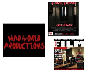
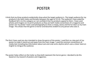
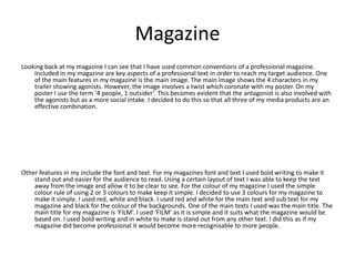
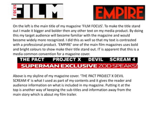
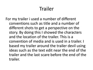
The document discusses how the author's three media products - a film poster, magazine, and trailer - work together effectively and contrast with professional texts. Key aspects like imagery, fonts, layout, and target demographics were considered to appeal to the target audience of 15-24 year olds. The products also utilize common conventions seen in other professional media like key cast/crew details, title treatments, and storyline previews. Marketing strategies are proposed to promote the fictional film further using the created products.
1. Question 2 – How effective is the
combination of your main products
and ancillary products.
2.
3. POSTER
I think that my three products evidentially show what the target audience is. The target audience for my
products is for both males and females between the ages of 15-24. The audience I have asked for
feedback fall in to this category so I am confident that my products appeal to them. I have used
photos and imagery on my print products as they are both media conventions of a magazine and
poster. For my poster I have used photography to show a creepy, weary and horror door as my main
image. This shows that the genre is horror and becomes evident to any person who sees it.
The font I have used are also intended to show the genre of the poster. I used font as a key part of my
poster to make it stand out and away from the main image. I used the common conventions of
media text including key information about cast and crew and a skyline which uses a clever twist on
English to intrigue the audience.
The poster helps reflect on the trailer as they both represent the horror genre. I decided to do this
based on my research of posters and magazines.
4. Magazine
Looking back at my magazine I can see that I have used common conventions of a professional magazine.
Included in my magazine are key aspects of a professional text in order to reach my target audience. One
of the main features in my magazine is the main image. The main image shows the 4 characters in my
trailer showing agonists. However, the image involves a twist which coronate with my poster. On my
poster I use the term ‘4 people, 1 outsider’. This becomes evident that the antagonist is also involved with
the agonists but as a more social intake. I decided to do this so that all three of my media products are an
effective combination.
Other features in my include the font and text. For my magazines font and text I used bold writing to make it
stand out and easier for the audience to read. Using a certain layout of text I was able to keep the text
away from the image and allow it to be clear to see. For the colour of my magazine I used the simple
colour rule of using 2 or 3 colours to make keep it simple. I decided to use 3 colours for my magazine to
make it simple. I used red, white and black. I used red and white for the main text and sub text for my
magazine and black for the colour of the backgrounds. One of the main texts I used was the main title. The
main title for my magazine is ‘FILM’. I used ‘FILM’ as it is simple and it suits what the magazine would be
based on. I used bold writing and in white to make is stand out from any other text. I did this as if my
magazine did become professional it would become more recognisable to more people.
5. Target Audience
The target audience for my trailer was based for people between the ages of
15-24 either males or females. My target audience was this age group and
either genre because of the research I carried out. From the research I
decided to base my trailer around this and used certain different ways to
do so. I used the storyline of my trailer to base around college for people
between the ages of 15-18. I did this because it would make them think of
what has occurred in the trailer and make them think ‘could it happen in
my college?’. This makes them want to see the full film. For the ages of 19-
25 I decided to use horror as my main genre from the research of
professional texts. From looking at the film ‘Scream’ I was able to find out
that the main target audience was from the ages of 19-25 because it was a
horror film.
6. Marketing
If I was to use my products for further marketing I would use a lot of different methods in order
to keep the film recognized and make people talk about the film.
One of the main ways I could use my poster product is to place in in different places in public.
Places such as bus stops and local supermarkets where a lot of different people are going will
be a good place. Other places in public where I could place my poster is on billboards near
motorways where more people will see the film advertised. Using public places to market a
film is an important way as it will constantly make them think of the film and that they want
to see the film.
Above are examples of what advertising I could use for further marketing of my products.
7. Another way in which I could market my product is to use the internet. The internet is the biggest
growing way in which people see stuff. The internet provides different servers such as social
networking and websites. Social networking includes Facebook and Twitter where friends and
family can share with each other. Using Facebook and Twitter I could create a fan page or main
page for the film in order to advertise. Using these pages I could provide the trailer everyday to
remind people of the film and to use different techniques such as interviews with the actors and
use behind the scenes footage to keep the audience interested. Other websites such as YouTube
can be used as well. Using YouTube will allow a wider audience to see my trailer.
Other, more obvious ways of marketing my product is using the cinema and TV as main market
strategies. Providing people short clips of the film before the film there going to see makes them
think they want to watch that when it released. Using TV is the same providing the audience with
short clips during advert brakes makes them wonder and think they want to watch the film.
8. Contrast with Professional texts.
In my products I have tried to use my three products in order to contrast with each other.
Contrasting with other professional texts has helped me determine whether my products
have done this.
Here is one of the common conventions in which I have used in both my film poster and film
trailer. This is the information which goes on the trailer and poster with information
containing the director, actors, executive producer and many other information.
This is another convention which is included in my trailer. This represents the age group of the
film audience and who it suits. This is relevant on many professional trailers. This shows that
my products are very effective and follow professional products.
9. On the left is the main title of my magazine ‘FILM FOCUS’. To make the title stand
out I made it bigger and bolder then any other text on my media product. By doing
this my target audience will become familiar with the magazine and would
become widely more recognized. I did this as well so that my text is contrasted
with a professional product. ‘EMPIRE’ one of the main film magazines uses bold
and bright colours to show make their title stand out. IT is apparent that this is a
media common convention for a magazine cover.
Above is my skyline of my magazine cover. ‘THE PACT PROJECT X DEVIL
SCREAM 4’ is what I used as part of my contents and it gives the reader and
audience information on what is included in my magazine. Putting it at the
top is another way of keeping the sub-titles and information away from the
main story which is about my film trailer.
10. Trailer
For my trailer i used a number of different
conventions such as title and a number of
different shots to get a perspective on the
story. By doing this I showed the characters
and the location of the trailer. This is a
convention of media and is used in a trailer. I
based my trailer around the trailer devil using
ideas such as the text edit near the end of the
trailer and the last scare before the end of the
trailer.