
Recommended
More Related Content
What's hot
What's hot (20)
Viewers also liked
Viewers also liked (18)
Similar to Horror film posters (blog) 1
Similar to Horror film posters (blog) 1 (20)
More from Emzzino
More from Emzzino (13)
Recently uploaded
Recently uploaded (20)
Horror film posters (blog) 1
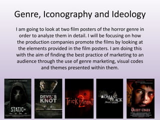
- 1. Genre, Iconography and Ideology I am going to look at two film posters of the horror genre in order to analyze them in detail. I will be focusing on how the production companies promote the films by looking at the elements provided in the film posters. I am doing this with the aim of finding the best practice of marketing to an audience through the use of genre marketing, visual codes and themes presented within them.
- 2. We see a figure with a black hooded top and a dark mask. The mask within the poster tells us that a lack of identity has been given to us, as we don’t know who or what it may be. There is very minimal text on the poster; a title, a headline slogan and information on the actors/actresses. The idea of having minimal visual codes is purposely done in order to make us want to watch the film and they are teasing us. In terms of the visual codes, I noticed that the main colour is black. Black is a stereotypical colour to portray evil or death, and this poster clearly is following the horror movie poster commonality. The darkness portrays the fear of unknown as we do not know what to see. The themes are mainly about death and lack of escape. Dark cloudy setting compliments the figure on the cover. This may give us a hint of when we expect the film to be full of drama. (at night when it is dark and cloudy). The films tagline is ‘if you hear them coming. You’re already dead’. This tagline contains the word dead, which reveals and the violence and genre. In addition, it raises a few questions that need to be answered. Who are they? And why are we already dead? Why can we not escape them? Big and bold text all in capital letters. The production company want us to see the written codes, although there is so little. This is because the few words in the poster speak a lot. The word static means lacking in movement, action, or change, especially in an undesirable or uninteresting way. This definition can relate to us when we are scared. We lack movement, and have no hope. Therefore static can be the idea of us not being able to escape within the film. Low-key lighting suggests the grim reaper, this may also connote the supernatural. The mask and hollow eyes show a lack of identity abnormality. There is a tiny bit of the production company information in very small text. The production company do this because they do not want us to focus on who made the film, they want us to notice the dark colours and the mysterious killer. STATIC 3D (2012)
- 3. I would expect to see more written codes in this poster, in order to get more information about the story. Although the production company knowingly reveal so little textual codes to make us wonder and ask questions, and eventually want us to find out by watching it. The poster creates a sense of mystery and enigma in a range of ways and many questions need answering: • The lack of information provided by the production company makes us want to know more about the film. • The identity of the figure is very subtle. This makes us want to ask who is behind the mask? Male or Female? Why are they trying to kill us? • The tagline also makes us wonder who is coming for us, why can we not escape and how are we already dead? • The location is not shown as we see a dark cloudy background. Where is the setting of the film? • The title Static means lack of movement, so what makes us lack in movement? The film producers are trying to create excitement and thrill by giving us very written codes. They want us to not read, and just watch. The props, background, bold text and tagline all complement each other to give away the genre; being Horror. The dark colours infer death, and the figure has a lack of identity wearing a mask, which is a commonality of horror movie characters.
- 4. YOUR’E NEXT (2013) We see a figure with an animal mask. The mask tells us similarly with the first poster, a lack of identify. We are not sure who may be behind the mask, as it appear to be abnormal. Big and bold text all in capital letters. The production company made sure we notice the big letters as this is one of the main focuses of the poster. Blood on the figures face. This clearly shows us that the film may be gory, and we expect to see blood through the visual codes. Very little written codes, and the production company. The reason to this is the production company want us to read the few words, which are powerful enough as they speak for themselves. The background of the film is dull, and dark. This creates a sense of evil and darkness. The figures colours matches the backgrounds which can link to when we see it (in the dull dark lighting) The written tagline on this poster is placed above the title of the film. “Did you remember to lock your door?”. This is a very powerful question, as it wants us to ask questions, and we get an idea of the films settings. The doors can imply that it is set in some sort of house or apartment. The title YOURE NEXT is in capital letters, and the font is almost scratched onto the poster. The written codes are trying to suggest a sense of animalistic behaviour, through the figure and also the text on the poster being carved on like an animal would. The main colour of the poster is again some sort of grey/black. This can suggest the theme of the film being dark, deathly, as well as the grim reaper being portrayed through the figure. Death is the only thing that we see when blood, dark colours and a evil animal mask is shown.
- 5. • The poster also creates a sense of mystery and enigma in a number of ways and the viewers have questions that need answering: • Firstly, the lack of written codes. Similarly with the first poster, hardly any text is used, and this is teasing us as we want to know more about the visual codes. • The background looks abstract and abnormal. Where is it? In addition, who is behind the mask, and why that specific mask? The blood on the mask makes us wonder how it got there, and who’s blood is it? • The words You’re Next make us ask why are we next? And how are they sure we are next? • I also want to know where the film is set, because all we see is a hooded masked figure, blended into a background. In terms of this film poster, I would expect to see more of the background. We do not get to see fully what the figure is behind, and showing us this will enable us to understand the location of the film. In addition, more written codes by the production company could help us with the films story. The film producers are trying to create excitement and thrill by giving us very written codes. Like the first poster, it is common that in horror movie posters, little information is given to us. The figure also seems to create a sense of animalism and abnormality, which is out of the norm. And this with the dark fuzzy background and carved text all emphasizes that this film is a horror one.