
Recommended
More Related Content
What's hot
What's hot (20)
Similar to How effective is the combination of my main product and ancillary texts?
Similar to How effective is the combination of my main product and ancillary texts? (20)
More from meganhall46121
More from meganhall46121 (20)
Recently uploaded
Recently uploaded (20)
How effective is the combination of my main product and ancillary texts?
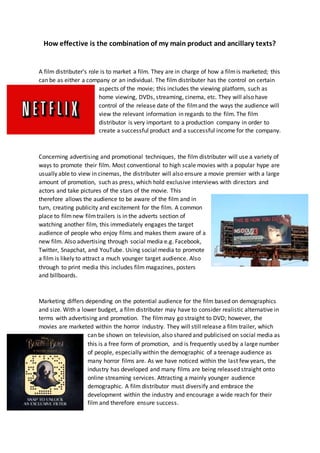
- 1. How effective is the combination of my main product and ancillary texts? A film distributer’s role is to market a film. They are in charge of how a filmis marketed; this can be as either a company or an individual. The film distributer has the control on certain aspects of the movie; this includes the viewing platform, such as home viewing, DVDs, streaming, cinema, etc. They will also have control of the release date of the filmand the ways the audience will view the relevant information in regards to the film. The film distributor is very important to a production company in order to create a successful product and a successful income for the company. Concerning advertising and promotional techniques, the film distributer will use a variety of ways to promote their film. Most conventional to high scale movies with a popular hype are usually able to view in cinemas, the distributer will also ensure a movie premier with a large amount of promotion, such as press, which hold exclusive interviews with directors and actors and take pictures of the stars of the movie. This therefore allows the audience to be aware of the film and in turn, creating publicity and excitement for the film. A common place to filmnew filmtrailers is in the adverts section of watching another film, this immediately engages the target audience of people who enjoy films and makes them aware of a new film. Also advertising through social media e.g. Facebook, Twitter, Snapchat, and YouTube. Using social media to promote a film is likely to attract a much younger target audience. Also through to print media this includes film magazines, posters and billboards. Marketing differs depending on the potential audience for the film based on demographics and size. With a lower budget, a film distributer may have to consider realistic alternative in terms with advertising and promotion. The filmmay go straight to DVD; however, the movies are marketed within the horror industry. They will still release a film trailer, which can be shown on television, also shared and publicised on social media as this is a free form of promotion, and is frequently used by a large number of people, especially within the demographic of a teenage audience as many horror films are. As we have noticed within the last few years, the industry has developed and many films are being released straight onto online streaming services. Attracting a mainly younger audience demographic. A film distributor must diversify and embrace the development within the industry and encourage a wide reach for their film and therefore ensure success.
- 2. Example of a successfully marketed product- There is high value of audience research to distribution companies when it comes to developing their campaign, for example, we can look at recent film, Beauty and the Beast 2017. Beauty and the Beast was released March 2017, all these posters carry unified identity within the brand, showing the iconography of the film within the posters, which includes the rose. In addition, we see the two main characters within the film on two of the posters. As Beauty and the Beast is a Disney classic, which they have recreated from the original 1991, we can assume a large target audience as to be expected with Disney. The demographics include the age of those who watched the original e.g. 26+ and new a new younger audience demographic who may not have seen the first film however are fans of the Disney brand and therefore have immediate trust that they will enjoy this film. The unified identity is clear from the poster by using the same branded and recognisable font relevant to the Disney brand. The distributer has also showed elements of the narrative and shared knowledge of the presumed audience. We assume that we are looking at Beauty and the Beast within the posters and that they are in love, this is also relevant when considering the trailer, the main poster and the film reviews. Within the promotion and marketing of this film we saw conventional advertising features such as billboards, premiers, interviews, film multiple posters, social media publicity and a trailer. The social media expanded through to Facebook live broadcasting of the live premier event, Twitter hashtags, and a snapchat filter dedicated to the release date of this film. It is clear that this film was successful due to the film topping 900 Million dollars at Worldwide Box Office.
- 3. My Poster- Magazine cover- specific elements I took inspiration from e.g. font composition, colours, image explain the value of getting on the cover of a filmmagazine to the film’s promotion and how my cover relates to my poster and trailer. Posters I took inspiration from- When I was deciding on the design of my poster, I began looking at existing and professional posters. The ones I thought were most effective were ones with low key lighting, a lot of use of black and white with only the colour red to represent a blood concept or just simply to relate to the horror genre. I have taken inspiration from the poster ‘Ancestors’ in regards to the image, as they have also used a shadow on part of the face, which I have on the left side of the image. This influenced my poster, as I wanted to achieve a scary image, which also infers creepiness and suspense relating to my filmtrailer and my magazine cover. All the existing posters that I had taken inspiration from had a very dark or a black background surrounding the image. This is something that I wanted to include within my poster, as the image was shot in a high-key lighting environment I had to use an exposure adjustment layer within editing on Photoshop to ensure I achieved a professional finish. The writing on my poster also symbolises the horror genre and represents the main theme of my trailer, which is a ‘broken’ family. Which was the main reason we wanted to use the smashed glass text effect. The idea to use a vibrant red was also influenced by existing media texts, just as the colour used in Jacob’s Ladder. On this poster, the red is the only colour used on the poster and works very effectively in evoking an element of fear with the text and the colour of the text. The idea to place a ‘from the directors of…’ strapline was derived again from the Jacob’s Ladder poster and this enabled me to find a suitable and professional placement of the strapline, title and building block. Just like the Blair Witch Project, I have kept all text within my poster central. In regards to the age certificates, we decided to make our filman age 15 due to the graphic scenes of moderate violence and adult themes similar films within the genre, e.g. Split have an age rating of 15 so we, as a group, presumed this would be appropriate.
- 4. My Magazine Cover- Existing magazine covers which I took inspiration from- Whilst designing my magazine cover I looked at existing media texts to gain inspiration. This included specific elements such as a masthead, I chose to follow similar design to total film, however called mine weekly film to differentiate the brand however still incorporate an element of brand identity with using similar font style, of a large sans serif font. I also used existing media as influence for the colour scheme of my magazine cover, I really liked the colour of the blue used in the James Bond style magazine, however, as I wanted to keep unity between my three products I chose the same shade of red used in my filmposter, as this created clear connection of my product of the film and in addition the red colour is effective in terms of the horror genre. It immediately alerts the audience of certain danger with what the colour red connotes (danger/ fear/ gore). With the composition of the cover lines my main guidance and inspiration was the total film magazine of Star Trek. I liked the balance of bold writing and normal writing and used my cover lines to shape the face of my image. My image works effectively when considering my three products as promotion for my film. The image was important to get right to ensure my cover relates to my poster and trailer. As I have used the antagonist on the magazine (inspiration from empire) it shows the different characters within the filmand the expression on my characters face again promotes the movie due to his very serious and ‘evil’ look. It was important not to break the character of the villain engage the audience who read the magazine. My cover relates to my poster due to the same use of the smashed glass font, and the use of black, white and red, which has also been a theme throughout our film trailer. I believe my three products work well together to promote the movie.
- 5. The Trailer- In regards to the trailer, my main aim was to create a successful campaign for the movie ‘The Perfect Family’. This included creating three media products that worked in a synergy to create promotion for my movie. Within my trailer certain aspects are established such as the main characters and they are quickly recognised within my magazine cover and my film poster, making it easier for the audience to identify. Poster Trailer Magazine Trailer I have used two of the main characters of the vulnerable girl and the male antagonist. This can be established by looking at all my media texts, showing the young girl in a very defenceless within my poster and showing a contrast within my film poster as my male character appears evil and confident within the close up shot, inferring that he is the villain within the narrative. The font which I have used on all three products is the same to ensure they continue a certain synergy and an audience can relate them together, I have also used similar colour style to denote unity within the tree products I have used red on perfect and white within ‘the’ and ‘family’. Considering all these marketing techniques used within my three media products I have created a successful unified marketing strategy in order to promote the film ‘The Perfect Family’.