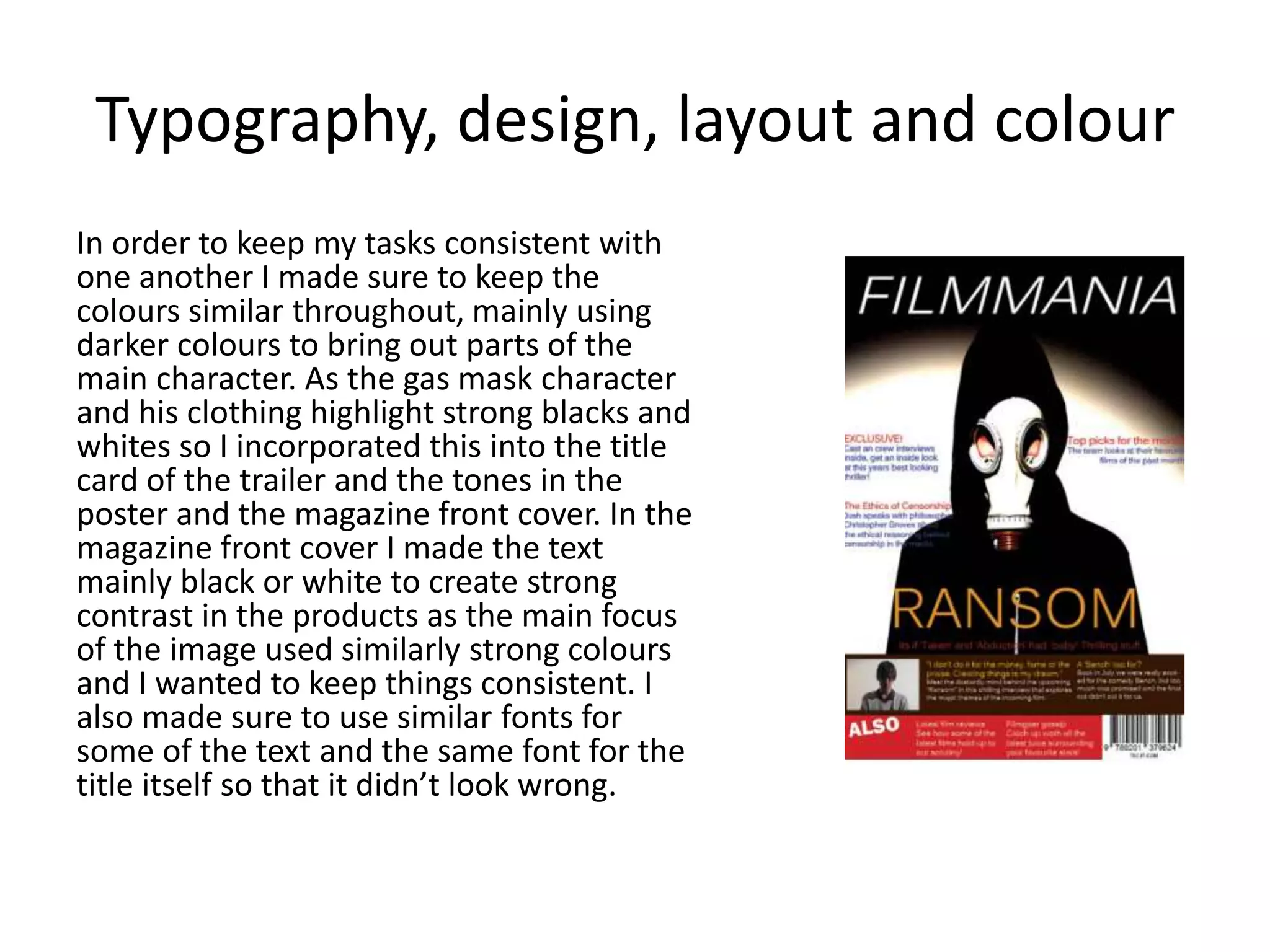
Evaluation Q2
How effective is your main product in
combination with your ancillary
tasks.
Ancillary 1
Ancillary 2
Introduction – why consistency is
important
It is important that work of the same type and
under the same banner maintains a level of
consistency, this is because it can then grow
confusing if say a film is very dark and foreboding
but the trailer and the marketing paint it as a much
different affair. Unless the tone is similar this cannot
work or if the film is a parody, as such I have made
certain that my Poster and Magazine Front Cover
work in tandem with the teaser trailer: possessing
most of the same aspects and themes.
Typography, design, layout and colour
In order to keep my tasks consistent with
one another I made sure to keep the
colours similar throughout, mainly using
darker colours to bring out parts of the
main character. As the gas mask character
and his clothing highlight strong blacks and
whites so I incorporated this into the title
card of the trailer and the tones in the
poster and the magazine front cover. In the
magazine front cover I made the text
mainly black or white to create strong
contrast in the products as the main focus
of the image used similarly strong colours
and I wanted to keep things consistent. I
also made sure to use similar fonts for
some of the text and the same font for the
title itself so that it didn’t look wrong.
Style
I created a consistent style between the three
texts by limiting the colours used to mainly dark
greys and black but also using bright reds,
oranges or white in order to create contrast and
compliment that at least looked good. For
example in the poster I only used white, grey,
orange and black as the four main colours and I
created a minimalist style that also showed the
dark theme that I was trying to replicate from
the teaser trailer itself, the poster is after all,
simply a compliment to the teaser trailer itself.
In the poster I had to brighten up the colour
palette but I tried to keep it minimal in order to
keep the themes created similar. I made the title
of the film orange in the poster as opposed to
white like in the teaser because I wanted it to
stand out in contrast to the strong sharp blacks
and whites that are extremely prominent in the
poster.
Genre
In the three texts the genre is suggested
using key codes and signifiers that would
make an audience quickly identify that
the genre is a crime thriller, this is due to
the inclusion of similar props and mise en
scene, for example the inclusion of iconic
props for the genre such as weapons and
dark clothing. The poster is deliberately
minimalist in order to illicit a response
from the viewer so that they ask
questions and become compelled to read
further into the texts which is an aspect
of the thriller genre as it keeps the
audience fully engaged and constantly
asking questions.
Effectiveness
Overall I think that the teaser itself is the most
effective as in some of the aspects of the
ancillary tasks are very weak but they add a
compliment to the teaser itself by spreading
awareness, the combination of all three tasks
makes for an effective marketing.
How the tasks sell the main product
The three tasks are at their core all forms of marketing. I
think that the style and genre in all three are very
effective and therefore sell the main product effectively
as they all communicate a similar message to the
audience regarding genre, style and typography. The
tasks sell the main product by raising increased
awareness and intrigue in what’s to come, the minimalist
design of the poster and the video is intended in order to
sell the main product, equally the magazine front cover is
designed in a way that the text will supposedly answer
questions that the audience may have on the inside of
the magazine.

Evaluation qestion 2

  • 1.
    Evaluation Q2 How effectiveis your main product in combination with your ancillary tasks.
  • 2.
  • 3.
    Introduction – whyconsistency is important It is important that work of the same type and under the same banner maintains a level of consistency, this is because it can then grow confusing if say a film is very dark and foreboding but the trailer and the marketing paint it as a much different affair. Unless the tone is similar this cannot work or if the film is a parody, as such I have made certain that my Poster and Magazine Front Cover work in tandem with the teaser trailer: possessing most of the same aspects and themes.
  • 4.
    Typography, design, layoutand colour In order to keep my tasks consistent with one another I made sure to keep the colours similar throughout, mainly using darker colours to bring out parts of the main character. As the gas mask character and his clothing highlight strong blacks and whites so I incorporated this into the title card of the trailer and the tones in the poster and the magazine front cover. In the magazine front cover I made the text mainly black or white to create strong contrast in the products as the main focus of the image used similarly strong colours and I wanted to keep things consistent. I also made sure to use similar fonts for some of the text and the same font for the title itself so that it didn’t look wrong.
  • 5.
    Style I created aconsistent style between the three texts by limiting the colours used to mainly dark greys and black but also using bright reds, oranges or white in order to create contrast and compliment that at least looked good. For example in the poster I only used white, grey, orange and black as the four main colours and I created a minimalist style that also showed the dark theme that I was trying to replicate from the teaser trailer itself, the poster is after all, simply a compliment to the teaser trailer itself. In the poster I had to brighten up the colour palette but I tried to keep it minimal in order to keep the themes created similar. I made the title of the film orange in the poster as opposed to white like in the teaser because I wanted it to stand out in contrast to the strong sharp blacks and whites that are extremely prominent in the poster.
  • 6.
    Genre In the threetexts the genre is suggested using key codes and signifiers that would make an audience quickly identify that the genre is a crime thriller, this is due to the inclusion of similar props and mise en scene, for example the inclusion of iconic props for the genre such as weapons and dark clothing. The poster is deliberately minimalist in order to illicit a response from the viewer so that they ask questions and become compelled to read further into the texts which is an aspect of the thriller genre as it keeps the audience fully engaged and constantly asking questions.
  • 7.
    Effectiveness Overall I thinkthat the teaser itself is the most effective as in some of the aspects of the ancillary tasks are very weak but they add a compliment to the teaser itself by spreading awareness, the combination of all three tasks makes for an effective marketing.
  • 8.
    How the taskssell the main product The three tasks are at their core all forms of marketing. I think that the style and genre in all three are very effective and therefore sell the main product effectively as they all communicate a similar message to the audience regarding genre, style and typography. The tasks sell the main product by raising increased awareness and intrigue in what’s to come, the minimalist design of the poster and the video is intended in order to sell the main product, equally the magazine front cover is designed in a way that the text will supposedly answer questions that the audience may have on the inside of the magazine.