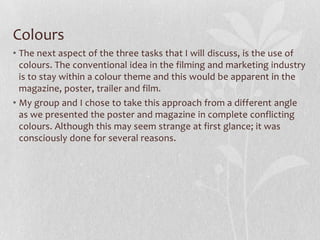
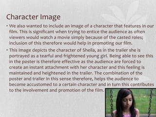
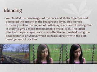
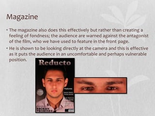
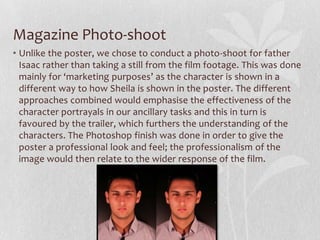
The document discusses the effectiveness of combining a film's main trailer with two ancillary marketing texts, a poster and magazine. It finds that the poster and magazine are most effective when they use consistent fonts, colors, and images that tie back to the trailer. Specifically, the poster and magazine for the film "Broken Promises" use matching fonts but different colors to represent the contrasting characters. Both ancillary texts also feature images that visually connect to scenes and themes shown in the trailer. The combination of the trailer, poster and magazine allows the film to be promoted to wider audiences through various marketing channels.


![Font
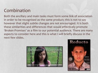
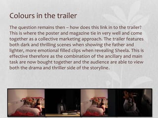
First and foremost we have the text, which although a minute detail -
does hold strong visual importance. In general terms, the two ancillary
tasks use identical fonts but this trend does not seem congruent in the
trailer and the reasons for this are simple.
The poster and magazine make use of the ‘Tahoma’ font style and this
works well due to its simplicity and clarity. Unlike fonts such as Arial; it
has a slightly more appealing style and so was used when being
aesthetically pleasing was fundamentally important [i.e. in the poster
and magazine]. On the trailer however – where we wanted the focus
drawn away from the text – a plainer font of Arial was used. The
consistency between the poster and magazine within themselves
however, was achieved effectively so that the audience can recognise
their link and so their individual marketing strategies are combined.](https://image.slidesharecdn.com/powerpoint-130426125955-phpapp02/85/Question-3-4-320.jpg)
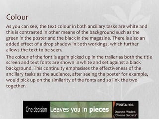
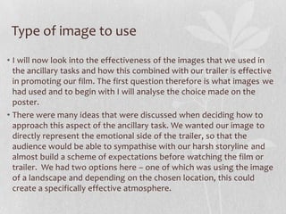
![Reasons for this contrast…
• The most important perhaps, is that the poster and magazine feature
two different characters and just like the colours in their individual
workings; they are shown in the film to be very conflictive. In other
words, Sheela [shown in the poster] is almost the protagonist, whilst
Isaac, who features in the magazine, is clearly the kidnapper and
antagonist of the film. The contrast in colours would therefore serve
to emphasise this.
• Another advantage of this emphasised difference is that it presents
not only the two different perspectives of the trailer, but also the two
genres that make up the story line of the film. The drama genre is
depicted through the depressing poster, whilst the thriller side is
suggested by the intenseness of the magazine. This would therefore
help in promoting the film and trailer as it would relate to a wider
range of audience. We believe that the different colour
representations in the poster and magazine work very well together
for the marketing of the film.](https://image.slidesharecdn.com/powerpoint-130426125955-phpapp02/85/Question-3-8-320.jpg)


![Kisi kisi dan materi uji olimpiade [toki]](https://cdn.slidesharecdn.com/ss_thumbnails/kisi-kisidanmateriujiolimpiadetoki-120116063143-phpapp02-thumbnail.jpg?width=640&height=640&fit=bounds)


