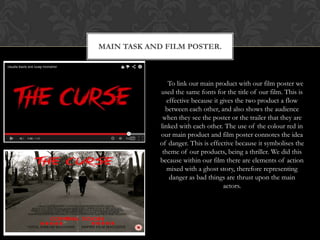
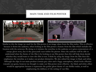
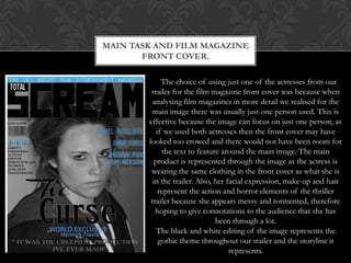
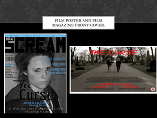
HOW EFFECTIVE IS THE
 COMBINATION OF YOUR MAIN
PRODUCT AND ANCILLARY TASKS?
MAIN TASK AND FILM POSTER.


               To link our main product with our film poster we
            used the same fonts for the title of our film. This is
               effective because it gives the two product a flow
              between each other, and also shows the audience
             when they see the poster or the trailer that they are
            linked with each other. The use of the colour red in
            our main product and film poster connotes the idea
            of danger. This is effective because it symbolises the
             theme of our products, being a thriller. We did this
            because within our film there are elements of action
               mixed with a ghost story, therefore representing
                danger as bad things are thrust upon the main
                                     actors.
MAIN TASK AND FILM POSTER


Similar to this the image we used for the film poster, is an image taken from the film trailer. This is effective
  because it shows the audience, when looking at the film poster a feature from the film which includes the
location with the actresses. By doing so it initiates the storyline to the audience as it gives connotations of a
     creepy ghost story, due to the graveyards seen within the picture. Since the audience will be able to
   understand what the theme of the film is by looking at our film poster then this will help them decide
    whether they would want to view this film or not. I think by using the image from the film then this
  emphasises the storyline as it makes our product distinctive. We also edited the image to black and white.
  Although the clips in our main product contain grey skies and a foggy atmosphere, which looks effective
 towards our genre, however we thought to make our film poster more effective the black and white effect
     would be appropriate because it represents the gothic ghost theme of our thriller trailer, as well as
                             emphasising the dullness of the setting of our film.
MAIN TASK AND FILM MAGAZINE
       FRONT COVER.

             The choice of using just one of the actresses from our
         trailer for the film magazine front cover was because when
          analysing film magazines in more detail we realised for the
          main image there was usually just one person used. This is
        effective because the image can focus on just one person, as
           if we used both actresses then the front cover may have
        looked too crowed and there would not have been room for
             the text to feature around the main image. The main
          product is represented through the image as the actress is
         wearing the same clothing in the front cover as what she is
          in the trailer. Also, her facial expression, make-up and hair
            represent the action and horror elements of the thriller
         trailer because she appears messy and tormented, therefore
           hoping to give connotations to the audience that she has
                                been through a lot.
           The black and white editing of the image represents the
            gothic theme throughout our trailer and the storyline it
                                     represents.
MAIN TASK AND FILM MAGAZINE
                           FRONT COVER.


The contrast in colour from the red used in the main product to the ice blue
  used in the film magazine front cover is effective because it separates the
     products as they would not have been made by the same publishing
companies. The ice blue colour is still significant towards our main product
because although it does not represent danger, like our film poster and main
product, it represents the cold feel of our trailer as it features a ghost story.
    We hope this would show the creepiness of our products towards the
                                  audience.
   To support the theme of our trailer we have featured similar themed films
  in the sub heads of on our film magazine front cover. We have also used
    actress and actors names who have featured in similar themed films to
 empahise the genre to make our film magazine front cover more effective.
FILM POSTER AND FILM
MAGAZINE FRONT COVER.
FILM POSTER AND FILM
                         MAGAZINE FRONT COVER.


  Both ancillary tasks are effective together because although they maintain a
separate colour scheme, they share similar qualities. We were able to approach
  the film magazine front cover in a different manner because unlike the film
  poster, it will not have been distributed from the same company as the film
   trailer itself. This is why we have chosen to use different fonts and colour
scheme on each task. It is still effective because all text is bold and able for the
   audience too see, while both main colours which we have used represent a
  part of our trailer. The ice blue represents the cold ghost story and the red
      represents the danger element within the action of the thriller genre.
 However, both tasks link together by using the black and white editing on the
 images. This is to represent the gothic element of our trailer. We hope this is
     effective in giving the audience connotations of what our film entails.

Evaluation question 2

  • 1.
    HOW EFFECTIVE ISTHE COMBINATION OF YOUR MAIN PRODUCT AND ANCILLARY TASKS?
  • 2.
    MAIN TASK ANDFILM POSTER. To link our main product with our film poster we used the same fonts for the title of our film. This is effective because it gives the two product a flow between each other, and also shows the audience when they see the poster or the trailer that they are linked with each other. The use of the colour red in our main product and film poster connotes the idea of danger. This is effective because it symbolises the theme of our products, being a thriller. We did this because within our film there are elements of action mixed with a ghost story, therefore representing danger as bad things are thrust upon the main actors.
  • 3.
    MAIN TASK ANDFILM POSTER Similar to this the image we used for the film poster, is an image taken from the film trailer. This is effective because it shows the audience, when looking at the film poster a feature from the film which includes the location with the actresses. By doing so it initiates the storyline to the audience as it gives connotations of a creepy ghost story, due to the graveyards seen within the picture. Since the audience will be able to understand what the theme of the film is by looking at our film poster then this will help them decide whether they would want to view this film or not. I think by using the image from the film then this emphasises the storyline as it makes our product distinctive. We also edited the image to black and white. Although the clips in our main product contain grey skies and a foggy atmosphere, which looks effective towards our genre, however we thought to make our film poster more effective the black and white effect would be appropriate because it represents the gothic ghost theme of our thriller trailer, as well as emphasising the dullness of the setting of our film.
  • 4.
    MAIN TASK ANDFILM MAGAZINE FRONT COVER. The choice of using just one of the actresses from our trailer for the film magazine front cover was because when analysing film magazines in more detail we realised for the main image there was usually just one person used. This is effective because the image can focus on just one person, as if we used both actresses then the front cover may have looked too crowed and there would not have been room for the text to feature around the main image. The main product is represented through the image as the actress is wearing the same clothing in the front cover as what she is in the trailer. Also, her facial expression, make-up and hair represent the action and horror elements of the thriller trailer because she appears messy and tormented, therefore hoping to give connotations to the audience that she has been through a lot. The black and white editing of the image represents the gothic theme throughout our trailer and the storyline it represents.
  • 5.
    MAIN TASK ANDFILM MAGAZINE FRONT COVER. The contrast in colour from the red used in the main product to the ice blue used in the film magazine front cover is effective because it separates the products as they would not have been made by the same publishing companies. The ice blue colour is still significant towards our main product because although it does not represent danger, like our film poster and main product, it represents the cold feel of our trailer as it features a ghost story. We hope this would show the creepiness of our products towards the audience. To support the theme of our trailer we have featured similar themed films in the sub heads of on our film magazine front cover. We have also used actress and actors names who have featured in similar themed films to empahise the genre to make our film magazine front cover more effective.
  • 6.
    FILM POSTER ANDFILM MAGAZINE FRONT COVER.
  • 7.
    FILM POSTER ANDFILM MAGAZINE FRONT COVER. Both ancillary tasks are effective together because although they maintain a separate colour scheme, they share similar qualities. We were able to approach the film magazine front cover in a different manner because unlike the film poster, it will not have been distributed from the same company as the film trailer itself. This is why we have chosen to use different fonts and colour scheme on each task. It is still effective because all text is bold and able for the audience too see, while both main colours which we have used represent a part of our trailer. The ice blue represents the cold ghost story and the red represents the danger element within the action of the thriller genre. However, both tasks link together by using the black and white editing on the images. This is to represent the gothic element of our trailer. We hope this is effective in giving the audience connotations of what our film entails.