The document discusses how the author addressed and attracted their target audience for their magazine. They took inspiration from the layout of Billboard magazine, using a bold front cover font and large central artist image to look professional. They conducted research through questionnaires to understand readers' interests and tailor the magazine content and design accordingly. Specifically, they incorporated darker colors popular with their genre audience.
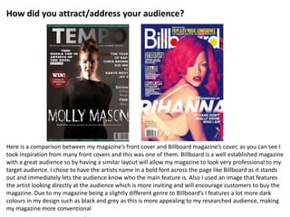
![The content that is included within
the magazine Tempo is great, its very
relevant, easy to read and suitable to
the genre as I find it interesting to
read. The layout used throughout is
also very clear and easy to follow and
understand which creates great
usability for the audience and I would
definitly buy this magazine again.
Tom Wilkinson- 20
I think that this magazine has very good,
original qualities such as its colour
scheme, a lot of magazines use white
throughout so seeing so much black used
in Tempo really stands out and it caught
my eye also I think its great for reflecting
the genre of music which is included
within the magazine. The bold main
image on the front cover is also great, as
she is looking directly at me [the
audience] I feel as if she is inviting me in
to read, which is great.
Simone Davidson- 17](https://image.slidesharecdn.com/evaluationq5-150416122103-conversion-gate01/85/Evaluation-q5-3-320.jpg)


