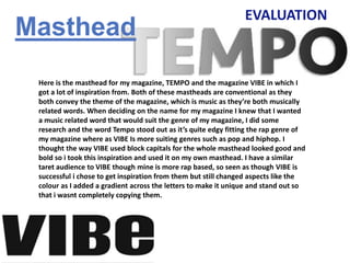
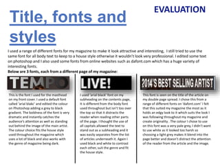
The document discusses the layout and design choices made for a magazine called TEMPO. It summarizes how conventions from other magazines like VIBE were used but also made unique. Dark colors, images of rappers in dark backgrounds, and fonts were chosen to reflect the rap genre. Artists from rap were featured to appeal to the target audience. The layout of the front cover, contents page, and double page spread followed conventions but also included original elements.


