Catherine Thompson
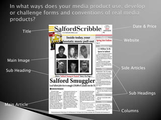
Date & Price
         Title

                  Website


 Main Image
                 Side Articles
Sub Heading


                     Sub Headings

Main Article
                 Columns
Main Article that matches front
                                     Columns
   cover image
                                                Different Articles to
                                                attract a wider
Eye Catching Language                           audience


        Titles                                  Advertisement to
                                                attract a wider
                                                audience.


 A variety of
 different images                              Easy to read and
                                               understand text &
                                               language


         Extras


                                         Side headings
Comparison To My Product & A Real Media Product
 Extras inside                   Layout                   Number of columns


                                One main
                                Image


                                                       Different articles included
Bold easy to read font                                 inside.
                         Colour scheme (Red, Yellow &Black)
Easy to read text   Broadsheet


                    Advertisement


                                       Tabloid


Clear/different images


                     Columns
Adverts & Images


          These are the adverts I’ve created and photographs
          I’ve edited on PhotoShop to include in my newspaper.
Ancillary Products:


               Billboard                              Radio Advert

-These are my two ancillary products I’ve produced to accompany my
newspaper, to target my audience.
-There is a consistent theme throughout all my ancillary texts leading to a more
professional main product.
Photograph of the area the
newspaper is situated (Salford).

                                   All flows by repeating the
                                   name of the newspaper
                                   and that it is local.


                                   Showing that it’s a
                                   local newspaper, full
                                   of local news.
Radio Advert                    Final Product:


   Script:


Music
I was inspired from an
existing advert
(LateRooms.com) I looked at
a variety of different music
but I feel that this fit best.
Billboard
                                  Eye-catching bold image   ‘We live in the...’

Name of the newspaper &
further information


   Website
-My own image taken of Salford                 Easy to read & understand
Quays, bold, colourful & eye-catching.
-Name of newspaper and website
-Describing what it is (Local News)
-Matches colour scheme of my                  Layout
newspaper (Red, white & black).
Font’s, Colour Schemes And Layouts: Easy to read font which is simple to
understand and a colour scheme that runs throughout my newspaper and
billboard.

Billboard & Radio Advert: Own script used and music chosen, individual and
professional looking.

Stories & Photographs: All my own images taken and edited (using
PhotoShop) which fit with the articles. Stand out, attract a wide audience.


    Showed my individuality throughout the main product and ancillary


 date, adverts, images, website, catchy music and wording these elements
add to the professionalism and therefore the realism of my final productsa.

             All based around local newspapers for local people
     I don’t feel that my newspaper looks like it has been made on a low
     budget, I feel it looks like it has been well planned and put together
      and could be with a few small alterations a realistic product in the
                                  media industry.
Market Research
Firstly to attract the audience I did;
   2 Questionnaires:
                                         My results helped me
                                         know what things I
                                         needed to include in
                                         my newspaper to
                                         help me attract the
                                         right local audience.


  Results
Facebook &Twitter Feedback


 The feedback given from Facebook and twitter was on my main product
 and my ancillary products. I received mostly positive comments, but I did
 get some constructive criticism, which was some of the following;

 -More colour and pictures throughout the main product, to make it even
 more eye-catching,
 -Inserting a picture of the newspaper on the billboard, to aid marketing.

 Positive feedback

 - Quite eye catching,
 -Layout and overall look is professional,
 -Radio Advert is funny and is remembered long after it is played,(isn’t
 full of dribble)
 -Billboard is very eye-catching because of the beautiful image of Salford
 Quays.
Feedback on final products:
                              Focus Group Findings
Photoshop
I used it to create:


                       -It helped me with the design of my
                       products and experiment with colours
                       and layouts.
                       -Edit images and fonts.
Premiere


Facebook             Twitter


       I uploaded my final products to
       receive feedback & comments.
Conclusion
  Overall, I am happy with the outcome of my coursework. After
  spending the time to research and plan my three products (main
  newspaper, radio advert and billboard).

  I found it a new challenge creating a radio advertisement seeing I
  have never used premiere but overall I enjoyed the experience and
  I am pleased with the final product.

  However to improve my newspaper further I feel I should have
  used more colour throughout the newspaper and made my images
  bigger to make a more eye-catching final product. (from audience
  feedback)

  Finally I feel that I could have marketed my newspaper better by
  including a picture preview on the billboard, to show the product
  I’m selling.

  I feel that my final products are successful at looking
  realistic, professional and eye-catching, which was confirmed by
  the positive feedback from my Facebook and Focus Group.
Thank You
 For Your
   Time

Catherine Thompson-Evaluation

  • 1.
  • 2.
    Date & Price Title Website Main Image Side Articles Sub Heading Sub Headings Main Article Columns
  • 3.
    Main Article thatmatches front Columns cover image Different Articles to attract a wider Eye Catching Language audience Titles Advertisement to attract a wider audience. A variety of different images Easy to read and understand text & language Extras Side headings
  • 4.
    Comparison To MyProduct & A Real Media Product Extras inside Layout Number of columns One main Image Different articles included Bold easy to read font inside. Colour scheme (Red, Yellow &Black)
  • 5.
    Easy to readtext Broadsheet Advertisement Tabloid Clear/different images Columns
  • 6.
    Adverts & Images These are the adverts I’ve created and photographs I’ve edited on PhotoShop to include in my newspaper.
  • 7.
    Ancillary Products: Billboard Radio Advert -These are my two ancillary products I’ve produced to accompany my newspaper, to target my audience. -There is a consistent theme throughout all my ancillary texts leading to a more professional main product.
  • 8.
    Photograph of thearea the newspaper is situated (Salford). All flows by repeating the name of the newspaper and that it is local. Showing that it’s a local newspaper, full of local news.
  • 9.
    Radio Advert Final Product: Script: Music I was inspired from an existing advert (LateRooms.com) I looked at a variety of different music but I feel that this fit best.
  • 10.
    Billboard Eye-catching bold image ‘We live in the...’ Name of the newspaper & further information Website -My own image taken of Salford Easy to read & understand Quays, bold, colourful & eye-catching. -Name of newspaper and website -Describing what it is (Local News) -Matches colour scheme of my Layout newspaper (Red, white & black).
  • 11.
    Font’s, Colour SchemesAnd Layouts: Easy to read font which is simple to understand and a colour scheme that runs throughout my newspaper and billboard. Billboard & Radio Advert: Own script used and music chosen, individual and professional looking. Stories & Photographs: All my own images taken and edited (using PhotoShop) which fit with the articles. Stand out, attract a wide audience. Showed my individuality throughout the main product and ancillary date, adverts, images, website, catchy music and wording these elements add to the professionalism and therefore the realism of my final productsa. All based around local newspapers for local people I don’t feel that my newspaper looks like it has been made on a low budget, I feel it looks like it has been well planned and put together and could be with a few small alterations a realistic product in the media industry.
  • 12.
    Market Research Firstly toattract the audience I did; 2 Questionnaires: My results helped me know what things I needed to include in my newspaper to help me attract the right local audience. Results
  • 13.
    Facebook &Twitter Feedback The feedback given from Facebook and twitter was on my main product and my ancillary products. I received mostly positive comments, but I did get some constructive criticism, which was some of the following; -More colour and pictures throughout the main product, to make it even more eye-catching, -Inserting a picture of the newspaper on the billboard, to aid marketing. Positive feedback - Quite eye catching, -Layout and overall look is professional, -Radio Advert is funny and is remembered long after it is played,(isn’t full of dribble) -Billboard is very eye-catching because of the beautiful image of Salford Quays.
  • 14.
    Feedback on finalproducts: Focus Group Findings
  • 15.
    Photoshop I used itto create: -It helped me with the design of my products and experiment with colours and layouts. -Edit images and fonts.
  • 16.
    Premiere Facebook Twitter I uploaded my final products to receive feedback & comments.
  • 17.
    Conclusion Overall,I am happy with the outcome of my coursework. After spending the time to research and plan my three products (main newspaper, radio advert and billboard). I found it a new challenge creating a radio advertisement seeing I have never used premiere but overall I enjoyed the experience and I am pleased with the final product. However to improve my newspaper further I feel I should have used more colour throughout the newspaper and made my images bigger to make a more eye-catching final product. (from audience feedback) Finally I feel that I could have marketed my newspaper better by including a picture preview on the billboard, to show the product I’m selling. I feel that my final products are successful at looking realistic, professional and eye-catching, which was confirmed by the positive feedback from my Facebook and Focus Group.
  • 18.
    Thank You ForYour Time