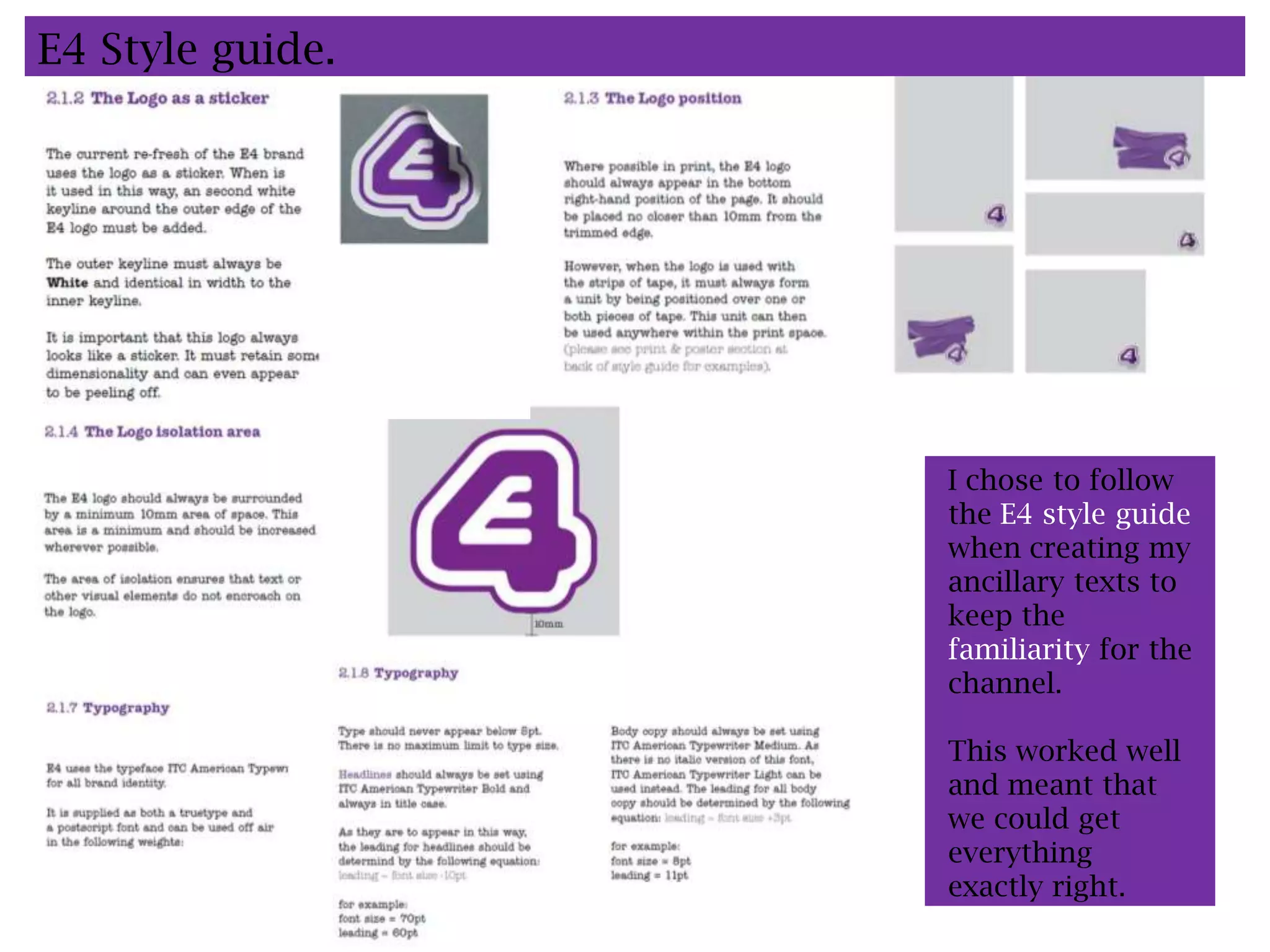
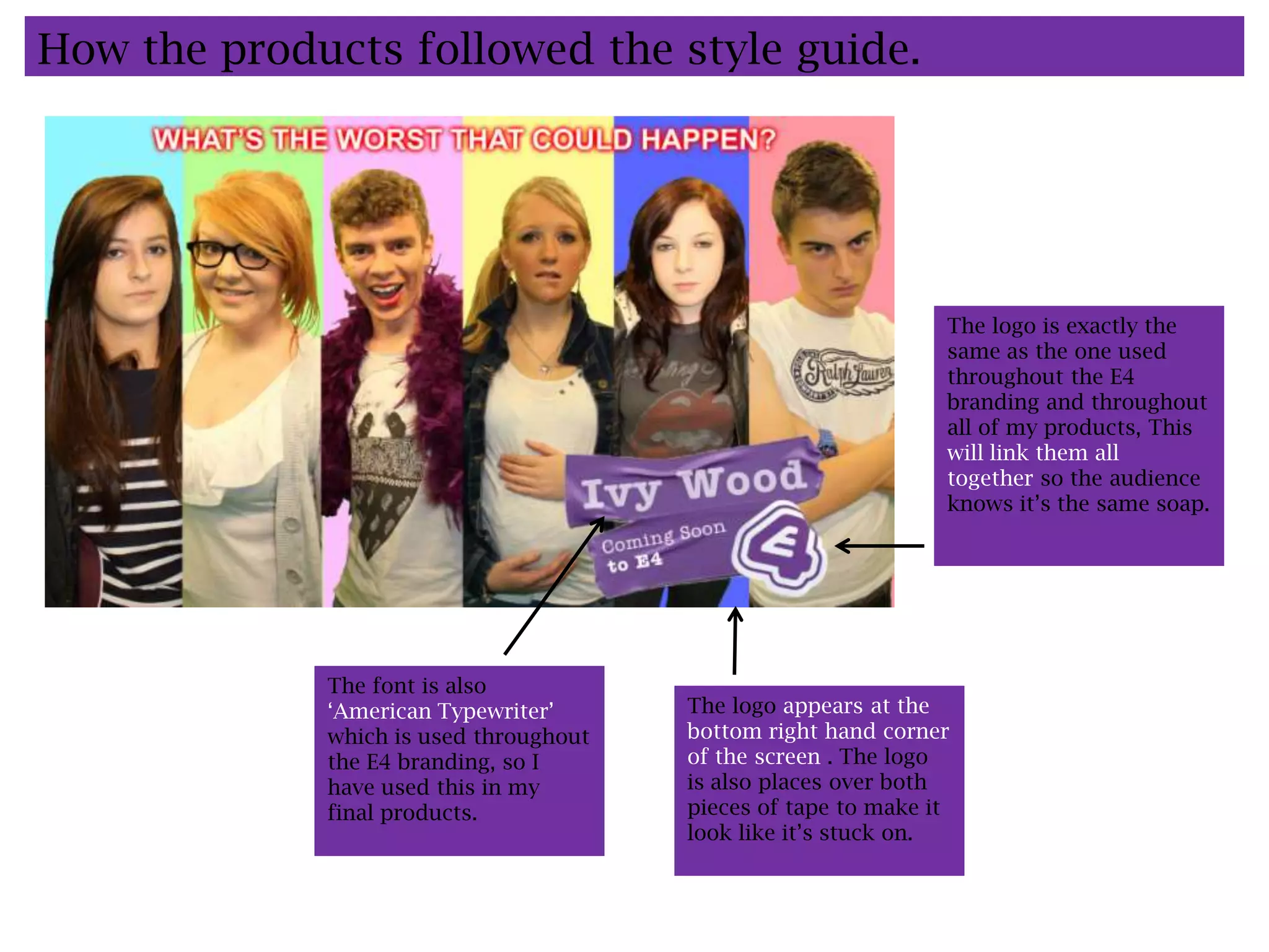
Question 2: How effective is the combination
of your main product and ancillary texts?
Ivy Wood.
G324: Advanced Production.
Henderson: Katie, 4405.
E4 Style guide.


                  I chose to follow
                  the E4 style guide
                  when creating my
                  ancillary texts to
                  keep the
                  familiarity for the
                  channel.

                  This worked well
                  and meant that
                  we could get
                  everything
                  exactly right.
Existing Front cover evaluation.


                                   Bright background.
     Date and issue
     number.


     Large name which              Stars from the main
     stands out                    storyline are larger.


                                   Looking at the
                                   reader to engage.


      Price is generally
      value price to appeal
      to audience.
                                   Large headline
                                   anchors the star.

                                   Subheading to
                                   anchor the headline.
 Stars are referred to
 using first names as the
 reader is already aware
 of who they are.                    Other storylines on
                                     the front cover.
My front cover.

     Large name which                               Date and issue
     stands out                                     number.


     Price is generally
     value price to appeal
     to audience.
                                                    Looking at the
                                                    reader to engage.

      Stars from the main
      storyline are larger.


                                                     Bright background.


     Large headline
     anchors the star.


                                                    Subheading to
                                                    anchor the headline.
 Stars are referred to
 using first names as the
 reader is already aware
 of who they are.


                              Other storylines on
                              the front cover.
How the products followed the style guide.


                                                                The logo is exactly the
                                                                same as the one used
                                                                throughout the E4
                                                                branding and throughout
                                                                all of my products, This
                                                                will link them all
                                                                together so the audience
                                                                knows it’s the same soap.


             The font is also
             ‘American Typewriter’      The logo appears at the
             which is used throughout   bottom right hand corner
             the E4 branding, so I      of the screen . The logo
             have used this in my       is also places over both
             final products.            pieces of tape to make it
                                        look like it’s stuck on.
Representations created through our products.
           Age.                    Gender.


      The reason we aimed it       We did aim our products
      at an E4 audience was        at both genders, and
      because all of our cast      didn’t use colours that
      are young and between        are generally related to a
      16-18, which fits in with    certain gender. We also
      out audience. If we were     starred both male and
      to aim it at an older        female characters equally
      audience we would have       throughout.
      to have used an older        In our main trailer
      cast so the audience can     though, we did do a
      relate to them.              cross dressing scene to
                                   show that boundaries
                                   between males and
                                   females have been
                                   crossed.

Evaluation question 2.

  • 1.
    Question 2: Howeffective is the combination of your main product and ancillary texts? Ivy Wood. G324: Advanced Production. Henderson: Katie, 4405.
  • 2.
    E4 Style guide. I chose to follow the E4 style guide when creating my ancillary texts to keep the familiarity for the channel. This worked well and meant that we could get everything exactly right.
  • 3.
    Existing Front coverevaluation. Bright background. Date and issue number. Large name which Stars from the main stands out storyline are larger. Looking at the reader to engage. Price is generally value price to appeal to audience. Large headline anchors the star. Subheading to anchor the headline. Stars are referred to using first names as the reader is already aware of who they are. Other storylines on the front cover.
  • 4.
    My front cover. Large name which Date and issue stands out number. Price is generally value price to appeal to audience. Looking at the reader to engage. Stars from the main storyline are larger. Bright background. Large headline anchors the star. Subheading to anchor the headline. Stars are referred to using first names as the reader is already aware of who they are. Other storylines on the front cover.
  • 5.
    How the productsfollowed the style guide. The logo is exactly the same as the one used throughout the E4 branding and throughout all of my products, This will link them all together so the audience knows it’s the same soap. The font is also ‘American Typewriter’ The logo appears at the which is used throughout bottom right hand corner the E4 branding, so I of the screen . The logo have used this in my is also places over both final products. pieces of tape to make it look like it’s stuck on.
  • 6.
    Representations created throughour products. Age. Gender. The reason we aimed it We did aim our products at an E4 audience was at both genders, and because all of our cast didn’t use colours that are young and between are generally related to a 16-18, which fits in with certain gender. We also out audience. If we were starred both male and to aim it at an older female characters equally audience we would have throughout. to have used an older In our main trailer cast so the audience can though, we did do a relate to them. cross dressing scene to show that boundaries between males and females have been crossed.