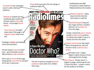
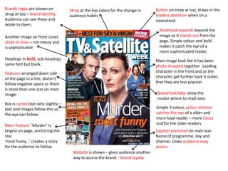
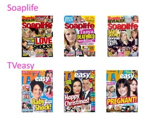
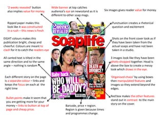
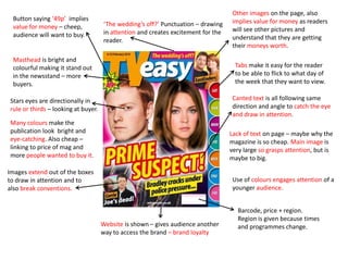
This magazine cover uses bright colors, multiple images, and dramatic headlines and punctuation to attract readers. It implies value for money with its low price point and promises of multiple stories. The disorganized layout with overlapping images and text creates an "organized chaos" that draws in the eye. In contrast, the other magazine uses a simple color scheme, bold masthead, and sophisticated single starring image to appeal to an older, more loyal audience.
This magazine front cover uses bright colors, multiple images, and tilted text to attract readers looking for gossip and drama. Six soap opera stars are featured across the page in three collaged images. Captions written in different colors and punctuation imply exciting revelations. The masthead stands out among other publications, while the "2 weeks revealed" button and 49p price imply value. Overall the chaotic colorful design aims to draw in readers looking for fresh drama on a budget.
The magazine uses a bright color scheme and prominent masthead to attract older, loyal viewers interested in weekly television programs. It encourages brand loyalty through its website listed in the masthead and provides value with multiple television program features and images. The largest headline teases a mystery to engage readers in learning more about the main story.
This document summarizes and analyzes the design elements of several magazine covers. It discusses how the covers use techniques like bold text, placement of images, color schemes, and negative space to attract audiences and convey information in an engaging way. Elements like dates, prices and barcodes also provide practical details. The goal across covers seems to be presenting high quality yet affordable products through memorable visual designs that draw in readers and communicate the key selling points of the magazines.
The document discusses key conventions used in magazine covers and TV posters. It analyzes several magazine covers and TV posters, noting conventions like central starring photos that make eye contact, backgrounds that provide context, minimal use of text, prominent branding, and colors and layouts that attract readers' attention without being distracting. Character costumes and poses are also used to convey narratives and target audiences. Overall, the document examines how magazine covers and posters employ visual elements, characters, and branding to effectively promote TV shows and magazines.
This weekly magazine uses six colors and five images to provide value while keeping costs low. Rhetorical questions in the headings are in uppercase yellow and red to attract attention. Dates show when the information is valid. The website provides another way for the audience to access the brand and encourages loyalty. Font sizes gradually decrease moving down the page to give an overview of story sizes.
The document provides examples of magazine covers and discusses design elements used to attract readers' attention and emphasize important information. Key elements highlighted include using:
1. Bright colors, bold text, and overlapping images to draw the eye to the main feature story.
2. Anchoring text to photos to clearly link the story being told.
3. Layering of stars or characters to build narrative interest and indicate importance.
4. Short, attention-grabbing captions to entice reading the full story.
This document provides an analysis of magazine layout designs. It notes design elements magazines commonly use like placing eye-catching images and celebrities on the cover to entice readers. The inside pages are organized with bold fonts for headlines and section headings in matching color schemes. Key details like issue dates and prices are prominently displayed. Images are placed strategically above articles to draw attention while also providing context. Magazine covers typically include the magazine name and issue information to allow readers to quickly identify the relevant content.
1) The document provides an analysis of the covers of several music magazines, noting design elements like use of color, images, fonts, and organization.
2) Key likes mentioned include the use of celebs to boost interest, eye-catching images, bold fonts, and sub-images with contrasting borders to show organization.
3) Dislikes mentioned include designs that are too complex, reveal too much information, or have too much empty space. Organization and highlighting the most important information is emphasized.
The document provides analysis of magazine cover design elements across 3 magazine covers. It summarizes the key elements magazines use to attract readers' attention on newsstands and entice them to purchase the issue. These include using bold colors, eye-catching images that relate to cover lines and headlines, strategic placement of text elements, and offering "puffs" or freebies to readers. Placement of cover lines and mastheads is also described to maximize visibility and coordination between visual and text elements.
This magazine targets a loyal older audience with its simple color scheme and mature tone. It draws readers' eyes with red mastheads and banners while providing the latest soap opera news in a weekly publication. Features are arranged throughout the page in a way that breaks design rules but still makes the largest headlines easily visible. Information like broadcast dates and publication schedules provide readers convenient access to the content.
The magazine cover uses bright colors and large fonts to attract attention. The central image of Calvin Harris draws in fans while headlines advertise articles on popular artists. Additional details like the barcode and masthead provide authenticity.
The contents page places the main image in the center for focus. It lists articles and sections simply to allow easy browsing. Buzzwords like "everything you need" engage readers by implying relevance. Subheadings categorize content to help audiences find their interests.
This TV magazine uses design elements to attract and engage its audience. The masthead prominently displays the publication dates and stands out from the page with shadowing. A strap line highlights older, loyal viewers, while the website encourages brand loyalty. Simple colors and fonts create a high-quality look, with red drawing the eye. Photos and stories are arranged to be eye-catching yet concise, focusing on drama shows to appeal to a genre-specific audience.
The document summarizes the layout and design of a magazine. It uses various techniques to attract and engage audiences such as placing the masthead prominently, using bold headings and varying font sizes. Color contrasts and close-up images of famous stars are used to draw the reader's eye. The layout aims to create a sense of quality while remaining affordable and accessible to a wide audience through both print and online content. Key details such as air times and program information are presented clearly.
The document analyzes magazine covers and contents pages. Some key conventions highlighted include:
- Placing the magazine logo/masthead prominently at the top
- Using a large central image to draw attention, often of a famous person
- Employing bright colors, large fonts, and overlapping text to make elements stand out
- Including pull quotes, plugs, and other snippets to entice readers
- Numbering article pages clearly to help readers find specific pieces
- Relying primarily on images and text to communicate information to audiences
The document summarizes the contents page of a magazine. It has a yellow, bold title that stands out against a black background. Below is the editor's letter and a quotation to tease a main feature article. The page is split into clear sections like News and Features with images and brief descriptions to preview articles. Page numbers and color coding aid navigation to find desired sections and stories. The largest picture implies a significant cover story while varying images represent the magazine's music genre focus.
This double page spread features an article about Lady Gaga. The large headline "The Lady Is A Champ" draws the reader's attention. The full page image of Lady Gaga in seductive clothing dominates the left page and overlaps the article text on the right page. The article is written in an informal, chatty tone and discusses Lady Gaga's unique fashion choices. The layout emphasizes the image over the text to attract readers' eyes to Lady Gaga as the focal point of the spread.
The document analyzes the front cover of a Complex magazine issue. It discusses various elements of the cover including the masthead, central image featuring two rappers, bright colors influenced by the KAWS artwork style, cover lines promoting rappers and brands, and the table of contents using images and taglines to attract readers. The analysis suggests Complex magazine covers are designed to stand out visually and promote topics of interest to their target hip hop audience.
The document summarizes key elements of magazine design. It discusses elements like the masthead, target audience, cover lines, images, and body copy. These elements are used to attract readers and convey what content can be found inside. The document provides examples of both effective and ineffective magazine designs, noting strengths and weaknesses as well as ways magazines could be improved.
Mark Tucker evaluated his music magazine project. He targeted younger individuals aged 16-40 interested in unique fashion. Photographs represented this audience with hip, stylish clothing. Text used informal language and dramatic slogans. Design elements like red, white and silver colors and a simple layout also appealed to this group. Through constructing the magazine, he learned skills with software like Photoshop and InDesign, and how manipulation and careful planning are important for representing a target audience.
The document summarizes the key elements of three music magazine covers.
1) The first magazine cover features a close-up photo of a female artist with supporting text in varying fonts and sizes to add depth. White space is maximized without looking cluttered.
2) The second magazine uses a sans-serif masthead and black/white color scheme with yellow accents. It features mid-shots of three people in casual clothing to challenge conventions.
3) The third magazine has a large masthead incorporating the Union Jack. It uses primary colors and features four male models with a laid-back style to represent their alternative audience.
The document summarizes the contents pages of 4 music magazines: Kerrang!, NME, Classic Rock, and Q. It describes elements like the mastheads, images, page numbers, color schemes, and text for each magazine's contents page. The mastheads stand out in color to draw the eye, and images are featured prominently in the center or along the side. Page numbers match the text color scheme. Together the elements follow a consistent style to clearly guide readers through what each issue contains.
The NME and KERRANG magazines are both weekly UK rock music publications. NME has been published since 1952 and costs £2.20. KERRANG first published in 1981 and also costs £2.20. Both magazines target audiences aged 15/16 years and older and can be obtained through subscriptions or retail stores. They utilize colorful designs, images, and quotes to attract readers and highlight music news, reviews, and interviews.
The layout uses a large dominant animated graphic taking up the entire double page spread to depict the struggle between South Korea and Japan. The title is bold and draws the eye, with a short blurb below to provide context before the article on the next page. The author and illustrator names are prominently displayed in colors that match the animation. Organization of the information guides the eye to first read the title and blurb, then turn to the next page for the full article.
Magazine cover analysis_worksheet rolling stonekruane95
The document analyzes the design of a magazine cover. It summarizes various elements of the design including the masthead font, main image featuring a model, model credit, main cover line, placement of elements according to the Guttenburg design principle, colors used, typefaces, photography lighting, coverlines of different sizes featuring various artists, and the overall informal yet professional house style. The design aims to attract fans of indie and rock music genres through prominent coverage of the band Arctic Monkeys and a retro-themed image of a model associated with that genre.
The document provides a summary of key design elements of a magazine cover. It highlights the use of bold text, capital letters, and bright colors to draw the reader's eye. Pictures appear to be casually arranged snapshots. The masthead prominently displays the publication dates and weekly frequency. The overall visual style aims to attract loyal audiences to recognized programs through an engaging yet simple and straightforward presentation.
Your media product represents a particular social group in the following ways:
- Target demographic: Based on your market research, your target audience is 16-year-old girls who enjoy indie/alternative/rock music. This represents a specific youth demographic interested in this genre of music.
- Musical interests: The content and stories featured focus on indie/rock bands and artists that would appeal to this social group. Including a competition for a festival known for indie acts further signals the musical tastes represented.
- Visual style: The bright color scheme, use of a young female on the cover, and casual/individualistic dress and style depicted visually convey the fashion and aesthetic preferences of this social group.
- Topics covered:
Stephanie Green documents her process of uploading a video clip to YouTube for research and embedding it in her blog. She first selects the clip and edits metadata like the name and tags. This determines how the video appears on her YouTube channel and is searched. She then tweets a link to her teacher to view her updated trailer. Finally, she copies the embedded code from the uploaded YouTube video and pastes it into the HTML of her blog post to display the clip.
The document describes the process of creating a magazine front cover by copying the layout and design elements from an existing magazine called Total TV Guide. Key elements like the masthead, strapline, images, colors, anchoring of text to images, and lowercase text are analyzed and their purpose is explained. Areas for potential improvement like clearer subheadings and including the website are also noted.
Cheska and Binky talk to Diego to find out details about his breakup with Kimberly a few weeks prior. At a picnic, Kimberly tells Richard she last had a boyfriend 2-3 months ago. Later at a party, Cheska and Diego arrive together, catching Kimberly by surprise as Cheska isn't one to keep secrets.
The document provides details on planning a scripted reality show trailer for "Made in Chelsea" including potential shots, dialogue, and formatting. Example shots include close-ups to show emotion between characters discussing a relationship drama, with artificial lighting used to set the mood. Product placements are included to emphasize the high-maintenance lifestyle. The trailer aims to excite audiences and leave them wanting more through cliffhangers and dramatic storylines.
The document discusses several soap opera sub-genres:
1. Scripted Reality - TOWIE, Made in Chelsea, The Hills, Geordie Shore fit this sub-genre which features everyday people and exaggerated, dramatic storylines.
2. Telenovela - Known for melodramatic plots, long-lasting relationships, and being spoken in Spanish. Ugly Betty originally started as a telenovela.
3. American Fantasy - Features unrealistic storylines and over-the-top elements. Examples given are Dallas, 90210, and Desperate Housewives.
4. Australian Soaps/Melodrama - Known for exaggerated characters and storylines. Examples
The document summarizes 11 scenes from a film or show. Scene 1 shows Jamie confronting Louise and Spencer about sleeping together, which upsets Louise. Scene 2 shows Caggie deciding to return to London. Scene 3 shows Millie telling Spencer he needs to speak to Jamie and Caggie. Scene 4 shows Millie telling Caggie she informed Spencer. Scene 5 shows Jamie accusing Spencer of being pathetic for sacrificing everything for Louise. Scene 6 shows Spencer asking Louise to be his girlfriend. Scene 7 shows Jamie ending his friendship with Spencer. Scene 8 shows Caggie telling Spencer she doesn't plan to return to Manchester soon, upsetting Spencer. Scene 9 shows Caggie ending a call with Louise about "Tarquin" and
This document discusses the key elements and conventions of melodramas by comparing the British soap operas Hollyoaks and Coronation Street. It outlines that melodramas feature stereotyped characters, heroes, villains, sidekicks and damsels in distress. The origins of the term melodrama are explained, along with how different camera work, mise-en-scene, sound, editing, lighting and scene structure are used in the two soap operas to create different tones and pacing.
This magazine summary provides concise information about key design elements in 3 sentences:
The magazine uses a simple color scheme and bold text to draw the reader's eye, with the red masthead and main story titles standing out. Images and text are arranged creatively across the page to attract and engage audiences. Key details like the publication date and featured programs are highlighted for easy access.
The document summarizes a magazine article layout. Key elements include a masthead that stands out to draw in loyal older audiences. A simple color scheme creates a high-quality feel. The text uses proper grammar and a mature tone to address its wide readership. Images and headlines are arranged intentionally throughout to attract and engage audiences with the content.
Freeview magazine caters to both young and old audiences through its simple color scheme and focus on providing up-to-date information over a one-week period. Produced by the BBC, it highlights its masthead in red to draw the eye and stands out from other publications. While breaking traditional rules of composition, it still maintains contact with readers through centering the star on the cover.
This magazine publication provides key information for its audience in a concise and visually appealing manner. The masthead and strap at the top give readers easy access to the brand and dates. Bold headings and a restrained color scheme create a quality look. Images and captions give readers valuable programming details while attracting their eyes to the center of the page through negative space and placement of the featured star. The long-running brand aims to entertain and inform loyal audiences through its trusted reporting of popular television shows and soap operas.
This TV magazine uses design elements like bright colors, large text, and dramatic images and headlines to attract readers' attention on newsstands. Key details like program names, channels and air times are prominently displayed to make it easy for viewers to find their favorite shows. The magazine aims to provide value to its older, loyal audience by highlighting multiple entertainment options over several pages in a simple, easy-to-read format.
This magazine uses bright colors and design elements to attract readers' attention on newsstands. It implies value through promotional messages and a low price. Images and text are arranged intentionally throughout the pages to guide readers' eyes and create excitement about the stories. The simple yet engaging layout aims to make the publication appealing and accessible to its target audience.
This magazine uses bright colors and design elements to attract readers' attention on newsstands. It implies value through promotional messages and a low price. Images and text are arranged intentionally throughout the pages to guide readers' eyes and create excitement around the stories. The simple yet engaging layout aims to make the publication appealing and accessible to its target weekly audience.
The document summarizes the key design elements of a magazine cover and pages. Some of the main techniques used include a masthead that stands out with shadows, headlines in different fonts and sizes to draw the eye, negative space between articles, and images that extend beyond edges to create a sense of "organized chaos." Color, punctuation, and tilted text are also used strategically to excite and engage audiences. The overall goal is to attract and retain readership through an engaging visual design.
This magazine targets a loyal older audience through its simple design featuring the brand name in red within the masthead. It has been the oldest brand on the market and is trusted by a wide audience. The magazine is produced weekly by the BBC in a grammatically correct, more mature tone.
This document summarizes key design elements of a magazine. It notes that the magazine has a simple, restrained color scheme to create a high-quality look. Red is used prominently to draw the reader's eye, and the masthead extends beyond the image to stand out from other publications. The magazine has a loyal, older audience and has been published weekly for many years, making it a trusted brand in the market.
The double page spread features a large image of singer Katy Perry taking up most of the space. The masthead is conventionally at the top of the pages and stretches across informing readers of downloads. Cover lines are in varying sizes, colors, and boldness to attract readers' attention. References to artists and their record labels suggest targeting fans familiar with current pop artists.
This magazine summary provides key information about the audience and design of the magazine in 3 concise sentences:
The magazine uses bright colors, images from TV shows, and prominent placement of features to attract older, loyal viewers to its TV listings and stories. A red masthead and bold headings draw the eye to prioritized programming information. Placement of price, region, and issue details ensure readers get relevant listings for an affordable weekly guide.
This document summarizes key differences between two types of magazine covers:
1. The "classy" magazine cover features a simple color scheme, masthead across the top, and uses lower case text for a more mature tone.
2. The "trashy" magazine cover has a wide colorful banner, images and text at different angles to look hastily made, and uses punctuation to create excitement.
Movie Magazine Cover & Poster analysis Naomi Collins
1) The document analyzes the cover of a movie magazine, noting key design elements like the masthead, images of main characters, taglines, and layout.
2) Color schemes, fonts, and positioning of elements are discussed in terms of appealing to the target audience and representing the theme and genre of the film.
3) Additional text provides context for the characters' costumes, poses, and expressions to engage readers and suggest what the film involves.
This document compares the cover designs of two fictional TV magazines - one described as "Classy" and the other as "Trashy".
The "Classy" magazine uses a simple color scheme, consistent formatting, and negative space to appear high-quality. It features the date, website, and barcode prominently. In contrast, the "Trashy" magazine uses 16 bright colors, tilted text, and photo manipulation for a cheap, attention-grabbing appearance. It emphasizes value for money and catching the audience's eye at newsstands. Both covers are deliberately designed according to their intended brand personalities.
The document discusses the layout and design elements of magazine covers. Key elements include the logo, masthead, skyline, cover lines, barcode, price, and main image. The logo and masthead identify the magazine brand for readers. Cover lines are used to promote stories inside and attract audiences. Imagery and text are tailored to the target genre and audience. Pricing and barcode information is placed strategically to not interfere with the overall design.
The magazine cover uses design elements like a smashed masthead, bright colors, and dramatic lighting on the main image of a rock artist to attract its target rock music audience. These design choices relate to and represent the loud, shocking nature of the rock genre. While the dramatic design would appeal to rock fans, it may overwhelm or be too intense for casual viewers or people outside the target demographic. The large eye-catching cover line also piques interest by hinting at something "really scary" without revealing what, prompting readers to investigate further.
The document is a magazine cover promoting television shows and celebrity gossip stories through a series of images and short captions. A topless male celebrity stands out as the main anchor image with eye contact with the reader and a provocative caption to intrigue them. Colors like yellow, blue, and red are used consistently throughout the layout alongside a simple design with the masthead, date, and program information.
This document analyzes the design elements of a magazine cover. It summarizes the font, colors, images, and layout used on the mock cover. The main coverline introduces the featured artist, Gracie, with her "mugshot" photo. Elements like the pink button and bold colors are meant to attract readers and portray an indie, alternative style. The direct eye contact of the cover image and red lips are intended to intrigue readers and match the edgy tone of the magazine's content.
The magazine cover summarizes the main elements of the document in 3 sentences:
The masthead covers parts of the title but readers will still recognize it due to its memorable design. The main cover line introduces the featured artist Taylor Swift who represents the "girl next door" image to appeal to her young female fan base. Overall the clean and simple layout with plenty of white space effectively positions the key elements like the cover lines and image of Taylor Swift to attract the target teenage audience.
The Ku Klux Klan is a white supremacist organization that was founded in the United States after the Civil War and continues today. It uses violence and intimidation to promote racist and anti-Semitic ideology. The KKK has had three iterations throughout history, originally forming in the 1860s and reemerging in the early 20th century and again in the 1940s-present. Members dress in white robes and hoods and utilize burning crosses and violence against racial and religious minorities to spread their message of white supremacy.
Stephanie Green used a green screen to shoot ancillary images for her project which allowed her to composite the images onto different colored backgrounds, creating a more professional finished product. She then used Photoshop to remove the green screen background from each character image on her billboard and in her trailer, giving each a unique colored background to look professionally produced. The green screen technique and Photoshop skills allowed her to flexibly composite images onto various backgrounds.
This document discusses how to embed slide presentations from SlideShare onto blogs. It explains that you can upload PowerPoint files to SlideShare and then copy the embedded code for a specific slide. This code can then be pasted into blog posts to display the selected slide and allow viewers to see presentations directly on the blog. The slides will appear online along with the ability to categorize and title the content from SlideShare.
Stephanie Green used Photoshop to create a billboard and magazine cover. She opened an image in Photoshop, used the magic wand tool to remove the background around a star, and filled in the new background with her desired color. She then added text over the star using layers to ensure the text appeared behind it. She also added a strap line and additional features to entice readers.
Use, develop and challenge in my billboardaq111082
The document discusses two posters for soap operas. It notes that both posters contain colorful images and backgrounds to catch viewers' attention quickly as they pass by. However, the author's poster includes text identifying the soap opera title and the e4 logo, since their soap is less well known than the real T.O.W.I.E. This additional context allows viewers to identify the program more easily and connect it to the e4 brand. The poster also challenges conventions by having all the stars look inward at the main character to indicate he is central to the storyline.
The document discusses key elements of TV show trailers including using background music, logos, following a storyline, using various camera shots including close-ups and voiceovers, and having a similar short length. It also discusses using close-up shots to understand characters, sticker logos showing the channel, not using pans due to equipment limitations, establishing shots with multiple characters, unusual shots focusing on action rather than characters, and using transitions between scenes.
The document discusses several key characteristics of soap operas including stereotypical characters, continuing storylines between episodes, makeup and lighting reflecting mood, and drama-filled conflicts. It also covers traits of soap opera trailers like promoting the show through music and teasing the storyline. Magazine covers for soap operas are described as containing logos, images, release dates and catchy designs to promote the soap.
it describes the bony anatomy including the femoral head , acetabulum, labrum . also discusses the capsule , ligaments . muscle that act on the hip joint and the range of motion are outlined. factors affecting hip joint stability and weight transmission through the joint are summarized.
How to Fix the Import Error in the Odoo 17Celine George
An import error occurs when a program fails to import a module or library, disrupting its execution. In languages like Python, this issue arises when the specified module cannot be found or accessed, hindering the program's functionality. Resolving import errors is crucial for maintaining smooth software operation and uninterrupted development processes.
हिंदी वर्णमाला पीपीटी, hindi alphabet PPT presentation, hindi varnamala PPT, Hindi Varnamala pdf, हिंदी स्वर, हिंदी व्यंजन, sikhiye hindi varnmala, dr. mulla adam ali, hindi language and literature, hindi alphabet with drawing, hindi alphabet pdf, hindi varnamala for childrens, hindi language, hindi varnamala practice for kids, https://www.drmullaadamali.com
How to Setup Warehouse & Location in Odoo 17 InventoryCeline George
In this slide, we'll explore how to set up warehouses and locations in Odoo 17 Inventory. This will help us manage our stock effectively, track inventory levels, and streamline warehouse operations.
How to Make a Field Mandatory in Odoo 17Celine George
In Odoo, making a field required can be done through both Python code and XML views. When you set the required attribute to True in Python code, it makes the field required across all views where it's used. Conversely, when you set the required attribute in XML views, it makes the field required only in the context of that particular view.
Executive Directors Chat Leveraging AI for Diversity, Equity, and InclusionTechSoup
Let’s explore the intersection of technology and equity in the final session of our DEI series. Discover how AI tools, like ChatGPT, can be used to support and enhance your nonprofit's DEI initiatives. Participants will gain insights into practical AI applications and get tips for leveraging technology to advance their DEI goals.
3. Strap at the top caters for the change in •Published by the BBC
‘Freeview’ in red, draws the audience habits •Trusted by a wide audience
eye of a older and loyal •Oldest brand on the market.
audience.
Weekly magazine – dates
Website is nestled into the show the time that the
masthead, gives audience information is valid for
another way to access the
brand – encourages brand Masthead expands beyond
loyalty the image and has a shadow
behind it so it stands out
Three features arranged from the page.
down side of the page in Simple, restrained colour scheme
negative space next to the creates a high quality product.
star. Red draws the reader’s eye as it
stands out from the white.
Headings in bold, sub-headings
Caption anchored on stars lapel.
same font but black.
Name of programme, day and
channel. Gives audience easy
All text except strap is in lower access.
case – grammatically correct. Barcode, price + region.
More mature mode of address. Region is given because times
and programmes change.
Star’s eye in centre of the page,
breaking the rule of thirds and part Main Feature: ‘Doctor who?’ is
The star is famous enough to attract largest on page, anchoring the star.
of his face is obscured. audiences even when he is hidden ‘Is there life after...’ creates a story
from view. for the audience to follow.
4. Brands logos are shown on Strap at the top caters for the change in Button on strap at top, draws in the
strap at top – brand identity. audience habits readers attention when on a
Audience can see these and newsstand.
relate to them.
Masthead expands beyond the
Another image on front cover, image so it stands out from the
sticks to lines – not messy and page. Simple colour and bold
is sophisticated makes it catch the eye of a
more sophisticated reader.
Headings in bold, sub-headings Main image look like it has been
same font but black. photo shopped together. Leading
Features arranged down side character in the front and as the
of the page in a line, doesn't character get further back it states
follow negative space as there that they are less popular.
is more than one star on main
image. Boxed text/tabs show the
reader where to read next.
Box is canted but only slightly –
text and images follow this so Simple 3 colour, colour scheme
the eye can follow. catches the eye of a older and
more loyal reader – more classy
Main Feature: ‘Murder’ is and for the older readers.
largest on page, anchoring the Caption anchored on main star.
star. Name of programme, day and
‘most funny...’ creates a story channel. Gives audience easy
for the audience to follow. access.
Website is shown – gives audience another
way to access the brand – brand loyalty
7. ‘2 weeks revealed’ button Wide banner at top catches
also implies value for money. audience’s eye on newsstand as it is Six images gives reader value for money.
different to other soap mags.
Ripped paper makes this Punctuation creates a rhetorical
look like it was constructed question and excitement
in a rush – this news is fresh
EIGHT colours makes this Shots on the front cover look as if
publication bright, cheap and they have been taken from the
cheerful. Colours are meant to actual soaps and have not been
clash for it to catch the readers eye taken in a studio.
All canted text is tilted in the 3 images look like they have been
same direction and to the same photo shopped together. Head is
angle – nothing is random above the box to create a messy
look which draws in the eye.
Each different story on the page ‘Organised chaos’ by using boxes
is a separate colour – links and then manipulated features and
keeps the focus on each at the images so they extend beyond the
right time edges.
Red box makes the other features
Bullet points make it seem that
stand out in contrast to the main
you are getting more for your
story on the cover.
money – links to button at top of Barcode, price + region.
page and cheap price. Region is given because times
and programmes change.
8. Other images on the page, also
Button saying ‘49p’ implies implies value for money as readers
value for money – cheep, ‘The wedding’s off?’ Punctuation – drawing
in attention and creates excitement for the will see other pictures and
audience will want to buy. understand that they are getting
reader.
their moneys worth.
Masthead is bright and
colourful making it stand out Tabs make it easy for the reader
in the newsstand – more to be able to flick to what day of
buyers. the week that they want to view.
Stars eyes are directionally in Canted text is all following same
rule or thirds – looking at buyer. direction and angle to catch the eye
and draw in attention.
Many colours make the
publication look bright and Lack of text on page – maybe why the
eye-catching. Also cheap – magazine is so cheap. Main image is
linking to price of mag and very large so grasps attention, but is
more people wanted to buy it. maybe to big.
Images extend out of the boxes
to draw in attention and to Use of colours engages attention of a
also break conventions. younger audience.
Barcode, price + region.
Region is given because times
Website is shown – gives audience another and programmes change.
way to access the brand – brand loyalty