This document evaluates how the author's media product uses, develops, and challenges conventions of real magazines. It summarizes:
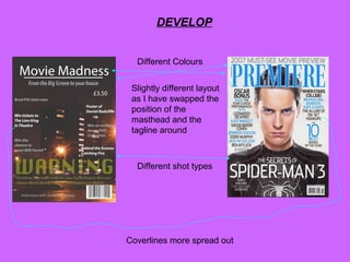
The author's magazine cover uses conventions like a barcode, masthead, and tagline. Colors and layout are slightly different, with the tagline below the masthead. Coverlines are more spread out and the image is an establishing shot.
The author challenges conventions by adding a bottom coverline, listing the film's cast with an exclusive interview note, and making the large price more visible. The cover design is simpler and less busy than typical magazines.