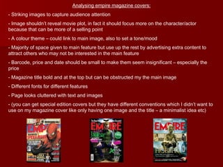
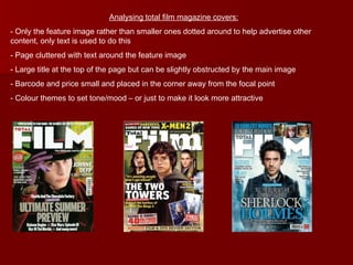
The document discusses conventions of magazine covers and how the author's media product challenges some of those conventions. Specifically:
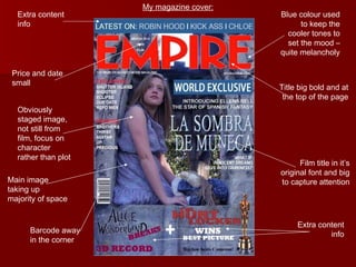
- Most magazines use multiple smaller images on the cover to advertise additional articles, but the author's cover only uses one large main image.
- Color schemes and fonts are used intentionally to set a mood, with a blue tone chosen to seem melancholy.
- While obstructing the title is common, the author ensures the film title is big and bold to capture attention.
- Other elements like price and date are kept small so as not to detract from the main image and film title.