Dubai Calls Girls Growing O525547819 (Seven Days Open) Call Girls In Dubai
Codes and Conventions of my Cover page
1. The cover of my magazine uses,
challenges and develops magazine
codes and conventions due to how
I created and used the codes and
conventions in a way I felt would
target and draw in my audience
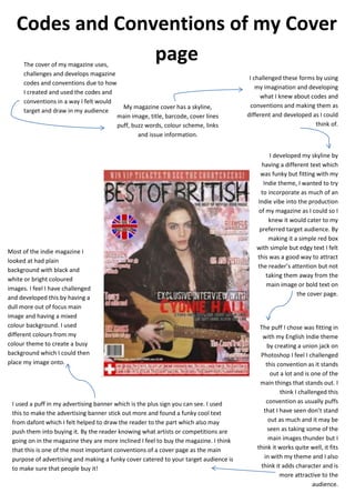
My magazine cover has a skyline,
main image, title, barcode, cover lines
puff, buzz words, colour scheme, links
and issue information.
I challenged these forms by using
my imagination and developing
what I knew about codes and
conventions and making them as
different and developed as I could
think of.
I developed my skyline by
having a different text which
was funky but fitting with my
Indie theme, I wanted to try
to incorporate as much of an
Indie vibe into the production
of my magazine as I could so I
knew it would cater to my
preferred target audience. By
making it a simple red box
with simple but edgy text I felt
this was a good way to attract
the reader’s attention but not
taking them away from the
main image or bold text on
the cover page.
The puff I chose was fitting in
with my English Indie theme
by creating a union jack on
Photoshop I feel I challenged
this convention as it stands
out a lot and is one of the
main things that stands out. I
think I challenged this
convention as usually puffs
that I have seen don’t stand
out as much and it may be
seen as taking some of the
main images thunder but I
think it works quite well, it fits
in with my theme and I also
think it adds character and is
more attractive to the
audience.
I used a puff in my advertising banner which is the plus sign you can see. I used
this to make the advertising banner stick out more and found a funky cool text
from dafont which I felt helped to draw the reader to the part which also may
push them into buying it. By the reader knowing what artists or competitions are
going on in the magazine they are more inclined I feel to buy the magazine. I think
that this is one of the most important conventions of a cover page as the main
purpose of advertising and making a funky cover catered to your target audience is
to make sure that people buy it!
Most of the indie magazine I
looked at had plain
background with black and
white or bright coloured
images. I feel I have challenged
and developed this by having a
dull more out of focus main
image and having a mixed
colour background. I used
different colours from my
colour theme to create a busy
background which I could then
place my image onto.
Codes and Conventions of my Cover
page