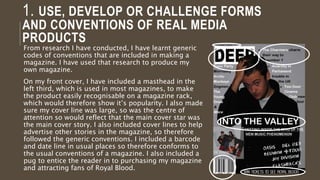
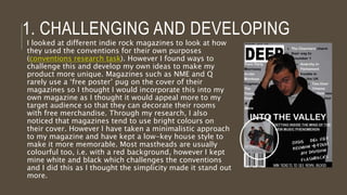
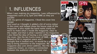
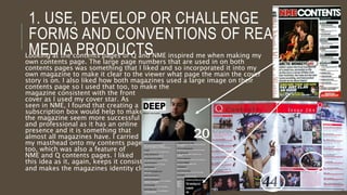
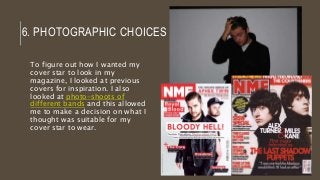
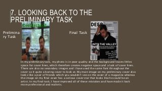
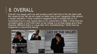
PRODUCT EVALUATION PAIGE TROMBLEY
1. IN WHAT WAYS DOES YOUR
MEDIA PRODUCT USE, DEVELOP
OR CHALLENGE FORMS AND
CONVENTIONS OF REAL MEDIA
PRODUCTS?
1. USE, DEVELOP OR CHALLENGE FORMS
AND CONVENTIONS OF REAL MEDIA
PRODUCTS
From research I have conducted, I have learnt generic
codes of conventions that are included in making a
magazine. I have used that research to produce my
own magazine.
On my front cover, I have included a masthead in the
left third, which is used in most magazines, to make
the product easily recognisable on a magazine rack,
which would therefore show it’s popularity. I also made
sure my cover line was large, so was the centre of
attention so would reflect that the main cover star was
the main cover story. I also included cover lines to help
advertise other stories in the magazine, so therefore
followed the generic conventions. I included a barcode
and date line in usual places so therefore conforms to
the usual conventions of a magazine. I also included a
pug to entice the reader in to purchasing my magazine
and attracting fans of Royal Blood.
1. CHALLENGING AND DEVELOPING
I looked at different indie rock magazines to look at how
they used the conventions for their own purposes
(conventions research task). However I found ways to
challenge this and develop my own ideas to make my
product more unique. Magazines such as NME and Q
rarely use a ‘free poster’ pug on the cover of their
magazines so I thought I would incorporate this into my
own magazine as I thought it would appeal more to my
target audience so that they can decorate their rooms
with free merchandise. Through my research, I also
noticed that magazines tend to use bright colours on
their cover. However I have taken a minimalistic approach
to my magazine and have kept a low-key house style to
make it more memorable. Most mastheads are usually
colourful too, i.e. with a red background, however I kept
mine white and black which challenges the conventions
and I did this as I thought the simplicity made it stand out
more.
1. INFLUENCES
When I was making my magazine, I was influenced by
magazines such as Q, Spin and NME as they are parallel
with my genre of magazine. I liked the cover line design
Spin used as I thought it added a bit of extra colour to the
cover and helped show the house style of the magazine. It
also made the band name stand out more to make what’s
inside the magazine, clear to the reader and that is what I
wanted in my magazine. I also liked the idea of having a
very different font on the cover, like the Ian Curtis cover of
NME, as it helped to fill in negative space and I
thought that it looked nice, so would be a good
way to bring attention to the magazine. My
magazine also uses direct address, like the 3
magazine shown, so creates a connection
between the audience and the cover star.
1. USE, DEVELOP OR CHALLENGE
FORMS AND CONVENTIONS OF REAL
MEDIA PRODUCTSLooking at the contents pages of Q and NME inspired me when making my own
contents page. The large page numbers that are used in on both contents pages
was something that I liked and so incorporated it into my own magazine to make
it clear to the viewer what page the main the cover story is on. I also liked how
both magazines used a large image on their contents page so I used that too, to
make the
magazine consistent with the front
cover as I used my cover star. As
seen in NME, I found that creating a
subscription box would help to make
the magazine seem more successful
and professional as it has an online
presence and it is something that
almost all magazines have. I carried
my masthead onto my contents page
too, which was also a feature of
NME and Q contents pages. I liked
this idea as it, again, keeps it consistent
and makes the magazines identity clear.
1. INFLUENCES
When looking at double page spreads, I found that I
liked the idea of have a title that covered both
pages, as I thought that this would make it clear to
the viewer that it’s the main story and would really
stand out when opening it up on that page. I also
liked how the text fitted in between Miles Kane and
Alex Turner as it does not conform to the usual
double page spread layout, so I chose to
incorporate this into my own spread. I used the last
shadow puppets spread as my main inspiration as
this spread really stood out to me compared to
others that have been produced. I also liked how
Alex Turner isn’t using direct address and so I
incorporated this with my own spread as I thought
that it could reflect a rebellious manner.
1. USE, DEVELOP OR CHALLENGE
FORMS AND CONVENTIONS OF REAL
MEDIA PRODUCTS
On my own double page spread, I included a pull
quote to draw the viewer into reading the article.
I kept the colour scheme consistent throughout
my page and even used the twitter logo and
changed it to fit my scheme. I did this as it gives
the artist an online presence too so makes it
seem more realistic and making the bird white
makes my magazine more coherent. My cover
star is not using direct address. I did this to
make it seem as though the artist has a secret to
hide, so could intrigue the audience as to what it
is.
2. HOW DOES YOUR MEDIA
PRODUCT REPRESENT
PARTICULAR SOCIAL GROUPS?
2. REPRESENTING PARTICULAR SOCIAL
GROUPSMy magazine is aimed at teenagers who are interested in
indie rock music. By looking at Q and NME, I found a way to
appeal to a target audience and fit the music genre into my
own magazine (Target audience-NME research 1 & 2).
Cover Star
My cover star ‘Lily of the Valley’ is portrayed as a troubled
and mysterious man through the images I have of him. This
does not conform to the usual stereotype of a male as they
are usually shown as strong-minded and have a lack of
emotion.
2. REPRESENTING PARTICULAR SOCIAL
GROUPSIn other photos I have used, it portrays teenagers in another
way. The top image presents teenagers as moody, which is a
stereotypical view on them. That could also reflect the type
of music too as some aspects of it can be seen as
depressing. However the second image reflects teens as
friendly and positive as ‘The Charmers’ are smiling at each
other.
3. WHAT KIND OF MEDIA
INSTITUTION MIGHT DISTRIBUTE
YOUR MEDIA PRODUCT AND
WHY?
3. MEDIA INSTITUTION
As my magazine is mainly
influenced by NME, I have decided
that the distributor to use would be
IPC Media. Many popular magazines
have been distributed from here
such as NME, Empire and Total Film.
(I looked into this whilst filling out
my publication plan)
4. WHO WOULD BE THE
AUDIENCE FOR YOUR MEDIA
PRODUCT?
4. THE AUDIENCE FOR YOUR MEDIA
PRODUCT
My magazine is aimed at men an
women aged 17-30 years old.
To find out more, I made a
questionnaire for people who are
within the target audience to
answer, to see what would be
successful in my magazine.
http://paigetrombley.blogspot.c
o.uk/2014/11/target-audience-
questionnaire.html
This questionnaire helped me
tailor my magazine to attract the
target audience I want.
NME also has the same target
audience as me so I took ideas
from NME to help attract them
5. HOW DID YOU
ATTRACT/ADDRESS YOUR
AUDIENCE?
5. ATTRACT/ADDRESS YOUR AUDIENCE
Masthead
I think the name ‘Deep’ is catchy
and it can symbolise how deeply
people can love music. It’s a
simple name so would make it an
easy name to remember.
Colours
My house style is grey, white and black which
are very mature colours. This would appeal to
the older end of my target audience. The
black connotes a sinister and dark meaning,
so can reflect the darker side of indie music.
The grey connotes sadness and depression
and coldness which again, can represent the
sadness in some of the music of the genre,
and also how teenagers can feel. The white
can connote purity and also makes the text
stand out more. The colour scheme I chose in
the end was different to what I had originally
planned (colour scheme planning) as I didn’t
think it would fit with my main cover image.
5. ATTRACT/ADDRESS YOUR AUDIENCE
Images
Most images included in my magazine are
of my cover star. He is a young man so
would appeal to a young audience as they
could associate with the star. Attitude is
shown in my photo, especially through the
use of direct address as it looks as though
he is reluctant and can show an attitude of
not conforming to rules and expectations
and so could reflect the target audience in
this way. (Research into cover stars)
Cover Lines
The cover lines I have used are
simple and don’t give much away to
the viewer. By having a different font
in the bottom right corner of my
magazine it makes it stands out
more. I have emphasised the names
of the bands so that they stand out,
so would attract my target audience
as they would be interested in the
bands mentioned.
6. WHAT HAVE YOU LEARNT
ABOUT TECHNOLOGIES FROM
THE PROCESS OF
CONSTRUCTING THE PRODUCT?
6. TECHNOLOGIES FROM THE
PROCESS
Publisher Page Plus Paint.net
Easy to use and
understand.
Easy to use and
understand.
Easy to use and
understand.
Able to use a range of
fonts and shapes.
Able to add text and
shapes.
Able to add text and
shapes.
Able to save an image as a
JPEG file.
Good at editing images i.e.
filters, cut-out studio and
has a range of tools to use.
Able to use tools such as
magic wand.
Already familiar with the
program so was able to
navigate it well and use it
well.
Allows you to save as a
PDF or a JPEG or PNG file.
Layers are used to help
edit every part of the
document.
I used many programs whilst making my product such as publisher,
page plus and paint.net. Here are the strengths of each.
6. TECHNOLOGIES FROM THE
PROCESS
Publisher Page Plus Paint.net
Can’t use cropping tools to
remove the background.
Effects don’t appear in
good quality on the photo.
Magic wand can be a
frustrating tool to use as it
can take the image as well
as the background.
Only has basic tools. Limited choice of shapes. Hard to use at first.
Here are the weaknesses of the programs I used.
6. TECHNOLOGIES FROM THE
PROCESS
Some difficulties I faced when making my magazine was using the
cut-out studio on page plus to make my cover star be on top of my
masthead. I wasn’t too sure about how to do it so I used the
guidelines that my teacher set to help me do it and I also practiced
using the cut-out studio to try and improve my skills with it (Page
plus practice)
6. PHOTOGRAPHIC CHOICES
To figure out how I wanted my
cover star to look in my
magazine, I looked at previous
covers for inspiration. I also
looked at photo-shoots of
different bands and this allowed
me to make a decision on what I
thought was suitable for my
cover star to wear.
6. BLOGGER
To show my progress throughout the
project, I kept a blog on Blogger in
which I posted my research and ideas
and plans for my magazine. I found
blogger an easy site to use as it was
self-explanatory. I found it a effective
as all of my work was in one place in
which I could go through my blog post
list to find anything I needed, which I
find more effective than scrolling
through documents in a file on a
computer. It was also easy to edit and
delete any posts I wanted which made
it easy for when I had a new idea or
changed my mind about something.
7. LOOKING BACK TO YOUR
PRELIMINARY TASK, WHAT DO
YOU FEEL THAT YOU HAVE
LEARNT IN THE PROGRESSION
FROM IT TO THE FULL
PRODUCT?
7. LOOKING BACK TO THE
PRELIMINARY TASK
Prelimina
ry Task
Final Task
In my preliminary task, my photo is in poor quality and the background leaves littles
space for cover lines, which therefore creates negative space and a lack of cover lines.
There are also no secondary images and I have used the same font throughout the
cover so it quite a boring cover to look at. My main image on my preliminary cover also
looks like a pair of friends which you wouldn’t see on the cover of a magazine whereas
the image on my final cover has a serious cover star that looks like he could be an
artist. In my final task, I have improved all of these mistakes and have made it look
more professional and realistic.
8. HOW SUCCESSFUL DO YOU
FEEL YOUR END PRODUCT IS IN
FULFILLING THE TASK? HOW
WELL DOES IT FIT THE BRIEF?
8. OVERALL
Overall I am happy with my end product and I feel that it fits the brief well.
My research has led me to create an indie rock music magazine that attracts
a target audience. I have created a magazine that is unique due to it’s
minimalism but is also typical due to it’s similarities to NME. I think that my
strongest page is my front cover as my image is a strong image and it also
features different fonts in a way that isn’t overwhelming. I think that my
magazine is successful overall.

Product evaluation media

  • 1.
  • 2.
    1. IN WHATWAYS DOES YOUR MEDIA PRODUCT USE, DEVELOP OR CHALLENGE FORMS AND CONVENTIONS OF REAL MEDIA PRODUCTS?
  • 3.
    1. USE, DEVELOPOR CHALLENGE FORMS AND CONVENTIONS OF REAL MEDIA PRODUCTS From research I have conducted, I have learnt generic codes of conventions that are included in making a magazine. I have used that research to produce my own magazine. On my front cover, I have included a masthead in the left third, which is used in most magazines, to make the product easily recognisable on a magazine rack, which would therefore show it’s popularity. I also made sure my cover line was large, so was the centre of attention so would reflect that the main cover star was the main cover story. I also included cover lines to help advertise other stories in the magazine, so therefore followed the generic conventions. I included a barcode and date line in usual places so therefore conforms to the usual conventions of a magazine. I also included a pug to entice the reader in to purchasing my magazine and attracting fans of Royal Blood.
  • 4.
    1. CHALLENGING ANDDEVELOPING I looked at different indie rock magazines to look at how they used the conventions for their own purposes (conventions research task). However I found ways to challenge this and develop my own ideas to make my product more unique. Magazines such as NME and Q rarely use a ‘free poster’ pug on the cover of their magazines so I thought I would incorporate this into my own magazine as I thought it would appeal more to my target audience so that they can decorate their rooms with free merchandise. Through my research, I also noticed that magazines tend to use bright colours on their cover. However I have taken a minimalistic approach to my magazine and have kept a low-key house style to make it more memorable. Most mastheads are usually colourful too, i.e. with a red background, however I kept mine white and black which challenges the conventions and I did this as I thought the simplicity made it stand out more.
  • 5.
    1. INFLUENCES When Iwas making my magazine, I was influenced by magazines such as Q, Spin and NME as they are parallel with my genre of magazine. I liked the cover line design Spin used as I thought it added a bit of extra colour to the cover and helped show the house style of the magazine. It also made the band name stand out more to make what’s inside the magazine, clear to the reader and that is what I wanted in my magazine. I also liked the idea of having a very different font on the cover, like the Ian Curtis cover of NME, as it helped to fill in negative space and I thought that it looked nice, so would be a good way to bring attention to the magazine. My magazine also uses direct address, like the 3 magazine shown, so creates a connection between the audience and the cover star.
  • 6.
    1. USE, DEVELOPOR CHALLENGE FORMS AND CONVENTIONS OF REAL MEDIA PRODUCTSLooking at the contents pages of Q and NME inspired me when making my own contents page. The large page numbers that are used in on both contents pages was something that I liked and so incorporated it into my own magazine to make it clear to the viewer what page the main the cover story is on. I also liked how both magazines used a large image on their contents page so I used that too, to make the magazine consistent with the front cover as I used my cover star. As seen in NME, I found that creating a subscription box would help to make the magazine seem more successful and professional as it has an online presence and it is something that almost all magazines have. I carried my masthead onto my contents page too, which was also a feature of NME and Q contents pages. I liked this idea as it, again, keeps it consistent and makes the magazines identity clear.
  • 7.
    1. INFLUENCES When lookingat double page spreads, I found that I liked the idea of have a title that covered both pages, as I thought that this would make it clear to the viewer that it’s the main story and would really stand out when opening it up on that page. I also liked how the text fitted in between Miles Kane and Alex Turner as it does not conform to the usual double page spread layout, so I chose to incorporate this into my own spread. I used the last shadow puppets spread as my main inspiration as this spread really stood out to me compared to others that have been produced. I also liked how Alex Turner isn’t using direct address and so I incorporated this with my own spread as I thought that it could reflect a rebellious manner.
  • 8.
    1. USE, DEVELOPOR CHALLENGE FORMS AND CONVENTIONS OF REAL MEDIA PRODUCTS On my own double page spread, I included a pull quote to draw the viewer into reading the article. I kept the colour scheme consistent throughout my page and even used the twitter logo and changed it to fit my scheme. I did this as it gives the artist an online presence too so makes it seem more realistic and making the bird white makes my magazine more coherent. My cover star is not using direct address. I did this to make it seem as though the artist has a secret to hide, so could intrigue the audience as to what it is.
  • 9.
    2. HOW DOESYOUR MEDIA PRODUCT REPRESENT PARTICULAR SOCIAL GROUPS?
  • 10.
    2. REPRESENTING PARTICULARSOCIAL GROUPSMy magazine is aimed at teenagers who are interested in indie rock music. By looking at Q and NME, I found a way to appeal to a target audience and fit the music genre into my own magazine (Target audience-NME research 1 & 2). Cover Star My cover star ‘Lily of the Valley’ is portrayed as a troubled and mysterious man through the images I have of him. This does not conform to the usual stereotype of a male as they are usually shown as strong-minded and have a lack of emotion.
  • 11.
    2. REPRESENTING PARTICULARSOCIAL GROUPSIn other photos I have used, it portrays teenagers in another way. The top image presents teenagers as moody, which is a stereotypical view on them. That could also reflect the type of music too as some aspects of it can be seen as depressing. However the second image reflects teens as friendly and positive as ‘The Charmers’ are smiling at each other.
  • 12.
    3. WHAT KINDOF MEDIA INSTITUTION MIGHT DISTRIBUTE YOUR MEDIA PRODUCT AND WHY?
  • 13.
    3. MEDIA INSTITUTION Asmy magazine is mainly influenced by NME, I have decided that the distributor to use would be IPC Media. Many popular magazines have been distributed from here such as NME, Empire and Total Film. (I looked into this whilst filling out my publication plan)
  • 14.
    4. WHO WOULDBE THE AUDIENCE FOR YOUR MEDIA PRODUCT?
  • 15.
    4. THE AUDIENCEFOR YOUR MEDIA PRODUCT My magazine is aimed at men an women aged 17-30 years old. To find out more, I made a questionnaire for people who are within the target audience to answer, to see what would be successful in my magazine. http://paigetrombley.blogspot.c o.uk/2014/11/target-audience- questionnaire.html This questionnaire helped me tailor my magazine to attract the target audience I want. NME also has the same target audience as me so I took ideas from NME to help attract them
  • 16.
    5. HOW DIDYOU ATTRACT/ADDRESS YOUR AUDIENCE?
  • 17.
    5. ATTRACT/ADDRESS YOURAUDIENCE Masthead I think the name ‘Deep’ is catchy and it can symbolise how deeply people can love music. It’s a simple name so would make it an easy name to remember. Colours My house style is grey, white and black which are very mature colours. This would appeal to the older end of my target audience. The black connotes a sinister and dark meaning, so can reflect the darker side of indie music. The grey connotes sadness and depression and coldness which again, can represent the sadness in some of the music of the genre, and also how teenagers can feel. The white can connote purity and also makes the text stand out more. The colour scheme I chose in the end was different to what I had originally planned (colour scheme planning) as I didn’t think it would fit with my main cover image.
  • 18.
    5. ATTRACT/ADDRESS YOURAUDIENCE Images Most images included in my magazine are of my cover star. He is a young man so would appeal to a young audience as they could associate with the star. Attitude is shown in my photo, especially through the use of direct address as it looks as though he is reluctant and can show an attitude of not conforming to rules and expectations and so could reflect the target audience in this way. (Research into cover stars) Cover Lines The cover lines I have used are simple and don’t give much away to the viewer. By having a different font in the bottom right corner of my magazine it makes it stands out more. I have emphasised the names of the bands so that they stand out, so would attract my target audience as they would be interested in the bands mentioned.
  • 19.
    6. WHAT HAVEYOU LEARNT ABOUT TECHNOLOGIES FROM THE PROCESS OF CONSTRUCTING THE PRODUCT?
  • 20.
    6. TECHNOLOGIES FROMTHE PROCESS Publisher Page Plus Paint.net Easy to use and understand. Easy to use and understand. Easy to use and understand. Able to use a range of fonts and shapes. Able to add text and shapes. Able to add text and shapes. Able to save an image as a JPEG file. Good at editing images i.e. filters, cut-out studio and has a range of tools to use. Able to use tools such as magic wand. Already familiar with the program so was able to navigate it well and use it well. Allows you to save as a PDF or a JPEG or PNG file. Layers are used to help edit every part of the document. I used many programs whilst making my product such as publisher, page plus and paint.net. Here are the strengths of each.
  • 21.
    6. TECHNOLOGIES FROMTHE PROCESS Publisher Page Plus Paint.net Can’t use cropping tools to remove the background. Effects don’t appear in good quality on the photo. Magic wand can be a frustrating tool to use as it can take the image as well as the background. Only has basic tools. Limited choice of shapes. Hard to use at first. Here are the weaknesses of the programs I used.
  • 22.
    6. TECHNOLOGIES FROMTHE PROCESS Some difficulties I faced when making my magazine was using the cut-out studio on page plus to make my cover star be on top of my masthead. I wasn’t too sure about how to do it so I used the guidelines that my teacher set to help me do it and I also practiced using the cut-out studio to try and improve my skills with it (Page plus practice)
  • 23.
    6. PHOTOGRAPHIC CHOICES Tofigure out how I wanted my cover star to look in my magazine, I looked at previous covers for inspiration. I also looked at photo-shoots of different bands and this allowed me to make a decision on what I thought was suitable for my cover star to wear.
  • 24.
    6. BLOGGER To showmy progress throughout the project, I kept a blog on Blogger in which I posted my research and ideas and plans for my magazine. I found blogger an easy site to use as it was self-explanatory. I found it a effective as all of my work was in one place in which I could go through my blog post list to find anything I needed, which I find more effective than scrolling through documents in a file on a computer. It was also easy to edit and delete any posts I wanted which made it easy for when I had a new idea or changed my mind about something.
  • 25.
    7. LOOKING BACKTO YOUR PRELIMINARY TASK, WHAT DO YOU FEEL THAT YOU HAVE LEARNT IN THE PROGRESSION FROM IT TO THE FULL PRODUCT?
  • 26.
    7. LOOKING BACKTO THE PRELIMINARY TASK Prelimina ry Task Final Task In my preliminary task, my photo is in poor quality and the background leaves littles space for cover lines, which therefore creates negative space and a lack of cover lines. There are also no secondary images and I have used the same font throughout the cover so it quite a boring cover to look at. My main image on my preliminary cover also looks like a pair of friends which you wouldn’t see on the cover of a magazine whereas the image on my final cover has a serious cover star that looks like he could be an artist. In my final task, I have improved all of these mistakes and have made it look more professional and realistic.
  • 27.
    8. HOW SUCCESSFULDO YOU FEEL YOUR END PRODUCT IS IN FULFILLING THE TASK? HOW WELL DOES IT FIT THE BRIEF?
  • 28.
    8. OVERALL Overall Iam happy with my end product and I feel that it fits the brief well. My research has led me to create an indie rock music magazine that attracts a target audience. I have created a magazine that is unique due to it’s minimalism but is also typical due to it’s similarities to NME. I think that my strongest page is my front cover as my image is a strong image and it also features different fonts in a way that isn’t overwhelming. I think that my magazine is successful overall.