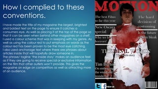
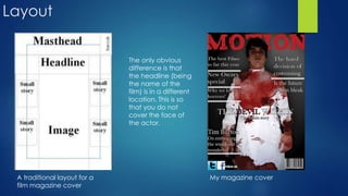
1. Evaluation Question 1
In what ways does your media
product use, develop or
challenge forms and
conventions of real media
products?
(Part 2-Magazine cover)
2. Codes and conventions of a movie
magazine
Masthead – This features on all magazine covers, usually at the top of
the page and indicates which magazine it is e.g. Empire or Vogue. This
is the largest text on the page. It can reflect the audience it caters for.
Image - The image should reflect the audience and also the style of
the magazine. The main image is usually a mid-shot (so I too used a mid
shot) and should reflect on what the film featured is about. This usually
involves the main actor from the film featured.
‘Buzz words’ - These involve ‘free’ and ‘exclusive’ which capture the
readers attention and want to buy the magazine.
Anchorage text – the text that tells what the stories inside will be about,
for example this could be a quote taken from the interview inside.
Banner – gives overall information about the magazine and what will be
found inside.
3. How I complied to these
conventions.
I have made the title of my magazine the largest, brightest
and boldest text on the page to ensure it catches a
consumers eye. As well as placing it at the top of the page so
that It can be seen when behind other magazines on a shelf.
I used a colour scheme that was in keeping with my genre. As
well as using the colour red to put emphasis on words as the
colour red has been proven to be the most eye catching.
I also used anchorage text where there are phrases about
articles inside that will hopefully draw someone in.
The phrase/ tagline ‘the inside story’ makes an audience feel
as if they are going to receive special or exclusive information
on the film that other outlets won’t provide. This gives the
magazine an edge on competitors as well as attracting more
of an audience.
4. Layout
A traditional layout for a
film magazine cover
My magazine cover
The only obvious
difference is that
the headline (being
the name of the
film) is in a different
location. This is so
that you do not
cover the face of
the actor.
5. Image
I noticed that the majority of film magazine covers use a mid shot of the
protagonist/antagonist of the feature film. So I too complied to this convention.
6. How my magazine cover is similar
to a genuine film magazine cover
Similarities and concepts that I
have followed or complied to
* Name of the magazine is the
largest text and located at the
top.
* Image depicting the iconic
actor/villain.
* Plain background
* Colour scheme that connotes
the genre.
*Information on articles that are
featured.