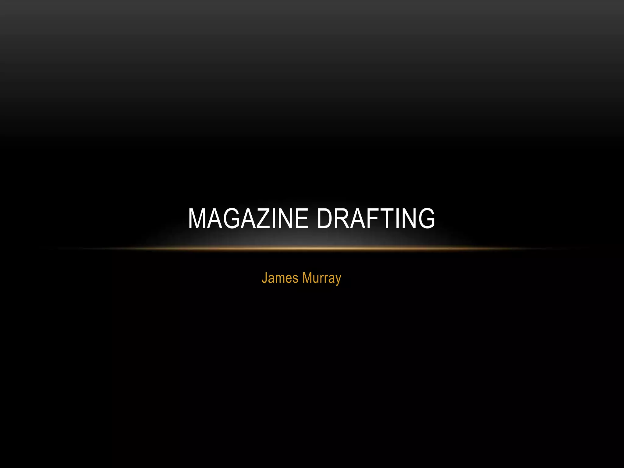
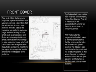
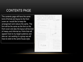
The document discusses the design choices for a summer magazine targeting a younger audience. For the front cover, the author has included pictures of pop artists like One Direction and Tulisa to appeal to younger readers. Bright colors like blue, yellow, red, orange and pink are used since they are associated with summer. The layout is informal with cluttered pictures and articles to avoid looking too sophisticated. A quirky font is chosen to appeal to youth. The contents page will mirror the front cover design for consistency. For double page spreads, the main image and quote need to stand out using an eye-catching, funky font.