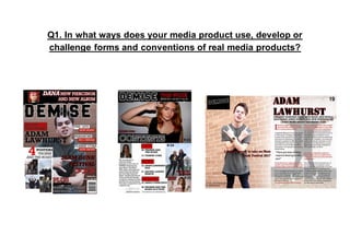
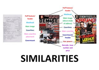
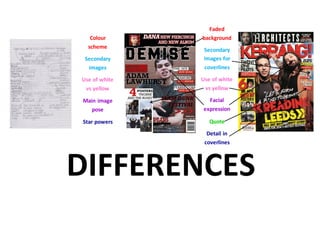
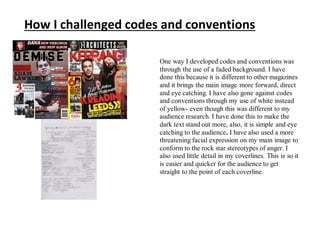
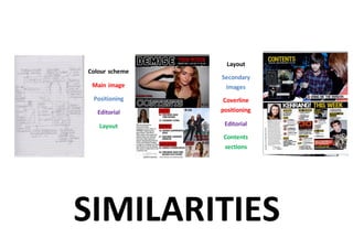
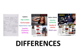
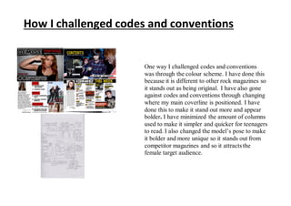
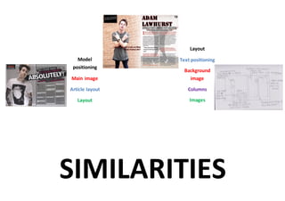
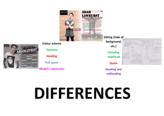
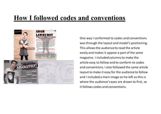
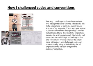
Q1. In what ways does your media product use, develop or
challenge forms and conventions of real media products?
Puff feature/
header
Masthead
Main image
(direct mode
of address)
Coverlines
Main coverline
Covermount/
freebie
Star powers
Barcode, issue
number and
price
SIMILARITIES
Puff feature/
header
Masthead
Main image
Coverlines
Main coverline
placement
Covermount
Faded
background
Secondary
images for
coverlines
Use of white
vs yellow
Facial
expression
Quote
Detail in
coverlines
DIFFERENCES
Colour
scheme
Secondary
images
Use of white
vs yellow
Main image
pose
Star powers
How I followed codes and conventions
One way I conformed to codes and conventions was through the
big, bold masthead. This informs the audience of the magazine
name and is eye catching. I also used an abovestrip to inform
the audience of an important coverline. I also used a large main
image, with direct mode of address, to attract the target
audience and link to the main coverline. Another way I
supported codes and conventions was through the coverlines
and main coverline. The main coverline is bolder tan the other
coverlines so it stands out as the most important partof the
magazine Also, the coverlines use the samefont and sizeas each
other to inform the target audience of the magazine’s features. I
also included a covermount(freebie) within my magazine (“4
posters”). This attracts the target audience who areinterested in
the band; therefore persuading them to purchasethe magazine.
I included the useof star powers to attract the audience and
create branding for the magazine and a popular, high quality
reputation. Lastly, I conformed to codes and conventions
through the useof the barcode, issuedate, issuenumber and
price. This informs the audience of issuenumbers and informs
the magazinecompany of sales records.
How I challenged codes and conventions
One way I developed codes and conventions was
through the use of a faded background. I have
done this because it is different to other magazines
and it brings the main image more forward, direct
and eye catching. I have also gone against codes
and conventions through my use of white instead
of yellow- even though this was different to my
audience research. I have done this to make the
dark text stand out more, also, it is simple and eye
catching to the audience. I have also used a more
threatening facial expression on my main image to
conform to the rock star stereotypes of anger. I
also used little detail in my coverlines. This is so it
is easier and quicker for the audience to get
straight to the point of each coverline.
SIMILARITIES
Colour scheme
Main image
Positioning
Editorial
Layout
Layout
Secondary
images
Coverline
positioning
Editorial
Contents
sections
DIFFERENCES
Colour scheme
Coverline
positioning
Number of
columns
Model’s pose
Captions
Page numbers
Text for header
Ripped banner edge
Coverline
(“Contents”)
positioning
How I followed codes and conventions
One way I conformed to codes and conventions was
through the layout of the contents page. This makes
it easy for the audience to read and see the
information they want to see. I included secondary
images as well to make the magazine more
interesting. Another way I supported codes and
conventions was through the coverlines’ positioning.
I did this to make is easy to read and quick to
understand. Also, the editorial conforms to codes
and conventions. This informs the target audience of
the reasoning of the magazine and why it was
written. I also conformed to codes and conventions
through including contents sections to make it easier
to read and to make it flow better.
How I challenged codes and conventions
One way I challenged codes and conventions
was through the colour scheme. I have done this
because it is different to other rock magazines so
it stands out as being original. I have also gone
against codes and conventions through changing
where my main coverline is positioned. I have
done this to make it stand out more and appear
bolder. I have minimized the amount of columns
used to make it simpler and quicker for teenagers
to read. I also changed the model’s pose to make
it bolder and more unique so it stands out from
competitor magazines and so it attracts the
female target audience.
SIMILARITIES
Model
positioning
Main image
Article layout
Layout
Layout
Text positioning
Background
image
Columns
Images
DIFFERENCES
Editing (fade of
background,
etc.)
Including
masthead
Quote
Heading and
subheading
Colour scheme
Columns
Heading
Pull quote
Model’s expression
How I followed codes and conventions
One way I conformed to codes and conventions
was through the layout and model’s positioning.
This allowsthe audienceto read the article
easily and makes it appeara part of the same
magazine. I includedcolumns to make the
article easy to follow and to conform to codes
and conventions. I also followed the same article
layout to make it easy for the audienceto follow
and I includeda main image on he left as this is
where the audience’seyes are drawn to first, so
it follows codes and conventions.
One way I challenged codes and conventions
was through the colour scheme. I have done this
to be original and to match the overall colour
scheme of my magazine. I have also gone against
codes and conventions through using 2 columns
rather than 3. I have done this to be original and
to make the article easy to read. I included a pull
quote over the main image to challenge codes
and conventions because it makes the article
more intriguing. I also challenged codes and
conventions by using an intimidating facial
expression to be different and grab the
audience’s attention.
How I challenged codes and conventions

Evaluation q1 Lydia Rosado

  • 1.
    Q1. In whatways does your media product use, develop or challenge forms and conventions of real media products?
  • 2.
    Puff feature/ header Masthead Main image (directmode of address) Coverlines Main coverline Covermount/ freebie Star powers Barcode, issue number and price SIMILARITIES Puff feature/ header Masthead Main image Coverlines Main coverline placement Covermount
  • 3.
    Faded background Secondary images for coverlines Use ofwhite vs yellow Facial expression Quote Detail in coverlines DIFFERENCES Colour scheme Secondary images Use of white vs yellow Main image pose Star powers
  • 4.
    How I followedcodes and conventions One way I conformed to codes and conventions was through the big, bold masthead. This informs the audience of the magazine name and is eye catching. I also used an abovestrip to inform the audience of an important coverline. I also used a large main image, with direct mode of address, to attract the target audience and link to the main coverline. Another way I supported codes and conventions was through the coverlines and main coverline. The main coverline is bolder tan the other coverlines so it stands out as the most important partof the magazine Also, the coverlines use the samefont and sizeas each other to inform the target audience of the magazine’s features. I also included a covermount(freebie) within my magazine (“4 posters”). This attracts the target audience who areinterested in the band; therefore persuading them to purchasethe magazine. I included the useof star powers to attract the audience and create branding for the magazine and a popular, high quality reputation. Lastly, I conformed to codes and conventions through the useof the barcode, issuedate, issuenumber and price. This informs the audience of issuenumbers and informs the magazinecompany of sales records.
  • 5.
    How I challengedcodes and conventions One way I developed codes and conventions was through the use of a faded background. I have done this because it is different to other magazines and it brings the main image more forward, direct and eye catching. I have also gone against codes and conventions through my use of white instead of yellow- even though this was different to my audience research. I have done this to make the dark text stand out more, also, it is simple and eye catching to the audience. I have also used a more threatening facial expression on my main image to conform to the rock star stereotypes of anger. I also used little detail in my coverlines. This is so it is easier and quicker for the audience to get straight to the point of each coverline.
  • 6.
  • 7.
    DIFFERENCES Colour scheme Coverline positioning Number of columns Model’spose Captions Page numbers Text for header Ripped banner edge Coverline (“Contents”) positioning
  • 8.
    How I followedcodes and conventions One way I conformed to codes and conventions was through the layout of the contents page. This makes it easy for the audience to read and see the information they want to see. I included secondary images as well to make the magazine more interesting. Another way I supported codes and conventions was through the coverlines’ positioning. I did this to make is easy to read and quick to understand. Also, the editorial conforms to codes and conventions. This informs the target audience of the reasoning of the magazine and why it was written. I also conformed to codes and conventions through including contents sections to make it easier to read and to make it flow better.
  • 9.
    How I challengedcodes and conventions One way I challenged codes and conventions was through the colour scheme. I have done this because it is different to other rock magazines so it stands out as being original. I have also gone against codes and conventions through changing where my main coverline is positioned. I have done this to make it stand out more and appear bolder. I have minimized the amount of columns used to make it simpler and quicker for teenagers to read. I also changed the model’s pose to make it bolder and more unique so it stands out from competitor magazines and so it attracts the female target audience.
  • 10.
  • 11.
    DIFFERENCES Editing (fade of background, etc.) Including masthead Quote Headingand subheading Colour scheme Columns Heading Pull quote Model’s expression
  • 12.
    How I followedcodes and conventions One way I conformed to codes and conventions was through the layout and model’s positioning. This allowsthe audienceto read the article easily and makes it appeara part of the same magazine. I includedcolumns to make the article easy to follow and to conform to codes and conventions. I also followed the same article layout to make it easy for the audienceto follow and I includeda main image on he left as this is where the audience’seyes are drawn to first, so it follows codes and conventions.
  • 13.
    One way Ichallenged codes and conventions was through the colour scheme. I have done this to be original and to match the overall colour scheme of my magazine. I have also gone against codes and conventions through using 2 columns rather than 3. I have done this to be original and to make the article easy to read. I included a pull quote over the main image to challenge codes and conventions because it makes the article more intriguing. I also challenged codes and conventions by using an intimidating facial expression to be different and grab the audience’s attention. How I challenged codes and conventions