Codes and conventionsin what ways does your media product use, develop or challenge forms and conventions of real media products?   INTRODUCTIONIn my media magazine I have challenged, developed and followed typical style conventions. I have used different ideas to make my magazine unique and different from other magazines that are already on the market. This way I thought  I could interest my own specific audience because the magazine is unlike any existing one. By looking at different styles of magazines like rock and pop I had an idea of what my magazine would look like, and even though I decided to stick to the pop magazine I have used elements from different magazine genres.
mastheadFor the masthead of my magazine’s cover I have followed a conventional style. I chose to put the masthead at the top of the page, because the pop magazines I looked at followed this type of masthead. I liked the idea to place it at the top of the page because my picture was suitable for itand when I did my images’ flat plans I decided to take the image in a way that I could leave some room at top for the masthead.I have also included a line that sums up the magazine in the way, which makes it look more professional. This also follows a conventional style.  Other magazinesMy magazine:To make sure my magazine differentiates from other magazines I have put the quote at the bottom of the masthead and this way I have challenge this convention.
page numbers The page number layout is similar to other magazines but it differentiates which give it its own unique style. I have chosen to put an imaginary website adress at the bottom corners right next to the page number so it gives it a more sophisticated note and it shows that the magazine is reliable and well-established as it has its’ own website My magazine Other magazineshighlightedsimplePlainbold
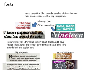
fontsIn my magazine I have used a number of fonts that are very much similar to other pop magazines. My magazine Other magazines: However, for my DPS which is very much text based I have chosen to challenge the idea of girly fonts and have gone for a more bolder and edgier look: My magazineOther magazines
Colour scheme:My colour scheme is very girly, but it developes the stereotype of use of pink/purple colours and proves that there’s more things that make something sweet and girly than colours: My magazineThe outfit of the model as well as the background in the magazine are in neutral colours which makes the magazine stand out to the rest of them and it appeals as more classy.Other magazines
Style of photographyMy magazine My media product follows and develops certain photography style conventions, for example these are typical pop magazine images where the model is posing in a studio: Other magazinesHowever two of the images in my contents page differentiate to these images as they were shot in a different angle which makes them look quite unusual for a pop magazine: Artist looking downArtist out of focus and too much blank space
Writing styleWith the writing style I chose to stick to conventional and stereotypical choice of words, because I discovered what my audience would like thanks to my audience research, and also I thought it could be a bit risky if I started experimenting with words from different genres that didn’t really appeal to a certain type of audience. My magazineOther magazines
Cover linesThe cover lines on my front page followed a conventional style. They created a frame around the picture without covering it, but slightly touching it at places. Other magazinesMy magazineI did this because I decided that it would appeal to my audience more if the layout was familiar already, although if I was doing a different kind of magazine, e.g. rock’n’roll the cover lines would have been placed differently. Main cover line (referring to the person on the picture) going across the page

Media evaluation

  • 1.
    Codes and conventionsinwhat ways does your media product use, develop or challenge forms and conventions of real media products? INTRODUCTIONIn my media magazine I have challenged, developed and followed typical style conventions. I have used different ideas to make my magazine unique and different from other magazines that are already on the market. This way I thought I could interest my own specific audience because the magazine is unlike any existing one. By looking at different styles of magazines like rock and pop I had an idea of what my magazine would look like, and even though I decided to stick to the pop magazine I have used elements from different magazine genres.
  • 2.
    mastheadFor the mastheadof my magazine’s cover I have followed a conventional style. I chose to put the masthead at the top of the page, because the pop magazines I looked at followed this type of masthead. I liked the idea to place it at the top of the page because my picture was suitable for itand when I did my images’ flat plans I decided to take the image in a way that I could leave some room at top for the masthead.I have also included a line that sums up the magazine in the way, which makes it look more professional. This also follows a conventional style. Other magazinesMy magazine:To make sure my magazine differentiates from other magazines I have put the quote at the bottom of the masthead and this way I have challenge this convention.
  • 3.
    page numbers Thepage number layout is similar to other magazines but it differentiates which give it its own unique style. I have chosen to put an imaginary website adress at the bottom corners right next to the page number so it gives it a more sophisticated note and it shows that the magazine is reliable and well-established as it has its’ own website My magazine Other magazineshighlightedsimplePlainbold
  • 4.
    fontsIn my magazineI have used a number of fonts that are very much similar to other pop magazines. My magazine Other magazines: However, for my DPS which is very much text based I have chosen to challenge the idea of girly fonts and have gone for a more bolder and edgier look: My magazineOther magazines
  • 5.
    Colour scheme:My colourscheme is very girly, but it developes the stereotype of use of pink/purple colours and proves that there’s more things that make something sweet and girly than colours: My magazineThe outfit of the model as well as the background in the magazine are in neutral colours which makes the magazine stand out to the rest of them and it appeals as more classy.Other magazines
  • 6.
    Style of photographyMymagazine My media product follows and develops certain photography style conventions, for example these are typical pop magazine images where the model is posing in a studio: Other magazinesHowever two of the images in my contents page differentiate to these images as they were shot in a different angle which makes them look quite unusual for a pop magazine: Artist looking downArtist out of focus and too much blank space
  • 7.
    Writing styleWith thewriting style I chose to stick to conventional and stereotypical choice of words, because I discovered what my audience would like thanks to my audience research, and also I thought it could be a bit risky if I started experimenting with words from different genres that didn’t really appeal to a certain type of audience. My magazineOther magazines
  • 8.
    Cover linesThe coverlines on my front page followed a conventional style. They created a frame around the picture without covering it, but slightly touching it at places. Other magazinesMy magazineI did this because I decided that it would appeal to my audience more if the layout was familiar already, although if I was doing a different kind of magazine, e.g. rock’n’roll the cover lines would have been placed differently. Main cover line (referring to the person on the picture) going across the page