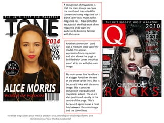
1. A convention of magazines is
that the main image overlaps
the masthead. I adapted this
convention to my magazine but I
didn’t cover it as much as this
magazine has. I have done this
because it’s the first issue of my
magazine and I want my
audience to become familiar
with the name.
Another convention I used
was a medium close up of my
model. This allows
expression from my model
and also allows the page to
be filled with cover lines that
aren't all to do with the main
image.
My main cover line headline is
in a bigger font than the rest
of the other cover lines. This is
because it links with the main
image. This is another
convention that published
magazines adapt. These are
also positioned usually to the
centre of the page. This is
because it again shows a clear
link between the main image
and the cover lines.
In what ways does your media product use, develop or challenge forms and
conventions of real media products?
2. My mast-head spreads
across my front cover. This
is a common convention in
RnB magazines. I also have
my image overlapping the
mast-head slightly. Many
RnB magazines use a simple
font so I decided to do the
same. I gave my mast-head
a bit of shadowing to make
it stand out more than it did
without it.
I decided to put my bar
code in the right hand
corner of my front cover.
This is another common
feature of a magazine. I
have also put the date my
magazine was published,
issue number and price at
the bottom of my page. This
breaks conventions of
magazines as these features
are usually put under bar
code or mast-head.
In what ways does your media product use,
develop or challenge forms and conventions of real
media products?
Many magazines use either a
head or footer on their front
page of the magazine cover. This
is because it allows additional
information to be added about
the magazine. I have added a
header to my magazine which
follows the conventions of a RnB
magazine.
3. A common convention of
magazines is that they usually
add additional information
about different music artists
and what they are doing. This
adds a diversity of artists
which expands the target
audience. I have added coverlines that tell my audience
about ‘Rick Ross’s new music
video’ and about new acts of
2014.
Another common
convention of magazines
is that they all stick to a
chosen colour scheme.
For my magazine I chose
the colour scheme of red,
grey, white and black.
Through-out all my pages
created, the colour
scheme is clear. Red is a
common colour that is
used in RnB magazines so
I that’s why I decided to
use red as my main bold
colour.
In what ways does your media product use, develop
or challenge forms and conventions of real media
products?
4. It’s a common convention
to have the
logo/masthead of your
music magazine included
on the contents page.
This is because it gives
their readers that
recognition of their
brand. Its also a common
convention to have this in
the left hand corner. This
is because we read from
left to right so it’s the first
thing we will recognise.
Most RnB magazines find
a unique way of selling
their contents page to its
target audience. In my
case, I chose to position
each letter differently,
making the first letter of
the word bigger and
bolder.
In what ways does your media product use,
develop or challenge forms and
conventions of real media products?
5. It is a common convention to
have sub-headings for the best
articles that are included in
the magazine. This means the
best things will appeal to my
audience making them want
to read it. It is also a common
convention to have the page
number by each sub-heading
so readers know which page
to turn to if they want to read
something more appealing to
them.
Most contents pages contain
more than one image. This is
done to show the faces of
different artists and maybe
where they are. I have
included one different image
of a male artist ‘Nick Cole’
that is included in my
magazine.
The colour scheme is also
clear in my contents page as
well as this published
magazine. I have used red
rectangles to break up the
pages, highlighting the
different most important
articles.
In what ways does your media product use,
develop or challenge forms and
conventions of real media products?
6. For my DPS I have followed a similar
layout to this magazine. I have used drop
cap letters to start my article. I have used
this to highlight the start of the text and
to catch my readers attention.
I have included a pull quote which is
another common convention in DPS
contained in magazines. They are used
again to give an insight to the article.
Most articles start with a subparagraph to inform its readers a bit
about the whole article. This generally
helps a reader decide whether they
are going to read the whole thing or
not.
I have enlarged the letter ‘A’ because it is
the first letter of my artists name. This is a
common convention of a magazine
because readers are able to link the letter
with the artist shown on the other side of
the DPS.
In what ways does your media product use,
develop or challenge forms and
conventions of real media products?
For my main image I have taken a long
shot of my model sitting down. This goes
against conventions of a DPS image
because most of them are either a
medium close up shot or just a close up.
I chose to do a long shot to vary my
camera shots.
In RnB magazines the layout is usually
quite simple. I have used red border lines
to add a bit of colour to the page.