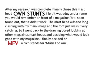
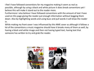
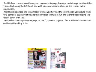
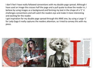
1. In what ways does your media
product use, develop or challenge forms
     and conventions of real media
               products?
I feel my final product of my mast head is very
conventional and eye-catching to my target audience. It
really talks to the reader, whilst also in red font it jumps
out to the reader, as I found in my research other music
magazines such as; NME, Q and Rolling Stones all use
red font to jump out to the reader.


                    MFY
Firstly, I chose to take pictures in Caversham Court, which is a nice
location by the river. I took an extreme close up of my model.
Unfortunately this did not work on my front cover as it was too close up
and the background was very busy. So from further research I concluded
to do a studio shoot to really emphasise the model and expressions rather
than the location. From looking at many magazine front covers I decided
that a lot of them were mid shots and that was the best for my target
audience. So I photographed my model sitting on a stool so I could get a
mid shot of her and emphasise her facial expressions as that is what the
reader automatically looks at, bar the mast head. Also I make sure the
lighting is all facing on my model to really project the image, leaving
shadows in the background. Finally I put the image into black and white so
that the writing on my front cover would jump out to the reader much
more as well as the image being in black and white making it look very
original and iconic to the reader.
Two of my photos on my contents page are close-ups
to connect with the reader and grab there attention
and one of them is a mid shot to put more emphasis
on the whole image rather than just the face. All the
shots taken are taken outside, to give them each an
edgy, unique look also tying in with the festival
theme, which our readers will be especially looking
for. Furthermore all of them use natural lighting
because they are outside, still giving off the festival
theme. I also didn’t edit the photographs at all
except from cropping them to keep the natural light
flowing.
This is the photo I used for my double
page spread. I chose to have use a mid
shot of my model, looking at the camera
giving an eye line match to the audience,
as through my research I found this was a
very popular and striking image to use to
draw the audience in. By choosing the
location being outside, and with the
guitar it follows the genre of music for
the model which is festival/indie. I
decided not to edit my image as again
like in my contents photos I wanted to
keep the natural light flowing and keep
the festival theme up.
Firstly I connect with my audience grabbing there attention with my front cover by the
clothes my model is wearing. She wears quite a retro iconic shirt something the
readers may wear, also showing her festival bands to connect with the audience.
Within my contents page and double page spread I
used a prop that I found was very common within,
music magazines and fitted perfectly within my genre of
music, so I included it in three of my pictures to draw
the readers attention.
I use two guitars showing the type of genre of my
music, hopefully connecting with my audience.
Furthermore by using a trilby in my double-page spread
it signifies Pete Doherty's signature look, connecting
with the audience as he is a strong musician within this
genre of music.
Name: Daisy Ferreia   Name: Betty Kelly
                         Age: 17               Age: 16
Name: Charlotte George                                                     Name: Conor Baker
Age: 16                                                                    Age: 17

  These are the people I have decided to use in my magazine, they are all very conventional
  for my magazine as they all have that ‘Indie’ type look. Furthermore they are the age of
  my target audience making the reader able to connect with them well. I have also created
  a girl group out of Daisy and Betty, similar to the girl band ‘Warpaint’, as you don’t see
  many girl bands this doesn’t follow conventions, yet I believe it will draw the reader in
  with this new look.
The style of language I use within my magazine
  is up to date. I don’t use slang, yet I am able to
  talk to my target audience on a level that I
  know they will understand and be able to
  indentify with. There are many magazines that
  try and follow these conventions of talking to
  there audience, yet I didn’t want to copy any
  of them as I wanted my writing to be fresh
  and unique for the reader.
After my research was complete I finally chose this mast
head                          I felt it was edgy and a name
you would remember on front of a magazine. Yet I soon
found out, that it didn’t work. The mast head was too long
clashing with my main image and the font just wasn’t very
catching. So I went back to the drawing bored looking at
other magazines mast heads and deciding what would look
good with my magazine. I finally decided on
           which stands for ‘Music For You’.
I feel the genre of my music is constantly
   reflected throughout my magazine, by the
   props down to little things such as festival
   bands etc.
By using the significant red, yellow and black
   colours on my front cover it really emphasises
   and conveys my point of promoting festival
   themes as red, yellow and black are the
   colours for Reading and Leeds festival, which
   will really connect with the audience.
I feel I have followed conventions for my magazine making it seem as real as
possible, although by using a black and white picture it does break conventions yet I
believe this will make it stand out to the reader more.
Furthermore I also believe I have followed conventions with the amount of text I have
used on this page giving the reader just enough information without bogging them
down. Also by highlighting words and using buzz and pull words it will draw the reader
in.
While making my front cover I was influenced by this NME cover as although it follows a
lot of the conventions a music magazine should have it breaks many of them as well, by
having a black and white image and then not having typed text, having text that
someone has written to try and grab the reader.
I feel I follow conventions throughout my contents page, having a main image to attract the
reader, text along the left hand side with page numbers to also give the reader extra
information.
I feel I have balanced the text/images well as you have all the information you would want
for a contents page whilst having three images to make it fun and vibrant not bogging the
reader down with text.
I decided to base my contents page on the Q contents page as I felt it followed conventions
well but still making it fun.
I don’t feel I have really followed conventions with my double page spread. Although I
have used an image the crosses half the page and a pull quote to draw the reader in, I
believe by using images as a background and forming my text in the shape of a ‘C’ it
challenges conventions and will catch the readers eye and make it more interesting
and exciting for the reader.
I got inspiration for my double page spread through this NME one, by using a Large ‘L’
for Lady Gaga it really captures the readers attention, so I tried to convey this with my
piece.
I believe overall I have followed conventions as I
   wanted to make my magazine look as real as
   possible. Yet I have broken conventions in
   parts to grab the readers attention and
   making my magazine stand out from the rest. I
   felt I had to break conventions as there are a
   lot of music magazines out there and I needed
   to give the audience something fresh and
   different making my magazine stand out from
   the rest.

Evaluation all

  • 1.
    1. In whatways does your media product use, develop or challenge forms and conventions of real media products?
  • 2.
    I feel myfinal product of my mast head is very conventional and eye-catching to my target audience. It really talks to the reader, whilst also in red font it jumps out to the reader, as I found in my research other music magazines such as; NME, Q and Rolling Stones all use red font to jump out to the reader. MFY
  • 3.
    Firstly, I choseto take pictures in Caversham Court, which is a nice location by the river. I took an extreme close up of my model. Unfortunately this did not work on my front cover as it was too close up and the background was very busy. So from further research I concluded to do a studio shoot to really emphasise the model and expressions rather than the location. From looking at many magazine front covers I decided that a lot of them were mid shots and that was the best for my target audience. So I photographed my model sitting on a stool so I could get a mid shot of her and emphasise her facial expressions as that is what the reader automatically looks at, bar the mast head. Also I make sure the lighting is all facing on my model to really project the image, leaving shadows in the background. Finally I put the image into black and white so that the writing on my front cover would jump out to the reader much more as well as the image being in black and white making it look very original and iconic to the reader.
  • 4.
    Two of myphotos on my contents page are close-ups to connect with the reader and grab there attention and one of them is a mid shot to put more emphasis on the whole image rather than just the face. All the shots taken are taken outside, to give them each an edgy, unique look also tying in with the festival theme, which our readers will be especially looking for. Furthermore all of them use natural lighting because they are outside, still giving off the festival theme. I also didn’t edit the photographs at all except from cropping them to keep the natural light flowing.
  • 5.
    This is thephoto I used for my double page spread. I chose to have use a mid shot of my model, looking at the camera giving an eye line match to the audience, as through my research I found this was a very popular and striking image to use to draw the audience in. By choosing the location being outside, and with the guitar it follows the genre of music for the model which is festival/indie. I decided not to edit my image as again like in my contents photos I wanted to keep the natural light flowing and keep the festival theme up.
  • 6.
    Firstly I connectwith my audience grabbing there attention with my front cover by the clothes my model is wearing. She wears quite a retro iconic shirt something the readers may wear, also showing her festival bands to connect with the audience. Within my contents page and double page spread I used a prop that I found was very common within, music magazines and fitted perfectly within my genre of music, so I included it in three of my pictures to draw the readers attention. I use two guitars showing the type of genre of my music, hopefully connecting with my audience. Furthermore by using a trilby in my double-page spread it signifies Pete Doherty's signature look, connecting with the audience as he is a strong musician within this genre of music.
  • 7.
    Name: Daisy Ferreia Name: Betty Kelly Age: 17 Age: 16 Name: Charlotte George Name: Conor Baker Age: 16 Age: 17 These are the people I have decided to use in my magazine, they are all very conventional for my magazine as they all have that ‘Indie’ type look. Furthermore they are the age of my target audience making the reader able to connect with them well. I have also created a girl group out of Daisy and Betty, similar to the girl band ‘Warpaint’, as you don’t see many girl bands this doesn’t follow conventions, yet I believe it will draw the reader in with this new look.
  • 8.
    The style oflanguage I use within my magazine is up to date. I don’t use slang, yet I am able to talk to my target audience on a level that I know they will understand and be able to indentify with. There are many magazines that try and follow these conventions of talking to there audience, yet I didn’t want to copy any of them as I wanted my writing to be fresh and unique for the reader.
  • 9.
    After my researchwas complete I finally chose this mast head I felt it was edgy and a name you would remember on front of a magazine. Yet I soon found out, that it didn’t work. The mast head was too long clashing with my main image and the font just wasn’t very catching. So I went back to the drawing bored looking at other magazines mast heads and deciding what would look good with my magazine. I finally decided on which stands for ‘Music For You’.
  • 10.
    I feel thegenre of my music is constantly reflected throughout my magazine, by the props down to little things such as festival bands etc. By using the significant red, yellow and black colours on my front cover it really emphasises and conveys my point of promoting festival themes as red, yellow and black are the colours for Reading and Leeds festival, which will really connect with the audience.
  • 11.
    I feel Ihave followed conventions for my magazine making it seem as real as possible, although by using a black and white picture it does break conventions yet I believe this will make it stand out to the reader more. Furthermore I also believe I have followed conventions with the amount of text I have used on this page giving the reader just enough information without bogging them down. Also by highlighting words and using buzz and pull words it will draw the reader in. While making my front cover I was influenced by this NME cover as although it follows a lot of the conventions a music magazine should have it breaks many of them as well, by having a black and white image and then not having typed text, having text that someone has written to try and grab the reader.
  • 12.
    I feel Ifollow conventions throughout my contents page, having a main image to attract the reader, text along the left hand side with page numbers to also give the reader extra information. I feel I have balanced the text/images well as you have all the information you would want for a contents page whilst having three images to make it fun and vibrant not bogging the reader down with text. I decided to base my contents page on the Q contents page as I felt it followed conventions well but still making it fun.
  • 13.
    I don’t feelI have really followed conventions with my double page spread. Although I have used an image the crosses half the page and a pull quote to draw the reader in, I believe by using images as a background and forming my text in the shape of a ‘C’ it challenges conventions and will catch the readers eye and make it more interesting and exciting for the reader. I got inspiration for my double page spread through this NME one, by using a Large ‘L’ for Lady Gaga it really captures the readers attention, so I tried to convey this with my piece.
  • 14.
    I believe overallI have followed conventions as I wanted to make my magazine look as real as possible. Yet I have broken conventions in parts to grab the readers attention and making my magazine stand out from the rest. I felt I had to break conventions as there are a lot of music magazines out there and I needed to give the audience something fresh and different making my magazine stand out from the rest.