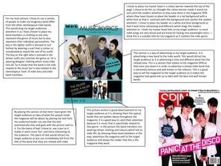
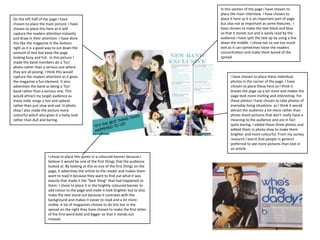
I chose to place my master head in a colour banner towards the top of the page. I chose to do this as I thought the colour banner made it stand out and catch the readers attention as they have done in the magazine SPIN where they have chosen to place the header in a red background with a white font so that it  contrasts with the background and catches the readers attention. I chose to place my header on a white and blue background so that it look more interesting and different which drags the readers attention in. I think my master head links to my target audience  as most indie songs are very lyrical and are know for having very meaningful lyrics.  I think this is a suitable title for my magazine as it outlines the indie genre.For my main picture I chose to use a variety of people to make my imaginary band differ from the other stereotypical indie bands. This would drag my target audiences attention in as I have chosen to place my band members in clothing to not only represent the genre of music but to also represent their individual personalities. The boy in the lighter outfit is dressed to suit fashion by wearing a scarf that is colour co coordinated to match the rest of his outfit. The boy on the right who is dressed in the darker outfit also matches the genre as  he is wearing designer clothing which many indie fans do. So it shows that the band is not only related to the music but is also related to the stereotypical ‘look’ of indie fans and indie band members.This section is a way of advertising to my target audience. It is advertising a new band to the indie world. This would attract my target audience as it is advertising a new and different band into the related area. This is a section that relates to the magazine SPIN as they have also done it in order to advertise a certain indie band that is extremely famous and well known in the industry. This is a good way to sell the magazine to the target audience as it makes the magazine look good and up to date with the best and well known bands.This picture section is good advertisement to my target audience as it is showing them the typical bands that are spoken about throughout the magazine, it is a good way to catch their attention because it is music that is specifically related to that genre.  In the picture the band members are wearing certain clothing and colours which link to indie life, by dressing these band members in this way, advertises the magazine well to the target audience and shows the reader that this is the magazine they want. By placing this section of text here I have given the target audience an idea of what the spread inside the magazine will be about, by placing the text here the audience/reader can see that the text automatically links and goes with the picture next to it. For this piece of text I chose to  use a pun as it makes it seem more ‘fun’ and more interesting to the audience. This piece of text would attract my target audience as you can immediately tell from the title of the band that they are related with indie.
I have chosen to place the main picture on half of my contents page. I chose to do this as I thought it would catch the audiences attention a lot better.  Q have chosen to do the same as the audience are more interested in pictures than text. In my picture I have chosen to dress the band in casual clothing. I chose to do this as I thought it was a different way of  portraying the band rather than dressing them to show off their indie style. I thought this would attract the audience more as it was a different way of doing it. Also in the Q magazine they have chosen to do the same.I chose to place the master head in the middle of the page placed on the main picture. I chose to do this as it breaks the page up more and makes it look more professional. I chose to place the text in a bright colour with a black border around it so that it stood out better against the picture. I thought this was a good way to catch the audiences attention as its bright and bold and also put in a big font so the audience can read it clearly and easily. By placing it here the audience see it almost instantly and therefore know already what this particular page is about. This differs from how they did it in Q as it doesn’t stand out as much which may be a bad point about this particular page.I chose to place the page numbers in a coloured banner at the side of the page. I chose to do this as it stands out to the audience so that they can be seen easily and read easily rather than the audience struggling to read the numbers or find a specific page,For the sub headings I chose to use a bright font  colour  because it stands out better to the audience  and catches their attention more. For the title of the sections in the contents page I based them on certain aspects and features to do with indie music and the way in which the indie culture live their lives. This would attract my target audience as they can see that this magazine is purely based on their preferred music rather than partially based on it.In Photoshop I chose to place a border around my page number. I chose to do this as I thought it the page look better and brighter, this would also help  to catch the readers attention as it adds more colour to the page in order to make it look more fun.
In this section of the page I have chosen to place the main interview. I have chosen to place it here as it is an important part of page but also not as important as some features.  I have chosen to make the text black and blue so that it stands out and is easily read by the audience I have split the text up by using a line down the middle. I chose not to use too much text as it can sometimes loose the readers concentration and make them bored of the spread.On the left half of the page I have chosen to place the main picture. I have chosen to place this here as it will capture the readers attention instantly and draw in their attention. I have done this like the magazine in the bottom right as it is a good way to cut down the amount of text but keep the page looking busy and full.  In this picture I made the band members do a ‘fun’ photo rather than a serious one where they are all posing. I think this would capture the readers attention as it gives the magazine a fun element. It also advertises the band as being a ‘fun’ band rather than a serious one. This would attract my target audience as many indie songs a live and upbeat rather than just slow and sad. In photo shop I also made the picture more colourful which also gives it a lively look rather than dull and boring.I have chosen to place these individual photos in the corner of the page. I have chosen to place these here as I think it breaks the page up a lot more and makes the page look more inviting and interesting. For these photos I have chosen to take photos of everyday living situations  as I think it would attract the audience a lot more rather than photo shoot pictures that don’t really have a meaning to the audience and are in fact quite boring. I added these three photos and edited them in photo shop to make them brighter and more colourful. From my survey research I learnt that people in general preferred to see more pictures than text in an article.I chose to place this quote in a coloured banner because I believe it would be one of the first things that the audience looked at. By looking at this as one of the first things on the page, it advertises the article to the reader and makes them want to read it because they want to find out what it was exactly that made it the “best thing” that had happened to them. I chose to place it in the brightly coloured banner to add colour to the page and make it look brighter but to also make the text stand out because it contrasts with the background and makes it easier to read and a lot more visible. A lot of magazines choose to do this but in the spread on the right they have chosen to make the first letter of the first word bold and bigger so that it stands out instead.

Media Presentation

  • 1.
    I chose toplace my master head in a colour banner towards the top of the page. I chose to do this as I thought the colour banner made it stand out and catch the readers attention as they have done in the magazine SPIN where they have chosen to place the header in a red background with a white font so that it contrasts with the background and catches the readers attention. I chose to place my header on a white and blue background so that it look more interesting and different which drags the readers attention in. I think my master head links to my target audience as most indie songs are very lyrical and are know for having very meaningful lyrics. I think this is a suitable title for my magazine as it outlines the indie genre.For my main picture I chose to use a variety of people to make my imaginary band differ from the other stereotypical indie bands. This would drag my target audiences attention in as I have chosen to place my band members in clothing to not only represent the genre of music but to also represent their individual personalities. The boy in the lighter outfit is dressed to suit fashion by wearing a scarf that is colour co coordinated to match the rest of his outfit. The boy on the right who is dressed in the darker outfit also matches the genre as he is wearing designer clothing which many indie fans do. So it shows that the band is not only related to the music but is also related to the stereotypical ‘look’ of indie fans and indie band members.This section is a way of advertising to my target audience. It is advertising a new band to the indie world. This would attract my target audience as it is advertising a new and different band into the related area. This is a section that relates to the magazine SPIN as they have also done it in order to advertise a certain indie band that is extremely famous and well known in the industry. This is a good way to sell the magazine to the target audience as it makes the magazine look good and up to date with the best and well known bands.This picture section is good advertisement to my target audience as it is showing them the typical bands that are spoken about throughout the magazine, it is a good way to catch their attention because it is music that is specifically related to that genre. In the picture the band members are wearing certain clothing and colours which link to indie life, by dressing these band members in this way, advertises the magazine well to the target audience and shows the reader that this is the magazine they want. By placing this section of text here I have given the target audience an idea of what the spread inside the magazine will be about, by placing the text here the audience/reader can see that the text automatically links and goes with the picture next to it. For this piece of text I chose to use a pun as it makes it seem more ‘fun’ and more interesting to the audience. This piece of text would attract my target audience as you can immediately tell from the title of the band that they are related with indie.
  • 2.
    I have chosento place the main picture on half of my contents page. I chose to do this as I thought it would catch the audiences attention a lot better. Q have chosen to do the same as the audience are more interested in pictures than text. In my picture I have chosen to dress the band in casual clothing. I chose to do this as I thought it was a different way of portraying the band rather than dressing them to show off their indie style. I thought this would attract the audience more as it was a different way of doing it. Also in the Q magazine they have chosen to do the same.I chose to place the master head in the middle of the page placed on the main picture. I chose to do this as it breaks the page up more and makes it look more professional. I chose to place the text in a bright colour with a black border around it so that it stood out better against the picture. I thought this was a good way to catch the audiences attention as its bright and bold and also put in a big font so the audience can read it clearly and easily. By placing it here the audience see it almost instantly and therefore know already what this particular page is about. This differs from how they did it in Q as it doesn’t stand out as much which may be a bad point about this particular page.I chose to place the page numbers in a coloured banner at the side of the page. I chose to do this as it stands out to the audience so that they can be seen easily and read easily rather than the audience struggling to read the numbers or find a specific page,For the sub headings I chose to use a bright font colour because it stands out better to the audience and catches their attention more. For the title of the sections in the contents page I based them on certain aspects and features to do with indie music and the way in which the indie culture live their lives. This would attract my target audience as they can see that this magazine is purely based on their preferred music rather than partially based on it.In Photoshop I chose to place a border around my page number. I chose to do this as I thought it the page look better and brighter, this would also help to catch the readers attention as it adds more colour to the page in order to make it look more fun.
  • 3.
    In this sectionof the page I have chosen to place the main interview. I have chosen to place it here as it is an important part of page but also not as important as some features. I have chosen to make the text black and blue so that it stands out and is easily read by the audience I have split the text up by using a line down the middle. I chose not to use too much text as it can sometimes loose the readers concentration and make them bored of the spread.On the left half of the page I have chosen to place the main picture. I have chosen to place this here as it will capture the readers attention instantly and draw in their attention. I have done this like the magazine in the bottom right as it is a good way to cut down the amount of text but keep the page looking busy and full. In this picture I made the band members do a ‘fun’ photo rather than a serious one where they are all posing. I think this would capture the readers attention as it gives the magazine a fun element. It also advertises the band as being a ‘fun’ band rather than a serious one. This would attract my target audience as many indie songs a live and upbeat rather than just slow and sad. In photo shop I also made the picture more colourful which also gives it a lively look rather than dull and boring.I have chosen to place these individual photos in the corner of the page. I have chosen to place these here as I think it breaks the page up a lot more and makes the page look more inviting and interesting. For these photos I have chosen to take photos of everyday living situations as I think it would attract the audience a lot more rather than photo shoot pictures that don’t really have a meaning to the audience and are in fact quite boring. I added these three photos and edited them in photo shop to make them brighter and more colourful. From my survey research I learnt that people in general preferred to see more pictures than text in an article.I chose to place this quote in a coloured banner because I believe it would be one of the first things that the audience looked at. By looking at this as one of the first things on the page, it advertises the article to the reader and makes them want to read it because they want to find out what it was exactly that made it the “best thing” that had happened to them. I chose to place it in the brightly coloured banner to add colour to the page and make it look brighter but to also make the text stand out because it contrasts with the background and makes it easier to read and a lot more visible. A lot of magazines choose to do this but in the spread on the right they have chosen to make the first letter of the first word bold and bigger so that it stands out instead.