2. 1 In what ways does your media product use, develop or challenge
forms and conventions of real media products?
Front Cover: the ideas I got my potential magazine from is from a
magazine called DJ. I chose this magazine because it is the only
relevant magazine to the type I designed for my media magazine.
This is the magazine front cover-
The magazine shows the simple
conventions of every other magazine
should have, the main image to
represent the magazines main story, and
surrounding either have subheadings about
other information about what is inside the
magazine. This magazine has a simple
layout and simple colour scheme, with
the use of a simple design. This magazine
shows the simple terms of what a
magazine should have, such as a
skyline, logo, heading, etc. I tried to use the same kind of style for
my magazine with the simple layout.
And now how this is compared to my front
cover:
Here with my magazine I went with the
original magazine and went with the
simple layout, but instead I faded the
3. background into two different colours; also I went with a relevant logo to
go with the theme of my magazine, I designed the logo using different
type of effects such as gradient blur, Gaussian blur, sharp edges,
scattered, over laying, dissolving, etc. by using the effects I
Was pretty happy with the final product of the logo:
How I produced the main image of the page is by manipulating the image
by originally getting the image of the DJ Calvin Harris and taking it into
Photoshop and then adding different types of layers and also by adding
different gradients and also applying the black and white tools to create
the emotion of the black and white serious effect. This gives of the
impression that the interview that CLUB magazine is taking a serious
interview of Calvin Harris. Even the expression of the face of him gives
out the serious side of the magazine. Also with the layout of the magazine
I have kept the colour scheme very dark but with the use of some vibrant
neon lines.
The style of the writing being used is very simple and straight to the
point, the point of this is to try and bring the audience into the magazine
and not bore them with so much writing on the front. Also I have used a
pull quote from Calvin Harris’s song which is acceptable in the 80’s, and
line I took from there is ‘I got hugs for you if you were born in the 80’2’.
Only the fans of Calvin Harris would understand this quote and what it
means
The way that my contents page has been created with the use of
conventions is that during the questionnaire the survey I carried out
people liked the idea of a freebee and also comps. So I thought I would
4. do a mini competition for the audience to win DJ DECKS. The way I
created the comp is by using my own pictures I took and applied it into a
montage picture. Also the layout being used is very simple and also it
links within the first page layout so it makes the magazine consistent.
The style of photography being used here is very simple; the images are
very linked within as the magazine is meant to be about such as the
correct image of the use of a concert image with the DJ at the decks and
the audience around him/her. The writing style here being used is again
simple so that the audience don’t get bored and stay engaged with the
magazine. The magazine’s language is very simple and also I have tried to
make the language very straight to the point so that the audience knows
what they are reading and what they should be looking forward to within
the magazine.
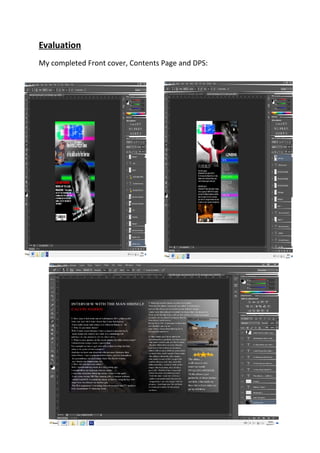
The use of conventions being used in my double page spread have been
applied within the same as the other pages are with the layout, I have
kept it the same and also consistent for that it doesn't make the reader
confused if they see a different layout, also the colour scheme being
applied has also been consistent all the way through the magazine from
the front cover, contents page and also the double page spread, this
helps the magazine by making it look more official and not make it look
like a mess.
The style of photography being applied in the double page spread is just
a simple close up shot of the main person and who the interview is about.
The way I have created the image of calvin harris is by taking it into
photoshop and then applying a blur gradient layer ontop of the picture to
give it a misc effort, and then after I gave the picture a lower opacity, and
then put it behind the writing text.
This then has a good effect on the actul page because you can see the
picture of who the interview is about and also the writing is apeared over
5. the picture so it is still visible to read. The type of writing bein used in the
double page spread is simple again and also just straight to the point, the
answers I have got from the question is mainly real quotes I have found
that calvin harris has mentioned before in his recent years of a DJ, but I
do think that the quotes being used are simple enough and also very
enjoyable to read, also ther is questions in there which calvin harris has to
talk about his past, so you do get a good story about how he became
what he is today.
2 How does your media product represent particular social groups?
I think that the main type of social group that this type of magazine is
aimed at can be mainly aimed at anyone at any age. I think that this type
of music can be for anyone because it provides a good positive vibe and
can keep people in a good mood. But I do think that the majority of the
audience would be mainly a teenager, this is because they are young and
have a lot of energy in them, they would most likely play this type of
music at house parties because of the positive vibe it gives off.
Also at clubs the type of music would be played because it will make the
teenagers very active and also give the teenagers a good buzz to dance
whilst with friends. I think that teenagers are shown in the media as
negative people, but I do disagree with that because it is mainly the cause
of the government and what actions they do that ca ntrigger of the
teenagers into doing something, so it is a natual response from them to
retaliate back, it aint the fault of the teenagers that there are a lack of
job, less money and less income for when they work.
So this whats triggers them to do things which makes them look bad, it is
mainly all just a set up. I think that this magazine helps the teenagers
maybe with situations they are in at the moment, this music can show a
positive vibe and can make people feel good about themselves and also
make them think positive as a person.
6. I think that age for this music hasnt got a specific number, but the
majority could be mainly between 16-25 years of age, also the gender
isn't just the one, it can be aimed at both male and female, I dont think
that the music is just for a certain social group but for everyone who
enjoys up beat up tempo music, music that can keep them relaxed or
even make them active.
4 Who would be the audience for your media product?
I dont think that there is an actual specific audience selection for whom
this is aimed at, I do think personally that this type of music is for
everyone, people who enjoy music and love to dance, or even like to relax
to, etc. this can be for anyone but mainly the audience that might be
more interested might be the teenagers as I said beofre why because of
the up beat tempo the teenagers can release there engery whilst they are
being active.
And I think that the suitable age for this would be for the age between
16-25 years old this is why because that is mainlt the age you would
attend night clubs where they play this type of music. I still think that the
gender is mainly aimed at the both female and male because it can be
applied to both of them.
5 How did you attract/address your audience?
For the final product I would like to mainly aim this magazine at the
teenagers to young adults, this is because it is most likely that they would
enjoy this type of music and magazine much more than a older adult, or a
younger child. This is maybe because if you are a older adult your life is
most likely to be fulfilled withmany things to do and don't have as much
time to socialise at clubs, and whith younger children well they are not
old enough to get into a club, so they would have to rely on different
types of music suppliers like youtube to hear the music.
I think also a better way that the audience was mainly dragged in into this
magazine was mainly to do with I think the layout and how simple I looks
7. but aswell at the same time it shows that there is so much inside that you
can read about, also I think that the use of font used was quite appealing
and very bright, so it did catch a lot of people's attention because
associated with club/DJ's is mainly the vibrant colours and lights that are
always around you to show the positive vibe.
I think how I addressed my audience was maybe, mainly to do with the
text that I used to pull the audience in and also try to keep them guessing
about what the magazine is about and what they sould look forward to. I
think also the type of text being used is small straight to the point and
simple, so when the reader reads it they don't get bored and feel like it is
dragging on forever. I think that the ype of photography being used in this
magazine is very mysterious in a way, it shows the serious side of the
magazine as such. And also the colours used are black and white so that
does indicate that this is a serious part of the magazine to come up. The
photography is very well linked to the text that describe the actual
images because it links it together and shows the connection between
them two together.
What have you learnt about technologies from the process of
constructing this product?
To be honest for me the technology used to produce the magazine was
that I was already very well familiar about photoshop and what the
software can produce, so making the magazine for me was perfectly
alright, the only areas where I think I could have done better was
probably construct it much better with different types layers and
different types of appliances could be used to make this a better
magazine, but the only thing that wasn't on my side was time, so thats
where I lacked mainly within this project.
But I think that overall the magazine did turn out good for the time I
had,and also I feel like I have grew upon the software even more and
found out different other types of ways to improve your work in any
situation you might have for when it comes designing. I think that the
8. I think that age for this music hasnt got a specific number, but the
majority could be mainly between 16-25 years of age, also the gender
isn't just the one, it can be aimed at both male and female, I dont think
that the music is just for a certain social group but for everyone who
enjoys up beat up tempo music, music that can keep them relaxed or
even make them active.
4 Who would be the audience for your media product?
I dont think that there is an actual specific audience selection for whom
this is aimed at, I do think personally that this type of music is for
everyone, people who enjoy music and love to dance, or even like to relax
to, etc. this can be for anyone but mainly the audience that might be
more interested might be the teenagers as I said beofre why because of
the up beat tempo the teenagers can release there engery whilst they are
being active.
And I think that the suitable age for this would be for the age between
16-25 years old this is why because that is mainlt the age you would
attend night clubs where they play this type of music. I still think that the
gender is mainly aimed at the both female and male because it can be
applied to both of them.
5 How did you attract/address your audience?
For the final product I would like to mainly aim this magazine at the
teenagers to young adults, this is because it is most likely that they would
enjoy this type of music and magazine much more than a older adult, or a
younger child. This is maybe because if you are a older adult your life is
most likely to be fulfilled withmany things to do and don't have as much
time to socialise at clubs, and whith younger children well they are not
old enough to get into a club, so they would have to rely on different
types of music suppliers like youtube to hear the music.
I think also a better way that the audience was mainly dragged in into this
magazine was mainly to do with I think the layout and how simple I looks