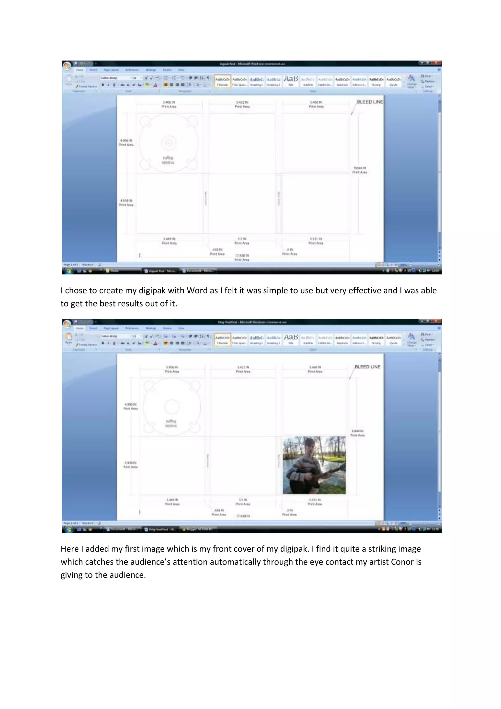
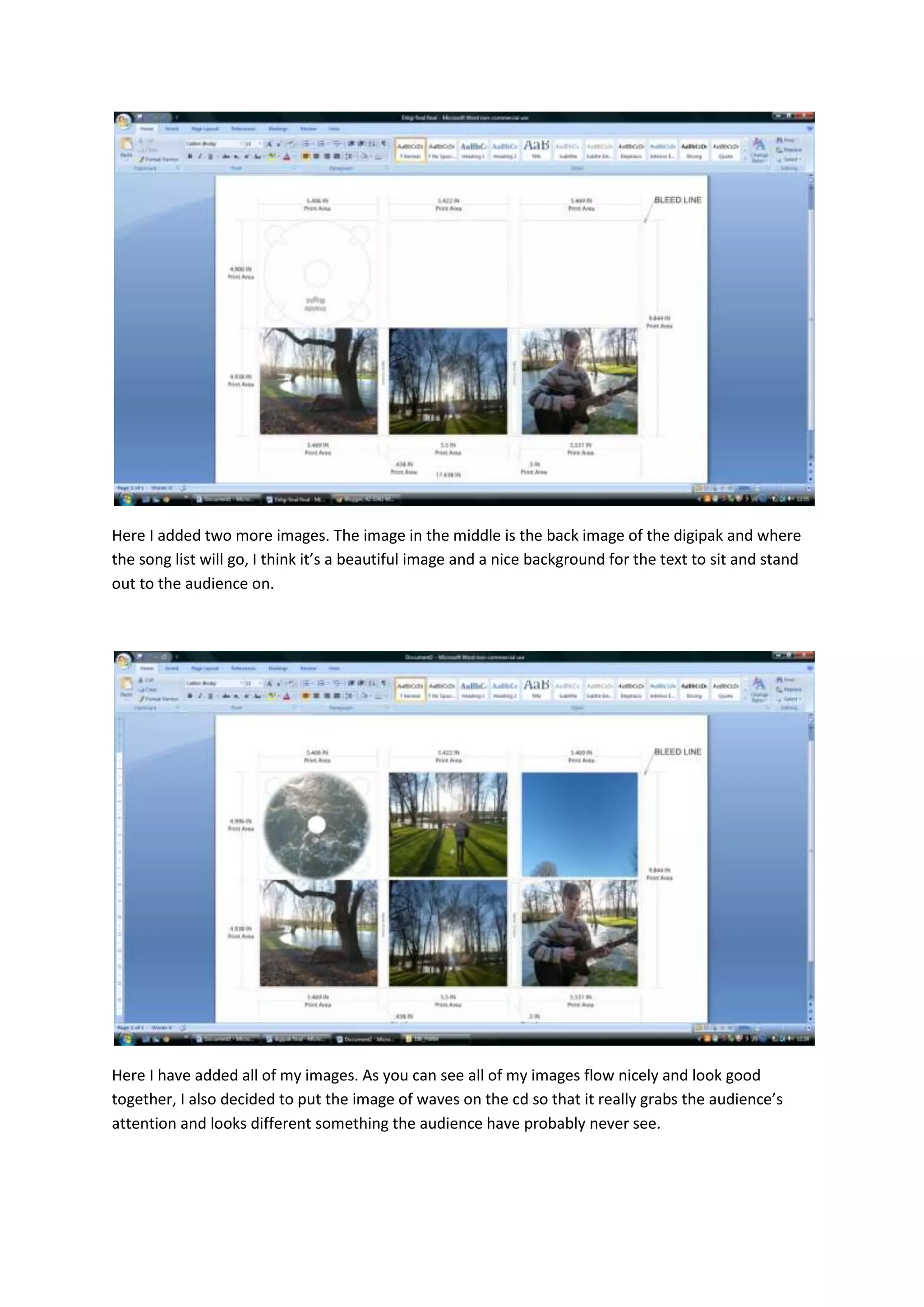
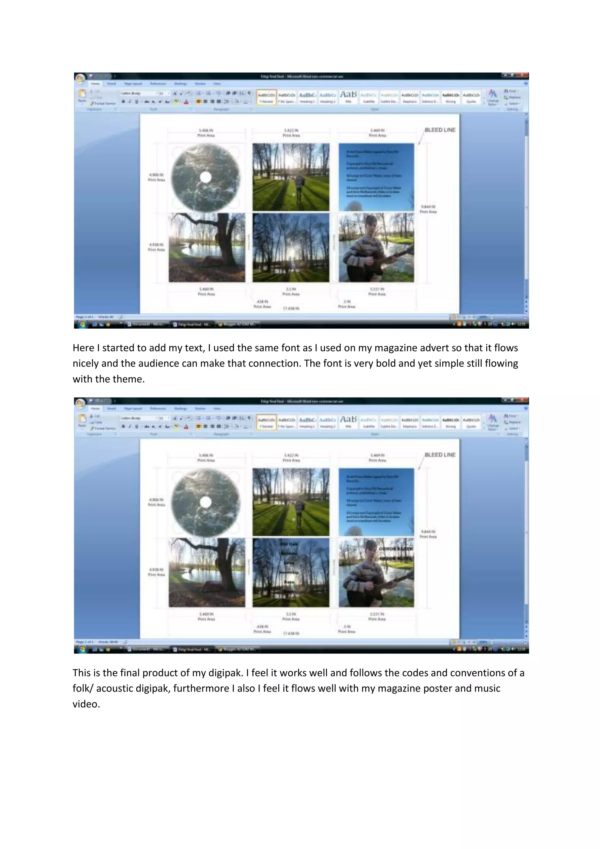
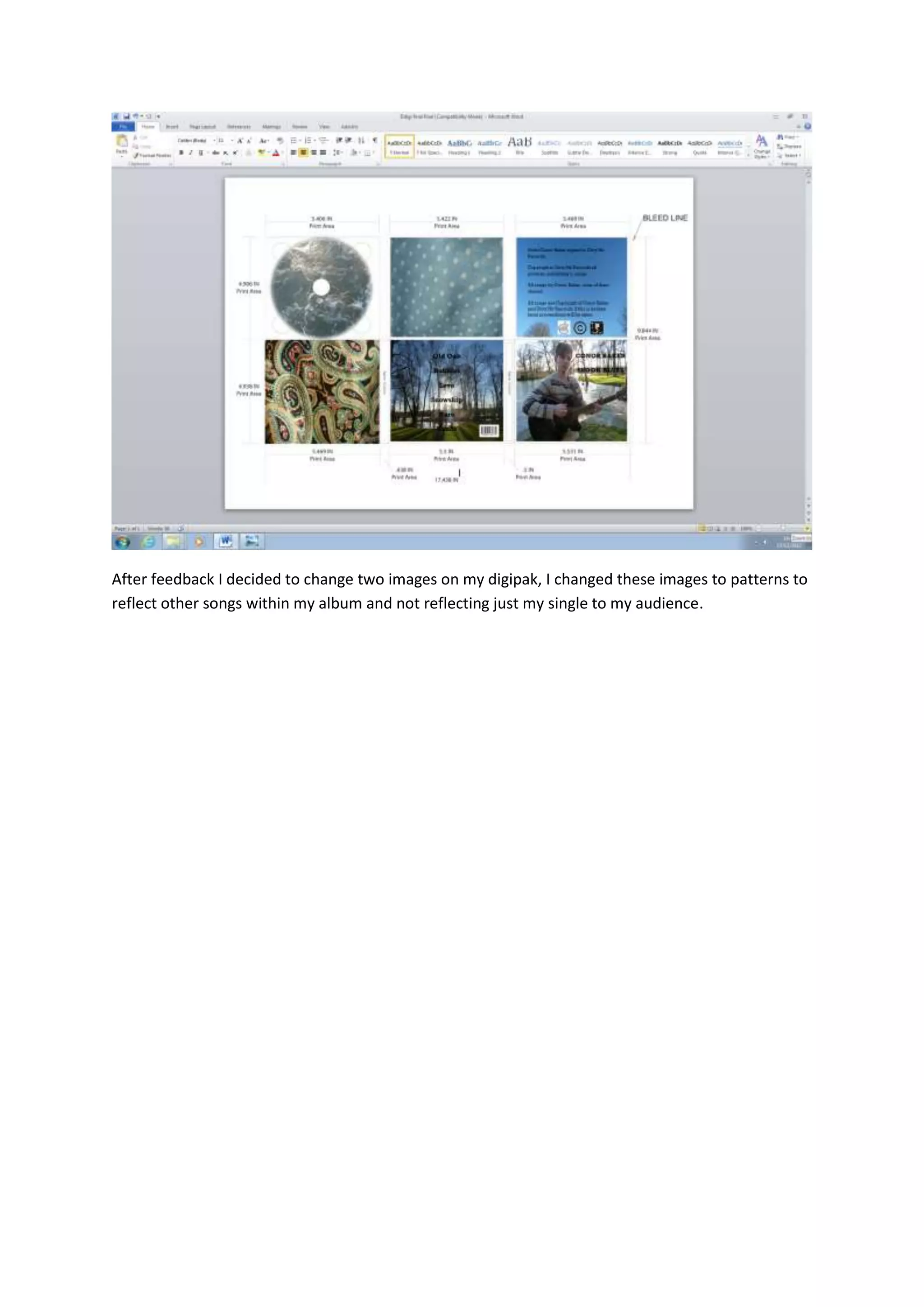
I chose Word to create my digipak because it was simple to use and allowed me to get the best results. The front cover features an image of the artist Conor that catches the audience's attention through eye contact. Another beautiful image was used on the back for the song list. All the images flow nicely together, and an image of waves was used on the CD to stand out. The same font used in the magazine ad was applied to the text to maintain consistency. The final product follows conventions of a folk/acoustic digipak and coordinates well with other promotional materials. After feedback, two images were changed to patterns representing other songs.