Download to read offline


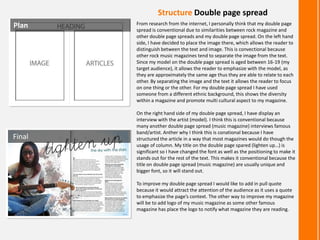

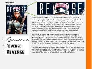


The document provides an evaluation of how the media product uses, develops, or challenges conventions of real media products. It summarizes how each element of the magazine - including the main image, structure, colors, and images - either conforms to or innovates beyond conventions. For example, the main image uses a common shot size but unconventional makeup, while the structure follows standard layouts but with some unique design choices. Overall, the evaluation examines the balance between conventional and challenging aspects in constructing an authentic-feeling magazine.


