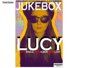
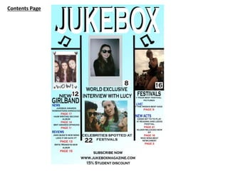
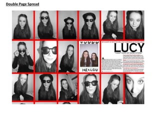
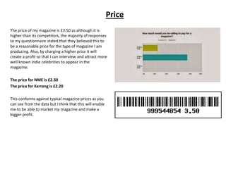
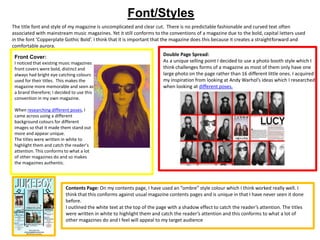
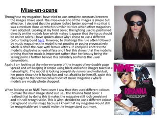
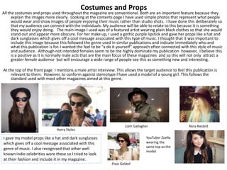
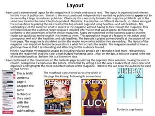
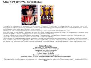
The document discusses how the media product, a music magazine, represents and conforms to conventions of real music magazines while also trying to be unique.
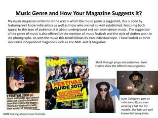
The summary discusses using conventions like mastheads, house styles, prices, and layouts similarly to magazines like NME and Kerrang. Photos and articles also conform to expectations but try to challenge stereotypes. Representation of various social groups is discussed through inclusion of male and female interviews and photos from music festivals. Overall, the magazine aims to be familiar yet independent for its target 16-21 year old audience.