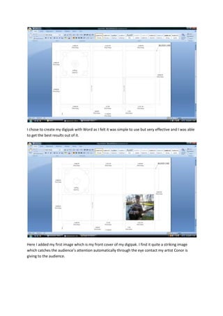
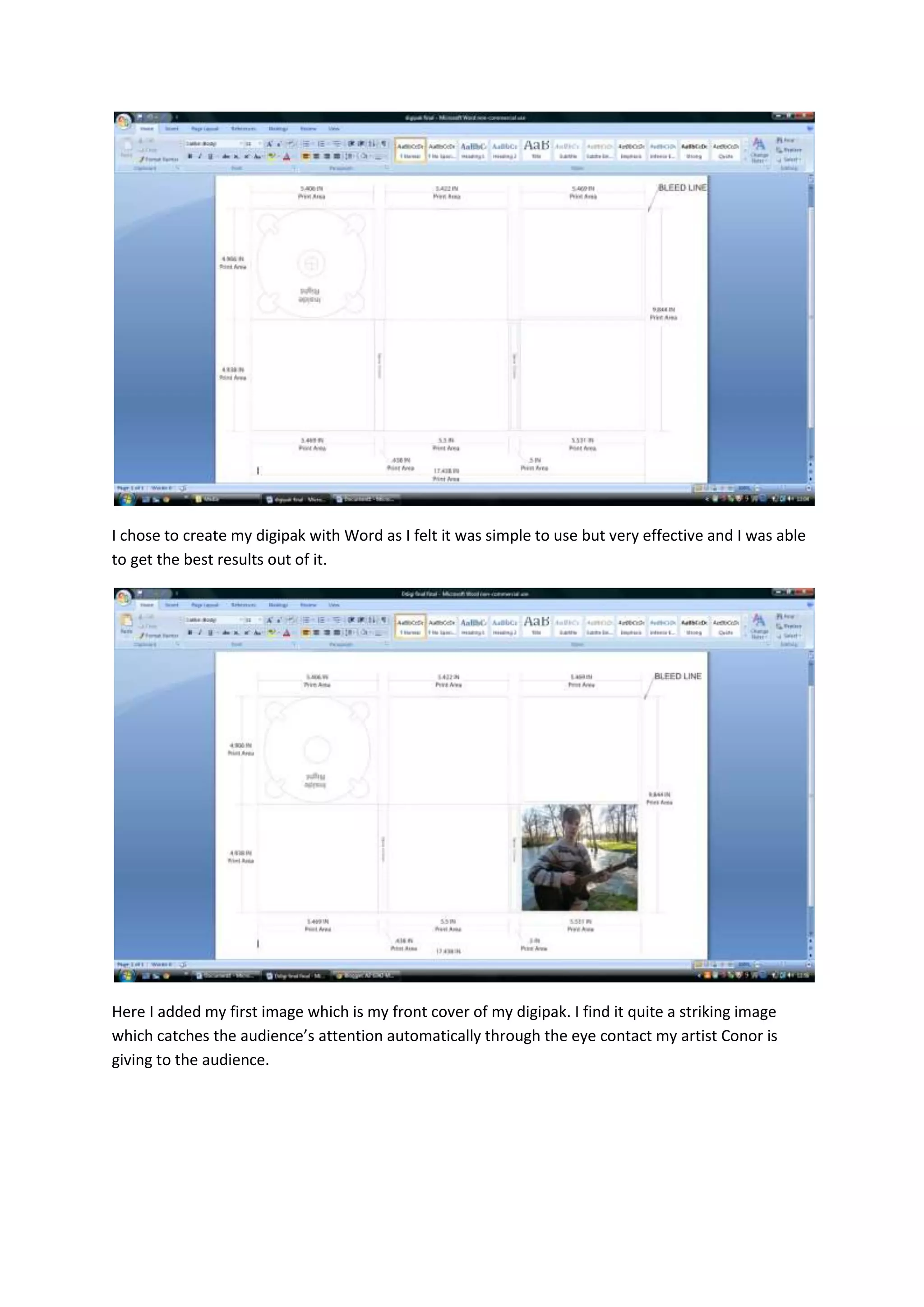
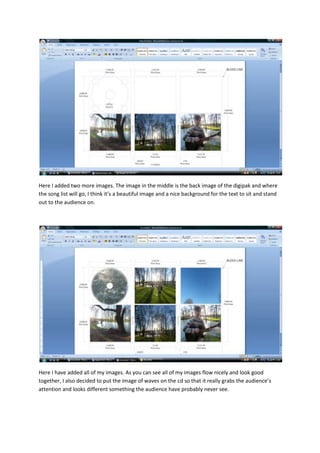
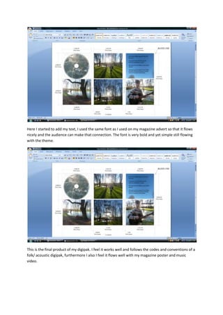
I chose Word to create my digipak because it was simple to use and allowed me to get the best results. The front cover features an image of the artist making eye contact that catches attention. The back cover includes a beautiful background image where the song list can sit and stand out. All the images flow nicely together, and an image of waves on the CD is meant to grab attention in something unusual. The same bold yet simple font from the magazine ad was used for consistency across materials promoting the artist. The final digipak follows conventions of the genre and flows cohesively with other promotional elements.


![Question 3 evaulation [recovered] [recovered]](https://cdn.slidesharecdn.com/ss_thumbnails/question3evaulationrecoveredrecovered-160229161753-thumbnail.jpg?width=640&height=640&fit=bounds)


