Question 1- In what ways does
your media product use, develop
or challenge forms and
conventions of real media
products?
Masthead
 From my research I noticed that all of
the pop magazines have a masthead
that is bright, colourful and catches the
eye.
 Therefore I kept with convention by
making my own masthead in a bold
font so it really stood out and catches
the readers’ attention
 I also noticed there was a convention
of where the masthead is positioned
and this is at the top in the centre.
 Because my central image takes up
some of the space in the middle I had
to position mine slightly to the left but
still at the top.
 I chose the name “on the Beat” as I
think it connotes to the idea of
freshness but still maintains the fact
that it is a music magazine obvious.
Mode ofAddress
 The magazines I researched had a very
informal mode of address and used lots
of slang, e.g. “freebie” and “Glamcam!”
 I however have challenged this
convention by using no slang and talking
to my audience as if they are adults
 I did this because I felt with my target
audience being slightly older, talking to
them as most of the pop magazines do
would seem patronising. It would also
make the magazine seem more childish.
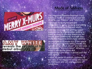
 An example to illustrate this is the splash
on my magazine “Amy White reveals the
secrets of her debut album” and We Love
pop’s splash “Merry X-Murs”. Whereas
mine is very to the point and
sophisticated the other is almost pun-like
and childish.
 I think my mode of address connotes to
the idea of my magazine being very based
on the music and not on the gossip of
celebrities.
Images
 One way I have developed convention is
my central image on the front cover. This is
because rather than have my model
directly looking at the camera she is
instead looking into the distance. I did this
to make my magazine visually look
different to the current pop magazines on
the market.
 I have also kept with convention in that I
noticed most of the photos in pop
magazines don’t have a background and so
I used Photoshop to take off the
backgrounds for some of my photos. I did
this because it draws attention to the
celebrity which is what will make the
readers buy the magazine.
Colourscheme
 From my research I found out that
many typical pop magazines use
bright girly colours like pink and
purple. Whilst I found Billboard
magazine uses less of a strict colour
scheme and instead picks a few base
colours each issue.
 I decided to challenge convention by
using a toned down colour scheme of
red and teal. The teal is particular is
not as bright as most of the colours
generally associated with pop
magazines.
 I did this again to make my magazine
look different but also because when I
asked my target audience they felt
bright colours looked childish and
immature.
Contents page
 I have decided to follow convention for the
general layout of my contents page.
 This is shown by the use of columns in both my
page and Shout magazine’s.
 We have both used sub-categories to sort the
magazine pages into. I decided to do this
because I think it makes navigation of the
magazine easier for readers because they can
identify what section they want to read and
find that page number very quickly.
 However there are some elements of the
contents page I have developed. Such as the
amount of images. For “Shout” magazine it has
only a few images but I decided to include
more.
 I did this to give the readers more of a visual
insight into my magazine. Also they would
recognise the celebrities pictures and so be
more likely to buy it .
Double page spread
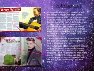
 I have generally kept to convention with
the design of my double page spread.
 I have noticed most of the magazines have
a text to image ratio of 50/50 with one
page dedicated to each. I did this because
it means there is enough text to be
informative, but the photo is also large
enough to create visual interest. If there
was a greater amount of text it could look
to heavy and might put people off from
reading it.
 I also think it creates a symmetry about
the page which makes the presentation
look professional and neat.
 I have also used other conventions like pull
quotes, the posed image and drop cap;
which have found examples of in every
magazine I have researched no matter the
genre. Therefore these are just general
conventions that make a magazine look
like a magazine, hence why I included
them.

Question 1

  • 1.
    Question 1- Inwhat ways does your media product use, develop or challenge forms and conventions of real media products?
  • 2.
    Masthead  From myresearch I noticed that all of the pop magazines have a masthead that is bright, colourful and catches the eye.  Therefore I kept with convention by making my own masthead in a bold font so it really stood out and catches the readers’ attention  I also noticed there was a convention of where the masthead is positioned and this is at the top in the centre.  Because my central image takes up some of the space in the middle I had to position mine slightly to the left but still at the top.  I chose the name “on the Beat” as I think it connotes to the idea of freshness but still maintains the fact that it is a music magazine obvious.
  • 3.
    Mode ofAddress  Themagazines I researched had a very informal mode of address and used lots of slang, e.g. “freebie” and “Glamcam!”  I however have challenged this convention by using no slang and talking to my audience as if they are adults  I did this because I felt with my target audience being slightly older, talking to them as most of the pop magazines do would seem patronising. It would also make the magazine seem more childish.  An example to illustrate this is the splash on my magazine “Amy White reveals the secrets of her debut album” and We Love pop’s splash “Merry X-Murs”. Whereas mine is very to the point and sophisticated the other is almost pun-like and childish.  I think my mode of address connotes to the idea of my magazine being very based on the music and not on the gossip of celebrities.
  • 4.
    Images  One wayI have developed convention is my central image on the front cover. This is because rather than have my model directly looking at the camera she is instead looking into the distance. I did this to make my magazine visually look different to the current pop magazines on the market.  I have also kept with convention in that I noticed most of the photos in pop magazines don’t have a background and so I used Photoshop to take off the backgrounds for some of my photos. I did this because it draws attention to the celebrity which is what will make the readers buy the magazine.
  • 5.
    Colourscheme  From myresearch I found out that many typical pop magazines use bright girly colours like pink and purple. Whilst I found Billboard magazine uses less of a strict colour scheme and instead picks a few base colours each issue.  I decided to challenge convention by using a toned down colour scheme of red and teal. The teal is particular is not as bright as most of the colours generally associated with pop magazines.  I did this again to make my magazine look different but also because when I asked my target audience they felt bright colours looked childish and immature.
  • 6.
    Contents page  Ihave decided to follow convention for the general layout of my contents page.  This is shown by the use of columns in both my page and Shout magazine’s.  We have both used sub-categories to sort the magazine pages into. I decided to do this because I think it makes navigation of the magazine easier for readers because they can identify what section they want to read and find that page number very quickly.  However there are some elements of the contents page I have developed. Such as the amount of images. For “Shout” magazine it has only a few images but I decided to include more.  I did this to give the readers more of a visual insight into my magazine. Also they would recognise the celebrities pictures and so be more likely to buy it .
  • 7.
    Double page spread I have generally kept to convention with the design of my double page spread.  I have noticed most of the magazines have a text to image ratio of 50/50 with one page dedicated to each. I did this because it means there is enough text to be informative, but the photo is also large enough to create visual interest. If there was a greater amount of text it could look to heavy and might put people off from reading it.  I also think it creates a symmetry about the page which makes the presentation look professional and neat.  I have also used other conventions like pull quotes, the posed image and drop cap; which have found examples of in every magazine I have researched no matter the genre. Therefore these are just general conventions that make a magazine look like a magazine, hence why I included them.