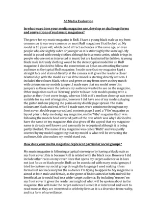
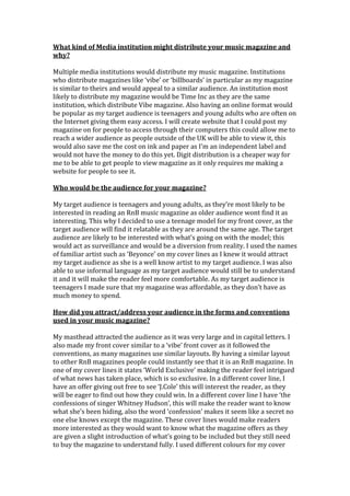
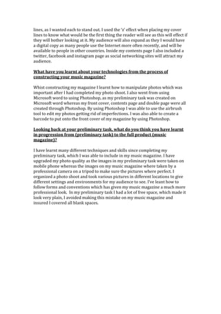
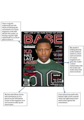
The student created a music magazine focused on R&B music. They aimed to follow conventions of real R&B magazines by including a young black male model on the front cover in trendy clothing. On the double page spread, they included two photos merged together in the bottom left corner, going against conventions, but allowing both models to be featured. They learned new skills in Photoshop and organizing a photoshoot to improve image quality from their preliminary task. The process taught them how to better follow conventions to make the magazine look more professional.
1. AS Media Evaluation
In what ways does your media magazine use, develop or challenge forms
and conventions of real music magazines?
The genre for my music magazine is RnB. I have a young black male as my front
common as it was very common on most RnB magazines I had looked at. My
model is 18 years old, which could attract audiences of the same age, or even
people who are slightly older or younger as it is still roughly the same age. My
model is posed with trendy clothes although he is a music artist, which brings in
people who are not as interested in music but are fascinated by fashion. A young
black male in trendy clothing would be the stereotypical model for an RnB
magazine; I decided to follow the conventions as I plan on attracting the same
audience as the typical RnB magazine. I made sure that my magazine kept a
straight face and starred directly at the camera as it gives the reader a closer
relationship with the model as it as if the model is starring directly at them. I
included the colours black, white and green on my front cover as they match
with colours on my models jumper, I made sure that my model wore this
jumpers as these were the colours my audience wanted to see on the magazine.
Other magazines such as ‘Kerrang’ prefer to have their models posing with a
guitar as their front cover image, whereas I felt as if a medium close up was more
suitable for my sort of magazine, however I did have one of my models playing
the guitar and one playing the piano on my double page spread. The main
colours are black and red, which I made sure, were consistent throughout my
front cover, double page spread and contents page. I used a ‘Vibe’ magazine as
layout plan to help me design my magazine, on the ‘Vibe’ magazine that I was
following the models head covered parts of the title which was why I decided to
have the same on my magazine, this also gives off the appeal that my magazine
name is already well known and can easily be recognized although it is being
partly blocked. The name of my magazine was called ‘BASE’ and was partly
covered by my model suggesting that my model is what will be attracting the
audience, this also makes my model stand out.
How does your media magazine represent particular social groups?
My music magazine is following a typical stereotype by having a black male as
my front cover; this is because RnB is related with the black race. However I did
include other races on my cover lines that opens my target audience as it does
not just focus on black people. RnB can be associated with many social groups; I
tried to capture my social group through the language I used making it less
formal is it not necessary for the audience I’m trying to appeal to. My magazine is
aimed at both male and female, as the genre of RnB is aimed at both and will be
beneficial, as it would lead to a wider target audience. By including ‘teasers’ on
my front cover it gives the reader an insight of what will be spoken about in the
magazine, this will make the target audience I aimed it at interested and want to
read more as they are interested in celebrity lives as it is a diversion from reality,
and is a form of surveillance.
2. What kind of Media institution might distribute your music magazine and
why?
Multiple media institutions would distribute my music magazine. Institutions
who distribute magazines like ‘vibe’ or ‘billboards’ in particular as my magazine
is similar to theirs and would appeal to a similar audience. An institution most
likely to distribute my magazine would be Time Inc as they are the same
institution, which distribute Vibe magazine. Also having an online format would
be popular as my target audience is teenagers and young adults who are often on
the Internet giving them easy access. I will create website that I could post my
magazine on for people to access through their computers this could allow me to
reach a wider audience as people outside of the UK will be able to view it, this
would also save me the cost on ink and paper as I’m an independent label and
would not have the money to do this yet. Digit distribution is a cheaper way for
me to be able to get people to view magazine as it only requires me making a
website for people to see it.
Who would be the audience for your magazine?
My target audience is teenagers and young adults, as they’re most likely to be
interested in reading an RnB music magazine as older audience wont find it as
interesting. This why I decided to use a teenage model for my front cover, as the
target audience will find it relatable as they are around the same age. The target
audience are likely to be interested with what’s going on with the model; this
would act as surveillance and would be a diversion from reality. I used the names
of familiar artist such as ‘Beyonce’ on my cover lines as I knew it would attract
my target audience as she is a well know artist to my target audience. I was also
able to use informal language as my target audience would still be to understand
it and it will make the reader feel more comfortable. As my target audience is
teenagers I made sure that my magazine was affordable, as they don’t have as
much money to spend.
How did you attract/address your audience in the forms and conventions
used in your music magazine?
My masthead attracted the audience as it was very large and in capital letters. I
also made my front cover similar to a ‘vibe’ front cover as it followed the
conventions, as many magazines use similar layouts. By having a similar layout
to other RnB magazines people could instantly see that it is an RnB magazine. In
one of my cover lines it states ‘World Exclusive’ making the reader feel intrigued
of what news has taken place, which is so exclusive. In a different cover line, I
have an offer giving out free to see ‘J.Cole’ this will interest the reader, as they
will be eager to find out how they could win. In a different cover line I have ‘the
confessions of singer Whitney Hudson’, this will make the reader want to know
what she’s been hiding, also the word ‘confession’ makes it seem like a secret no
one else knows except the magazine. These cover lines would make readers
more interested as they would want to know what the magazine offers as they
are given a slight introduction of what’s going to be included but they still need
to buy the magazine to understand fully. I used different colours for my cover
3. lines, as I wanted each to stand out. I used the ‘z’ effect when placing my cover
lines to know what would be the first thing the reader will see as this will effect if
they will bother looking at it. My audience will also expand as they I would have
a digital copy as many people use the Internet more often recently, and will be
available to people in other countries. Inside my contents page I also included a
twitter, facebook and instagram page as social networking sites will attract my
audience.
What have you learnt about your technologies from the process of
constructing your music magazine?
Whist constructing my magazine I learnt how to manipulate photos which was
important after I had completed my photo shoot. I also went from using
Microsoft word to using Photoshop, as my preliminary task was created on
Microsoft word whereas my front cover, contents page and double page were all
created through Photoshop. By using Photoshop I was able to use the airbrush
tool to edit my photos getting rid of imperfections. I was also able to create a
barcode to put onto the front cover of my magazine by using Photoshop.
Looking back at your preliminary task, what do you think you have learnt
in progression from (preliminary task) to the full product (music
magazine)?
I have learnt many different techniques and skills since completing my
preliminary task, which I was able to include in my music magazine. I have
upgraded my photo quality as the images in my preliminary task were taken on
mobile phone whereas the images on my music magazine where taken by a
professional camera on a tripod to make sure the pictures where perfect. I
organized a photo shoot and took various pictures in different locations to give
different settings and environments for my audience to see. I’ve leant how to
follow forms and conventions which has given my music magazine a much more
professional look. In my preliminary task I had a lot of free space, which made it
look very plain, I avoided making this mistake on my music magazine and
insured I covered all blank spaces.
4. I included other places
audience could find my
magazine in social networks
as it is very popular with my
target audience
I have put my title in the top
right hand corner which
follows conventions as I had
seen this on a ‘Vibe’
magazine.
I had my model
take up a majority
of the page which
followed
conventions as he
is the main
attraction to the
audience.
I include a pull
quote which is very
common in double
page spreads with
my genre so I
decided to follow
the convention and
include it in my
magazine.
I decided to merge
two photos together
and fitted them in the
bottom left corner
which goes against
the conventions
however allowed me
to include both my
models in the same
space yet in different
shots.
I placed my title in
the top left corner of
my double page
spread which
follows conventions
as it is the first place
the audience look
and it explains what
the whole page is
going to be about.
5. My barcode follows forms
and conventions as it is
placed on the left bottom
corner of the magazine as it
isn’t meant to take up too
much space.
I have a tag line
underneath my title
which is following the
conventions of a music
magazine as the title
attracts the reader, so
having a tag line right
underneath it is a clever
place to have it
My model is
looking directly
at the audience
which is a form
and convention
of a music
magazine as it
gives the reader
a closer
relationship with
the model and
makes them feel
more involved.
I have placed my puff in the
bottom right corner instead
of the top right hand corner
which went against the
conventions.