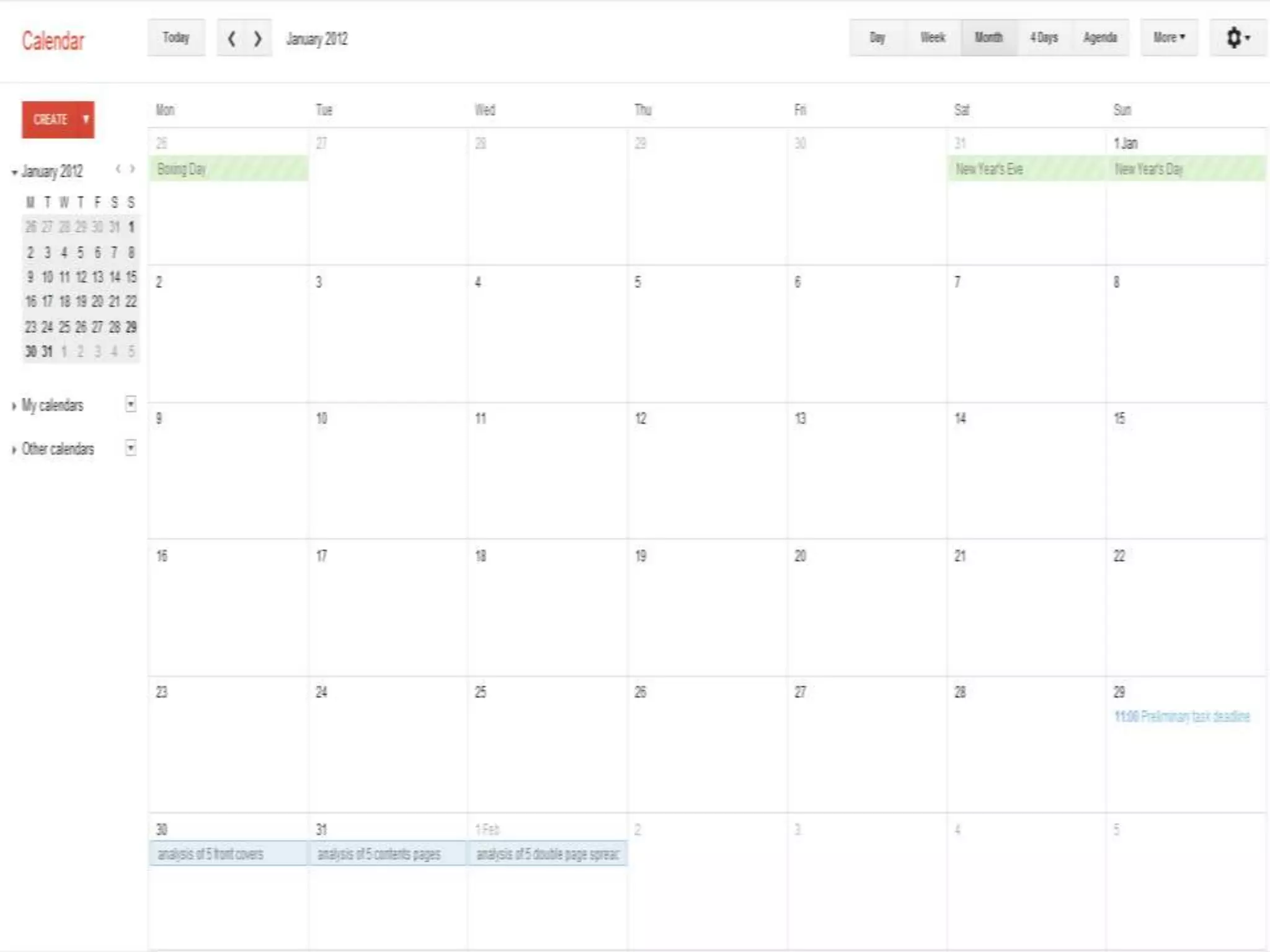
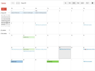
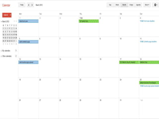
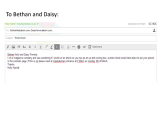
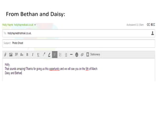
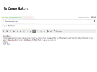
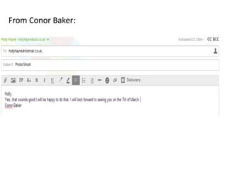
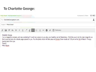
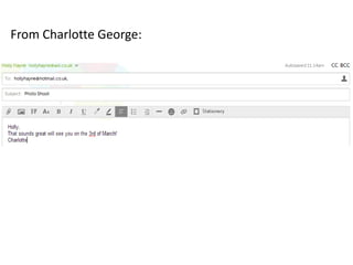
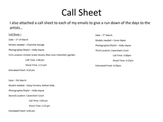
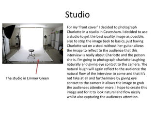
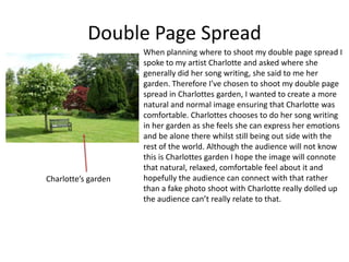
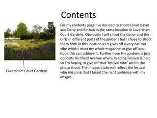
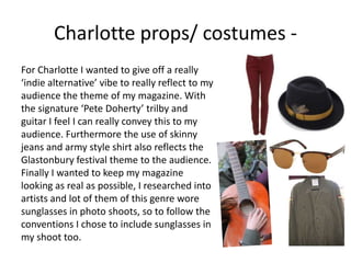
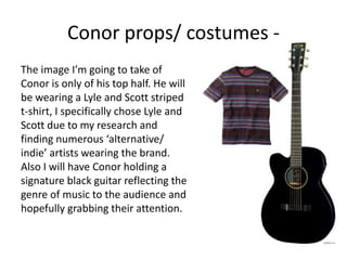
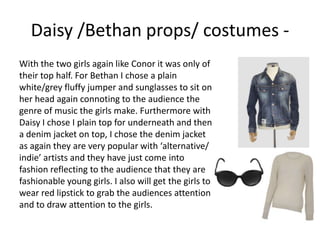
Emails Concerning the three photo
shoots…
To Bethan and Daisy:
From Bethan and Daisy:
To Conor Baker:
From Conor Baker:
To Charlotte George:
From Charlotte George:
Call Sheet
I also attached a call sheet to each of my emails to give a run down of the days to the
artists…
Locations…
Studio
For my ‘front cover’ I decided to photograph
Charlotte in a studio in Caversham. I decided to use
a studio to get the best quality image as possible,
also to strip the image back to basics, just having
Charlotte sat on a stool without her guitar allows
the image to reflect to the audience that this
interview is really about Charlotte and the person
she is. I’m going to photograph charlotte laughing
naturally and giving eye contact to the camera. The
natural laugh will again reflect to the audience the
natural flow of the interview to come and that it’s
not fake at all and furthermore by giving eye
contact to the camera it allows the image to grab
the audiences attention more. I hope to create this
image and for it to look natural and flow nicely
whilst also capturing the audiences attention.
The studio in Emmer Green
Double Page Spread
When planning where to shoot my double page spread I
spoke to my artist Charlotte and asked where she
generally did her song writing, she said to me her
garden. Therefore I’ve chosen to shoot my double page
spread in Charlottes garden, I wanted to create a more
natural and normal image ensuring that Charlotte was
comfortable. Charlottes chooses to do her song writing
in her garden as she feels she can express her emotions
and be alone there whilst still being out side with the
rest of the world. Although the audience will not know
this is Charlottes garden I hope the image will connote
that natural, relaxed, comfortable feel about it and
hopefully the audience can connect with that rather
than a fake photo shoot with Charlotte really dolled up
the audience can’t really relate to that.
Charlotte’s garden
Contents
For my contents page I’ve decided to shoot Conor Baker
and Daisy and Bethan in the same location in Caversham
Court Gardens. Obviously I will shoot the Conor and the
Girls in different parts of the gardens but I chose to shoot
them both in this location as it gives off a very natural
vibe which I want my whole magazine to give off and I
hope this can achieve it. Furthermore the gardens is just
opposite Richfield Avenue where Reading Festival is held
so I’m hoping to give off that ‘festival vibe’ within the
photo shoot. The images I take will reflect the festival
vibe ensuring that I target the right audience with my
images.
Caversham Court Gardens
Costumes and Props…
Charlotte props/ costumes -
For Charlotte I wanted to give off a really
‘indie alternative’ vibe to really reflect to my
audience the theme of my magazine. With
the signature ‘Pete Doherty’ trilby and
guitar I feel I can really convey this to my
audience. Furthermore the use of skinny
jeans and army style shirt also reflects the
Glastonbury festival theme to the audience.
Finally I wanted to keep my magazine
looking as real as possible, I researched into
artists and lot of them of this genre wore
sunglasses in photo shoots, so to follow the
conventions I chose to include sunglasses in
my shoot too.
The image I’m going to take of
Conor is only of his top half. He will
be wearing a Lyle and Scott striped
t-shirt, I specifically chose Lyle and
Scott due to my research and
finding numerous ‘alternative/
indie’ artists wearing the brand.
Also I will have Conor holding a
signature black guitar reflecting the
genre of music to the audience and
hopefully grabbing their attention.
Conor props/ costumes -
With the two girls again like Conor it was only of
their top half. For Bethan I chose a plain
white/grey fluffy jumper and sunglasses to sit on
her head again connoting to the audience the
genre of music the girls make. Furthermore with
Daisy I chose I plain top for underneath and then
a denim jacket on top, I chose the denim jacket
as again they are very popular with ‘alternative/
indie’ artists and they have just come into
fashion reflecting to the audience that they are
fashionable young girls. I also will get the girls to
wear red lipstick to grab the audiences attention
and to draw attention to the girls.
Daisy /Bethan props/ costumes -
Thinking of names for my magazine…
• Flame
• Tune
• Note
• M
• Howl
• Fresh
• Focus
• Zest
• You
• Pulse
• Own Stunts
• Ask
• Awake my soul
• Basic Space
• Inside
• In Between Dreams
• Is this it
• Rush
• Forever and Ever
• What If
• Sway
• Towers
• The Sound
• Sahara
• Tonight’s Today
• Ultimate
• Young
• Blinding
• Bright
• Captain
• Crazy
• Wave
• Daylight
• Dreaming
• Echoes
• Expectations
• Fantasy
• Fix
• Flightless Bird
• Fluorescent
• Moon
• Wide Eyes
• Disposition
• Breeze
• Young Blood
• Future
• Stand Up
• Ghosting
• Hey
• Howl
• If You Wanna
• Infinity
• Intro
• Jamming
• Joy Ride
• Love is Noise
• Never Know
• Own Stunts
• Possibility
• Roll With It
• Soul
• Shine
• Shock
• Shuffle
• Situations
• Song Bird
I have chosen…
• Own Stunts
• I have chosen this to be the name of my music
magazine because although it isn’t anything to do
with music, it can be targeted at a very large
audience. Also when this is on the shelf no
magazine has a name like this so it will stand out
to the reader. Finally by using ‘Own’ in the title of
the magazine it uses synthetic personalisation
and makes the reader feel like it’s their ‘Own’
magazine.
• Out of the fonts that I have chosen some of
them don’t stand out to the reader enough or
are hard to read, e.g.
• So I have ruled out having these fonts
because I need my font to be bold and really
eye-catching to the reader and I don’t think
these fonts will be able to do that.
The font I have chosen to use...
• I have chosen to use this font because
although it is quite simple, it is very bold and
eye-catching for the reader hopefully grabbing
there attention. I’m going to keep the font in
black so it really stands out to the reader and
doesn’t look cheap it has a classic feel about
it.
Colour Scheme for all pages...
• Of course I won’t use all
these colours at once but I
have decided to use them
throughout my magazine
making it exciting and
bright for the reader
instead of it being plain.
Mode of Address
• Own Stunts will be written in an informal style of
writing to try and connect with the readers on a
certain level. I feel that if I use formal writing I
wouldn’t be able to connect with my readers very
well as my target audience is 16-22 year olds and
they should feel that they’re reading a cool new
music magazine not a formal newspaper.
Although my writing will be informal I won’t be
using any abbreviated words such as ‘cool’ to ‘kl’
or ‘you’ to ‘u’. I won’t be doing this because I feel
it will loose the classiness of the magazine even
though it is quite informal.
Shot types of Conor -
Main Image
Masthead
Main Image
Sub Headings
Sub Headings
Sub Headings
Sub Headings
Masthead
Masthead
Info
Info
Info
Masthead
Masthead
Main Image Body of Text
Body of TextMain Image
Pull Quote

Planning

  • 4.
    Emails Concerning thethree photo shoots…
  • 5.
  • 6.
  • 7.
  • 8.
  • 9.
  • 10.
  • 11.
    Call Sheet I alsoattached a call sheet to each of my emails to give a run down of the days to the artists…
  • 12.
  • 13.
    Studio For my ‘frontcover’ I decided to photograph Charlotte in a studio in Caversham. I decided to use a studio to get the best quality image as possible, also to strip the image back to basics, just having Charlotte sat on a stool without her guitar allows the image to reflect to the audience that this interview is really about Charlotte and the person she is. I’m going to photograph charlotte laughing naturally and giving eye contact to the camera. The natural laugh will again reflect to the audience the natural flow of the interview to come and that it’s not fake at all and furthermore by giving eye contact to the camera it allows the image to grab the audiences attention more. I hope to create this image and for it to look natural and flow nicely whilst also capturing the audiences attention. The studio in Emmer Green
  • 14.
    Double Page Spread Whenplanning where to shoot my double page spread I spoke to my artist Charlotte and asked where she generally did her song writing, she said to me her garden. Therefore I’ve chosen to shoot my double page spread in Charlottes garden, I wanted to create a more natural and normal image ensuring that Charlotte was comfortable. Charlottes chooses to do her song writing in her garden as she feels she can express her emotions and be alone there whilst still being out side with the rest of the world. Although the audience will not know this is Charlottes garden I hope the image will connote that natural, relaxed, comfortable feel about it and hopefully the audience can connect with that rather than a fake photo shoot with Charlotte really dolled up the audience can’t really relate to that. Charlotte’s garden
  • 15.
    Contents For my contentspage I’ve decided to shoot Conor Baker and Daisy and Bethan in the same location in Caversham Court Gardens. Obviously I will shoot the Conor and the Girls in different parts of the gardens but I chose to shoot them both in this location as it gives off a very natural vibe which I want my whole magazine to give off and I hope this can achieve it. Furthermore the gardens is just opposite Richfield Avenue where Reading Festival is held so I’m hoping to give off that ‘festival vibe’ within the photo shoot. The images I take will reflect the festival vibe ensuring that I target the right audience with my images. Caversham Court Gardens
  • 16.
  • 17.
    Charlotte props/ costumes- For Charlotte I wanted to give off a really ‘indie alternative’ vibe to really reflect to my audience the theme of my magazine. With the signature ‘Pete Doherty’ trilby and guitar I feel I can really convey this to my audience. Furthermore the use of skinny jeans and army style shirt also reflects the Glastonbury festival theme to the audience. Finally I wanted to keep my magazine looking as real as possible, I researched into artists and lot of them of this genre wore sunglasses in photo shoots, so to follow the conventions I chose to include sunglasses in my shoot too.
  • 18.
    The image I’mgoing to take of Conor is only of his top half. He will be wearing a Lyle and Scott striped t-shirt, I specifically chose Lyle and Scott due to my research and finding numerous ‘alternative/ indie’ artists wearing the brand. Also I will have Conor holding a signature black guitar reflecting the genre of music to the audience and hopefully grabbing their attention. Conor props/ costumes -
  • 19.
    With the twogirls again like Conor it was only of their top half. For Bethan I chose a plain white/grey fluffy jumper and sunglasses to sit on her head again connoting to the audience the genre of music the girls make. Furthermore with Daisy I chose I plain top for underneath and then a denim jacket on top, I chose the denim jacket as again they are very popular with ‘alternative/ indie’ artists and they have just come into fashion reflecting to the audience that they are fashionable young girls. I also will get the girls to wear red lipstick to grab the audiences attention and to draw attention to the girls. Daisy /Bethan props/ costumes -
  • 20.
    Thinking of namesfor my magazine… • Flame • Tune • Note • M • Howl • Fresh • Focus • Zest • You • Pulse • Own Stunts • Ask • Awake my soul • Basic Space • Inside • In Between Dreams • Is this it • Rush • Forever and Ever • What If • Sway • Towers • The Sound • Sahara • Tonight’s Today • Ultimate • Young • Blinding • Bright • Captain • Crazy • Wave • Daylight • Dreaming • Echoes • Expectations • Fantasy • Fix • Flightless Bird • Fluorescent • Moon • Wide Eyes • Disposition • Breeze • Young Blood • Future • Stand Up • Ghosting • Hey • Howl • If You Wanna • Infinity • Intro • Jamming • Joy Ride • Love is Noise • Never Know • Own Stunts • Possibility • Roll With It • Soul • Shine • Shock • Shuffle • Situations • Song Bird
  • 21.
    I have chosen… •Own Stunts • I have chosen this to be the name of my music magazine because although it isn’t anything to do with music, it can be targeted at a very large audience. Also when this is on the shelf no magazine has a name like this so it will stand out to the reader. Finally by using ‘Own’ in the title of the magazine it uses synthetic personalisation and makes the reader feel like it’s their ‘Own’ magazine.
  • 23.
    • Out ofthe fonts that I have chosen some of them don’t stand out to the reader enough or are hard to read, e.g. • So I have ruled out having these fonts because I need my font to be bold and really eye-catching to the reader and I don’t think these fonts will be able to do that.
  • 24.
    The font Ihave chosen to use... • I have chosen to use this font because although it is quite simple, it is very bold and eye-catching for the reader hopefully grabbing there attention. I’m going to keep the font in black so it really stands out to the reader and doesn’t look cheap it has a classic feel about it.
  • 25.
    Colour Scheme forall pages... • Of course I won’t use all these colours at once but I have decided to use them throughout my magazine making it exciting and bright for the reader instead of it being plain.
  • 26.
    Mode of Address •Own Stunts will be written in an informal style of writing to try and connect with the readers on a certain level. I feel that if I use formal writing I wouldn’t be able to connect with my readers very well as my target audience is 16-22 year olds and they should feel that they’re reading a cool new music magazine not a formal newspaper. Although my writing will be informal I won’t be using any abbreviated words such as ‘cool’ to ‘kl’ or ‘you’ to ‘u’. I won’t be doing this because I feel it will loose the classiness of the magazine even though it is quite informal.
  • 27.
  • 28.
  • 29.
    Main Image Sub Headings SubHeadings Sub Headings Sub Headings Masthead
  • 30.
  • 31.
  • 32.
  • 33.
    Body of TextMainImage Pull Quote