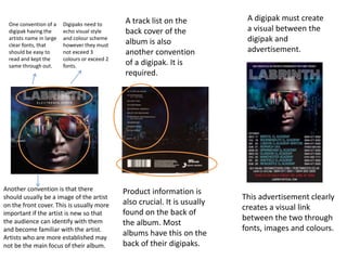
In what ways does your media
products use, develop or challenge
forms and conventions of real media
products?
As part of my research into my ancillary texts,
I viewed many previous digipaks and
advertisements. I also researched the conventions
of ancillary texts.
I believe that in the following slides you will see
how my ancillary texts followed the conventions
of my chosen genre (R&B)
One convention of a
digipak having the
artists name in large
clear fonts, that
should be easy to
read and kept the
same through out.
Another convention is that there
should usually be a image of the artist
on the front cover. This is usually more
important if the artist is new so that
the audience can identify with them
and become familiar with the artist.
Artists who are more established may
not be the main focus of their album.
A track list on the
back cover of the
album is also
another convention
of a digipak. It is
required.
Product information is
also crucial. It is usually
found on the back of
the album. Most
albums have this on the
back of their digipaks.
Digipaks need to
echo visual style
and colour scheme
however they must
not exceed 3
colours or exceed 2
fonts.
A digipak must create
a visual between the
digipak and
advertisement.
This advertisement clearly
creates a visual link
between the two through
fonts, images and colours.
My digipak and advertisement follow conventions. As you can see my
digipak had a colour scheme of no more that ¾ colours. I used fonts that
were large and clear for important titles such as the album name and
artists name. I have included all the essential information such as
tracklist, product information a barcode. Through out all two ancillary
texts I used the same visual style. The font is the same through out,
images create a visual link.
The only thing that may be different is that although the artist is the
main focus on the digipak he is not actually making eye contact with the
audience. However I made sure I did my research and found there was
other up and coming artists who too did not look directly at the camera.
The advertisement can be clearly linked to the digi pak, I have also
added the conventional things you would find on an advertisements,
such as where you will be able to find the album, social networking sites
you may be able to reach the artists . In comparision to Labrinths digipak
an album cover, as he is from the same genre, there is a similarity with
the layout and placement of things. Although there are obvious
difference as they are different artists you can tell that I have aimed to
follow conventions.

1

  • 1.
    In what waysdoes your media products use, develop or challenge forms and conventions of real media products?
  • 2.
    As part ofmy research into my ancillary texts, I viewed many previous digipaks and advertisements. I also researched the conventions of ancillary texts. I believe that in the following slides you will see how my ancillary texts followed the conventions of my chosen genre (R&B)
  • 3.
    One convention ofa digipak having the artists name in large clear fonts, that should be easy to read and kept the same through out. Another convention is that there should usually be a image of the artist on the front cover. This is usually more important if the artist is new so that the audience can identify with them and become familiar with the artist. Artists who are more established may not be the main focus of their album. A track list on the back cover of the album is also another convention of a digipak. It is required. Product information is also crucial. It is usually found on the back of the album. Most albums have this on the back of their digipaks. Digipaks need to echo visual style and colour scheme however they must not exceed 3 colours or exceed 2 fonts. A digipak must create a visual between the digipak and advertisement. This advertisement clearly creates a visual link between the two through fonts, images and colours.
  • 4.
    My digipak andadvertisement follow conventions. As you can see my digipak had a colour scheme of no more that ¾ colours. I used fonts that were large and clear for important titles such as the album name and artists name. I have included all the essential information such as tracklist, product information a barcode. Through out all two ancillary texts I used the same visual style. The font is the same through out, images create a visual link. The only thing that may be different is that although the artist is the main focus on the digipak he is not actually making eye contact with the audience. However I made sure I did my research and found there was other up and coming artists who too did not look directly at the camera. The advertisement can be clearly linked to the digi pak, I have also added the conventional things you would find on an advertisements, such as where you will be able to find the album, social networking sites you may be able to reach the artists . In comparision to Labrinths digipak an album cover, as he is from the same genre, there is a similarity with the layout and placement of things. Although there are obvious difference as they are different artists you can tell that I have aimed to follow conventions.