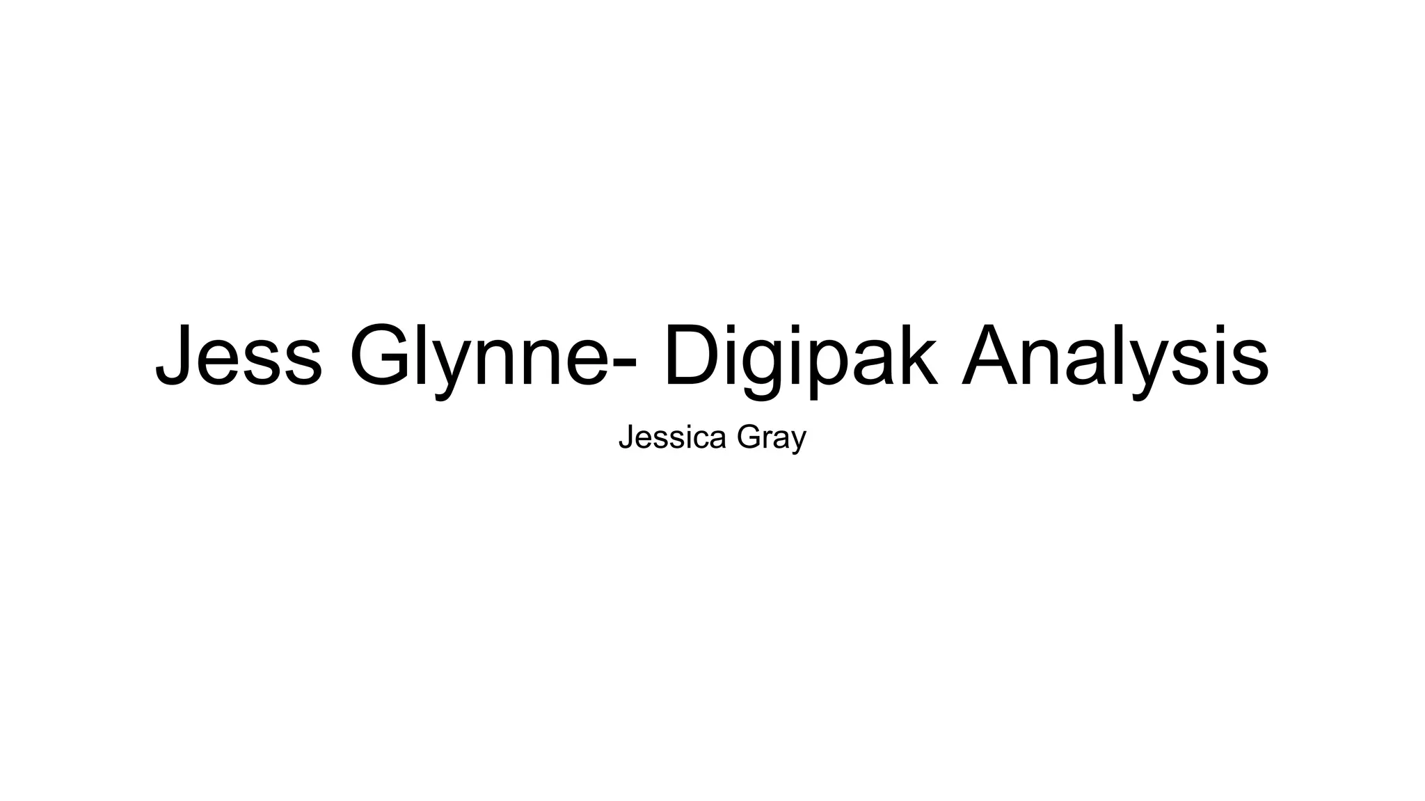
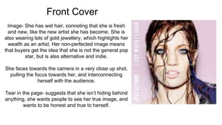
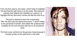
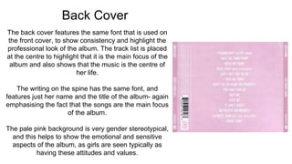
Jess Glynne- Digipak Analysis
Jessica Gray
Front Cover
Image- She has wet hair, connoting that she is fresh
and new, like the new artist she has become. She is
also wearing lots of gold jewellery, which highlights her
wealth as an artist. Her non-perfected image means
that buyers get the idea that she is not the general pop
star, but is also alternative and indie.
She faces towards the camera in a very close up shot,
pulling the focus towards her, and interconnecting
herself with the audience.
Tear in the page- suggests that she isn’t hiding behind
anything, she wants people to see her true image, and
wants to be honest and true to herself.
Font- the font used is very basic, which helps to highlight
the fact that the sole focus is on the artist. Also being an
ordinary font reflects her reliability as a person, to
highlight the fact that she's human just like the rest of us.
The text is vertical to show her uniqueness.
Title- the title uses the personal pronoun ‘I’ which makes
it very personal to herself, and makes the audience feel
empathy for her and connect with her on an emotional
level.
The front cover conforms to the genres of pop because it
focuses purely on the artist and is very bold.
Disc Cover
The top half of the disc is pink, which conforms to the
colours and conventions of typical pop, however the
use of the sea-like image mixes it up. The images of
the peeled back paper are used to connote that she
used to hide but now she can show her true self
through song, and by releasing this album she can
show who she really is and come out of her shell.
The information regarding the record label is in tiny font
around the edges, suggesting that the information is
not as key as the image that she is trying to put across.
Back Cover
The back cover features the same font that is used on
the front cover, to show consistency and highlight the
professional look of the album. The track list is placed
at the centre to highlight that it is the main focus of the
album and also shows that the music is the centre of
her life.
The writing on the spine has the same font, and
features just her name and the title of the album- again
emphasising the fact that the songs are the main focus
of the album.
The pale pink background is very gender stereotypical,
and this helps to show the emotional and sensitive
aspects of the album, as girls are seen typically as
having these attitudes and values.

Jess Glynne Digipak Analysis

  • 1.
    Jess Glynne- DigipakAnalysis Jessica Gray
  • 2.
    Front Cover Image- Shehas wet hair, connoting that she is fresh and new, like the new artist she has become. She is also wearing lots of gold jewellery, which highlights her wealth as an artist. Her non-perfected image means that buyers get the idea that she is not the general pop star, but is also alternative and indie. She faces towards the camera in a very close up shot, pulling the focus towards her, and interconnecting herself with the audience. Tear in the page- suggests that she isn’t hiding behind anything, she wants people to see her true image, and wants to be honest and true to herself.
  • 3.
    Font- the fontused is very basic, which helps to highlight the fact that the sole focus is on the artist. Also being an ordinary font reflects her reliability as a person, to highlight the fact that she's human just like the rest of us. The text is vertical to show her uniqueness. Title- the title uses the personal pronoun ‘I’ which makes it very personal to herself, and makes the audience feel empathy for her and connect with her on an emotional level. The front cover conforms to the genres of pop because it focuses purely on the artist and is very bold.
  • 4.
    Disc Cover The tophalf of the disc is pink, which conforms to the colours and conventions of typical pop, however the use of the sea-like image mixes it up. The images of the peeled back paper are used to connote that she used to hide but now she can show her true self through song, and by releasing this album she can show who she really is and come out of her shell. The information regarding the record label is in tiny font around the edges, suggesting that the information is not as key as the image that she is trying to put across.
  • 5.
    Back Cover The backcover features the same font that is used on the front cover, to show consistency and highlight the professional look of the album. The track list is placed at the centre to highlight that it is the main focus of the album and also shows that the music is the centre of her life. The writing on the spine has the same font, and features just her name and the title of the album- again emphasising the fact that the songs are the main focus of the album. The pale pink background is very gender stereotypical, and this helps to show the emotional and sensitive aspects of the album, as girls are seen typically as having these attitudes and values.