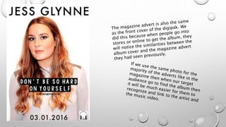
EVALUATION 2
HOW EFFECTIVE IS THE
COMBINATION OF YOUR MAIN
PRODUCT AND ANCILLARY
TEXTS
In the Digipak front cover we used this shot
which is a mid shot with high lighting and is
by herself. This shows that she is an
independent solo artist. This is similar to one
of the shots in our music video where we
shoot Charley singing part of the song in
front of a blank white wall with high lighting
as well.
Another comparison that we can
see between the digipak front
cover and shots in the music
video is the costume. They are
both wearing the same blouse and
hairstyle which is a direct link
between the two.
A comparison between the billboard
and the music video shot is the brick
wall. The brick is used frequently
throughout the music video and is a
statement. We used the brick wall in the
advert because it looks like a
professional photo-shoot and it also
relates well with the shots in the video.
These shots were all done in the
same flat as well which is another
key comparison and was done in the
same location as the music videos.
The costume is also the same in both
the advert and the shots in the video
which could be another way that
target audiences can relate and link
the artist with the album and the
music video.
Another area in the digipak we have an
image of 2 friends hugging with the French
and Great Britain flag draped around them
to show unity. This is very similar to parts in
the music video where they are portraying
the same theme and wearing the same
costumes and flags. They are also in the
same location which is a similarity as well as
the audience can identify this comparison
and recognize that it is from the ‘Don’t be
so hard on yourself’ Music video.
Another comparison is that in both of
these screenshots from the digipak
and from the final cut of the music
video, they are both smiling and are
giving out a positive vibe towards the
audience. This is good to show in the
digipak to portray to the target
audience that this is a happy, cheery
and enjoyable album/song and not a
The comparison here is that
throughout the music video in
various places the French and
British flag are involved somehow
through. This could be round
someone's shoulders, blowing in
the breeze or draping over a chair.
We needed to involve the flag
within the digipak which we have
done as it is our key theme and has
to be mentioned. This would be
another comparison for the
audience when they purchase the
album to notice this theme even
more and understand what we are
trying to portray which ultimately is
friendship.
Another comparison is the shots in the
music video where the flag is being
blown around in the wind we thought was
a successful shot, we used this idea on
the digipak cover where one side is the
French and the other side is the British
which is similar to the music video
because Beckie who is French is always
next to Charley who is the British Flag
By using the same pose and
head slant in all of the
different advertising
strategies it will become
more and more
recognizable which is an
effective way of making the
artist well known and
remembered.

Evaluation 2

  • 1.
    EVALUATION 2 HOW EFFECTIVEIS THE COMBINATION OF YOUR MAIN PRODUCT AND ANCILLARY TEXTS
  • 2.
    In the Digipakfront cover we used this shot which is a mid shot with high lighting and is by herself. This shows that she is an independent solo artist. This is similar to one of the shots in our music video where we shoot Charley singing part of the song in front of a blank white wall with high lighting as well. Another comparison that we can see between the digipak front cover and shots in the music video is the costume. They are both wearing the same blouse and hairstyle which is a direct link between the two.
  • 4.
    A comparison betweenthe billboard and the music video shot is the brick wall. The brick is used frequently throughout the music video and is a statement. We used the brick wall in the advert because it looks like a professional photo-shoot and it also relates well with the shots in the video. These shots were all done in the same flat as well which is another key comparison and was done in the same location as the music videos. The costume is also the same in both the advert and the shots in the video which could be another way that target audiences can relate and link the artist with the album and the music video.
  • 5.
    Another area inthe digipak we have an image of 2 friends hugging with the French and Great Britain flag draped around them to show unity. This is very similar to parts in the music video where they are portraying the same theme and wearing the same costumes and flags. They are also in the same location which is a similarity as well as the audience can identify this comparison and recognize that it is from the ‘Don’t be so hard on yourself’ Music video. Another comparison is that in both of these screenshots from the digipak and from the final cut of the music video, they are both smiling and are giving out a positive vibe towards the audience. This is good to show in the digipak to portray to the target audience that this is a happy, cheery and enjoyable album/song and not a
  • 6.
    The comparison hereis that throughout the music video in various places the French and British flag are involved somehow through. This could be round someone's shoulders, blowing in the breeze or draping over a chair. We needed to involve the flag within the digipak which we have done as it is our key theme and has to be mentioned. This would be another comparison for the audience when they purchase the album to notice this theme even more and understand what we are trying to portray which ultimately is friendship. Another comparison is the shots in the music video where the flag is being blown around in the wind we thought was a successful shot, we used this idea on the digipak cover where one side is the French and the other side is the British which is similar to the music video because Beckie who is French is always next to Charley who is the British Flag
  • 7.
    By using thesame pose and head slant in all of the different advertising strategies it will become more and more recognizable which is an effective way of making the artist well known and remembered.