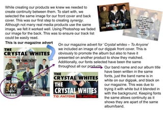
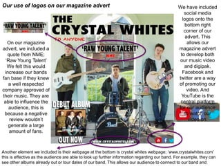
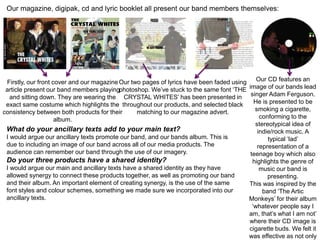
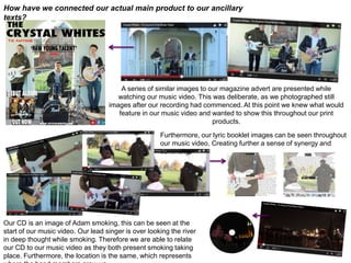
The document discusses creating continuity and synergy across various music products for a band called The Crystal Whites, including their magazine advert, digipak, CD, and lyric booklet. Some techniques used were selecting the same front and back cover image, using consistent fonts, including promotional elements like social media logos and a music video link. Photos of the band members were also consistently featured across products to connect their identity. The goal was to connect the different products and promote the band and their album.
Лечение гипертонии. Как нормализовать повышенное давлениеSerhii Kushchenko
Эффективное лечение гипертонии - без "голодных" диет, изнурительных физических нагрузок и вредных "химических" таблеток. Реальный способ, чтобы нормализовать повышенное давление и похудеть.
1. While creating our products we knew we needed to
create continuity between them. To start with, we
selected the same image for our front cover and back
cover. This was our first step to creating synergy.
Although not many real media products use the same
image, we felt it worked well. Using Photoshop we faded
our image for the back. This was to ensure our track list
could be easily read.
This is our magazine advert
On our magazine advert for ‘Crystal whites – To Anyone’
we included an image of our digipak front cover. This is
obviously to promote the album but also to have it
presented on another product to show they matched.
Additionally, our fonts selected have been the same
throughout all our products. Our band name and our album title
have been written in the same
fonts, just the band name is in
white on our digipak, and black on
our magazine. This was due to
trying it with white but it blended in
with the background. Keeping fonts
the same allows continuity as it
shows they are apart of the same
album/band.
2. Our use of logos on our magazine advert We have included
social media
logos onto the
bottom right
corner of our
advert. This
allows our
magazine advert
to develop both
our music video
and digipak.
Facebook and
twitter are a way
of promoting our
video. And
YouTube is the
central platform
for our audience
to watch our
video on.
On our magazine
advert, we included a
quote from NME;
‘Raw Young Talent’
We felt this would
increase our bands
fan base if they knew
a well respected
company approved of
their music. They are
able to influence the
audience, this is
because a negative
review wouldn’t
generate a large
amount of fans.
Another element we included is their webpage at the bottom is crystal whites webpage; ‘www.crystalwhites.com’
this is effective as the audience are able to look up further information regarding our band. For example, they can
see other albums already out or tour dates of our band. This allows our audience to connect to our band and
3. Our magazine, digipak, cd and lyric booklet all present our band members themselves:
Firstly, our front cover and our magazine
article present our band members playing
and sitting down. They are wearing the
exact same costume which highlights the
consistency between both products for their
album.
Our two pages of lyrics have been faded using
photoshop. We’ve stuck to the same font ‘THE
CRYSTAL WHITES’ has been presented in
throughout our products, and selected black
matching to our magazine advert.
Our CD features an
image of our bands lead
singer Adam Ferguson.
He is presented to be
smoking a cigarette,
conforming to the
stereotypical idea of
indie/rock music. A
typical ‘lad’
representation of a
teenage boy which also
highlights the genre of
music our band is
presenting.
This was inspired by the
band ‘The Artic
Monkeys’ for their album
‘whatever people say I
am, that’s what I am not’
where their CD image is
cigarette buds. We felt it
was effective as not only
What do your ancillary texts add to your main text?
I would argue our ancillary texts promote our band, and our bands album. This is
due to including an image of our band across all of our media products. The
audience can remember our band through the use of our imagery.
Do your three products have a shared identity?
I would argue our main and ancillary texts have a shared identity as they have
allowed synergy to connect these products together, as well as promoting our band
and their album. An important element of creating synergy, is the use of the same
font styles and colour schemes, something we made sure we incorporated into our
ancillary texts.
4. How have we connected our actual main product to our ancillary
texts?
A series of similar images to our magazine advert are presented while
watching our music video. This was deliberate, as we photographed still
images after our recording had commenced. At this point we knew what would
feature in our music video and wanted to show this throughout our print
products.
Furthermore, our lyric booklet images can be seen throughout
our music video. Creating further a sense of synergy and
continuity.
Our CD is an image of Adam smoking, this can be seen at the
start of our music video. Our lead singer is over looking the river
in deep thought while smoking. Therefore we are able to relate
our CD to our music video as they both present smoking taking
place. Furthermore, the location is the same, which represents