SlideShare a Scribd company logo
Evaluation
Harry Taylor
Production Process Evaluation
Research
I think that I started off my research strong by adding lots of detail, ideas and interpretations into the existing
products. My research definitely helped me to generate ideas for images colours and fonts for my products.
Another strength of my research was the quantity of research into existing products that I did. For example, I
research 7 products in detail. I believe this is a strength of my research because not only did it continuously
give me ideas and points of interest to look at, it also gave me the skills for researching in detail as in the past I
haven’t gone to great lengths of effort when researching. I believe that researching more than a couple of
products in one project will help me in the future. A final strength to note is my audience research or my
primary research. This really helped me to weigh up a balance between my ideas and what the audience finds
appealing. I tried to make the balance more towards the audience as it is really the audience that will consume
the final product and not the producer. On the other hand, if the work has none of the artists input, the
product may not appeal to anyone as people buy the product because of who makes it or what it represents.
Research
This research helped my product because I could look at existing products that would ultimately influence my
work. For example, I have learned from these products what poses to create for an album cover, what colours I
should use and what fonts make an album look like a hip hop album and not a pop or rock album. I also think
that researching helped my product because it helped to build up an existing idea or it made me change an
idea that probably wouldn’t have worked. For instance, if I had thought of an image that I would place on the
front cover of my album and then compared it to one of the albums on the existing products, I may have
thought that it would need changing as it doesn’t fit in with the genre of the album. My research also helped
with my products because I could take direct information from my interviews and survey and then put this into
my product. Without any primary research, I think I would have struggled because I often referred to this to
see what products I should and shouldn’t make, what the product should have on it and anything that the
product was missing.
Research
There are some weaknesses to list about my research. The first weakness that I think could be improved is the amount
of detail I go into when I talk about the audience from my survey research. I didn’t put a lot of detail into some of the
questions because they were self explanatory. However, I now realise that I need to explain these aspects of research
in greater detail. If I improved this area it wouldn’t have that much impact on the products I have made because it isn’t
my reaction to the responses that would effect my product, it is the responses that would effect my product. I think
another weakness of my research is the interviews. I think my questions were quite general. To improve on this next
time, I will make sure that I make the questions more specific. In some ways, I also think that the interviews were a
weakness to my research. I don’t feel like I had the most detailed responses but it was still good to have direct
feedback from the audience. A way to improve the interviews could be for me to write an easier question so that the
interviewee has less to think about but more to write about. I don’t think that the interview analysis was a weakness
but I feel as if I could have improved it. The amount of detail is quite minimal so I will aim to add to this in the future.
Planning – Initial Plans
I started off my planning by first creating the Initial Plans PowerPoint. The first step to the initial plans was
the initial reaction. This was my reaction to the brief. To summarise, I discussed what product I was thinking
of making and why. I found this to be a strength because immediately, I was thinking of ways to structure my
products and what products I could make. I then collected some images of existing products to make the
reaction visual. This wasn’t a strength or a weakness but it did help me to structure this particular
PowerPoint. The next part of the initial plans is the mind maps. I found these to be a massive strength
because any ideas I had from the reaction could be put into words and I could now further develop these
ideas. I then wrote a short paragraph explaining why I would choose to make that certain product. This
helped me to understand the ideas that I thought of and it brought the idea together. The next part of the
initial plans was the final idea. I chose the idea that I was most likely to do well in which for me was a CD
Cover and then expanded that idea further. I talked about colours, images, genre and extra products to go
alongside the cover such as merch. This was also a strength because I could start thinking about specific
items that could go onto an album cover. This helped me divide good and bad ideas as well.
Overall, these strengths helped me with my final product because they helped me to visualise and see the
pros and cons of what an idea could turn out like.
Planning – Initial Plans
The next stage in the initial plans were the mod boards. Although I sometimes find these helpful, I did
find this a weakness because I have collected images that potentially wont help me. For example, in a
later stage of planning I may change an idea and then this will make the mood board less useful than it
was before. To improve on this I could collect less images but make sure that they actually help me in
production. On the contrary I don’t think less images would be a sufficient amount for the planning.
Furthermore, analysing the mood boards that I created is also a weakness of my research. I don’t feel
as if I will look back at this for it to help me in production whereas looking at a mind map will. I don’t
feel as there is an improvement to this but there could be an alternative to analysing a mood board. An
alternative for me would be just talking about what I would be doing with the mood board and how it
will help instead of talking about why I made it and what images I collected.
There wont be any major effects on my final product from these weakness because I think that plans
are meant to be changed with better ideas. A second reason why these weaknesses wont effect my
product is because I have other sources of inspiration other than a mood board so I don’t need to
solely rely on this to compare my product to an existing product.
Planning – Production experiments
The next stage of planning is the production experiments. This is where we experimented with
Photoshop to practice techniques so we could see if we wanted to carry on from out final idea. An
immediate and obvious strength for this stage of planning is that I get to practice using the tools and
experimenting with new techniques that I could potentially use. The strength within my planning is
discussing the process. This helps me to understand and remember what exactly I have made and
therefore improves my skills within Photoshop. Another strength within my production experiments is
the actual experiments themselves. When I made these, I used a tutorial to create the products so I
had never used that technique before. This is a strength because I have learned new techniques that I
used in my final products which varies my work from simple techniques like I planned to. I think a final
strength of my experiments is the reflection. This helped me to evaluate the work and decide whether
or not I like it and whether I could use it for my actual products. It also helped me to pick out specific
points of the experiment so that I could refer to certain techniques later on.
These strengths helped me in my final product because I could practice using techniques and I could
also pick out the techniques or styles that I don’t like. Another way that these experiments helped me
was the way I could see how a product turned out. For example, if I had a really good idea that seemed
good in my head but then looked bad when I made it, it didn’t matter because it was only an
experiment and I could look at alternative techniques to use.
Planning – production experiments
The first weakness of my experiments would be the mind map for the experiment. I didn’t find that
these actually helped with my experiments as most of the time I would change the plans. I also think
that my plans weren’t too detailed. This is one area that I could have improved by adding extra
possibilities and variations to the existing ideas. I could have expanded the mind maps but as I had a
good idea of what I was going to experiment with, I didn’t add much detail. A second weakness to
point out is the amount of detail in the process. I feel like I could have made it clearer to the reader
about what I was doing. I think I could definitely improve this by explaining the specific tools that I
used and also explaining what exact filter or colour I used.
The weaknesses that I have discussed luckily haven't had much of an impact on my products because I
could still understand the general process for each technique. I actually ended up using the glitch
animation technique and I could follow it well. The mind maps had no effect on my product but I still
feel they need to be improved.
Planning – Pre-production
The pre-production stage was all about generating ideas for what the structure of our product would
look like. This structure included fonts, colours, images and layout plans. The first strength of my work
that comes to mine was the layout plans. This was a strength to me because if I got stuck in production
for where to put a certain item, I could look at the layout plan and immediately fix my problem. This
meant that I spent less time fixing problems so therefore had more time for production an improving
my products. A second strength of my pre-production would be the fonts style sheet. For me, this is a
strength because when I was at the production stage, I didn’t have to waste time looking for a font to
use. Instead, I could look at my style sheet, type in the font on the website and then immediately
download that font which would prevent me from having to spend valuable time looking for a font that
might not work.
These strengths helped my end product because it saved me time and it meant that I shouldn’t have
had a problem with how to structure my product.
Planning – Pre-production
The first weakness of my pre-production was the colours style sheet. This was a weakness to me
because I couldn’t actually visualise these colours on my product as the colours may have looked
different when placed next to another colour. The colours style sheet was useful or planning what basic
colours I could use but I didn’t feel as if it helped me during production. This was very unlike the fonts
style sheet because I could actually see the font and how it would work whereas with the colours, it
was hard to visualise how this could work with the images I took. A second weakness to me was the
contingency planning and the resources list. I normally find lists useful but as there was so few items
that I needed then to me it was common sense to have these items at hand. Something that I could
have done better about this was explain why I needed each piece of equipment and why I needed that
specific location. The contingency plan didn’t prove useful either as no problems actually occurred and
even if they did it seemed obvious to make sure the SD card wasn’t full or make sure the battery was
fully charged. I think I maybe could have thought outside the box more and thought of less obvious
contingencies that may have helped. One last weakness is the layout plans. I feel as if the slides are a
bit empty so to improve, I could explain the design choice and the font/colour choice.
I don’t feel as if these weaknesses had any effect on the final products but they had an effect on the
quality of the PowerPoint. I will definitely aim to improve them now I have noticed some faults.
Time Management
• My time management was fairly good. I kept on time with all the PowerPoints and
managed to complete my production on time. The only part of this project I fell
slightly behind on was the weekly evaluation.
• My products are all complete and I actually was left with time to improve them
after I finished each one so I don’t think I could improve them with any additional
time. I maybe could have used an alternative technique to improve them but an
alternative technique might not have worked with my products. I think that I could
have improved some of my PowerPoints with extra detail. For example, on my pre-
production PowerPoint, I could have written about the layouts but I was focused
on creating the layouts that I ran out of time and had to move onto the next
PowerPoint.
• If I had more time to produce my work then I would have looked at alternative
techniques to use on my work. For example, I would still keep the same images but
use a different effect rather than the graffiti effect I used. After I did this I would
then compare them and see which one was the better one.
Technical Qualities
The title is in a font
that represents the
tone of the album,
just like the existing
product.
Although the
background colour is
different, the colour
still represents the
mood of the
artist.
The parental advisory sticker
is an obvious similarity
which shows the content of
the albums.
The pose of the artist is
different. The existing
product makes it look like he
is bragging but the product I
made is showing the artists
shame for what he’s done.
The colour of the font is gold
showing the artists attraction to
riches. This is different to my
product because the colours
show the change in mood.
My product does not
contain the artist’s
name but it is made
very clear on this
album as this artist
wants to be the best
so he needs to get his
name known. My
product is about the
artist writing music to
show his feelings.
Technical Qualities
An immediate first difference is the image
of the artist on the back cover. I have a
picture on the front cover but you cant
see the artists face so it makes it a
mystery as you find out who the artist is
through the music and not pictures.
The titles of the
songs aren’t as
obvious as mine. I
think that the artist
on this album wants
to be known for
who he is and
where he came
from and just have
his music to
intimidate. It is like
the music tracks are
backing his picture
so if something
happened to him,
his music would still
be there to take his
place.
The red colour is very noticeable on this
back cover. This is a clear message that
the album will bring danger.
Both albums have a copyright statement.
The tracks are very noticeable and continue
the theme of red and blue like the other
products have. The tracks are also central and
don’t have numbers to establish an order. This
could be saying that there is no order over this
artist and he doesn’t answer to authority.
The barcode is very
obvious on both
products making it
clear that these artist
are all about sales..
The font is a hip hop
style font. This is
different to the other
product as it has a
straight and orderly
text.
The background colour in my picture is a
red/pink sky whereas it is a street in the
other picture. This could mean that the
other album is street music whereas this
product is set as a view so the artist may
be reaching out to people.
Technical Qualities
The name of the
artist is made
very clear so we
know who's
tour it is straight
away.
The background colour is very
different which shows the
different personalities and
attitudes of the artists.
The record label is also made
clear on this unlike my product.
The positioning
of the artist is
different on my
product. My
artist fills up
more of the
page which I
believe is more
effective
because there is
more colour to
the image and it
makes it very
obvious who's
tour it is.
I think that if I had less tour dates I could
have made the text all different sizes like
the existing product. I think that it looks
more presentable when the text is
different sizes, fonts and colours.
The general layout of the dates is very different.
The dates on the existing product is contained
within a shape which makes the dates obvious
whereas mine are just spread out on the whole
page.
There are no
social media
links on either
poster. This is
something that I
will improve on
my product.
There is a heavy theme of red, white and yellow whereas
my product has a theme of red, blue and white. The
colours on my product represent the mood of the artist
so perhaps this could be the same for the existing artist.
The red could represent the danger of the tour.
The placement and
style of this font
makes it easy to
read. This is similar
to mine because it
is a different colour
from what it is
surrounded by so it
contrasts well.
Technical Qualities
The first similarity
between these
products is the title.
The placement of
both titles is at the
top of the page so
the audience
immediately knows
what the product is
or at least what the
product shows. There is no picture
of the artist on the
existing product
which makes the
product less
recognisable.
An obvious
difference between
these products is
the text. The graffiti
effect on my
product isn’t as
bright but because
it is a big font it still
stands out.
My product includes a
copyright statement
making the product
look more authentic.
The graffiti technique makes the
product look realistic. The
existing product has computer
edited text.
This product has an alternative
logo for the album. This brings
more recognition to the album
in case someone hasn’t seen
the other logo. My product
only has one logo so this could
make it less recognisable.
This tracklist has
numbers to identify
the tracks. This
makes sense on this
particular product
due to its structure.
As my structure is
very linear, there
are no numbers
needed.
The background on my product is an image whereas the
existing product is a computer generated colour. This
reminds the viewer that the existing product can be
bought digitally and in real life .
Technical Qualities
The text on the products have similar
placement. The existing product has an image
of the artist which makes the product more
appealing to an audience. This is because of the
audiences association towards the artist.
The colour of both
products is black. This
colour is associated with
power, fear and negative
connotations. My
product is meant to
show the change of
emotions and not just
show one emotion so I
should have maybe
changed the colour of
the product. The colour
black can also represent
passion so I think that
the existing product is
definitely the right
colour because this artist
delivers messages of
passion in his raps.
This hoodie is the special edition and has the artists
name embroided on the sleeve. I had to add this in on
Photoshop because it wouldn’t let me edit anything
but the front and back on the website. I think that
adding something on an item of clothing other than
the front or back improves the aesthetics.
The T-Shirt has the artists name spelt
properly rather than having the name
as 2Pac. I think that this makes the
product more formal. I think that this
is a massive difference to my product
because my merch was meant to look
informal.
There is a fade
effect on the artist
like the artist has
faded with the
merch so when
someone wears it,
they feel a part of
the artist with
them. On my
product however,
the logo is just
placed on top so to
feels like there
aren’t any
connections to the
artist.
The text is plain on this product whereas there is
colour on my product. I think this makes my product
more attractive and eye-catching. This is due to the
colour red as it is one of the most noticeable
colours.
Technical Qualities
My product is an
animation to advertise
when the product will
be released whereas
the existing product is
a poster. I think that
having an animation
makes it more
appealing because you
watch it all the way
through so you notice
every detail whereas
on a poster you may
not notice every detail
or every piece of
information.
The colours included on both products are
very different. The colours on the existing
product are washed out apart from the red. I
think this is a good technique because the red
will catch the attention of the viewer and
then the viewer can read the rest of it. My
product fades in so it is still appealing as
people will want to know what happens in the
animation.
The existing product has an image as
the background. My product has no
image. I think that the existing
product is more appealing because
the audience wants to know what
image is behind the red lines so if
they buy the product they may find
out.
The artists name is
made obvious at the
top. My product has
no artists name as
this will add to the
suspense of the
album release.
The extra
information is
written out at the
bottom instead of
having it abbreviated
like I have done. I
think that having it
written out makes it
more appealing to a
world audience
because when a date
is written in
numbers, different
countries put the day
and month different
ways round so this
could be confusing
to some people.
The fonts used in my product are basic so that people think that it is a
normal advert but when it glitches and becomes distorted then people get
a hint of what the album is like. (Appears normal but is very
deep/distorted). The font used on the existing product is quite basic but the
sharp edges to it could represent the edge and malice of the album.
Aesthetic Qualities – Front cover
The parental advisory sticker is
small but noticeable as it
contrasts wit the background. This
lets people know that however
small the artist may be, you will
still notice him due to his choice
of words.
The colour of the background is probably a
strength of this product because it represents
the problems in the world that surrounds the
artist.
The motion blur and filter on
the artist make him stand out. I
think this is a strength of the
product because the attention
of the audience is immediately
drawn to the item that stands
out so it keeps the viewer
interested in the product as
they want to know who this
person is.
An improvement that I
could make is adding
something extra to the
background. I think that
even for the mood I was
going for, the background
is too empty. I could add
the artists name or
another image.
The title is a big aesthetic
quality of my product
because this makes the
Fibonacci square come
into place. For example,
the viewer starts at the
title, moves across to the
artist and ends up at the
parental advisory sticker.
I think I could make the
font a bit clearer as the
dark from the background
makes the letters hard to
see.
Aesthetic Qualities – Back cover
The first improvement
that I could make to this
product is changing the
colour of the
background to match the
colour on the front cover.
I think there is quite a big
difference but it also
shows the change from
light to dark from the
front cover to the back
cover. This is another
change in mood the this
album represents.
The red and blue theme is
continued on this product
which makes it a strength
because it means that the
audience can associate all the
products..
The font is another strength
because it relates to the genre
of my album which is hip hop.
The font is quite sharp which
could show that the album is
dangerous to listen to.
I have included a
copyright statement
which makes the product
look more authentic. If
the audience notices this
they will think that the
album is professional so
would be more likely to
buy it.
The barcode adds to
the authenticity.
The background image could
also be improved. I think
that it isn't visually
interesting but it makes the
track names stand out. The
mage is also quite dark.
I think that this is probably one
of the less creative pieces but as
I never planned to make his I
feel that I have have done a
good job with presenting the
text and choosing decent
imagery.
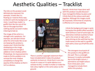
Aesthetic Qualities – Tracklist
The title on this product could
definitely be improved. For
example, it looks like it is
floating so I need to find a way
to blend it with the background
more. I could have made ir a
graffiti font like the rest of the
text on the page but then
nothing stands out and it makes
it boring to look at.
The image of the artist is a
strength and a weakness. For
example, we still don’t know
what the artist looks like so we
are keeping this product a
mystery but I think that the
shadowing on the image
doesn’t look real enough (I
added an inner shadow within
Photoshop). An improvement to
make to fix this problem is to
remove the inner shadow
completely or change the
opacity of the shadow so that it
isn't as obvious.
There is another copyright statement that I
have included which makes the product
authentic to loom at. I think that it ruins the
visuals in a way as it is quite obvious so a
solution to this, is make it smaller or make the
text colour lighter or the same colour as the
ground.
I think the background image is quite
boring but the graffiti effect wouldn’t
work without a wall of some type. An
alternative method could be to have
wall in the street at night with a
lamp shining on the wall that has the
track names on the wall in a graffiti
style with a close up of half the artist
face.
The strongest visual point of
this product is the graffiti on
the wall. This is a strength
because it is easily noticeable
due to the bright colours. I
planned to use bright colours
from initial plans and I
managed to include them
within this product.
Overall, I think that I have done well
with this product visually because I
have managed to follow my plans and
I think that all the colours work well
together. Although the images could
be improved, I think that its simplicity
is effective as it is eye-catching.
Aesthetic Qualities - Merchandise
A first improvement to
notice about this product is
the lack of imagery/designs
included on the hoodie. The
website only let me cover
the front and back of the
hoodie so I had to add the
text on the sleeve on
Photoshop. I think that I
could have chosen a
different design for this
hoodie but having two logos
for one album may be
confusing to the audience.
An improvement to the text
on the sleeve could be to
look up a tutorial of how to
make it look like something
has been embroided onto a
piece of clothing. The colour of the hoodie that I chose does not represent anything of
the album. For example, the hoodie is black but this colour represents
passion and fear which are two themes that the album represents,
but it is not the main theme. I could change the colour of the hoodie
to red or blue but then either of these colours would make half the
logo invisible.
The positioning of the
logo is a strength
because if it was
positioned horizontally
then people can easily
read it but if it is
positioned like this
people will spend more
time looking at the
product instead of
disregarding it straight
away.
Overall, this product could
definitely be improved by including
a different image on the front, but
with the limited options I had on
the website, I think my product
looks ok.
Aesthetic Qualities - Animation
https://youtu.be/Bjl3kPMSyFk
This is a product that I made in
Photoshop. The animation is
very simple but effective. I think
that an improvement to list
straight away is the lack of
images, other text or effects.
There is simply a date that fades
in, glitches and then fades out. I
think that I could have included
the album logo at the end
instead of having a blank
screen.
A strength of this product is
that the product is still
mysterious. There is no images
or words to describe or help
the audience to visualise the
products. This keeps interest in
the product.
The glitch includes the colours red and blue which can
be briefly seen within the animation. This is the first
teaser towards a theme of the album. I would say that
this is quite a creative aspect of my product because I
have made a massive theme of the album compact
down into a split second of an animation.
Overall, I think that this
product is creative and doesn’t
need a lot of adjusting
compared to the other
products.
Aesthetic Qualities – Tour poster
The choice of fonts is an
immediate strength of this
poster. The fonts are bold and
the colours contrast with the
background so they stand out.
I think that this product could
have included the album logo. I
think I could have added this at
the bottom right corner.
Another strength to point out
is the red and blue theme that
I have carried on with this
product. I think that this is also
a weakness because there is a
lot of text and I feel that this
drowns out the image in the
background. To improve on
this, I can get rid of some of
the dates.
The effects on the artist continues the
main theme of the album and captures
the viewers attention because the
shades of blue and red are slightly
different to the text. This is a strength
because it differentiates the text to the
images.
The radial gradient background helps to
make the image stand out more. I also
think that it contrasts well with the
colours used for the text.
Overall, I feel as if this is one
of the best graphical products
I have made due to how many
colour I have used.
Audience Appeal
The bright colours that I
planned to use have been
included in my title. This will
appeal to the young audience.
I have made a hip hop album
as the survey said that people
liked rap more than other
genres. This will appeal
because people wont listen to
the other genres.
I have included the artist on
the cover. If I didn’t do this, I
would have lost a lot of
interest as it wouldn’t have
been appealing.
The album isnt that
detailed but includes
colour, text and
imagery so as long as it
has the main items
then this could be
classed as detail.
Audience Appeal
I never ended up making a special edition cover.
Instead, I made a back cover. This was due to the fact
that many people that took the survey had never
bought a special edition album. If I had made one,
people would have been less attracted to it as it is
really the same product, so instead I made a
different product. I believe that this will be more
appealing because it means I have used more
colours, fonts and images that I may not have been
able to include on the front.
In my proposal, I stated that I will aim my products
towards social grades C2, D and E. I have almost
achieved this using the imagery on this product
because it looks fairly run down and empty.
Audience Appeal
There is no audience information on whether they would like to see
a tracklist but from the information they have given, I can make an
educated guess whether this product will be appealing.
To begin with, I have managed to include bright colours. This is a
highly important part of audience appeal especially with my
audience because this is what will attract the audience to the
product. I have included the colour red as well which is one of the
most noticeable colours.
Secondly, I have included the artist on the product. This helps with
association and recognition as the audience can relate each of the
products that include the artist.
Thirdly, I have made the artist a male. This is important because as
hip hop is mostly a male industry, it means that more people will
listen to a male artist than a female artist.
An improvement that I could make to this product to include more
audience appeal is maybe include more detail. To do this, I can
explore more techniques to apply to the image of the artist using
YouTube or Photoshop books/websites.
Audience Appeal
I have included merchandise like the survey asked for. The
design is fairly unique like I planned but contains many
weaknesses. For example, compared to other clothing
that is worn by younger people, this doesn’t really fit with
the same style. Also, there is no image of the artist which
is another point that the audience wanted to see.
Audience Appeal
Similar to my tracklist, I did not ask any questions about the
animation that I planned to make but I can make some more
educated guesses.
A first point is that I have included some colour. I stated in my
proposal that if I couldn’t or didn’t include colour in a product I
would resort to using white which is what I have done. I used white
because it contrasts with the black background so is still heavily
noticeable.
I think that this product could definitely have some improvements
for audience appeal such as including an image. I planned to include
the album cover somewhere within the animation but I couldn’t get
this to work. I can now see that I could probably improve this
product by including the album name at the end.
Another improvement to this product is to make the background
more exciting. For example, I need to appeal to a young audience
and using a black background with nothing there won’t work.
Audience Appeal
I have also not collected any audience data for this product. I will
also be guessing what audience appeal I have included.
The first thing to notice is the image of the artist. This is important
because even though the artists face has been revealed which may
cause confusion, the artist is still noticeable which is what the
audience suggested I do.
The second thing to notice is the amount of colour that I have
included. This is very appealing because the colours are bright but
there is also darker, washed out colours to balance the colour
scheme.
I think that an improvement to this is to reduce the amount of text
as younger audiences wont want to read a lot of text. To improve on
this I will either get rid of some of the dates or find a different way
of presenting it to make it easier to read.
Improvements
I have made a minimal improvement to my front cover. I made the face in the title appear
more detailed and made it more colourful as it look washed out before. This was not hard to
improve at all. The first step was just drawing a circle using the ellipse tool. I then duplicated
this layer 3 times so that I had 2 black circles and 2 white circles to make the eyes. I then
duplicated it once more and used the warp option to create the sad mouth. I also added a
tear drop to reinforce the mood of the album. The final step of improving this product was
downsizing the parental advisory sticker. I did this because I felt that it took up quite a lot of
the cover and felt like it was drawing the attention away from the artist and title.
Improvements
With this product, I made two changes. The first of which was adding some social media links. I did
this because it added some authenticity to the product as before it looked unfinished and more like a
plan rather than an actual product. I made the links black which is the same colour as the title of the
tour. I did this because it means they share the same amount of importance and don’t draw
attention away from anything else on the page. The second adjustment I made to this product was
resizing the main text at the top. I did this for two reasons, the first being so that I could fit the social
media links in and then also because I felt it took up to much of the page and I thought it looked
neater like this.
Improvements
The final product that I made changes to was my back cover. The first change I made to this
product was the stroke on the song names. I changed it because the gradient stroke I had
looked messy. Instead of having a red and blue gradient stroke, I used a full red stroke. This
kept the theme going and also makes the text stand out a bit more. I made the background
a tiny bit lighter as it looked quite dark and dingy. The final change I made was changing
the colour of the copyright. I think that it blends in more with the background. This is good
because when it was white, it drew quite a lot of attention so now that it blends in, the
audience wont be distracted by the statement.
Peer
Feedback
Feedback 1
• What did you like about the product?
• There are a lot of different elements to your product, I really like the writing on the wall (song lyric not
intended) I also really like the album cover, the colours go really well together. I also think that your
products overall looks very professional. I really like the blur effect that you have placed on your album
cover as well.
• What improvements could have been made to
the product?
• I think for improvements, you could make more t-shirt designs, and experiment
more. I think you could also maybe explore different colours to put on to your
album cover as well.
Peer Feedback Summary
• What do you agree with from your peer
feedback?
• I agree with the first improvement mostly. I only had time to make
one design though but I will try and create some other designs.
• What do you disagree with from your peer
feedback?
• I don’t really agree with the second part of the improvement
because the colours on the album cover are there to represent the
moods and attitudes of the artist so any other colours wouldn’t
really work.
Feedback 2
• What did you like about the product?
Both of the products use lots of colour which makes the
products stand out. I like how both of then products use the
same logo and person which easily makes it recognisable that
the album is from the same artist. The writing on the wall
looks realistic. The photography is in focus which makes the
work look professional.
• What improvements could have been made to the
product?
Some improvements which could of have been made would be the
colour scheme could have been kept the same across both of the
products. I also feel like the sad face in the logo looks out of place. This
could be due to the colour being bright yellow?
Peer Feedback Summary
• What do you agree with from your peer
feedback?
• I agree with the fact that I used a lot of colour. This was intentional as I
wanted my products to make a good first impact on the viewer.
• What do you disagree with from your peer
feedback?
• I disagree with the improvements because I tried to keep an on going
colour scheme and there is red and blue in most of my products. The
second improvement I also disagree with because this was meant to stand
out so it would clearly deliver the mood of the album.
Feedback 3
• What did you like about the product?
– The front cover of the album cover has a very nice colour
scheme which helps to accentuate the person walking in frame
especially with the effect put on.
– The album title is also a nice font and I like the usage of the
frowning face as an O.
– The tracklist blends nicely with the background of the wall.
• What improvements could have been made to the product?
• The effect used on the person in the album cover could maybe blend with
the background a bit better.
Peer Feedback Summary
• What do you agree with from your peer
feedback?
• I agree with the fact that I used a lot of colour. This was intentional as I
wanted my products to make a good first impact on the viewer. This also
means I have captured the audiences attention immediately which is what
I wanted to happen.
• What do you disagree with from your peer
feedback?
• I disagree with the improvements because the artist isnt meant to blend in
he is meant to stand out. I will probably find a different way of making him
stand out because people haven’t noticed to the intention of the
technique used.

More Related Content

What's hot

7. evaluation
7. evaluation7. evaluation
7. evaluation
Jude McMichan
 
7. evaluation
7. evaluation7. evaluation
7. evaluation
Jude McMichan
 
Diary For FMP
Diary For FMPDiary For FMP
Diary For FMP
jackhurst8
 
7. evaluation
7. evaluation7. evaluation
7. evaluation
Jude McMichan
 
Developmental Diary (pre production)
Developmental Diary (pre production)Developmental Diary (pre production)
Developmental Diary (pre production)
Thomas Haase
 
Learning journey
Learning journeyLearning journey
Learning journey
Louisbiddles7
 
Learning journey fmp
Learning journey fmpLearning journey fmp
Learning journey fmp
Louisbiddles7
 
Learning journey
Learning journeyLearning journey
Learning journey
Louisbiddles7
 
Reflection
ReflectionReflection
Reflection
jay birkin
 
5. evaluation 3
5. evaluation 35. evaluation 3
5. evaluation 3
holly-clark
 
(4) project 1 communication methods (nathan millett)
(4) project 1 communication methods (nathan millett)(4) project 1 communication methods (nathan millett)
(4) project 1 communication methods (nathan millett)
NathanMillett
 
Reflective journal
Reflective journalReflective journal
Reflective journal
jessicacrosland
 
Reflective journal
Reflective journalReflective journal
Reflective journal
jessicacrosland
 
Reflective journal
Reflective journalReflective journal
Reflective journal
jessicacrosland
 
Communication Methods
Communication MethodsCommunication Methods
Communication Methods
Joshua Blakeley
 
Reflective journal
Reflective journalReflective journal
Reflective journal
jessicacrosland
 
Evaluation
EvaluationEvaluation
Evaluation
Thomas Haase
 
On Going Evaluations Two
On Going Evaluations TwoOn Going Evaluations Two
On Going Evaluations Two
RichardBurnn
 
1. communication methods pro forma(1) (1)
1. communication methods pro forma(1) (1)1. communication methods pro forma(1) (1)
1. communication methods pro forma(1) (1)
HarryAllinson1
 
Evaluation FMP
Evaluation FMPEvaluation FMP
Evaluation FMP
Tommy Lister
 

What's hot (20)

7. evaluation
7. evaluation7. evaluation
7. evaluation
 
7. evaluation
7. evaluation7. evaluation
7. evaluation
 
Diary For FMP
Diary For FMPDiary For FMP
Diary For FMP
 
7. evaluation
7. evaluation7. evaluation
7. evaluation
 
Developmental Diary (pre production)
Developmental Diary (pre production)Developmental Diary (pre production)
Developmental Diary (pre production)
 
Learning journey
Learning journeyLearning journey
Learning journey
 
Learning journey fmp
Learning journey fmpLearning journey fmp
Learning journey fmp
 
Learning journey
Learning journeyLearning journey
Learning journey
 
Reflection
ReflectionReflection
Reflection
 
5. evaluation 3
5. evaluation 35. evaluation 3
5. evaluation 3
 
(4) project 1 communication methods (nathan millett)
(4) project 1 communication methods (nathan millett)(4) project 1 communication methods (nathan millett)
(4) project 1 communication methods (nathan millett)
 
Reflective journal
Reflective journalReflective journal
Reflective journal
 
Reflective journal
Reflective journalReflective journal
Reflective journal
 
Reflective journal
Reflective journalReflective journal
Reflective journal
 
Communication Methods
Communication MethodsCommunication Methods
Communication Methods
 
Reflective journal
Reflective journalReflective journal
Reflective journal
 
Evaluation
EvaluationEvaluation
Evaluation
 
On Going Evaluations Two
On Going Evaluations TwoOn Going Evaluations Two
On Going Evaluations Two
 
1. communication methods pro forma(1) (1)
1. communication methods pro forma(1) (1)1. communication methods pro forma(1) (1)
1. communication methods pro forma(1) (1)
 
Evaluation FMP
Evaluation FMPEvaluation FMP
Evaluation FMP
 

Similar to Evaluation

8. Evaluation
8. Evaluation8. Evaluation
8. Evaluation
Harry Taylor
 
8. Evaluation
8. Evaluation8. Evaluation
8. Evaluation
Harry Taylor
 
evaluation
 evaluation evaluation
evaluation
Tom Batty
 
Evaluation
EvaluationEvaluation
Evaluation
Tom Batty
 
7. evaluation
7. evaluation7. evaluation
7. evaluation
NathanMillett
 
Fanzine evaluation
Fanzine evaluationFanzine evaluation
Fanzine evaluation
HarrietSmith35
 
7. fmp evaluation
7. fmp evaluation7. fmp evaluation
7. fmp evaluation
HarrietSmith35
 
5. evaluation .1
5. evaluation .15. evaluation .1
5. evaluation .1
carter smith
 
Evaluation fmp
Evaluation fmpEvaluation fmp
Evaluation fmp
aasiyahchopdat
 
5. evaluation .1
5. evaluation .15. evaluation .1
5. evaluation .1
carter smith
 
5. evaluation(1) 2
5. evaluation(1) 25. evaluation(1) 2
5. evaluation(1) 2
jackedwardsz
 
7. Evaluation FMP (Liberty Whitehorn)
7. Evaluation FMP (Liberty Whitehorn)7. Evaluation FMP (Liberty Whitehorn)
7. Evaluation FMP (Liberty Whitehorn)
Libby Whitehorn
 
7. evaluation
7. evaluation7. evaluation
7. evaluation
jay birkin
 
7. evaluation
7. evaluation7. evaluation
7. evaluation
jay birkin
 
Evaluation fmp (1)
Evaluation fmp  (1)Evaluation fmp  (1)
Evaluation fmp (1)
Daniel Thompson
 
Evaluation FMP
Evaluation FMPEvaluation FMP
Evaluation FMP
Daniel Thompson
 
On going evaluations
On going evaluationsOn going evaluations
On going evaluationsOliviaBolt
 
7. evaluation
7. evaluation7. evaluation
7. evaluation
Daniel Thompson
 
7. Evaluation FMP (Liberty Whitehorn)
7. Evaluation FMP (Liberty Whitehorn)7. Evaluation FMP (Liberty Whitehorn)
7. Evaluation FMP (Liberty Whitehorn)
Libby Whitehorn
 

Similar to Evaluation (20)

8. Evaluation
8. Evaluation8. Evaluation
8. Evaluation
 
8. Evaluation
8. Evaluation8. Evaluation
8. Evaluation
 
evaluation
 evaluation evaluation
evaluation
 
Evaluation
EvaluationEvaluation
Evaluation
 
7. evaluation
7. evaluation7. evaluation
7. evaluation
 
Fanzine evaluation
Fanzine evaluationFanzine evaluation
Fanzine evaluation
 
7. fmp evaluation
7. fmp evaluation7. fmp evaluation
7. fmp evaluation
 
Evaluation 7
Evaluation 7Evaluation 7
Evaluation 7
 
5. evaluation .1
5. evaluation .15. evaluation .1
5. evaluation .1
 
Evaluation fmp
Evaluation fmpEvaluation fmp
Evaluation fmp
 
5. evaluation .1
5. evaluation .15. evaluation .1
5. evaluation .1
 
5. evaluation(1) 2
5. evaluation(1) 25. evaluation(1) 2
5. evaluation(1) 2
 
7. Evaluation FMP (Liberty Whitehorn)
7. Evaluation FMP (Liberty Whitehorn)7. Evaluation FMP (Liberty Whitehorn)
7. Evaluation FMP (Liberty Whitehorn)
 
7. evaluation
7. evaluation7. evaluation
7. evaluation
 
7. evaluation
7. evaluation7. evaluation
7. evaluation
 
Evaluation fmp (1)
Evaluation fmp  (1)Evaluation fmp  (1)
Evaluation fmp (1)
 
Evaluation FMP
Evaluation FMPEvaluation FMP
Evaluation FMP
 
On going evaluations
On going evaluationsOn going evaluations
On going evaluations
 
7. evaluation
7. evaluation7. evaluation
7. evaluation
 
7. Evaluation FMP (Liberty Whitehorn)
7. Evaluation FMP (Liberty Whitehorn)7. Evaluation FMP (Liberty Whitehorn)
7. Evaluation FMP (Liberty Whitehorn)
 

More from Harry Taylor

Harry Taylor CV
Harry Taylor CVHarry Taylor CV
Harry Taylor CV
Harry Taylor
 
FMP Portfolio
FMP PortfolioFMP Portfolio
FMP Portfolio
Harry Taylor
 
UAL UCAS Pro-Forma
UAL UCAS Pro-FormaUAL UCAS Pro-Forma
UAL UCAS Pro-Forma
Harry Taylor
 
FMP Presentation process
FMP Presentation processFMP Presentation process
FMP Presentation process
Harry Taylor
 
Feedback FMP
Feedback FMPFeedback FMP
Feedback FMP
Harry Taylor
 
Production Reflection FMP
Production Reflection FMPProduction Reflection FMP
Production Reflection FMP
Harry Taylor
 
Development Diary FMP
Development Diary FMPDevelopment Diary FMP
Development Diary FMP
Harry Taylor
 
FMP Final Products
FMP Final ProductsFMP Final Products
FMP Final Products
Harry Taylor
 
FMP Planning
FMP PlanningFMP Planning
FMP Planning
Harry Taylor
 
FMP Research
FMP ResearchFMP Research
FMP Research
Harry Taylor
 
Problem solving
Problem solvingProblem solving
Problem solving
Harry Taylor
 
FMP Proposal
FMP ProposalFMP Proposal
FMP Proposal
Harry Taylor
 
FMP Pre-Proposal
FMP Pre-ProposalFMP Pre-Proposal
FMP Pre-Proposal
Harry Taylor
 
FMP Ideas
FMP IdeasFMP Ideas
FMP Ideas
Harry Taylor
 
Theories Research
Theories ResearchTheories Research
Theories Research
Harry Taylor
 
Media Product Analysis
Media Product AnalysisMedia Product Analysis
Media Product Analysis
Harry Taylor
 
Client Evaluation
Client EvaluationClient Evaluation
Client Evaluation
Harry Taylor
 
Client Products
Client ProductsClient Products
Client Products
Harry Taylor
 
Development diary
Development diaryDevelopment diary
Development diary
Harry Taylor
 
Ideas and Planning
Ideas and PlanningIdeas and Planning
Ideas and Planning
Harry Taylor
 

More from Harry Taylor (20)

Harry Taylor CV
Harry Taylor CVHarry Taylor CV
Harry Taylor CV
 
FMP Portfolio
FMP PortfolioFMP Portfolio
FMP Portfolio
 
UAL UCAS Pro-Forma
UAL UCAS Pro-FormaUAL UCAS Pro-Forma
UAL UCAS Pro-Forma
 
FMP Presentation process
FMP Presentation processFMP Presentation process
FMP Presentation process
 
Feedback FMP
Feedback FMPFeedback FMP
Feedback FMP
 
Production Reflection FMP
Production Reflection FMPProduction Reflection FMP
Production Reflection FMP
 
Development Diary FMP
Development Diary FMPDevelopment Diary FMP
Development Diary FMP
 
FMP Final Products
FMP Final ProductsFMP Final Products
FMP Final Products
 
FMP Planning
FMP PlanningFMP Planning
FMP Planning
 
FMP Research
FMP ResearchFMP Research
FMP Research
 
Problem solving
Problem solvingProblem solving
Problem solving
 
FMP Proposal
FMP ProposalFMP Proposal
FMP Proposal
 
FMP Pre-Proposal
FMP Pre-ProposalFMP Pre-Proposal
FMP Pre-Proposal
 
FMP Ideas
FMP IdeasFMP Ideas
FMP Ideas
 
Theories Research
Theories ResearchTheories Research
Theories Research
 
Media Product Analysis
Media Product AnalysisMedia Product Analysis
Media Product Analysis
 
Client Evaluation
Client EvaluationClient Evaluation
Client Evaluation
 
Client Products
Client ProductsClient Products
Client Products
 
Development diary
Development diaryDevelopment diary
Development diary
 
Ideas and Planning
Ideas and PlanningIdeas and Planning
Ideas and Planning
 

Recently uploaded

GIÁO ÁN DẠY THÊM (KẾ HOẠCH BÀI BUỔI 2) - TIẾNG ANH 8 GLOBAL SUCCESS (2 CỘT) N...
GIÁO ÁN DẠY THÊM (KẾ HOẠCH BÀI BUỔI 2) - TIẾNG ANH 8 GLOBAL SUCCESS (2 CỘT) N...GIÁO ÁN DẠY THÊM (KẾ HOẠCH BÀI BUỔI 2) - TIẾNG ANH 8 GLOBAL SUCCESS (2 CỘT) N...
GIÁO ÁN DẠY THÊM (KẾ HOẠCH BÀI BUỔI 2) - TIẾNG ANH 8 GLOBAL SUCCESS (2 CỘT) N...
Nguyen Thanh Tu Collection
 
2024.06.01 Introducing a competency framework for languag learning materials ...
2024.06.01 Introducing a competency framework for languag learning materials ...2024.06.01 Introducing a competency framework for languag learning materials ...
2024.06.01 Introducing a competency framework for languag learning materials ...
Sandy Millin
 
Welcome to TechSoup New Member Orientation and Q&A (May 2024).pdf
Welcome to TechSoup   New Member Orientation and Q&A (May 2024).pdfWelcome to TechSoup   New Member Orientation and Q&A (May 2024).pdf
Welcome to TechSoup New Member Orientation and Q&A (May 2024).pdf
TechSoup
 
Unit 8 - Information and Communication Technology (Paper I).pdf
Unit 8 - Information and Communication Technology (Paper I).pdfUnit 8 - Information and Communication Technology (Paper I).pdf
Unit 8 - Information and Communication Technology (Paper I).pdf
Thiyagu K
 
The Challenger.pdf DNHS Official Publication
The Challenger.pdf DNHS Official PublicationThe Challenger.pdf DNHS Official Publication
The Challenger.pdf DNHS Official Publication
Delapenabediema
 
Thesis Statement for students diagnonsed withADHD.ppt
Thesis Statement for students diagnonsed withADHD.pptThesis Statement for students diagnonsed withADHD.ppt
Thesis Statement for students diagnonsed withADHD.ppt
EverAndrsGuerraGuerr
 
Overview on Edible Vaccine: Pros & Cons with Mechanism
Overview on Edible Vaccine: Pros & Cons with MechanismOverview on Edible Vaccine: Pros & Cons with Mechanism
Overview on Edible Vaccine: Pros & Cons with Mechanism
DeeptiGupta154
 
How to Break the cycle of negative Thoughts
How to Break the cycle of negative ThoughtsHow to Break the cycle of negative Thoughts
How to Break the cycle of negative Thoughts
Col Mukteshwar Prasad
 
Students, digital devices and success - Andreas Schleicher - 27 May 2024..pptx
Students, digital devices and success - Andreas Schleicher - 27 May 2024..pptxStudents, digital devices and success - Andreas Schleicher - 27 May 2024..pptx
Students, digital devices and success - Andreas Schleicher - 27 May 2024..pptx
EduSkills OECD
 
special B.ed 2nd year old paper_20240531.pdf
special B.ed 2nd year old paper_20240531.pdfspecial B.ed 2nd year old paper_20240531.pdf
special B.ed 2nd year old paper_20240531.pdf
Special education needs
 
Unit 2- Research Aptitude (UGC NET Paper I).pdf
Unit 2- Research Aptitude (UGC NET Paper I).pdfUnit 2- Research Aptitude (UGC NET Paper I).pdf
Unit 2- Research Aptitude (UGC NET Paper I).pdf
Thiyagu K
 
Mule 4.6 & Java 17 Upgrade | MuleSoft Mysore Meetup #46
Mule 4.6 & Java 17 Upgrade | MuleSoft Mysore Meetup #46Mule 4.6 & Java 17 Upgrade | MuleSoft Mysore Meetup #46
Mule 4.6 & Java 17 Upgrade | MuleSoft Mysore Meetup #46
MysoreMuleSoftMeetup
 
Model Attribute Check Company Auto Property
Model Attribute  Check Company Auto PropertyModel Attribute  Check Company Auto Property
Model Attribute Check Company Auto Property
Celine George
 
aaaaaaaaaaaaaaaaaaaaaaaaaaaaaaaaaaaaaaaaa
aaaaaaaaaaaaaaaaaaaaaaaaaaaaaaaaaaaaaaaaaaaaaaaaaaaaaaaaaaaaaaaaaaaaaaaaaaaaaaaaaa
aaaaaaaaaaaaaaaaaaaaaaaaaaaaaaaaaaaaaaaaa
siemaillard
 
Additional Benefits for Employee Website.pdf
Additional Benefits for Employee Website.pdfAdditional Benefits for Employee Website.pdf
Additional Benefits for Employee Website.pdf
joachimlavalley1
 
Synthetic Fiber Construction in lab .pptx
Synthetic Fiber Construction in lab .pptxSynthetic Fiber Construction in lab .pptx
Synthetic Fiber Construction in lab .pptx
Pavel ( NSTU)
 
CLASS 11 CBSE B.St Project AIDS TO TRADE - INSURANCE
CLASS 11 CBSE B.St Project AIDS TO TRADE - INSURANCECLASS 11 CBSE B.St Project AIDS TO TRADE - INSURANCE
CLASS 11 CBSE B.St Project AIDS TO TRADE - INSURANCE
BhavyaRajput3
 
Operation Blue Star - Saka Neela Tara
Operation Blue Star   -  Saka Neela TaraOperation Blue Star   -  Saka Neela Tara
Operation Blue Star - Saka Neela Tara
Balvir Singh
 
Digital Tools and AI for Teaching Learning and Research
Digital Tools and AI for Teaching Learning and ResearchDigital Tools and AI for Teaching Learning and Research
Digital Tools and AI for Teaching Learning and Research
Vikramjit Singh
 
Introduction to Quality Improvement Essentials
Introduction to Quality Improvement EssentialsIntroduction to Quality Improvement Essentials
Introduction to Quality Improvement Essentials
Excellence Foundation for South Sudan
 

Recently uploaded (20)

GIÁO ÁN DẠY THÊM (KẾ HOẠCH BÀI BUỔI 2) - TIẾNG ANH 8 GLOBAL SUCCESS (2 CỘT) N...
GIÁO ÁN DẠY THÊM (KẾ HOẠCH BÀI BUỔI 2) - TIẾNG ANH 8 GLOBAL SUCCESS (2 CỘT) N...GIÁO ÁN DẠY THÊM (KẾ HOẠCH BÀI BUỔI 2) - TIẾNG ANH 8 GLOBAL SUCCESS (2 CỘT) N...
GIÁO ÁN DẠY THÊM (KẾ HOẠCH BÀI BUỔI 2) - TIẾNG ANH 8 GLOBAL SUCCESS (2 CỘT) N...
 
2024.06.01 Introducing a competency framework for languag learning materials ...
2024.06.01 Introducing a competency framework for languag learning materials ...2024.06.01 Introducing a competency framework for languag learning materials ...
2024.06.01 Introducing a competency framework for languag learning materials ...
 
Welcome to TechSoup New Member Orientation and Q&A (May 2024).pdf
Welcome to TechSoup   New Member Orientation and Q&A (May 2024).pdfWelcome to TechSoup   New Member Orientation and Q&A (May 2024).pdf
Welcome to TechSoup New Member Orientation and Q&A (May 2024).pdf
 
Unit 8 - Information and Communication Technology (Paper I).pdf
Unit 8 - Information and Communication Technology (Paper I).pdfUnit 8 - Information and Communication Technology (Paper I).pdf
Unit 8 - Information and Communication Technology (Paper I).pdf
 
The Challenger.pdf DNHS Official Publication
The Challenger.pdf DNHS Official PublicationThe Challenger.pdf DNHS Official Publication
The Challenger.pdf DNHS Official Publication
 
Thesis Statement for students diagnonsed withADHD.ppt
Thesis Statement for students diagnonsed withADHD.pptThesis Statement for students diagnonsed withADHD.ppt
Thesis Statement for students diagnonsed withADHD.ppt
 
Overview on Edible Vaccine: Pros & Cons with Mechanism
Overview on Edible Vaccine: Pros & Cons with MechanismOverview on Edible Vaccine: Pros & Cons with Mechanism
Overview on Edible Vaccine: Pros & Cons with Mechanism
 
How to Break the cycle of negative Thoughts
How to Break the cycle of negative ThoughtsHow to Break the cycle of negative Thoughts
How to Break the cycle of negative Thoughts
 
Students, digital devices and success - Andreas Schleicher - 27 May 2024..pptx
Students, digital devices and success - Andreas Schleicher - 27 May 2024..pptxStudents, digital devices and success - Andreas Schleicher - 27 May 2024..pptx
Students, digital devices and success - Andreas Schleicher - 27 May 2024..pptx
 
special B.ed 2nd year old paper_20240531.pdf
special B.ed 2nd year old paper_20240531.pdfspecial B.ed 2nd year old paper_20240531.pdf
special B.ed 2nd year old paper_20240531.pdf
 
Unit 2- Research Aptitude (UGC NET Paper I).pdf
Unit 2- Research Aptitude (UGC NET Paper I).pdfUnit 2- Research Aptitude (UGC NET Paper I).pdf
Unit 2- Research Aptitude (UGC NET Paper I).pdf
 
Mule 4.6 & Java 17 Upgrade | MuleSoft Mysore Meetup #46
Mule 4.6 & Java 17 Upgrade | MuleSoft Mysore Meetup #46Mule 4.6 & Java 17 Upgrade | MuleSoft Mysore Meetup #46
Mule 4.6 & Java 17 Upgrade | MuleSoft Mysore Meetup #46
 
Model Attribute Check Company Auto Property
Model Attribute  Check Company Auto PropertyModel Attribute  Check Company Auto Property
Model Attribute Check Company Auto Property
 
aaaaaaaaaaaaaaaaaaaaaaaaaaaaaaaaaaaaaaaaa
aaaaaaaaaaaaaaaaaaaaaaaaaaaaaaaaaaaaaaaaaaaaaaaaaaaaaaaaaaaaaaaaaaaaaaaaaaaaaaaaaa
aaaaaaaaaaaaaaaaaaaaaaaaaaaaaaaaaaaaaaaaa
 
Additional Benefits for Employee Website.pdf
Additional Benefits for Employee Website.pdfAdditional Benefits for Employee Website.pdf
Additional Benefits for Employee Website.pdf
 
Synthetic Fiber Construction in lab .pptx
Synthetic Fiber Construction in lab .pptxSynthetic Fiber Construction in lab .pptx
Synthetic Fiber Construction in lab .pptx
 
CLASS 11 CBSE B.St Project AIDS TO TRADE - INSURANCE
CLASS 11 CBSE B.St Project AIDS TO TRADE - INSURANCECLASS 11 CBSE B.St Project AIDS TO TRADE - INSURANCE
CLASS 11 CBSE B.St Project AIDS TO TRADE - INSURANCE
 
Operation Blue Star - Saka Neela Tara
Operation Blue Star   -  Saka Neela TaraOperation Blue Star   -  Saka Neela Tara
Operation Blue Star - Saka Neela Tara
 
Digital Tools and AI for Teaching Learning and Research
Digital Tools and AI for Teaching Learning and ResearchDigital Tools and AI for Teaching Learning and Research
Digital Tools and AI for Teaching Learning and Research
 
Introduction to Quality Improvement Essentials
Introduction to Quality Improvement EssentialsIntroduction to Quality Improvement Essentials
Introduction to Quality Improvement Essentials
 

Evaluation

  • 3. Research I think that I started off my research strong by adding lots of detail, ideas and interpretations into the existing products. My research definitely helped me to generate ideas for images colours and fonts for my products. Another strength of my research was the quantity of research into existing products that I did. For example, I research 7 products in detail. I believe this is a strength of my research because not only did it continuously give me ideas and points of interest to look at, it also gave me the skills for researching in detail as in the past I haven’t gone to great lengths of effort when researching. I believe that researching more than a couple of products in one project will help me in the future. A final strength to note is my audience research or my primary research. This really helped me to weigh up a balance between my ideas and what the audience finds appealing. I tried to make the balance more towards the audience as it is really the audience that will consume the final product and not the producer. On the other hand, if the work has none of the artists input, the product may not appeal to anyone as people buy the product because of who makes it or what it represents.
  • 4. Research This research helped my product because I could look at existing products that would ultimately influence my work. For example, I have learned from these products what poses to create for an album cover, what colours I should use and what fonts make an album look like a hip hop album and not a pop or rock album. I also think that researching helped my product because it helped to build up an existing idea or it made me change an idea that probably wouldn’t have worked. For instance, if I had thought of an image that I would place on the front cover of my album and then compared it to one of the albums on the existing products, I may have thought that it would need changing as it doesn’t fit in with the genre of the album. My research also helped with my products because I could take direct information from my interviews and survey and then put this into my product. Without any primary research, I think I would have struggled because I often referred to this to see what products I should and shouldn’t make, what the product should have on it and anything that the product was missing.
  • 5. Research There are some weaknesses to list about my research. The first weakness that I think could be improved is the amount of detail I go into when I talk about the audience from my survey research. I didn’t put a lot of detail into some of the questions because they were self explanatory. However, I now realise that I need to explain these aspects of research in greater detail. If I improved this area it wouldn’t have that much impact on the products I have made because it isn’t my reaction to the responses that would effect my product, it is the responses that would effect my product. I think another weakness of my research is the interviews. I think my questions were quite general. To improve on this next time, I will make sure that I make the questions more specific. In some ways, I also think that the interviews were a weakness to my research. I don’t feel like I had the most detailed responses but it was still good to have direct feedback from the audience. A way to improve the interviews could be for me to write an easier question so that the interviewee has less to think about but more to write about. I don’t think that the interview analysis was a weakness but I feel as if I could have improved it. The amount of detail is quite minimal so I will aim to add to this in the future.
  • 6. Planning – Initial Plans I started off my planning by first creating the Initial Plans PowerPoint. The first step to the initial plans was the initial reaction. This was my reaction to the brief. To summarise, I discussed what product I was thinking of making and why. I found this to be a strength because immediately, I was thinking of ways to structure my products and what products I could make. I then collected some images of existing products to make the reaction visual. This wasn’t a strength or a weakness but it did help me to structure this particular PowerPoint. The next part of the initial plans is the mind maps. I found these to be a massive strength because any ideas I had from the reaction could be put into words and I could now further develop these ideas. I then wrote a short paragraph explaining why I would choose to make that certain product. This helped me to understand the ideas that I thought of and it brought the idea together. The next part of the initial plans was the final idea. I chose the idea that I was most likely to do well in which for me was a CD Cover and then expanded that idea further. I talked about colours, images, genre and extra products to go alongside the cover such as merch. This was also a strength because I could start thinking about specific items that could go onto an album cover. This helped me divide good and bad ideas as well. Overall, these strengths helped me with my final product because they helped me to visualise and see the pros and cons of what an idea could turn out like.
  • 7. Planning – Initial Plans The next stage in the initial plans were the mod boards. Although I sometimes find these helpful, I did find this a weakness because I have collected images that potentially wont help me. For example, in a later stage of planning I may change an idea and then this will make the mood board less useful than it was before. To improve on this I could collect less images but make sure that they actually help me in production. On the contrary I don’t think less images would be a sufficient amount for the planning. Furthermore, analysing the mood boards that I created is also a weakness of my research. I don’t feel as if I will look back at this for it to help me in production whereas looking at a mind map will. I don’t feel as there is an improvement to this but there could be an alternative to analysing a mood board. An alternative for me would be just talking about what I would be doing with the mood board and how it will help instead of talking about why I made it and what images I collected. There wont be any major effects on my final product from these weakness because I think that plans are meant to be changed with better ideas. A second reason why these weaknesses wont effect my product is because I have other sources of inspiration other than a mood board so I don’t need to solely rely on this to compare my product to an existing product.
  • 8. Planning – Production experiments The next stage of planning is the production experiments. This is where we experimented with Photoshop to practice techniques so we could see if we wanted to carry on from out final idea. An immediate and obvious strength for this stage of planning is that I get to practice using the tools and experimenting with new techniques that I could potentially use. The strength within my planning is discussing the process. This helps me to understand and remember what exactly I have made and therefore improves my skills within Photoshop. Another strength within my production experiments is the actual experiments themselves. When I made these, I used a tutorial to create the products so I had never used that technique before. This is a strength because I have learned new techniques that I used in my final products which varies my work from simple techniques like I planned to. I think a final strength of my experiments is the reflection. This helped me to evaluate the work and decide whether or not I like it and whether I could use it for my actual products. It also helped me to pick out specific points of the experiment so that I could refer to certain techniques later on. These strengths helped me in my final product because I could practice using techniques and I could also pick out the techniques or styles that I don’t like. Another way that these experiments helped me was the way I could see how a product turned out. For example, if I had a really good idea that seemed good in my head but then looked bad when I made it, it didn’t matter because it was only an experiment and I could look at alternative techniques to use.
  • 9. Planning – production experiments The first weakness of my experiments would be the mind map for the experiment. I didn’t find that these actually helped with my experiments as most of the time I would change the plans. I also think that my plans weren’t too detailed. This is one area that I could have improved by adding extra possibilities and variations to the existing ideas. I could have expanded the mind maps but as I had a good idea of what I was going to experiment with, I didn’t add much detail. A second weakness to point out is the amount of detail in the process. I feel like I could have made it clearer to the reader about what I was doing. I think I could definitely improve this by explaining the specific tools that I used and also explaining what exact filter or colour I used. The weaknesses that I have discussed luckily haven't had much of an impact on my products because I could still understand the general process for each technique. I actually ended up using the glitch animation technique and I could follow it well. The mind maps had no effect on my product but I still feel they need to be improved.
  • 10. Planning – Pre-production The pre-production stage was all about generating ideas for what the structure of our product would look like. This structure included fonts, colours, images and layout plans. The first strength of my work that comes to mine was the layout plans. This was a strength to me because if I got stuck in production for where to put a certain item, I could look at the layout plan and immediately fix my problem. This meant that I spent less time fixing problems so therefore had more time for production an improving my products. A second strength of my pre-production would be the fonts style sheet. For me, this is a strength because when I was at the production stage, I didn’t have to waste time looking for a font to use. Instead, I could look at my style sheet, type in the font on the website and then immediately download that font which would prevent me from having to spend valuable time looking for a font that might not work. These strengths helped my end product because it saved me time and it meant that I shouldn’t have had a problem with how to structure my product.
  • 11. Planning – Pre-production The first weakness of my pre-production was the colours style sheet. This was a weakness to me because I couldn’t actually visualise these colours on my product as the colours may have looked different when placed next to another colour. The colours style sheet was useful or planning what basic colours I could use but I didn’t feel as if it helped me during production. This was very unlike the fonts style sheet because I could actually see the font and how it would work whereas with the colours, it was hard to visualise how this could work with the images I took. A second weakness to me was the contingency planning and the resources list. I normally find lists useful but as there was so few items that I needed then to me it was common sense to have these items at hand. Something that I could have done better about this was explain why I needed each piece of equipment and why I needed that specific location. The contingency plan didn’t prove useful either as no problems actually occurred and even if they did it seemed obvious to make sure the SD card wasn’t full or make sure the battery was fully charged. I think I maybe could have thought outside the box more and thought of less obvious contingencies that may have helped. One last weakness is the layout plans. I feel as if the slides are a bit empty so to improve, I could explain the design choice and the font/colour choice. I don’t feel as if these weaknesses had any effect on the final products but they had an effect on the quality of the PowerPoint. I will definitely aim to improve them now I have noticed some faults.
  • 12. Time Management • My time management was fairly good. I kept on time with all the PowerPoints and managed to complete my production on time. The only part of this project I fell slightly behind on was the weekly evaluation. • My products are all complete and I actually was left with time to improve them after I finished each one so I don’t think I could improve them with any additional time. I maybe could have used an alternative technique to improve them but an alternative technique might not have worked with my products. I think that I could have improved some of my PowerPoints with extra detail. For example, on my pre- production PowerPoint, I could have written about the layouts but I was focused on creating the layouts that I ran out of time and had to move onto the next PowerPoint. • If I had more time to produce my work then I would have looked at alternative techniques to use on my work. For example, I would still keep the same images but use a different effect rather than the graffiti effect I used. After I did this I would then compare them and see which one was the better one.
  • 13. Technical Qualities The title is in a font that represents the tone of the album, just like the existing product. Although the background colour is different, the colour still represents the mood of the artist. The parental advisory sticker is an obvious similarity which shows the content of the albums. The pose of the artist is different. The existing product makes it look like he is bragging but the product I made is showing the artists shame for what he’s done. The colour of the font is gold showing the artists attraction to riches. This is different to my product because the colours show the change in mood. My product does not contain the artist’s name but it is made very clear on this album as this artist wants to be the best so he needs to get his name known. My product is about the artist writing music to show his feelings.
  • 14. Technical Qualities An immediate first difference is the image of the artist on the back cover. I have a picture on the front cover but you cant see the artists face so it makes it a mystery as you find out who the artist is through the music and not pictures. The titles of the songs aren’t as obvious as mine. I think that the artist on this album wants to be known for who he is and where he came from and just have his music to intimidate. It is like the music tracks are backing his picture so if something happened to him, his music would still be there to take his place. The red colour is very noticeable on this back cover. This is a clear message that the album will bring danger. Both albums have a copyright statement. The tracks are very noticeable and continue the theme of red and blue like the other products have. The tracks are also central and don’t have numbers to establish an order. This could be saying that there is no order over this artist and he doesn’t answer to authority. The barcode is very obvious on both products making it clear that these artist are all about sales.. The font is a hip hop style font. This is different to the other product as it has a straight and orderly text. The background colour in my picture is a red/pink sky whereas it is a street in the other picture. This could mean that the other album is street music whereas this product is set as a view so the artist may be reaching out to people.
  • 15. Technical Qualities The name of the artist is made very clear so we know who's tour it is straight away. The background colour is very different which shows the different personalities and attitudes of the artists. The record label is also made clear on this unlike my product. The positioning of the artist is different on my product. My artist fills up more of the page which I believe is more effective because there is more colour to the image and it makes it very obvious who's tour it is. I think that if I had less tour dates I could have made the text all different sizes like the existing product. I think that it looks more presentable when the text is different sizes, fonts and colours. The general layout of the dates is very different. The dates on the existing product is contained within a shape which makes the dates obvious whereas mine are just spread out on the whole page. There are no social media links on either poster. This is something that I will improve on my product. There is a heavy theme of red, white and yellow whereas my product has a theme of red, blue and white. The colours on my product represent the mood of the artist so perhaps this could be the same for the existing artist. The red could represent the danger of the tour. The placement and style of this font makes it easy to read. This is similar to mine because it is a different colour from what it is surrounded by so it contrasts well.
  • 16. Technical Qualities The first similarity between these products is the title. The placement of both titles is at the top of the page so the audience immediately knows what the product is or at least what the product shows. There is no picture of the artist on the existing product which makes the product less recognisable. An obvious difference between these products is the text. The graffiti effect on my product isn’t as bright but because it is a big font it still stands out. My product includes a copyright statement making the product look more authentic. The graffiti technique makes the product look realistic. The existing product has computer edited text. This product has an alternative logo for the album. This brings more recognition to the album in case someone hasn’t seen the other logo. My product only has one logo so this could make it less recognisable. This tracklist has numbers to identify the tracks. This makes sense on this particular product due to its structure. As my structure is very linear, there are no numbers needed. The background on my product is an image whereas the existing product is a computer generated colour. This reminds the viewer that the existing product can be bought digitally and in real life .
  • 17. Technical Qualities The text on the products have similar placement. The existing product has an image of the artist which makes the product more appealing to an audience. This is because of the audiences association towards the artist. The colour of both products is black. This colour is associated with power, fear and negative connotations. My product is meant to show the change of emotions and not just show one emotion so I should have maybe changed the colour of the product. The colour black can also represent passion so I think that the existing product is definitely the right colour because this artist delivers messages of passion in his raps. This hoodie is the special edition and has the artists name embroided on the sleeve. I had to add this in on Photoshop because it wouldn’t let me edit anything but the front and back on the website. I think that adding something on an item of clothing other than the front or back improves the aesthetics. The T-Shirt has the artists name spelt properly rather than having the name as 2Pac. I think that this makes the product more formal. I think that this is a massive difference to my product because my merch was meant to look informal. There is a fade effect on the artist like the artist has faded with the merch so when someone wears it, they feel a part of the artist with them. On my product however, the logo is just placed on top so to feels like there aren’t any connections to the artist. The text is plain on this product whereas there is colour on my product. I think this makes my product more attractive and eye-catching. This is due to the colour red as it is one of the most noticeable colours.
  • 18. Technical Qualities My product is an animation to advertise when the product will be released whereas the existing product is a poster. I think that having an animation makes it more appealing because you watch it all the way through so you notice every detail whereas on a poster you may not notice every detail or every piece of information. The colours included on both products are very different. The colours on the existing product are washed out apart from the red. I think this is a good technique because the red will catch the attention of the viewer and then the viewer can read the rest of it. My product fades in so it is still appealing as people will want to know what happens in the animation. The existing product has an image as the background. My product has no image. I think that the existing product is more appealing because the audience wants to know what image is behind the red lines so if they buy the product they may find out. The artists name is made obvious at the top. My product has no artists name as this will add to the suspense of the album release. The extra information is written out at the bottom instead of having it abbreviated like I have done. I think that having it written out makes it more appealing to a world audience because when a date is written in numbers, different countries put the day and month different ways round so this could be confusing to some people. The fonts used in my product are basic so that people think that it is a normal advert but when it glitches and becomes distorted then people get a hint of what the album is like. (Appears normal but is very deep/distorted). The font used on the existing product is quite basic but the sharp edges to it could represent the edge and malice of the album.
  • 19. Aesthetic Qualities – Front cover The parental advisory sticker is small but noticeable as it contrasts wit the background. This lets people know that however small the artist may be, you will still notice him due to his choice of words. The colour of the background is probably a strength of this product because it represents the problems in the world that surrounds the artist. The motion blur and filter on the artist make him stand out. I think this is a strength of the product because the attention of the audience is immediately drawn to the item that stands out so it keeps the viewer interested in the product as they want to know who this person is. An improvement that I could make is adding something extra to the background. I think that even for the mood I was going for, the background is too empty. I could add the artists name or another image. The title is a big aesthetic quality of my product because this makes the Fibonacci square come into place. For example, the viewer starts at the title, moves across to the artist and ends up at the parental advisory sticker. I think I could make the font a bit clearer as the dark from the background makes the letters hard to see.
  • 20. Aesthetic Qualities – Back cover The first improvement that I could make to this product is changing the colour of the background to match the colour on the front cover. I think there is quite a big difference but it also shows the change from light to dark from the front cover to the back cover. This is another change in mood the this album represents. The red and blue theme is continued on this product which makes it a strength because it means that the audience can associate all the products.. The font is another strength because it relates to the genre of my album which is hip hop. The font is quite sharp which could show that the album is dangerous to listen to. I have included a copyright statement which makes the product look more authentic. If the audience notices this they will think that the album is professional so would be more likely to buy it. The barcode adds to the authenticity. The background image could also be improved. I think that it isn't visually interesting but it makes the track names stand out. The mage is also quite dark. I think that this is probably one of the less creative pieces but as I never planned to make his I feel that I have have done a good job with presenting the text and choosing decent imagery.
  • 21. Aesthetic Qualities – Tracklist The title on this product could definitely be improved. For example, it looks like it is floating so I need to find a way to blend it with the background more. I could have made ir a graffiti font like the rest of the text on the page but then nothing stands out and it makes it boring to look at. The image of the artist is a strength and a weakness. For example, we still don’t know what the artist looks like so we are keeping this product a mystery but I think that the shadowing on the image doesn’t look real enough (I added an inner shadow within Photoshop). An improvement to make to fix this problem is to remove the inner shadow completely or change the opacity of the shadow so that it isn't as obvious. There is another copyright statement that I have included which makes the product authentic to loom at. I think that it ruins the visuals in a way as it is quite obvious so a solution to this, is make it smaller or make the text colour lighter or the same colour as the ground. I think the background image is quite boring but the graffiti effect wouldn’t work without a wall of some type. An alternative method could be to have wall in the street at night with a lamp shining on the wall that has the track names on the wall in a graffiti style with a close up of half the artist face. The strongest visual point of this product is the graffiti on the wall. This is a strength because it is easily noticeable due to the bright colours. I planned to use bright colours from initial plans and I managed to include them within this product. Overall, I think that I have done well with this product visually because I have managed to follow my plans and I think that all the colours work well together. Although the images could be improved, I think that its simplicity is effective as it is eye-catching.
  • 22. Aesthetic Qualities - Merchandise A first improvement to notice about this product is the lack of imagery/designs included on the hoodie. The website only let me cover the front and back of the hoodie so I had to add the text on the sleeve on Photoshop. I think that I could have chosen a different design for this hoodie but having two logos for one album may be confusing to the audience. An improvement to the text on the sleeve could be to look up a tutorial of how to make it look like something has been embroided onto a piece of clothing. The colour of the hoodie that I chose does not represent anything of the album. For example, the hoodie is black but this colour represents passion and fear which are two themes that the album represents, but it is not the main theme. I could change the colour of the hoodie to red or blue but then either of these colours would make half the logo invisible. The positioning of the logo is a strength because if it was positioned horizontally then people can easily read it but if it is positioned like this people will spend more time looking at the product instead of disregarding it straight away. Overall, this product could definitely be improved by including a different image on the front, but with the limited options I had on the website, I think my product looks ok.
  • 23. Aesthetic Qualities - Animation https://youtu.be/Bjl3kPMSyFk This is a product that I made in Photoshop. The animation is very simple but effective. I think that an improvement to list straight away is the lack of images, other text or effects. There is simply a date that fades in, glitches and then fades out. I think that I could have included the album logo at the end instead of having a blank screen. A strength of this product is that the product is still mysterious. There is no images or words to describe or help the audience to visualise the products. This keeps interest in the product. The glitch includes the colours red and blue which can be briefly seen within the animation. This is the first teaser towards a theme of the album. I would say that this is quite a creative aspect of my product because I have made a massive theme of the album compact down into a split second of an animation. Overall, I think that this product is creative and doesn’t need a lot of adjusting compared to the other products.
  • 24. Aesthetic Qualities – Tour poster The choice of fonts is an immediate strength of this poster. The fonts are bold and the colours contrast with the background so they stand out. I think that this product could have included the album logo. I think I could have added this at the bottom right corner. Another strength to point out is the red and blue theme that I have carried on with this product. I think that this is also a weakness because there is a lot of text and I feel that this drowns out the image in the background. To improve on this, I can get rid of some of the dates. The effects on the artist continues the main theme of the album and captures the viewers attention because the shades of blue and red are slightly different to the text. This is a strength because it differentiates the text to the images. The radial gradient background helps to make the image stand out more. I also think that it contrasts well with the colours used for the text. Overall, I feel as if this is one of the best graphical products I have made due to how many colour I have used.
  • 25. Audience Appeal The bright colours that I planned to use have been included in my title. This will appeal to the young audience. I have made a hip hop album as the survey said that people liked rap more than other genres. This will appeal because people wont listen to the other genres. I have included the artist on the cover. If I didn’t do this, I would have lost a lot of interest as it wouldn’t have been appealing. The album isnt that detailed but includes colour, text and imagery so as long as it has the main items then this could be classed as detail.
  • 26. Audience Appeal I never ended up making a special edition cover. Instead, I made a back cover. This was due to the fact that many people that took the survey had never bought a special edition album. If I had made one, people would have been less attracted to it as it is really the same product, so instead I made a different product. I believe that this will be more appealing because it means I have used more colours, fonts and images that I may not have been able to include on the front. In my proposal, I stated that I will aim my products towards social grades C2, D and E. I have almost achieved this using the imagery on this product because it looks fairly run down and empty.
  • 27. Audience Appeal There is no audience information on whether they would like to see a tracklist but from the information they have given, I can make an educated guess whether this product will be appealing. To begin with, I have managed to include bright colours. This is a highly important part of audience appeal especially with my audience because this is what will attract the audience to the product. I have included the colour red as well which is one of the most noticeable colours. Secondly, I have included the artist on the product. This helps with association and recognition as the audience can relate each of the products that include the artist. Thirdly, I have made the artist a male. This is important because as hip hop is mostly a male industry, it means that more people will listen to a male artist than a female artist. An improvement that I could make to this product to include more audience appeal is maybe include more detail. To do this, I can explore more techniques to apply to the image of the artist using YouTube or Photoshop books/websites.
  • 28. Audience Appeal I have included merchandise like the survey asked for. The design is fairly unique like I planned but contains many weaknesses. For example, compared to other clothing that is worn by younger people, this doesn’t really fit with the same style. Also, there is no image of the artist which is another point that the audience wanted to see.
  • 29. Audience Appeal Similar to my tracklist, I did not ask any questions about the animation that I planned to make but I can make some more educated guesses. A first point is that I have included some colour. I stated in my proposal that if I couldn’t or didn’t include colour in a product I would resort to using white which is what I have done. I used white because it contrasts with the black background so is still heavily noticeable. I think that this product could definitely have some improvements for audience appeal such as including an image. I planned to include the album cover somewhere within the animation but I couldn’t get this to work. I can now see that I could probably improve this product by including the album name at the end. Another improvement to this product is to make the background more exciting. For example, I need to appeal to a young audience and using a black background with nothing there won’t work.
  • 30. Audience Appeal I have also not collected any audience data for this product. I will also be guessing what audience appeal I have included. The first thing to notice is the image of the artist. This is important because even though the artists face has been revealed which may cause confusion, the artist is still noticeable which is what the audience suggested I do. The second thing to notice is the amount of colour that I have included. This is very appealing because the colours are bright but there is also darker, washed out colours to balance the colour scheme. I think that an improvement to this is to reduce the amount of text as younger audiences wont want to read a lot of text. To improve on this I will either get rid of some of the dates or find a different way of presenting it to make it easier to read.
  • 31. Improvements I have made a minimal improvement to my front cover. I made the face in the title appear more detailed and made it more colourful as it look washed out before. This was not hard to improve at all. The first step was just drawing a circle using the ellipse tool. I then duplicated this layer 3 times so that I had 2 black circles and 2 white circles to make the eyes. I then duplicated it once more and used the warp option to create the sad mouth. I also added a tear drop to reinforce the mood of the album. The final step of improving this product was downsizing the parental advisory sticker. I did this because I felt that it took up quite a lot of the cover and felt like it was drawing the attention away from the artist and title.
  • 32. Improvements With this product, I made two changes. The first of which was adding some social media links. I did this because it added some authenticity to the product as before it looked unfinished and more like a plan rather than an actual product. I made the links black which is the same colour as the title of the tour. I did this because it means they share the same amount of importance and don’t draw attention away from anything else on the page. The second adjustment I made to this product was resizing the main text at the top. I did this for two reasons, the first being so that I could fit the social media links in and then also because I felt it took up to much of the page and I thought it looked neater like this.
  • 33. Improvements The final product that I made changes to was my back cover. The first change I made to this product was the stroke on the song names. I changed it because the gradient stroke I had looked messy. Instead of having a red and blue gradient stroke, I used a full red stroke. This kept the theme going and also makes the text stand out a bit more. I made the background a tiny bit lighter as it looked quite dark and dingy. The final change I made was changing the colour of the copyright. I think that it blends in more with the background. This is good because when it was white, it drew quite a lot of attention so now that it blends in, the audience wont be distracted by the statement.
  • 35. Feedback 1 • What did you like about the product? • There are a lot of different elements to your product, I really like the writing on the wall (song lyric not intended) I also really like the album cover, the colours go really well together. I also think that your products overall looks very professional. I really like the blur effect that you have placed on your album cover as well. • What improvements could have been made to the product? • I think for improvements, you could make more t-shirt designs, and experiment more. I think you could also maybe explore different colours to put on to your album cover as well.
  • 36. Peer Feedback Summary • What do you agree with from your peer feedback? • I agree with the first improvement mostly. I only had time to make one design though but I will try and create some other designs. • What do you disagree with from your peer feedback? • I don’t really agree with the second part of the improvement because the colours on the album cover are there to represent the moods and attitudes of the artist so any other colours wouldn’t really work.
  • 37. Feedback 2 • What did you like about the product? Both of the products use lots of colour which makes the products stand out. I like how both of then products use the same logo and person which easily makes it recognisable that the album is from the same artist. The writing on the wall looks realistic. The photography is in focus which makes the work look professional. • What improvements could have been made to the product? Some improvements which could of have been made would be the colour scheme could have been kept the same across both of the products. I also feel like the sad face in the logo looks out of place. This could be due to the colour being bright yellow?
  • 38. Peer Feedback Summary • What do you agree with from your peer feedback? • I agree with the fact that I used a lot of colour. This was intentional as I wanted my products to make a good first impact on the viewer. • What do you disagree with from your peer feedback? • I disagree with the improvements because I tried to keep an on going colour scheme and there is red and blue in most of my products. The second improvement I also disagree with because this was meant to stand out so it would clearly deliver the mood of the album.
  • 39. Feedback 3 • What did you like about the product? – The front cover of the album cover has a very nice colour scheme which helps to accentuate the person walking in frame especially with the effect put on. – The album title is also a nice font and I like the usage of the frowning face as an O. – The tracklist blends nicely with the background of the wall. • What improvements could have been made to the product? • The effect used on the person in the album cover could maybe blend with the background a bit better.
  • 40. Peer Feedback Summary • What do you agree with from your peer feedback? • I agree with the fact that I used a lot of colour. This was intentional as I wanted my products to make a good first impact on the viewer. This also means I have captured the audiences attention immediately which is what I wanted to happen. • What do you disagree with from your peer feedback? • I disagree with the improvements because the artist isnt meant to blend in he is meant to stand out. I will probably find a different way of making him stand out because people haven’t noticed to the intention of the technique used.

Editor's Notes

  1. What were the strengths of your research? How did your research help your product? What were the weaknesses of your research? What could you have done better/improve? What effect would this have had on your product?
  2. What were the strengths of your research? How did your research help your product? What were the weaknesses of your research? What could you have done better/improve? What effect would this have had on your product?
  3. What were the strengths of your research? How did your research help your product? What were the weaknesses of your research? What could you have done better/improve? What effect would this have had on your product?
  4. What were the strengths of your planning? How did your planning help your product? What were the weaknesses of your planning? What could you have done better/improve? What effect would this have had on your product?
  5. What were the strengths of your planning? How did your planning help your product? What were the weaknesses of your planning? What could you have done better/improve? What effect would this have had on your product?
  6. What were the strengths of your planning? How did your planning help your product? What were the weaknesses of your planning? What could you have done better/improve? What effect would this have had on your product?
  7. What were the strengths of your planning? How did your planning help your product? What were the weaknesses of your planning? What could you have done better/improve? What effect would this have had on your product?
  8. What were the strengths of your planning? How did your planning help your product? What were the weaknesses of your planning? What could you have done better/improve? What effect would this have had on your product?
  9. What were the strengths of your planning? How did your planning help your product? What were the weaknesses of your planning? What could you have done better/improve? What effect would this have had on your product?
  10. Did you manage your time well? Did you complete your project on time or would your products have improved with additional time? What would you have done if you had more time to produce your work?
  11. Compare your work to similar existing products and discuss the similarities and differences Put your final piece(s) in the centre of a page alongside an existing product Use text boxes and arrows
  12. Compare your work to similar existing products and discuss the similarities and differences Put your final piece(s) in the centre of a page alongside an existing product Use text boxes and arrows
  13. Compare your work to similar existing products and discuss the similarities and differences Put your final piece(s) in the centre of a page alongside an existing product Use text boxes and arrows
  14. Compare your work to similar existing products and discuss the similarities and differences Put your final piece(s) in the centre of a page alongside an existing product Use text boxes and arrows
  15. Compare your work to similar existing products and discuss the similarities and differences Put your final piece(s) in the centre of a page alongside an existing product Use text boxes and arrows
  16. Compare your work to similar existing products and discuss the similarities and differences Put your final piece(s) in the centre of a page alongside an existing product Use text boxes and arrows
  17. Does your work look good? Was it creative? What aspects of your game’s visuals do you like? What would you improve? How would you improve it? Discuss the strengths and weaknesses Put your final piece(s) in the centre of a page and analyse them Use text boxes and arrows
  18. Does your work look good? Was it creative? What aspects of your game’s visuals do you like? What would you improve? How would you improve it? Discuss the strengths and weaknesses Put your final piece(s) in the centre of a page and analyse them Use text boxes and arrows
  19. Does your work look good? Was it creative? What aspects of your game’s visuals do you like? What would you improve? How would you improve it? Discuss the strengths and weaknesses Put your final piece(s) in the centre of a page and analyse them Use text boxes and arrows
  20. Does your work look good? Was it creative? What aspects of your game’s visuals do you like? What would you improve? How would you improve it? Discuss the strengths and weaknesses Put your final piece(s) in the centre of a page and analyse them Use text boxes and arrows
  21. Does your work look good? Was it creative? What aspects of your game’s visuals do you like? What would you improve? How would you improve it? Discuss the strengths and weaknesses Put your final piece(s) in the centre of a page and analyse them Use text boxes and arrows
  22. Does your work look good? Was it creative? What aspects of your game’s visuals do you like? What would you improve? How would you improve it? Discuss the strengths and weaknesses Put your final piece(s) in the centre of a page and analyse them Use text boxes and arrows
  23. How have you appealed to your target audience? What specific bits of content would appeal to your target audience. Refer to your findings from your questionnaire. Put your final piece(s) in the centre of a page and analyse them Use text boxes and arrows
  24. How have you appealed to your target audience? What specific bits of content would appeal to your target audience. Refer to your findings from your questionnaire. Put your final piece(s) in the centre of a page and analyse them Use text boxes and arrows
  25. How have you appealed to your target audience? What specific bits of content would appeal to your target audience. Refer to your findings from your questionnaire. Put your final piece(s) in the centre of a page and analyse them Use text boxes and arrows
  26. How have you appealed to your target audience? What specific bits of content would appeal to your target audience. Refer to your findings from your questionnaire. Put your final piece(s) in the centre of a page and analyse them Use text boxes and arrows
  27. How have you appealed to your target audience? What specific bits of content would appeal to your target audience. Refer to your findings from your questionnaire. Put your final piece(s) in the centre of a page and analyse them Use text boxes and arrows
  28. How have you appealed to your target audience? What specific bits of content would appeal to your target audience. Refer to your findings from your questionnaire. Put your final piece(s) in the centre of a page and analyse them Use text boxes and arrows