Double page spreads
•Download as PPTX, PDF•
0 likes•139 views

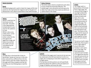
The document discusses the design elements of a magazine double page spread. It analyzes the use of color, including black for the background, white for text, light blue to draw attention to a band title, and yellow for separating columns. The layout is described as intriguingly at an angle rather than straight, and images are professionally taken and relevant to the article. The heading is placed centrally to attract readers, and the overall design aims to be aesthetically pleasing and balanced between images and text.
Report
Share
Report
Share

Recommended
Double page spread research
This document summarizes the layout, colors, fonts, and images used in magazine spreads about various artists. For Nicki Minaj's spread, pink, black and white are used with her image as the focal point. The text wraps around her shape. For an artist described as emo, casual colors and messy hair are featured to portray her style. An indie musician is pictured plainly to suggest an ordinary persona. Jay-Z's spread uses bold fonts and red to draw readers in, with his serious image conveying his dedication to music.
Analyses of double page spreads
This document analyzes two page spreads from magazines. It summarizes four different spreads, noting key details about the color scheme, images, fonts, and layout in each. Color schemes emphasize themes like femininity, individuality, and danger. Images convey confidence, unpredictability, and emotionlessness. Fonts are used to draw attention and convey sophistication or casualness. Layouts follow conventions but sometimes feature unusual elements like large headings.
Task2
The document analyzes various design elements of magazine covers and pages, including their use of typography, layout, color, images, and language. It summarizes the typographic, color, image, and layout choices made for the cover of a music magazine featuring the band The White Stripes. These design elements are intended to identify the magazine's genre as rock/alternative and draw attention to the featured article about the band splitting up. It also summarizes the typographic, color, image, and layout elements of the magazine's contents page and a double-page feature article about musician Jake Bugg. Across all pages analyzed, the document discusses how the design reinforces the magazine's target demographic of younger readers interested in rock music
Magazine Cover and Contents
The student created a magazine cover and contents page with a cartoon theme to appeal to younger students. For the cover, they adjusted the brightness and contrast of an image, used a funky sans serif font, included an "L plate" icon relating to learning, and used bold colors. The contents page continued the cartoon theme with block blue, "L plate" icons, and smiling pictures to keep it cheerful.
Becky double page spread magazine analysis
This document analyzes and compares several double page spreads. It discusses elements like layout, use of images, colors, font, and space usage. Overall assessments are provided for each spread, noting what elements work well and could be improved. Some spreads use clear, interesting photos and fonts that are easy to read. Others are said to have boring, low quality photos and colors that don't blend well. The masthead, text size, and balance of elements vary across spreads, with some being more eye-catching and professionally designed than others.
3 dps
The DPS uses a dark colour scheme of red and black to match the topic of discussing Jay-Z, who is often seen wearing red. The mysterious image takes up half the page and shows Jay-Z covering his eyes with sunglasses. The basic fonts are not very attractive but suit the intended audience of Jay-Z fans. The layout places most of the text in two columns on the right side with the image on the left, including text overlaying the image to advertise the topic.
Music Magazine - Textual Analysis
This document analyzes the textual elements of several magazine covers and interior pages. It examines aspects like mastheads, fonts, images, colors and layouts and what they suggest about the target audiences and messages. For example, masculine fonts and colors on one cover aim it at men. Iconic images show importance, while casual poses portray approachability. Cluttered covers entice readers with many stories. Overall, the analysis considers visual design choices and what they imply about the magazines' brands and intended readers.
Cohesion of images
All the images of 50 Cent in the XXL magazine follow a dark, moody tone to make the artist appear mysterious and intrigue audiences. The close-up shot on the front cover progresses to mid-shots and long shots on subsequent pages, representing the increasing information about 50 Cent as the camera moves further back. The same costume is worn throughout the images, showing cohesion and signaling the article will focus only on the artist. While the genre of music is not what the document author wants to pursue, the simplistic backgrounds and mysterious tone provide ideas to consider.
Textual analysis
The document provides an analysis of the cover of an indie magazine. It summarizes:
1. The main image is a close-up shot of a girl looking up with innocent expression. High key lighting and editing make her seem pure and happy to attract readers.
2. The magazine masthead is in the top left in a bold sans-serif font to make it prominent. The girl appears to be looking at the masthead to emphasize its importance.
3. There is one sell line "In Love with Daisy" in a stylish font to convey the personality of the band/singer and focus attention on the close-up image of the girl.
Front cover
The document evaluates two existing magazine covers. Both covers have the masthead in the top third and include a main storyline in the middle. One cover uses punctuation and smaller storylines around the page to engage readers, while the other includes different narratives and tabs to please everyone. Both clearly state the barcode, price and date and do not have a consistent color scheme.
Music Magazine - Textual Analysis
The document analyzes the design elements of various magazine covers. It discusses features like mastheads, primary and secondary stories, images, fonts, and colors. It notes how these elements are used differently on covers targeting different audiences to portray the publication and stories in a way that will attract readers and convey the right tone. Specific covers are examined to show how photographic style, text treatments, and other techniques help represent the topics and aim to engage audiences.
Music magazine Analysis
This document provides analysis of images and text from different music magazines. It discusses the main images of Katy Perry and Cheryl Cole, analyzing things like their facial expressions, positioning, use of lighting and how they are being used to attract both male and female audiences. It also summarizes the use of color, typography, layout, language and double page spreads in the magazines. Overall, it examines how symbolic and visual elements are strategically employed in the magazines to appeal to target demographics.
5 magazine double page spreads
The layout of the double page spread is simple yet effective. It draws the reader's attention to the large main image while also presenting the text in a balanced way. A consistent color theme of blue, black, and sepia tones is used throughout, helping to tie the design together while also making strategic use of color to highlight key elements like the text. Overall, the simple yet cohesive design successfully engages the reader with the image while also communicating the accompanying information in an accessible manner.
Magazine codes and connections for double page spread
This document summarizes magazine design conventions for double page spreads. It discusses key elements like the main image, dropped cap, headlines, columns, pull quotes, sidebars, page numbers, negative space, and color schemes. The main purpose of these elements is to guide the reader through the article in an aesthetically pleasing way and highlight important information to make the reader interested in the content. Proper use of design conventions allows the double page spread to effectively focus attention on the main topic.
Analysis for existing music magazines
1) Bold fonts, large images, and contrasting colors are used on magazine covers to attract attention and highlight key artists and stories.
2) Inside pages feature numerous images, simple fonts, and varying colors to engage readers while maintaining a cohesive style.
3) Cover images, taglines, and article previews are designed to draw in audiences and communicate the tone and content of the magazines.
front cover
Kate Bradford edited her film magazine front cover by following 30 steps. She cut out and used the main character's face from her film poster to create continuity. She added a grainy cloud background and erased corners of the photo to create a ripped effect. She then added the magazine title in bold red letters, the film's title and cover lines in different colors. After feedback, she adjusted colors, fonts, and layout to attract audiences and reduce negative space while following professional conventions.
Double Page Spread Analysis
The color scheme of the double page spread is mainly black, white and red. The main image takes up one whole page and shows half of Jay-Z's face lit by a red light and the other half by a blue/green light, possibly representing two sides of his persona. Unlike typical celebrity photos, Jay-Z has sunglasses on, possibly hiding something, and stares directly at the camera with a serious expression. The font is simple but contrasts with Jay-Z's serious demeanor in the photo. The layout clearly divides the image page from the text page.
Poster and Magazine Drafts
This document contains draft designs for a film poster and magazine cover for a movie called "Best Friends". It describes several iterations of designs for both the poster and magazine cover, with changes to images, layouts, fonts, and colors. The goal is to create eye-catching designs that advertise the movie and magazine contents effectively.
Magazine contents analysis
The document analyzes and compares the contents pages of two rock music magazines, Q and Kerrang!. It discusses their house styles, imagery, design balance, and symmetry. Q has a consistent masthead and color scheme featuring solo artists to appeal to a mature audience. Kerrang! features band members and a collage-like style to attract a younger demographic. Both magazines achieve horizontal balance and symmetry through strategic placement of images and text.
Contents Page and Double Page Spread
Both magazine contents pages use a mix of pictures and bold, colorful text to attract readers. ELLE's page features images of fashion and makeup alongside headlines of articles. Glamour's page uses a competition and quotes to engage readers. Both remind readers of the magazine name and use different colors to distinguish headings from body text. The pages provide a preview of the magazines' focuses on fashion, beauty, and celebrity to match their target audiences.
Double page analysis
The document analyzes the layout, design, and visual elements of a fashion article. It notes that the title draws attention with larger typography. Questions are distinguished from answers through different font colors. Paragraphs are arranged in columns with images alongside related text. Larger initial letters and varying font sizes emphasize important text. Color is used to highlight key information. The overall color scheme and use of direct address make the article seem formal and aimed at adults. The central photographic image engages the audience by demonstrating the article's content.
Double page spread
The document describes a double-page magazine spread focused on the artist Lady Gaga. The left page features a large greyscale image of Lady Gaga taking up the entire page. Her name is displayed prominently in differing fonts across both pages. The spread uses a limited color palette of black, white, grey and red to give it a classy, vintage appearance.
Homework double page spread 2
The double page magazine spread uses a dark color scheme of reds, blacks, and whites to match the horror genre of the story and television show "American Horror Story". The main image grabs attention with a bold, large picture featuring darkly dressed figures including someone in a scary mask. The design leads the eye to specific areas according to the Gutenberg principle, first to the top left primary optical area then to the other corners in a specific order. The headline indicates the band will discuss bad past events and relates to the popular horror television show. Pull quotes and a larger dropped cap first letter are used in the informal text containing some taboo language. The design has an informal balance with the full page image and writing on one
Poppy dps analysis 1
The document analyzes the design elements of a double page magazine spread. It discusses the colour scheme, images, fonts, and layout. The colour scheme uses consistent colours that provide a clean feel. The large main image and title fonts capture readers' attention. While the interview text is small and could lose readers, section headings in a different colour help break up the content. Overall, the design elements give the magazine a stylish, on-trend look and feel that matches the profiled music style.
Kerrang
This document summarizes the design elements used on the front cover and contents pages of a Kerrang magazine. The front cover uses a black and white color scheme with artist photos in grayscale to fit the theme. Coverlines are in contrasting colors like yellow and red to draw attention. The contents pages continue the color blocking with quotes in vibrant colors to hook readers. Photos of popular artists are prominently featured throughout to appeal to readers and promote articles. Consistent branding elements like the logo and masthead maintain recognition across pages.
Double page spread two
The document analyzes a magazine spread featuring Drake. It notes that using Drake's own words in the heading helps connect readers to the famous rap artist. Two large images of Drake are displayed to emphasize his importance as a well-known artist. The simple fonts and layout reinforce the casual, laid-back style of the magazine to make readers feel comfortable.
Adivina
Este documento contiene una serie de preguntas y respuestas destinadas a evaluar la inteligencia del lector. Las preguntas son engañosas y difíciles de responder rápidamente, y las respuestas insultan al lector si contesta incorrectamente. El objetivo parece ser molestar y humillar al lector más que evaluar sinceramente su inteligencia.
Presentation southernstork 2009-nov-southernworkshop
This document discusses data placement scheduling between distributed repositories. It introduces Stork, a batch scheduler for data placement activities that supports plug-in data transfer modules and scheduling of data movement jobs. The document discusses techniques used by Stork such as throttling concurrent transfers, fault tolerance, job aggregation, and adaptive tuning of data transfer protocols. It also covers topics like network reservation, failure awareness, and directions for future work including priority-based scheduling and advance resource reservation.
Egypt 2011
The document discusses the benefits of exercise for mental health. Regular physical activity can help reduce anxiety and depression and improve mood and cognitive function. Exercise causes chemical changes in the brain that may help protect against developing mental illness and improve symptoms for those who already suffer from conditions like anxiety and depression.
La Amistad
La amistad es un ensayo de 3 párrafos sobre la importancia de la amistad escrito por Wilson Paredes, un estudiante del 4to grado del Colegio Sudamericano.
More Related Content
What's hot
Textual analysis
The document provides an analysis of the cover of an indie magazine. It summarizes:
1. The main image is a close-up shot of a girl looking up with innocent expression. High key lighting and editing make her seem pure and happy to attract readers.
2. The magazine masthead is in the top left in a bold sans-serif font to make it prominent. The girl appears to be looking at the masthead to emphasize its importance.
3. There is one sell line "In Love with Daisy" in a stylish font to convey the personality of the band/singer and focus attention on the close-up image of the girl.
Front cover
The document evaluates two existing magazine covers. Both covers have the masthead in the top third and include a main storyline in the middle. One cover uses punctuation and smaller storylines around the page to engage readers, while the other includes different narratives and tabs to please everyone. Both clearly state the barcode, price and date and do not have a consistent color scheme.
Music Magazine - Textual Analysis
The document analyzes the design elements of various magazine covers. It discusses features like mastheads, primary and secondary stories, images, fonts, and colors. It notes how these elements are used differently on covers targeting different audiences to portray the publication and stories in a way that will attract readers and convey the right tone. Specific covers are examined to show how photographic style, text treatments, and other techniques help represent the topics and aim to engage audiences.
Music magazine Analysis
This document provides analysis of images and text from different music magazines. It discusses the main images of Katy Perry and Cheryl Cole, analyzing things like their facial expressions, positioning, use of lighting and how they are being used to attract both male and female audiences. It also summarizes the use of color, typography, layout, language and double page spreads in the magazines. Overall, it examines how symbolic and visual elements are strategically employed in the magazines to appeal to target demographics.
5 magazine double page spreads
The layout of the double page spread is simple yet effective. It draws the reader's attention to the large main image while also presenting the text in a balanced way. A consistent color theme of blue, black, and sepia tones is used throughout, helping to tie the design together while also making strategic use of color to highlight key elements like the text. Overall, the simple yet cohesive design successfully engages the reader with the image while also communicating the accompanying information in an accessible manner.
Magazine codes and connections for double page spread
This document summarizes magazine design conventions for double page spreads. It discusses key elements like the main image, dropped cap, headlines, columns, pull quotes, sidebars, page numbers, negative space, and color schemes. The main purpose of these elements is to guide the reader through the article in an aesthetically pleasing way and highlight important information to make the reader interested in the content. Proper use of design conventions allows the double page spread to effectively focus attention on the main topic.
Analysis for existing music magazines
1) Bold fonts, large images, and contrasting colors are used on magazine covers to attract attention and highlight key artists and stories.
2) Inside pages feature numerous images, simple fonts, and varying colors to engage readers while maintaining a cohesive style.
3) Cover images, taglines, and article previews are designed to draw in audiences and communicate the tone and content of the magazines.
front cover
Kate Bradford edited her film magazine front cover by following 30 steps. She cut out and used the main character's face from her film poster to create continuity. She added a grainy cloud background and erased corners of the photo to create a ripped effect. She then added the magazine title in bold red letters, the film's title and cover lines in different colors. After feedback, she adjusted colors, fonts, and layout to attract audiences and reduce negative space while following professional conventions.
Double Page Spread Analysis
The color scheme of the double page spread is mainly black, white and red. The main image takes up one whole page and shows half of Jay-Z's face lit by a red light and the other half by a blue/green light, possibly representing two sides of his persona. Unlike typical celebrity photos, Jay-Z has sunglasses on, possibly hiding something, and stares directly at the camera with a serious expression. The font is simple but contrasts with Jay-Z's serious demeanor in the photo. The layout clearly divides the image page from the text page.
Poster and Magazine Drafts
This document contains draft designs for a film poster and magazine cover for a movie called "Best Friends". It describes several iterations of designs for both the poster and magazine cover, with changes to images, layouts, fonts, and colors. The goal is to create eye-catching designs that advertise the movie and magazine contents effectively.
Magazine contents analysis
The document analyzes and compares the contents pages of two rock music magazines, Q and Kerrang!. It discusses their house styles, imagery, design balance, and symmetry. Q has a consistent masthead and color scheme featuring solo artists to appeal to a mature audience. Kerrang! features band members and a collage-like style to attract a younger demographic. Both magazines achieve horizontal balance and symmetry through strategic placement of images and text.
Contents Page and Double Page Spread
Both magazine contents pages use a mix of pictures and bold, colorful text to attract readers. ELLE's page features images of fashion and makeup alongside headlines of articles. Glamour's page uses a competition and quotes to engage readers. Both remind readers of the magazine name and use different colors to distinguish headings from body text. The pages provide a preview of the magazines' focuses on fashion, beauty, and celebrity to match their target audiences.
Double page analysis
The document analyzes the layout, design, and visual elements of a fashion article. It notes that the title draws attention with larger typography. Questions are distinguished from answers through different font colors. Paragraphs are arranged in columns with images alongside related text. Larger initial letters and varying font sizes emphasize important text. Color is used to highlight key information. The overall color scheme and use of direct address make the article seem formal and aimed at adults. The central photographic image engages the audience by demonstrating the article's content.
Double page spread
The document describes a double-page magazine spread focused on the artist Lady Gaga. The left page features a large greyscale image of Lady Gaga taking up the entire page. Her name is displayed prominently in differing fonts across both pages. The spread uses a limited color palette of black, white, grey and red to give it a classy, vintage appearance.
Homework double page spread 2
The double page magazine spread uses a dark color scheme of reds, blacks, and whites to match the horror genre of the story and television show "American Horror Story". The main image grabs attention with a bold, large picture featuring darkly dressed figures including someone in a scary mask. The design leads the eye to specific areas according to the Gutenberg principle, first to the top left primary optical area then to the other corners in a specific order. The headline indicates the band will discuss bad past events and relates to the popular horror television show. Pull quotes and a larger dropped cap first letter are used in the informal text containing some taboo language. The design has an informal balance with the full page image and writing on one
Poppy dps analysis 1
The document analyzes the design elements of a double page magazine spread. It discusses the colour scheme, images, fonts, and layout. The colour scheme uses consistent colours that provide a clean feel. The large main image and title fonts capture readers' attention. While the interview text is small and could lose readers, section headings in a different colour help break up the content. Overall, the design elements give the magazine a stylish, on-trend look and feel that matches the profiled music style.
Kerrang
This document summarizes the design elements used on the front cover and contents pages of a Kerrang magazine. The front cover uses a black and white color scheme with artist photos in grayscale to fit the theme. Coverlines are in contrasting colors like yellow and red to draw attention. The contents pages continue the color blocking with quotes in vibrant colors to hook readers. Photos of popular artists are prominently featured throughout to appeal to readers and promote articles. Consistent branding elements like the logo and masthead maintain recognition across pages.
Double page spread two
The document analyzes a magazine spread featuring Drake. It notes that using Drake's own words in the heading helps connect readers to the famous rap artist. Two large images of Drake are displayed to emphasize his importance as a well-known artist. The simple fonts and layout reinforce the casual, laid-back style of the magazine to make readers feel comfortable.
What's hot (18)
Magazine codes and connections for double page spread
Magazine codes and connections for double page spread
Viewers also liked
Adivina
Este documento contiene una serie de preguntas y respuestas destinadas a evaluar la inteligencia del lector. Las preguntas son engañosas y difíciles de responder rápidamente, y las respuestas insultan al lector si contesta incorrectamente. El objetivo parece ser molestar y humillar al lector más que evaluar sinceramente su inteligencia.
Presentation southernstork 2009-nov-southernworkshop
This document discusses data placement scheduling between distributed repositories. It introduces Stork, a batch scheduler for data placement activities that supports plug-in data transfer modules and scheduling of data movement jobs. The document discusses techniques used by Stork such as throttling concurrent transfers, fault tolerance, job aggregation, and adaptive tuning of data transfer protocols. It also covers topics like network reservation, failure awareness, and directions for future work including priority-based scheduling and advance resource reservation.
Egypt 2011
The document discusses the benefits of exercise for mental health. Regular physical activity can help reduce anxiety and depression and improve mood and cognitive function. Exercise causes chemical changes in the brain that may help protect against developing mental illness and improve symptoms for those who already suffer from conditions like anxiety and depression.
La Amistad
La amistad es un ensayo de 3 párrafos sobre la importancia de la amistad escrito por Wilson Paredes, un estudiante del 4to grado del Colegio Sudamericano.
Presentació ateneu web
Este documento describe los esfuerzos para crear un nuevo centro cultural comunitario (llamado "Ateneu") en Barcelona. Se han reunido más de 100 "bombillas" o miembros voluntarios hasta la fecha. El nuevo espacio de 300 metros cuadrados en la calle Enric Delaris tendrá varias salas para música, conferencias, proyecciones y más. El objetivo es que el centro sea autosuficiente a través de cuotas de socios y alquiler de espacios. Se pide la participación de más voluntarios y donaciones para hacer realidad este
One day when i grow up
We very seldom know about the supply chain in our high school career. Find out what careers you can pursue in the supply chain industry.
Photo shop
Adobe PhotoShop é um dos principais softwares de edição de imagens utilizados no Design Gráfico, permitindo a criação de efeitos visuais e montagens. O documento também fornece um link para um curso de Design Gráfico na escola Olimpio.
(Older) Quote of the Week by Stone Michaels
Colorful collection of poems passing through the heart and soul of our life journey’s darkest and brightest moments, showing that strength, heartache, love, courage, and most importantly sincerity, play an intimate experience to our destiny.
Make:Shift
The document discusses various topics related to creative processes including how to wrap eggs, the Eames Powers of Ten film, questions about knowing when a creative work is finished, and links to videos and a blog post by Les Bicknell about creative thinking.
Comas_Quinn_Barcelona2011
This document summarizes a presentation about LORO (Languages Open Resources Online), a repository for sharing open educational resources (OER) among language teachers at The Open University. LORO aims to facilitate collaboration and professional development by allowing teachers to find, reuse, and create shared teaching materials. A survey found that teachers view LORO as useful for finding resources and inspiration, but that increasing peer review and collaborative creation of resources could further support professional development. The presenter advocates for dedicating more time to workshops and collaborative evaluation to encourage participation in LORO.
Policy Paper Menuju Pemanfaatan Ruang Sumatera Selatan Yang Adil
Pandangan Masyarakat Sipil Sumatera Selatan Terhadap Pola
Pemanfaatan Ruang di Sumatera Selatan.
Aliansi Masyarakat Sipil untuk Tata Kelola Hutan & Lahan yang Baik di Sumsel.
WBH SUMSEL- WALHI SUMSEL- PINUS SUMSEL- FITRA SUMSEL – SPORA INSTITUTE
LBH PALEMBANG - IMPALM – AMAN SUMSEL- JMG SUMSEL – FKMPH SUSMEL – MHI SUMSEL – KOBAR9 - RIMBA INSTITUTE - DEPATI INSTITUTE - KHATULISTIWA HIJAU – KKDB BANYUASIN – FMS KIP BANYUASIN -PMP2D BANYUASIN - KPPM MUBA - LSM PBB MUBA – FORUM SILAMPARI MURA – LPLH MURA – YAYASAN BAKAU OKI – P3LH OKI – FORUM KONTAMINASI MUARA ENIM.
Africa diapo
La Comunidad Económica Africana (CEA) se estableció en 1991 para promover el desarrollo económico, social y cultural de África a través de la creación de zonas de libre comercio, uniones aduaneras y un mercado único. Actualmente incluye varias organizaciones regionales como la Comunidad Africana Oriental, la Unión Aduanera de África Austral y el Mercado Común de África Oriental y Austral, que reúnen a más de 20 países y buscan facilitar el comercio entre ellos a través de tratados de libre
Viewers also liked (20)
Presentation southernstork 2009-nov-southernworkshop
Presentation southernstork 2009-nov-southernworkshop
Policy Paper Menuju Pemanfaatan Ruang Sumatera Selatan Yang Adil
Policy Paper Menuju Pemanfaatan Ruang Sumatera Selatan Yang Adil
Similar to Double page spreads
Magazine analysis
This document analyzes the cover and contents page of three different magazines. For the first magazine, the cover uses light pink colours and a simple image of Katy Perry to appeal to women. The contents page has a more professional design with various images and sections of text. The second magazine cover features Adele in red, white and black colours to seem bold. The contents page continues this colour scheme and professional layout. The third magazine cover has Katy Perry in pink matching the background. Both pages prioritize the large central image with minimal other design elements or text to draw attention to the main story.
Music magazine analysis
The document analyzes the contents page of a magazine. It notes that the page is set out professionally with the contents list on the right side and sections divided by theme. While images are included, they do not detract from the main focus on the contents. The color scheme and layout make the page easy to read. However, there is no title indicating it is the contents page, which could cause confusion.
Music Magazine Analysis
The document analyzes the contents pages of several music magazines. It discusses the layout, images, colors and target audiences presented on each contents page. Key details analyzed include the positioning of images and text, color schemes used, and clues about the implied target demographics based on stylistic choices. The level of professionalism of the layout and how effectively the main focus is kept on the contents listing is also considered for each magazine analyzed.
Music magazine analysation
The document analyzes the contents page of a magazine. It notes that the page is set out professionally with the contents list on the right side and sections divided by theme. While images are included, they do not detract from the main focus on the contents. The color scheme and layout create an attractive yet readable page that would appeal to the magazine's target audience.
Music magazine analysation
The document analyzes the contents pages of four different music magazines. It discusses the layout, colors, images and target audiences presented on each contents page. Key details analyzed include the positioning of images and text, color schemes used, and clues about the intended readership based on the stylistic choices. The level of professionalism in the layout and the clarity or busyness of the page design is also considered for each magazine contents page.
Magazine analysis totp 1
The document provides details on the design elements of a magazine cover and contents page targeted towards teenage girls. The cover uses bright pinks, yellows and blues to create a happy, girly atmosphere. It features an image of One Direction to appeal to the target audience. The contents page continues the fun, quirky style through images and captions. It addresses the reader directly to make them feel special. The overall impression of both the cover and contents page is that the magazine is designed to interest teenage girls through topics like celebrities and boy bands.
Magazine analysis totp 1
The document provides an analysis of the design elements of a magazine cover and contents page. Key points analyzed include:
- The magazine cover uses bright colors like yellow and blue to draw attention to the main image of an artist making a comeback.
- The contents page is criticized for being too cluttered with writing and not clear or appealing for younger audiences.
- While an image on the contents spread of someone humorously dressed as Elvis appeals to younger readers, it is noted as not fitting the magazine's overall house style.
Suggestions are made to use bigger font for cover stories and improve the organization and clarity of the contents page. In summary, the document provides a critique of design and stylistic elements
magazine analysis
The document provides an analysis of the design elements of a magazine cover and contents page aimed at teenage girls. It discusses the use of bright colours and images of boy bands on the cover to attract readers. The contents page analysis highlights the fun, informal tone created through images of the bands and captions. Overall both pages are assessed as effectively appealing to the interests of the target audience through their use of popular artists and an engaging design.
Codes and conventions
The document discusses techniques used in magazine design and layout to attract and engage readers. Close-up shots are used to draw attention to faces and expressions. Bold fonts, mastheads, and taglines are employed to attract attention. Color schemes appeal to target demographics. Minimalistic layouts do not overload readers with text. Direct addresses and intriguing images and text encourage emotional connections and provoke curiosity to learn more.
Codes and conventions
The document discusses various codes and conventions used in magazine design. It provides examples of techniques used to attract readers' attention and engage them, such as bold fonts, direct eye contact in images, minimalistic layouts, and intriguing language. Color schemes, image sizes, and text positioning are also described as ways to emphasize important information and guide the reader through the magazine. The goal of these design elements is to draw readers in, satisfy their curiosity, and ultimately increase sales.
Market analysis hjgj
The document provides an analysis of magazine design elements including the front cover, masthead, images, headlines, plugs, pull quotes, and barcodes. It examines how these elements are used on sample magazine covers and interior pages to attract readers' attention, highlight key stories and artists, and encourage readers to learn more by purchasing or subscribing to the magazine. Specific techniques analyzed include the use of bright colors, bold fonts, close-up portraits of popular musicians, secondary images and quotes, and informational "plugs" to preview content. The document seeks to understand how magazine layout, images, and text are designed to effectively promote stories and engage audiences.
Magazine annotations
This document summarizes the key design features of two double page magazine spreads. The first spread uses techniques like pull quotes, bold text, large headline and images to draw attention to important information. Columns separate information neatly and drop caps highlight paragraph starts. The second spread also uses bold text, large images and colored text to emphasize certain elements. Photos across the top provide context and the layout aims to attract a young audience with fashionable representations.
Task two detailed analysis of music magazine (1)
The document discusses the typography, layout, color, images, language, and conventions used in various pages of a Rolling Stones magazine issue. For the cover, both serif and sans serif fonts are used to appeal to both male and female readers. The layout follows standard conventions and uses route of the eye. Neutral colors are used for the background with red and white text. The main image is a close-up of the featured artist. The contents page uses serif fonts and unconventional layout but standard colors and images. The article page features sans serif fonts and dark colors with a full-body image to convey masculinity and the genre of rock music. Standard conventions are generally followed throughout.
Task two detailed analysis of music magazine (1)
The document summarizes the typography, layout, color, images, language, and conventions used across several pages in a Rolling Stones magazine issue. Serif and sans serif fonts are used to appeal to both male and female readers. The layout employs the route of the eye and is professionally organized. Neutral colors are used for the background with red and white text to make the text stand out. Images focus closely on artists to portray them as powerful but glamorous. Language is casual but intellectual to engage older audiences. Conventions include consistent branding elements and design choices suited to the magazine's mixed genre.
Number 3
The magazine cover uses bold blue and pink colors to attract both male and female readers. The main image is of Kanye West looking directly at the camera against a dull background to draw attention. Lighting is used to make the image and text stand out while creating a mysterious mood. Cover lines in pink, blue, and black down the right side advertise the magazine's contents while following the formal house style.
Tasks 1 4 and hwk 2
The document analyzes the design elements of a rock music magazine cover and contents pages. It discusses the typography, colors, images, layout, and language used on the different pages. Serif fonts in bold are used on the cover to draw attention, with a variety of sizes. Blacks and reds set a dark, angry mood. Images feature rock artists. The formal layout guides the eye across important elements. The same design conventions carry through the contents pages to maintain a consistent brand identity that positions the magazine for its target audience of teenage rock fans.
Textual analysis
The document provides an analysis of the design elements of two music magazines: NME and The Fly. For NME, the summary discusses the neutral colors with pops of color, structured yet messy layout, and use of images that relate to stories. For The Fly, the summary notes the bold black title and splash of orange, simple yet effective layout and design, and close-up images that create a personal feel. In both magazines, the design elements are analyzed as effectively appealing to the target audiences through an casual yet informative style.
Powerpoint 3
This document analyzes the layout and design elements of a magazine double page spread. It discusses how the large central bleeding image is used to attract readers' attention and set the scene for the article. Short snippets of text, blown up quotes, and different fonts and colors are employed to entice readers to learn more without overwhelming them with lengthy text. Visual elements like people, instruments, and logos depicted in the images help readers connect with the topics and genres covered in the magazine.
Double page spread analysis (main task)
The document analyzes the layout, design elements, and stylistic choices used across multiple double page spreads in a magazine. Most spreads follow a conventional layout with a large photo on one page and text on the other to create familiarity for readers. Colors, fonts, and focal elements are designed to attract the target teenage/young adult audience and build reader engagement through quotes, headlines and images placed in prominent positions within the spreads.
Similar to Double page spreads (20)
More from Jessy Baker
As it is
As It Is is a pop-punk band from America that has gained popularity in the UK. Their target audience is likely ages 16-19, as they aim to connect with a devoted but similar fan base rather than a larger and more varied audience. The music video narrative depicts a young boy acting out the daily routine of an adult job he is miserable with. He rebels against it by throwing things and screaming. At the end, his reflection shows an older boy, representing how youth today are forced to take on adult responsibilities too early.
Pink
P!nk's music video for "So What" portrays her rebelling against a breakup by engaging in rebellious acts like driving a lawn mower on the road and cutting down trees. The video follows her through the emotional stages of a relationship ending, portraying relatable feelings in a humorous way that makes viewers sympathize with and laugh at her actions. The genre blends pop and rock styles to appeal to a wide target audience from ages 15-16 and up.
One
MKTO's music video for "God Only Knows" follows the band members Malcolm Kelley and Tony Oller as they become obsessed with a game called "God Only Knows." They hide and fight over the game throughout their day, to the point that it falls out a window and gets run over. When a replacement game arrives, they again struggle to possess it. The video targets teenage girls through its portrayal of the band members as an "American boy band" and focuses on themes of friendship, gaming, and rebelling against responsibilities of work or adulthood.
Final Evaluation
Our media product uses conventions of real music videos such as having an easy to follow narrative, lyrics that correlate with visuals, close ups, and point of view shots. It challenges conventions by having an unconventional unhappy ending and not including typical "live band" shots. Feedback was generally positive about the story, editing, and characters, but suggested limiting fast/slow motion and point of view shots. New media technologies used included cameras, Google Maps, Survey Monkey, Photoshop, and WordPress for research, planning, production, and evaluation.
Survey
The survey results provide useful information for creating a music video that will appeal to Smash Mouth's target audience:
- The audience was evenly split between male and female, allowing the video to relate to both genders. Most respondents were between 17-21 years old, matching the band's demographic.
- YouTube was the most common platform for viewing music videos, so releasing the video on YouTube will provide broad accessibility.
- Rock, indie, and pop were the most popular music styles, aligning with the band's style. Parody/comedy was the highest liked narrative, matching the group's initial idea.
- Respondents had a relaxed attitude and said they would enjoy the video
Survey
The survey results provide useful information for creating a music video that will appeal to Smash Mouth's target audience:
- The audience was evenly split between male and female, allowing the video to relate to both genders. Most respondents were between 17-21 years old, matching the band's demographic.
- The most common platforms for viewing music videos were YouTube and streaming services, so the video will be posted to YouTube for broad accessibility.
- Rock, indie, and pop were the most popular music styles, confirming the band's style. Parody/comedy was the highest liked narrative, matching the group's initial comedic idea.
- Respondents had a relaxed attitude and said they
Survey
The survey results provide useful information for creating a music video that will appeal to Smash Mouth's target audience:
- The audience was evenly split between male and female, allowing the video to relate to both genders. Most respondents were between 17-21 years old, matching the band's core demographic.
- YouTube was the most popular platform for viewing music videos, so releasing the video on YouTube will give the widest audience reach.
- Rock, indie, and pop music were the most popular genres, aligning with the band's style. Parody/comedy and including subtle lyric links were also highly liked themes.
- Respondents had a relaxed attitude towards music video content and
Pres
The film crew had to reschedule shooting to a later date because they did not get enough footage on their initial trip, so they went back out to film additional shots they had missed previously to fill the required space. Rescheduling took time to arrange a new date when the whole crew and their subject George were all available again, so it put them slightly behind in filming.
Smash Mouth
Smash Mouth is an American rock band formed in 1994 consisting of 4 original members. Their most successful song is "All Star" released in 1999, which is upbeat, catchy and their most well-loved. Their music has been described as alternative rock, ska punk, surf rock and pop rock. They are best known for their albums "All Star" and "Astro Lounge" and their music video for "All Star" which humorously relates to the song lyrics through unusual costumes, characters and locations.
Risk Assessments
PetrolStation is a business that sells fuel and other automotive products. Located on Main Street in a small town, PetrolStation has been operating for over 30 years. It offers gasoline, diesel, oil, and other car care items to local residents and travelers passing through the area.
Evaluation
The document discusses how the student's media product uses and develops conventions of real music magazines. Specifically, it replicates features of magazines like Kerrang! such as the slanted cover line and placement of the masthead behind the band image on the front cover. The color scheme represents the chosen music genres. While maintaining conventions, the student also challenges some, such as using unprofessional band photos taken with a white background instead of on location. The student learned various technologies like Photoshop and Blogger in constructing the magazine.
Evaluation
The document discusses the key differences between the student's college magazine and their music magazine. While the college magazine lacked quality and detail, it provided a starting point. Creating the music magazine required adhering to conventions of music magazines like Kerrang and Rock Sound. Technologies like Photoshop were used to professionalize the look. Market research helped inform magazine details. Overall, the student learned skills in layout, design, photography and content that will benefit their future media work.
Evaluation
The document discusses the differences between the author's college magazine and their music magazine. They learned a significant amount about technologies like Photoshop and how to design a magazine to appeal to a target audience. While the college magazine lacked quality, it provided a starting point. Creating the music magazine required adhering to conventions of music magazines while adding unique elements. Market research was also important to understand the target readership. Overall, the author gained valuable skills in magazine design, technologies, and audience analysis through creating the two magazines.
Magazine analysis
The document analyzes three music magazines: Kerrang!, Rock Sound, and Alternative Press. For Kerrang!, it notes its large market share and popularity boosted by social media sharing. Rock Sound has a median age of 21 and aims for a younger audience of 15-24 year olds, especially females. Alternative Press has a wider age range and aims more for males, using masculine colors. All three magazines thrive on fans sharing content online and aim to maintain relevance through up-to-date content and developing relationships with readers.
Photograph planning
This document provides planning details for the photography of various album covers and magazine spreads. For the front cover, it recommends a medium shot of Pink at eye level without props to focus on her rock style. For the contents, it suggests showing Paramore on a rural property in casual rock outfits with a piano to indicate their music. It also recommends a long shot of model Thalia in a rock-inspired casual outfit on a plain studio background without props. For the double page spread, it proposes a medium shot of The Veronica's sisters looking directly at the camera in dark outfits with makeup and jewelry on a gradient white backdrop without props.
Photograph planning
This document provides planning details for the photography of various album covers and magazine spreads. For the front cover, it recommends a medium shot of Pink at eye level without props to focus on her rock and roll style. For the contents, it suggests photographing Paramore in casual clothing at a rural location with a piano to emphasize their original music. It also recommends a long shot of Thalia in a rock-inspired outfit in a studio without props. For the double page spread, it proposes a medium shot of The Veronics sisters in dark outfits with makeup and jewelry in a studio against a white gradient without props.
More from Jessy Baker (16)
Recently uploaded
Amazing and On Point - Ramon Ray, USA TODAY
Amazing and On Point - Ramon Ray, USA TODAYDigiMarCon - Digital Marketing, Media and Advertising Conferences & Exhibitions
The Future of ''Digital marketing'' .pptx
Digital marketing leverages digital channels such as SEO, content marketing, social media, PPC, and email to promote products or services. It includes affiliate and influencer marketing, mobile strategies, and online PR. Marketing automation helps streamline efforts, while analytics guide data-driven decisions. The objective is to engage target audiences, drive conversions, and build brand loyalty by reaching customers in the digital spaces they frequent.The future of digital marketing will be driven by advancements in artificial intelligence (AI) for personalized content and customer service, and the rise of voice search optimization due to smart speakers. Video content, especially short-form videos, will continue to dominate, while augmented reality (AR) and virtual reality (VR) will enhance customer experiences. Emphasis on data privacy and compliance will grow, alongside the need for seamless omnichannel marketing. Blockchain technology will offer secure digital advertising, and sustainability will become a key focus. With the advent of 5G technology, faster mobile internet will enable new innovations, and advanced personalization will deliver highly relevant content to users.
Embark on style journeys Indian clothing store denver guide.pptx
Finding the perfect "Indian Clothing Store Denver" is essential for those seeking vibrant, authentic, and culturally rich attire in the heart of Colorado. Denver, a city known for its diverse culture and eclectic fashion scene, offers a variety of options for those in search of traditional and contemporary Indian clothing. Whether you're preparing for a wedding, festival, or cultural event, or simply wish to incorporate the elegance and beauty of Indian fashion into your wardrobe, discovering the right store can make all the difference.
Story Telling Master Class - Jennifer Morilla
Story Telling Master Class - Jennifer MorillaDigiMarCon - Digital Marketing, Media and Advertising Conferences & Exhibitions
The Strategic Impact of Storytelling in the Age of AI
In the grand tapestry of marketing, where algorithms analyze data and artificial intelligence predicts trends, one essential thread remains constant — the timeless art of storytelling. As we stand on the precipice of a new era driven by AI, join me in unraveling the narrative alchemy that transforms brands from mere entities into captivating tales that resonate across the digital landscape. In this exploration, we will discover how, in the face of advancing technology, the human touch of a well-crafted story becomes not just a marketing tool but the very essence that breathes life into brands and forges lasting connections with our audience.Mastering The Best Restaurant Advertising Campaigns Detailed Guide
A guide for making the Best Restaurant Advertising Campaigns with demographics, data analytics, and digital advertising for measurable results.
Get Off the Bandwagon - Separating Digital Marketing Myths from Truth - Scott...
Get Off the Bandwagon - Separating Digital Marketing Myths from Truth - Scott...DigiMarCon - Digital Marketing, Media and Advertising Conferences & Exhibitions
Conferences like DigiMarCon provide ample opportunities to improve our own marketing programs by learning from others. But just because everyone is jumping on board with the latest idea/tool/metric doesn’t mean it works – or does it? This session will examine the value of today’s hottest digital marketing topics – including AI, paid ads, and social metrics – and the truth about what these shiny objects might be distracting you from.
Key Takeaways:
- How NOT to shoot your digital program in the foot by using flashy but ineffective resources
- The best ways to think about AI in connection with digital marketing
- How to cut through self-serving marketing advice and engage in channels that truly grow your businessEfficient Website Management for Digital Marketing Pros
Learn how to optimize website projects, leverage SEO tactics effectively, and implement product-led marketing approaches for enhanced digital presence and ROI.
This session is your key to unlocking the secrets of successful digital marketing campaigns and maximizing your business's online potential.
Actionable tactics you can apply after this session:
- Streamlined Website Management: Discover techniques to streamline website development, manage day-to-day operations efficiently, and ensure smooth project execution.
- Effective SEO Practices: Gain valuable insights into optimizing your website for search engines, improving visibility, and driving organic traffic to your digital assets.
- Leverage Product-Led Marketing: Explore strategies for incorporating product-led marketing principles into your digital marketing efforts, enhancing user engagement and driving conversions.
Don't miss out on this opportunity to elevate your digital marketing game and achieve tangible results!
Assignment 2 Task 1: Digital Marketing Course
How Consumers Use Technology And Its Impact On Their Lives
How to Maximize Sales Using Social Commerce
Discover the best practices and strategies on using social commerce to grow your business and drive sales.
Luxury Hanloom Saree Brand ,Capstone Project_Kiran Bansal.pdf
Capstone Project: Luxury Handloom Saree Brand
As part of my college project, I applied my learning in brand strategy to create a comprehensive project for a luxury handloom saree brand. Key aspects of this project included:
- *Competitor Analysis:* Conducted in-depth competitor analysis to identify market position and differentiation opportunities.
- *Target Audience:* Defined and segmented the target audience to tailor brand messages effectively.
- *Brand Strategy:* Developed a detailed brand strategy to enhance market presence and appeal.
- *Brand Perception:* Analyzed and shaped the brand perception to align with luxury and heritage values.
- *Brand Ladder:* Created a brand ladder to outline the brand's core values, benefits, and attributes.
- *Brand Architecture:* Established a cohesive brand architecture to ensure consistency across all brand touchpoints.
This project helped me gain practical experience in brand strategy, from research and analysis to strategic planning and implementation.
Boost Your Instagram Views Instantly Proven Free Strategies.pptx
Join Performance Car Exclusive to drive the finest supercars, engineered with advanced materials and cutting-edge technology for peak performance.
https://instblast.com/instagram/free-instagram-views
Boost Your Instagram Views Instantly Proven Free Strategies.
Supercars use advanced materials and tech for top-speed performance. Join Performance Car Exclusive to experience driving excellence.
https://instblast.com/instagram/free-instagram-views
How to Make Your Trade Show Booth Stand Out
Unlock the secrets to creating a standout trade show booth with our comprehensive guide from Blue Atlas Marketing! This presentation is packed with essential tips and innovative strategies to ensure your booth attracts attention, engages visitors, and drives business success. Whether you're a seasoned exhibitor or a first-timer, these expert insights will help you maximize your impact and make a memorable impression in a crowded exhibition hall. Learn how to:
Design an eye-catching and inviting booth
Incorporate interactive elements that engage visitors
Use effective branding and visuals to reinforce your message
Plan your booth layout for maximum traffic flow
Implement technology to enhance the visitor experience
Create memorable experiences that leave a lasting impression
Transform your trade show presence with these proven tactics and ensure your booth stands out from the competition. Download the PDF now and start planning your next successful exhibit!
原版制作(Sunderland毕业证书)桑德兰大学毕业证录取通知书一模一样
学校原件一模一样【微信:741003700 】《(Sunderland毕业证书)桑德兰大学毕业证》【微信:741003700 】学位证,留信认证(真实可查,永久存档)原件一模一样纸张工艺/offer、雅思、外壳等材料/诚信可靠,可直接看成品样本,帮您解决无法毕业带来的各种难题!外壳,原版制作,诚信可靠,可直接看成品样本。行业标杆!精益求精,诚心合作,真诚制作!多年品质 ,按需精细制作,24小时接单,全套进口原装设备。十五年致力于帮助留学生解决难题,包您满意。
本公司拥有海外各大学样板无数,能完美还原。
1:1完美还原海外各大学毕业材料上的工艺:水印,阴影底纹,钢印LOGO烫金烫银,LOGO烫金烫银复合重叠。文字图案浮雕、激光镭射、紫外荧光、温感、复印防伪等防伪工艺。材料咨询办理、认证咨询办理请加学历顾问Q/微741003700
【主营项目】
一.毕业证【q微741003700】成绩单、使馆认证、教育部认证、雅思托福成绩单、学生卡等!
二.真实使馆公证(即留学回国人员证明,不成功不收费)
三.真实教育部学历学位认证(教育部存档!教育部留服网站永久可查)
四.办理各国各大学文凭(一对一专业服务,可全程监控跟踪进度)
如果您处于以下几种情况:
◇在校期间,因各种原因未能顺利毕业……拿不到官方毕业证【q/微741003700】
◇面对父母的压力,希望尽快拿到;
◇不清楚认证流程以及材料该如何准备;
◇回国时间很长,忘记办理;
◇回国马上就要找工作,办给用人单位看;
◇企事业单位必须要求办理的
◇需要报考公务员、购买免税车、落转户口
◇申请留学生创业基金
留信网认证的作用:
1:该专业认证可证明留学生真实身份
2:同时对留学生所学专业登记给予评定
3:国家专业人才认证中心颁发入库证书
4:这个认证书并且可以归档倒地方
5:凡事获得留信网入网的信息将会逐步更新到个人身份内,将在公安局网内查询个人身份证信息后,同步读取人才网入库信息
6:个人职称评审加20分
7:个人信誉贷款加10分
8:在国家人才网主办的国家网络招聘大会中纳入资料,供国家高端企业选择人才
SEO in the AI Era - Trust, Quality and Content Discovery - Andy Crestodina
SEO in the AI Era - Trust, Quality and Content Discovery - Andy CrestodinaDigiMarCon - Digital Marketing, Media and Advertising Conferences & Exhibitions
We’ve entered a new era in digital. Search and AI are colliding, in more ways than one. And they all have major implications for marketers.
• SEOs now use AI to optimize content.
• Google now uses AI to generate answers.
• Users are skipping search completely. They can now use AI to get answers. So AI has changed everything …or maybe not. Our audience hasn’t changed. Their information needs haven’t changed. Their perception of quality hasn’t changed. In reality, the most important things haven’t changed at all. In this session, you’ll learn the impact of AI. And you’ll learn ways that AI can make us better at the classic challenges: getting discovered, connecting through content and staying top of mind with the people who matter most. We’ll use timely tools to rebuild timeless foundations. We’ll do better basics, but with the most advanced techniques. Andy will share a set of frameworks, prompts and techniques for better digital basics, using the latest tools of today. And in the end, Andy will consider - in a brief glimpse - what might be the biggest change of all, and how to expand your footprint in the new digital landscape.
Key Takeaways:
How to use AI to optimize your content
How to find topics that algorithms love
How to get AI to mention your content and your brandFrom Hope to Despair The Top 10 Reasons Businesses Ditch SEO Tactics.pptx
From Hope to Despair: The Top 10 Reasons Businesses Ditch SEO Tactics
Are you tired of seeing your business's online visibility plummet from hope to despair? When it comes to SEO tactics, many businesses find themselves grappling with challenges that lead them to abandon their strategies altogether. In a digital landscape that's constantly evolving, staying on top of SEO best practices is crucial to maintaining a competitive edge.
In this blog, we delve deep into the top 10 reasons why businesses ditch SEO tactics, uncovering the pain points that may resonate with you:
1. Algorithm Changes: The ever-changing algorithms can leave businesses feeling like they're chasing a moving target. Search engines like Google frequently update their algorithms to improve user experience and provide more relevant search results. However, these updates can significantly impact your website's visibility and ranking if you're not prepared.
2. Lack of Results: Investing time and resources without seeing tangible results can be disheartening. The absence of immediate results often leads businesses to lose faith in their SEO strategies. It's important to remember that SEO is a long-term game that requires patience and consistent effort.
3. Technical Challenges: From site speed issues to complex metadata implementation, technical hurdles can be daunting. Overcoming these challenges is crucial for SEO success, as technical issues can hinder your website's performance and user experience.
4. Keyword Competition: Fierce competition for top keywords can make it hard to rank effectively. Businesses often struggle to find the right balance between targeting high-traffic keywords and finding less competitive, niche keywords that can still drive significant traffic.
5. Lack of Understanding of SEO Basics: Many businesses dive into the complex world of SEO without fully grasping the fundamental principles. This lack of understanding can lead to several issues:
Keyword Awareness: Failing to recognize the importance of keyword research and targeting the right keywords in content.
On-Page Optimization: Ignorance regarding crucial on-page elements such as meta tags, headers, and content structure.
Technical SEO Best Practices: Overlooking essential aspects like site speed, mobile responsiveness, and crawlability.
Backlinks: Not understanding the value of high-quality backlinks from reputable sources.
Analytics: Failing to track and analyze data prevents businesses from optimizing their SEO efforts effectively.
6. Unrealistic Expectations and Timeframe: Entrepreneurs often fall prey to the allure of quick fixes and overnight success. Unrealistic expectations can overshadow the reality of the time and effort needed to see tangible results in the highly competitive digital landscape. SEO is a long-term strategy, and setting realistic goals is crucial for success.
#SEO #DigitalMarketing #BusinessGrowth #OnlineVisibility #SEOChallenges #BostonSEO
Data-Driven Personalization - Build a Competitive Advantage by Knowing Your C...
Data-Driven Personalization - Build a Competitive Advantage by Knowing Your C...DigiMarCon - Digital Marketing, Media and Advertising Conferences & Exhibitions
Data-Driven Personalization: Build a Competitive Advantage by Knowing Your Customers Better Than Your CompetitionMindfulness Techniques Cultivating Calm in a Chaotic World.pptx
In today’s fast-paced world, stress and anxiety have become common companions for many. With constant connectivity and an unending stream of information, finding moments of peace can seem like an insurmountable challenge. However, mindfulness techniques offer a beacon of calm amidst the chaos, helping individuals to center themselves and find balance. These practices, rooted in ancient traditions and supported by modern science, are accessible to everyone and can profoundly impact mental and emotional well-being.
Global Growth Starts With Translation - How To Unlock Global Markets - Tim Kirby
Global Growth Starts With Translation - How To Unlock Global Markets - Tim KirbyDigiMarCon - Digital Marketing, Media and Advertising Conferences & Exhibitions
Did you know that while 50% of content on the internet is in English, English only makes up 26% of the world’s spoken language? And yet 87% of customers won’t buy from an English only website.
Uncover the immense potential of communicating with customers in their own language and learn how translation holds the key to unlocking global growth. Join Smartling CEO, Bryan Murphy, as he reveals how translation software can streamline the translation process and seamlessly integrate into your martech stack for optimal efficiency. And that's not all – he’ll also share some inspiring success stories and practical tips that will turbocharge your multilingual marketing efforts!
Key takeaways:
1. The growth potential of reaching customers in their native language
2. Tips to streamline translation with software and integrations to your tech stack
3. Success stories from companies that have increased lead generation, doubled revenue, and more with translationRecently uploaded (20)
Embark on style journeys Indian clothing store denver guide.pptx
Embark on style journeys Indian clothing store denver guide.pptx
Mastering The Best Restaurant Advertising Campaigns Detailed Guide
Mastering The Best Restaurant Advertising Campaigns Detailed Guide
Get Off the Bandwagon - Separating Digital Marketing Myths from Truth - Scott...
Get Off the Bandwagon - Separating Digital Marketing Myths from Truth - Scott...
Efficient Website Management for Digital Marketing Pros
Efficient Website Management for Digital Marketing Pros
Learn more about affiliate marketing as a beginner
Learn more about affiliate marketing as a beginner
Luxury Hanloom Saree Brand ,Capstone Project_Kiran Bansal.pdf
Luxury Hanloom Saree Brand ,Capstone Project_Kiran Bansal.pdf
Boost Your Instagram Views Instantly Proven Free Strategies.pptx
Boost Your Instagram Views Instantly Proven Free Strategies.pptx
Boost Your Instagram Views Instantly Proven Free Strategies.
Boost Your Instagram Views Instantly Proven Free Strategies.
SEO in the AI Era - Trust, Quality and Content Discovery - Andy Crestodina
SEO in the AI Era - Trust, Quality and Content Discovery - Andy Crestodina
From Hope to Despair The Top 10 Reasons Businesses Ditch SEO Tactics.pptx
From Hope to Despair The Top 10 Reasons Businesses Ditch SEO Tactics.pptx
Data-Driven Personalization - Build a Competitive Advantage by Knowing Your C...
Data-Driven Personalization - Build a Competitive Advantage by Knowing Your C...
Mindfulness Techniques Cultivating Calm in a Chaotic World.pptx
Mindfulness Techniques Cultivating Calm in a Chaotic World.pptx
Global Growth Starts With Translation - How To Unlock Global Markets - Tim Kirby
Global Growth Starts With Translation - How To Unlock Global Markets - Tim Kirby
Double page spreads
- 1. MAIN COLOURS: Black; The black background is used to make the image and the text stand out, this represents the magazine well as the genre of Rocksound is rock, which is presented as loud, bold and dark. Colour Scheme; The entire colour scheme compliments each other its very simple but extremely affective. The double page is very attractive and enticing as the editor has made certain lines stand out which are used to draw in the reader. White; White is used here for text boxes and the text itself, the white is the opposing tone to black which is very easy for the audience to read. White is also a very subtle colour, so the use of having a calmer colour for the text against the aggressive image and layout ensures that the reader isn’t too intimidated by the whole page. Blue; The light blue in the band title ‘A Day To Remember’ stands out most as it is the only blue used and has a different font, this has been used to catch the readers attention to the page and if they recognise and like the band they are most likely going to read this article. Layout; The layout of the pages aren’t neat at all, the text may be columned to the left hand side but its still on an angle, this is intriguing as most other magazines use a straight layout. The text box and title positions are still specifically placed to please the audience, they just express an image of rebellion and messy life style. Image; The image used is a group photo of the band from a high angle, the contrast of the image is very high to blend the photo into the colour scheme of white and black, this is very affective as it conveys the professionalism of the double page. The image represents the band as loud and bold, this is accurate to how the band wants to be seen. The theme of the image and the layout of the double page both work together as they have the same theme. The picture itself is taken affectively, they’ve got it from a high angle to ensure that every member is seen and is part of the page. The facial expressions represent each member in an aggressive way but may also come across as joking and fun, as some members don’t actually look angry at all just shouting expressively.
- 2. FONT: Bold, Old fashioned, stereotypical, slim. Eye line matches ‘ADELE’ personal? Looks hand written, giving a personal account again. Adele- strong, bold, curvy. No direct eye contact, secrecy? Darkness? Facial expression: Shock? She doesn’t look happy, maybe its her emotions towards her secrets being revealed? Hair: her hair is quite messy, this may represent a rough maybe even masculine quality to her? Or could be due to modern fashion so she’s been styled to look modern and fashionable. COLOURS: Black: bold, dark, hidden; secret? Eye makeup, strong, brave. (OPPOSITES) (Grey, complimentry) White: clean, dignity, pure, idyllic, gentle, feminine. Grey: mid tone, dark, dull, sad?, doesn’t reduce from other bold colours, a filler, shadows. Dropped caps; Start of a story, grabs readers attention, ‘I’ personal account. IMAGE: Aesthetically pleasing, attractive, Photoshop. Simple yet perfect makeup; femininity, idyllic, ideal woman, male gaze? Not revealing anything yet still beautiful and will appeal to men, they may have to be a fan of Adele to read the article but the image is still attractive. Dimple in chin: childish, imperfection, stands out quite a lot where as in other images her dimple has been removed, she’s realistic.
- 3. IMAGES: MAIN COLOURS; The images here are very relevant and interesting, they represent the band from many different angles, some shots are posed and others are more natural during conversation; this allows the reader to feel as though they are with the people and feel involved in the article rather than having limited images that are facing away from the reader or are all posed. The images also link with the text which is necessary, if they weren’t relevant then they would seem pointless and confuse the reader. Yellow; Yellow is used to lighten up the page, giving it a fun bright feel. Using such a bold colour draws the readers attention, especially if other pages are fairly dark. Most of the yellow is used for separating columns or used for headlines. LAYOUT: The layout of this double page spread is made to appeal to the human eye, it is neat and clean making it attractive and come across as sensible rather than if they had text boxes and images on a slant or slightly out of proportion. The images surround the text but don’t take away from the importance, they are both equally balanced and both just as exciting and intriguing as the other. HEADING: The significance of having the heading placed almost central to the left hand page where there is limited text instantly draws in the readers attention. Also, the fact that the headline is so uncommon and almost taboo language will attract the reader and make them read more as they would want to find out more on why they deliberately used this wording to describe or quote the article. White; The white is mainly used as text box fill on this double page, using white instead of something darker such as black or grey gives the page a bright feel and brings out the white in the backgrounds of the images. COLUMNS: The columns are laid out to be aesthetically pleasing for the reader as they are aligned sensibly and are ordered into different sections for different subjects in cluded in the article. They have used a dropped cap ‘T’ to point out to the reader where the text begins. Also the different sections are easy to identify due to the yellow textbox’s that separate them.