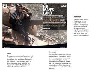
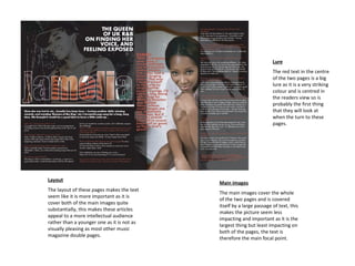
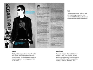
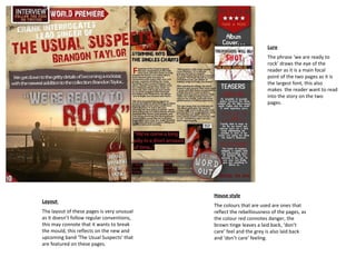
The document analyzes the layout, design elements, and stylistic choices used across multiple double page spreads in a magazine. Most spreads follow a conventional layout with a large photo on one page and text on the other to create familiarity for readers. Colors, fonts, and focal elements are designed to attract the target teenage/young adult audience and build reader engagement through quotes, headlines and images placed in prominent positions within the spreads.