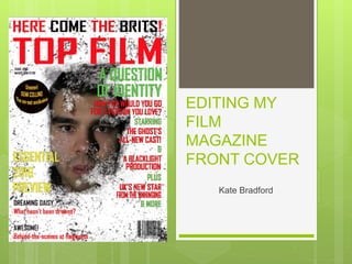
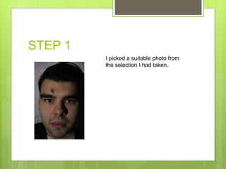
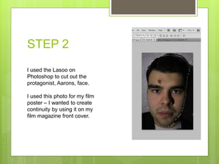
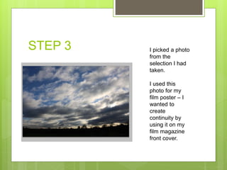
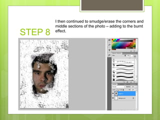
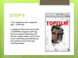
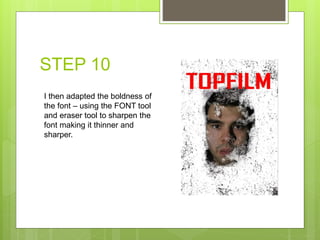
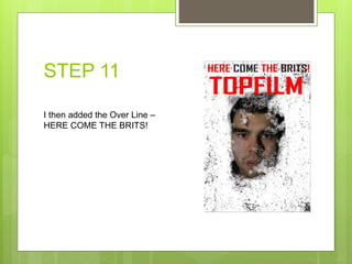
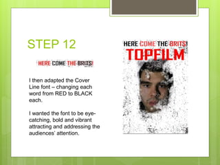
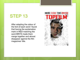
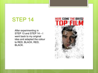
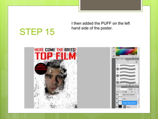
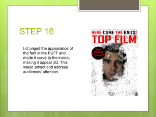
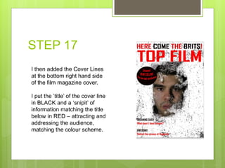
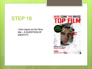
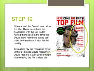
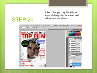
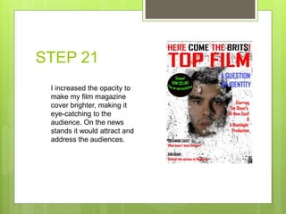
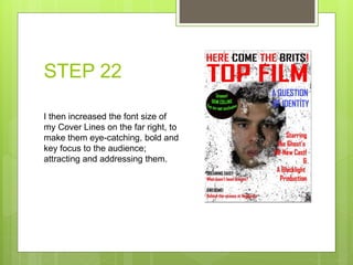
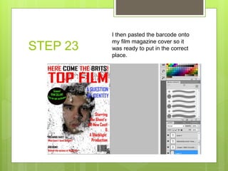
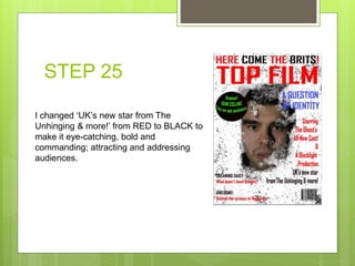
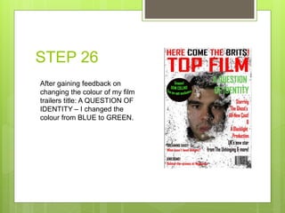
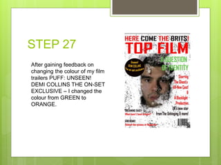
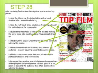
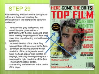
Kate Bradford edited her film magazine front cover by following 30 steps. She cut out and used the main character's face from her film poster to create continuity. She added a grainy cloud background and erased corners of the photo to create a ripped effect. She then added the magazine title in bold red letters, the film's title and cover lines in different colors. After feedback, she adjusted colors, fonts, and layout to attract audiences and reduce negative space while following professional conventions.
2. STEP 1
I picked a suitable photo from
the selection I had taken.
3. STEP 2
I used the Lasoo on
Photoshop to cut out the
protagonist, Aarons, face.
I used this photo for my film
poster – I wanted to create
continuity by using it on my
film magazine front cover.
4. STEP 3 I picked a photo
from the
selection I had
taken.
I used this
photo for my
film poster – I
wanted to
create
continuity by
using it on my
film magazine
front cover.
5. STEP 4
I altered the opacity of the photo by
using the Transform > Opacity tool on
EDIT.
6. STEP 5
After trying to copy
the sky photo
used in ‘STEP 4’
and the photo
turning blurry and
losing resolution –
I found it easier to
create a
background my
self.
I used the paint brush and stippling tool on the right hand side
menu. I created ‘cloud’ effects across the page to create a
grainy, irregular and smudgy effect.
7. STEP 6
I the pasted the photo in ‘STEP 1’ and
pasted it onto the background made in
‘STEP 5’.
8. STEP 7
I then used the Eraser tool and smudged/erased the
corners of the photos, creating a ripped and broken
effect. I thought this followed the genre codes and
conventions by creating jeopardy and suspense – as if
the protagonist, Aaron, is being suspected as a criminal
and questioned over his identity.
This follows my film trailers genre and storyline.
9. STEP 8
I then continued to smudge/erase the corners and
middle sections of the photo – adding to the burnt
effect.
10. STEP 9
I then added my film magazine
title – TOPFILM.
I wanted to follow the same style
as EMPIRE magazine with big,
bold red writing stretching over
the top middle section of the front
cover; attracting and addressing
the audience due to the eye-
catching design.
11. STEP 10
I then adapted the boldness of
the font – using the FONT tool
and eraser tool to sharpen the
font making it thinner and
sharper.
12. STEP 11
I then added the Over Line –
HERE COME THE BRITS!
13. STEP 12
I then adapted the Cover
Line font – changing each
word from RED to BLACK
each.
I wanted the font to be eye-
catching, bold and vibrant
attracting and addressing the
audiences’ attention.
14. STEP 13
After adapting the colour of
the font of each word I found
that having the exclamation
mark in RED matching the
word BRITS made them
merge together and almost
disappear against the film
magazines’ title.
15. STEP 14
After experimenting in
STEP 13 and STEP 14 – I
went back to my original
idea and adapted the colour
to RED, BLACK, RED,
BLACK.
16. STEP 15
I then added the PUFF on the left
hand side of the poster.
17. STEP 16
I changed the appearance of
the font in the PUFF and
made it curve to the inside,
making it appear 3D. This
would attract and address
audiences’ attention.
18. STEP 17
I then added the Cover Lines
at the bottom right hand side
of the film magazine cover.
I put the ‘title’ of the cover line
in BLACK and a ‘snipit’ of
information matching the title
below in RED – attracting and
addressing the audience,
matching the colour scheme.
19. STEP 18
I then typed out the films
title – A QUESTION OF
IDENTITY.
20. STEP 19
I then added the Cover Lines below
the title. These cover lines are
associated with the film trailer;
having them close to the films title
would allow readers to easily see
them and associate it with the film
quickly.
By reading my film magazine cover
in the ‘S’ method would mean they
would read the Cover Lines straight
after reading the film trailers title.
21. STEP 20
I then changed my film title to
eye-catching blue to attract and
address my audience.
22. STEP 21
I increased the opacity to
make my film magazine
cover brighter, making it
eye-catching to the
audience. On the news
stands it would attract and
address the audiences.
23. STEP 22
I then increased the font size of
my Cover Lines on the far right, to
make them eye-catching, bold and
key focus to the audience;
attracting and addressing them.
24. STEP 23
I then pasted the barcode onto
my film magazine cover so it
was ready to put in the correct
place.
25. STEP 24
I added my last cover line
‘UK’s new star from The
Unhinging & more!’ above the
barcode.
26. STEP 25
I changed ‘UK’s new star from The
Unhinging & more!’ from RED to BLACK to
make it eye-catching, bold and
commanding; attracting and addressing
audiences.
27. STEP 26
After gaining feedback on
changing the colour of my film
trailers title: A QUESTION OF
IDENTITY – I changed the
colour from BLUE to GREEN.
28. STEP 27
After gaining feedback on
changing the colour of my film
trailers PUFF: UNSEEN!
DEMI COLLINS THE ON-SET
EXCLUSIVE – I changed the
colour from GREEN to
ORANGE.
29. STEP 28
After receiving feedback on the negative space around my
poster:
• I made the title of my film trailer bolder with a black
shadow effect around the lettering.
• I made the Puff black circle smaller as it was impacting on
the main photo of the protagonist.
• I adjusted the mast head to line up with the title making
the cover lines, title, mast head and Plug vertically lined
up.
• I added my films slogan under the title so it had continuity
with my film poster.
• I added another cover line to attract and address my
audience – equally covering unwanted negative space.
• I added a cover issue, cover date and price to match
professional codes and conventions.
• I decreased the negative space in between the cover lines
and highlighted the joining words such as ‘plus’ or ‘&’ in
green to signal to the audience that it has a connection
with the film trailer.
30. STEP 29
After receiving feedback on the background
colour and features impacting the
effectiveness of the background colour on
audiences’:
1. I removed the grey background and
turned it a pale green colour –
contrasting with the red, black and green
them, making the protagonists’ face and
cover lines pop attracting and addressing
audiences.
2. I reduced the size of the black Plug
making it less obtrusive next to the face.
3. I add black shadowing around the left
hand side of the protagonists face to
make his head appear less isolated on
the page, reducing the negative space –
matching the right hand side of the face
– making him appear bolder,
commanding and dominant in the centre
of the page.