SlideShare a Scribd company logo
Colour: Bright pinks yellows & blue’s are
used as they are eye-catching, they standout
and the create a happy and girly atmosphere
which connects with the target audience. They
are inviting colours which make the reader
want to see inside.

Design: The image is of One Direction which the
target audience (teenage girls) are completely
obsessed with. The puff is linked to the image
using the buzz word ‘WIN’, this will make the
reader want to win the t-shirts because they are
associated with One Direction. Also capital letters
are used for cover lines to convey that that is the
most important information on the cover. The
word ‘unleashed’ creates excitement making the
readers want to find out more. They use informal
lexis e.g. “phew” – this is associated with the
target audience and creates a humorous friendly
inviting atmosphere.

Images: The main image is of One Direction, these boys
attract the reader because they are seen as attractive and
girls desperately want to meet them. This also links to the
main story, you are getting to know them so the readers
feel on a more personal level. There is also images of the
poster which are included inside, therefore if the reader
wants that poster they will buy the magazine.

The use of words: The ‘1D UNLEASHED’
suggests the interest of the readers because they
want to know more about them. This is big enough
to read from a distance so it is the first thing you
notice therefore being the most important focus.

Language: The word ‘outrageous’
associated with Union J has connotations
that something bad has happened and there
is gossip, the readers will want to read the
magazine to find out what the boy band has
done. I cannot see any language
features, therefore to improve I would add
an onomatopoeia word to grab the
attention even more.

Impression: The cover gives a really good
impression of what’s inside because there’s stories with
1D etc. It is designed to appeal to the readers interests
by using boy bands which girls appear to be obsessed
with.

Pose, style, hair, makeup: The poses of the models
are all happy and cheeky which creates a fun and happy
mood. They are very fashionable, it is what the target
audience would want boys their age to wear so therefore
is appealing. In addition all of the hair is different, this
could create an opinion where the reader chooses which
one they prefer which again creates a more personal
level. Their skin is clear which highlights their ‘perfection’.

Institution: Immediate Media Company
publish this magazine, they publish all BBC
related magazines. This magazine would be
distributed in most newsagents and big
supermarkets.
I do not think they have made it very
clear that it is the contents page because
the word ‘contents’ is in plain black and
white contrasting to all the other colours
going on around.
They have added a picture of the
front cover to analyse, this is a great
skill because then if you only want
to find one thing on the front cover
then it gives you a direct page
number to go to, therefore it makes
it quick, simple and easy which is
incredibly useful for the target
audience.
The images appeal to the
reader, the magazine has
images of what the reader
might buy when they are out
shopping, this conveys that
they are representing the
reader.

There is an editor’s note which
addressed the readers, it is very
informal by using the language
‘hey’ and ‘love’ – also we know
that the target audience is girls
as it has now been said. This is
accompanied by an image to
create a more personal level. In
addition, the language used is
very personal with the word
‘your’ – it makes the reader feel
special as it is ‘theirs’.
A puff has been included in the
contents page, about loving boys.
This challenges conventions as these
are normally only found on the front
cover. However I think this is
effective because it fits in with the
style and design on the magazine.

The overall impression of this contents page is very fun and quirky, it would not appeal to
boys because stereotypically they do not love all the gossip and boy information. In
addition older people would not be interested either because it is all very new and
upcoming modern information about teenagers themselves.
They have used a landscape
picture rather than all
portrait here, this is to
make the magazine more
interesting so not
everything is the same. The
gutter separating the image
is all equal and quite large, I
think this is good because it
spaces everything out and
makes it seem bigger and
bolder therefore more eyecatching. They have
obviously used a flat plan to
work of the dimensions.

The spot colour theme for
this double page spread is
red, this is a bright friendly
colours which attracts
attention.

It is mainly dominated
by pictures, this is
because the target
audience doesn’t want
to read loads and load of
writing, they would
rather have illustrations
to look at with quirky
captions.
Funny captions are used to add humour and
create a light hearted atmosphere. This
double page spread is mainly about mocking
celebrities, this is very humorous and the
reader feels on a personal level with them. It
isn’t a serious topic which portrays that this
isn’t a serious corporate magazine.

The overall impression of this double page
spread is that it is designed for people who
are celebrity mad and like to keep up to
date with that world, but not only the good
news, the funny news too. This draws in
readers because the artists and celebrities
are representing them.

‘AWKWARD’ grabs the
attention of the reader, they
are interested to find out
what is so awkward? It makes
them read on and become
engaged in the magazine.
Colour: The red background connotes to
blood which is associated with ‘emos’ which
is the target audience. The yellow connotes
to dangerous which is possibly how they like
to be perceived. The cover gives off a dark
mysterious mood which reflects the target
audience. The masthead is yellow which is
harsh on the eyes but grabs your attention
and stands out.
Design: ‘Bite’ is symbolised by the two
Rottweiler's with their mouths open, these
have connotations of danger which interests
the reader. The capital letters grab the
attention of the reader, it highlights the
importance and interests the reader.
Images: The Of mice and men band member
has tattoos, this could represents what the
reader would like to aspire to be like.
Image: Again the Rottweiler’s symbolise risk
and danger which is how emos like to be
perceived.
The main image is a long
shot, this is challenging conventions because
it is normally a medium close up, however it
works as he is a slim, well groomed man.
Pose, style, hair and makeup: The pose of the
model is camp and he is protected by dogs
which are seen as scary. One image is of a
man screaming, this could be foreshadowing
that the information inside the magazine is
about screamo.

Words: ‘PANIC’ makes you want to know
what the problem is so the reader will turn
the page and read the magazine to find
out therefore this is a very effective
technique. ‘BITE’ connotes to snap, feisty,
dangerous, this could be the image the
target audience is trying to portray. The
cover lines are very big, they would
definitely be able to be read from a
distance, you are then drawn into the
smaller text. The colour’s of red and yellow
makes the magazine stand on a shelf.
Language techniques: This magazine
contains alliteration: “fights, fury and
future” this creates a fun and quirky feel.
‘PANIC’ grabs attention, it seems like there
is something cool and catching to read
inside.
Overall Impression: There is a good
indication of what is inside because the
cover lines are specific. All apart form
‘panic’ which makes you think there is
something exciting but it is just about a
band. It is designed for punk rock people,
the bands represent the readers interests.
Stereotypically young girls and the elderly
would not be interested because it is not
their genre and nothing interests them.
Institution: Bauer media group publishes
this in London, they also publish Q.
Colour: The main colour theme of yellow and
red is carried through to the contents
page, the titles are yellow and page numbers
red, I think this is a good consistency and
creates a theme and house style. The
background is white which could be
perceived as boring however I think this
works well because if it was a bright colour
there would be too much going on, however
if it was a pastel colour it wouldn’t fit in with
the overall impression of the magazine.

Images: The theme of danger is continued
through
the
picture
of
the
Rottweiler, however there are glasses added
on to add humour to it. All images are
landscape or square, this is because it fits
with the house style and fits to the flat plans
dimensions.

Pose, style, hair, make-up: The middle image
conveys a singer (Kellin) performing, this is
used to attract the readers because that is
the sort of concert/gig they would go to. The
main image at the top of the page has direct
eye contact, this brings it down to a personal
level to the reader. It gives the impression
that they too want you to read the magazine.

Words: I think if you know the magazine and
regularly subscribe then you would know
where the contents page is, also the use of
the white writing on the black background
contrasts and stands out. However I think it
is on the wrong side of the page, it is not the
first thing you look at.

Language: On the image of Kellin it has a
caption “Kellin’s nipple was a little cold” –
this is mocking him but not in a nasty way
because he is a favourite artist. However it
would appeal to the humour of the readers.
This is colloquial language which represents
the target audience.

Overall impression: The overall impression
gives a good indication to what is inside
because it includes the bands which have
stories, articles, interviews and pictures
inside. It appeals to the same target
audience as the front cover. I would make the
gradients a little smaller so it is not so spaced
out to make it look a little more brought
together. On the other hand I think the
consistency of the colours, images and house
style add to the overall feel.
Design: The words ‘hearts’ and ‘souls’ really stand
out, they have connotations of desire, love and
happiness. This could be the feeling which the band are
trying to spread to the reader. These words fit with the
images because they look passionate. The fact that the
words heart and soul stand out so much shows that that
is what it is all really about.
Images & pose, style, hair, make-up: the band members
are all pulling weird faces, this is to symbolise their
individuality. In addition the image represents the ideal
that the target reader would like to aspire too, especially
young males who want tattoos, they could be inspired by
this photo. The men are seen as attractive to the female
audience so dressing them in tight clothing (far left)
appeals to them.

Colour: Again the colour is consistent, the reds and yellows and been
transferred through to create this feel of a house style. Also the colours are
effective on the page because the picture is all dull colours so you are instantly
drawn to the bright colours which makes you read the headline.

Language: Again the headline is the only thing which
grabs the attention of the reader due to the colours and
the boldness. In addition there is a puff which I think is
situated in the correct place because it is related to the
image and text.
Overall impression: The font is the biggest attention
seeking item on this page, the font type compliments the
type of band that they are as well.
This magazine has been published since marsh 1952, it was Britain's
best selling music magazine during the seventies and it is still very
popular. It mainly features on indie/rock bangs, for example Arctic
Monkeys, the target audience is young adults and teens.
The main image is relevant to the main cover line, he is dressed quite
smartly which could represent that he is trying to look cool and trendy
as it is his comeback and he wants to make a good impression.

The colours are mainly simple and corporate except the origami
birds, they are yellow and blue which draws attention to him, they
could symbolise his success. The colours of the birds also link to the
colour of the text which creates a good house style.
The design is bold and clear so it can be easily understood, the
important information is underlined. I think to improve the front cover
they should have used bigger font for the cover stories to attract more
attention.
The Contents page is not very good, it is very cluttered because you
don’t know what is going on or where to look. It does not appeal to
young people because there is too much writing. I think the image on
the double page spread is good because it appeal to the younger
audience with humour (a person dressed as Elvis Presley), however I do
not think this fits in with the addressed house style.

More Related Content

What's hot

Front cover analysis
Front cover analysisFront cover analysis
Front cover analysisbhatty97
 
Contents page analysis
Contents page analysisContents page analysis
Contents page analysisbhatty97
 
Music Magazine Analysis
Music Magazine Analysis Music Magazine Analysis
Music Magazine Analysis
elenafulea
 
C1 a2
C1 a2C1 a2
C1 a2
Neill Ford
 
Analysing music magazine 2
Analysing music magazine 2Analysing music magazine 2
Analysing music magazine 2
Mariah Loizou
 
Magazine research
Magazine researchMagazine research
Magazine research
amy foster
 
Unit 13 LO1
Unit 13 LO1Unit 13 LO1
Unit 13 LO1
Ldowley
 
Evaluation
EvaluationEvaluation
Evaluation
charliemae1999
 
Contents Page Analysis
Contents Page Analysis Contents Page Analysis
Contents Page Analysis
Shauna-Mullen
 
Front Cover Analysis 1
Front Cover Analysis 1Front Cover Analysis 1
Front Cover Analysis 1
KirstyMaeHarragan
 
How my magazine appeals to the target audience
How my magazine appeals to the target audienceHow my magazine appeals to the target audience
How my magazine appeals to the target audienceJoshd96
 
Contents Page Analysis
Contents Page AnalysisContents Page Analysis
Contents Page Analysis
Shauna-Mullen
 
Research into roducts
Research into roducts Research into roducts
Research into roducts paris12346
 
Front Cover Analysis
Front Cover AnalysisFront Cover Analysis
Front Cover Analysisrebeccadahl98
 
Media evaluation proper
Media evaluation properMedia evaluation proper
Media evaluation properasmediaellie
 
Double pages spread analysis one
Double pages spread analysis oneDouble pages spread analysis one
Double pages spread analysis one
KirstyMaeHarragan
 

What's hot (19)

Front cover analysis
Front cover analysisFront cover analysis
Front cover analysis
 
Contents page analysis
Contents page analysisContents page analysis
Contents page analysis
 
Music Magazine Analysis
Music Magazine Analysis Music Magazine Analysis
Music Magazine Analysis
 
C1 a2
C1 a2C1 a2
C1 a2
 
Music Analysis
Music Analysis Music Analysis
Music Analysis
 
Analysing music magazine 2
Analysing music magazine 2Analysing music magazine 2
Analysing music magazine 2
 
Magazine research
Magazine researchMagazine research
Magazine research
 
One.
One.One.
One.
 
Unit 13 LO1
Unit 13 LO1Unit 13 LO1
Unit 13 LO1
 
Evaluation
EvaluationEvaluation
Evaluation
 
Contents Page Analysis
Contents Page Analysis Contents Page Analysis
Contents Page Analysis
 
Front Cover Analysis 1
Front Cover Analysis 1Front Cover Analysis 1
Front Cover Analysis 1
 
How my magazine appeals to the target audience
How my magazine appeals to the target audienceHow my magazine appeals to the target audience
How my magazine appeals to the target audience
 
Contents Page Analysis
Contents Page AnalysisContents Page Analysis
Contents Page Analysis
 
Research into roducts
Research into roducts Research into roducts
Research into roducts
 
Front Cover Analysis
Front Cover AnalysisFront Cover Analysis
Front Cover Analysis
 
Media evaluation proper
Media evaluation properMedia evaluation proper
Media evaluation proper
 
Appealing to ta
Appealing to taAppealing to ta
Appealing to ta
 
Double pages spread analysis one
Double pages spread analysis oneDouble pages spread analysis one
Double pages spread analysis one
 

Viewers also liked

Boletín de prensa n° 33. la casa gerontológica “dejando huellas” presente en ...
Boletín de prensa n° 33. la casa gerontológica “dejando huellas” presente en ...Boletín de prensa n° 33. la casa gerontológica “dejando huellas” presente en ...
Boletín de prensa n° 33. la casa gerontológica “dejando huellas” presente en ...alcaldia municipal
 
Agenda #7
Agenda #7Agenda #7
Mekanisme bsd
Mekanisme bsd Mekanisme bsd
Mekanisme bsd
El Gala
 
Much last reflection
Much last reflectionMuch last reflection
Much last reflection
Mica Much
 
Diseño de llanta posterior de motocicleta
Diseño de llanta posterior de motocicletaDiseño de llanta posterior de motocicleta
Diseño de llanta posterior de motocicletaAlex Montero
 
Instructions and Requirements for Agribusiness Grant Application-HIMALI
Instructions and Requirements for Agribusiness Grant Application-HIMALI Instructions and Requirements for Agribusiness Grant Application-HIMALI
Instructions and Requirements for Agribusiness Grant Application-HIMALI
Agrifood Consulting International
 
06.potere e genere
06.potere e genere06.potere e genere
06.potere e genere
Sofia Venturoli
 
2012 jan pelaksanaan interaksi kuliah ppg semester ii-2012
2012 jan pelaksanaan interaksi kuliah ppg semester ii-20122012 jan pelaksanaan interaksi kuliah ppg semester ii-2012
2012 jan pelaksanaan interaksi kuliah ppg semester ii-2012Holoman Halimunan
 
Sam smith Profile
Sam smith ProfileSam smith Profile
Sam smith Profile
erinnicolematherhoward
 
Boletín150413
Boletín150413Boletín150413
Boletín150413
Openbank
 
Ds 160 form mandatory worldwide
Ds 160 form mandatory worldwideDs 160 form mandatory worldwide
Ds 160 form mandatory worldwide
Nachman Phulwani Zimovcak (NPZ) Law Group, P.C.
 
Auszug präsentation lenz
Auszug präsentation lenzAuszug präsentation lenz
Auszug präsentation lenzDAVID MALAM
 
Le baromètre Metronews LCI du changement dans l'action politique - Par Opinio...
Le baromètre Metronews LCI du changement dans l'action politique - Par Opinio...Le baromètre Metronews LCI du changement dans l'action politique - Par Opinio...
Le baromètre Metronews LCI du changement dans l'action politique - Par Opinio...
OpinionWay
 
13 April Daily technical trader
13 April Daily technical trader13 April Daily technical trader
13 April Daily technical traderQNB Group
 
Agenda #9
Agenda #9Agenda #9
20131018誠品敦南深夜講座 後猩猩時代:綠色游擊你的心
20131018誠品敦南深夜講座 後猩猩時代:綠色游擊你的心20131018誠品敦南深夜講座 後猩猩時代:綠色游擊你的心
20131018誠品敦南深夜講座 後猩猩時代:綠色游擊你的心YenWei Zheng
 

Viewers also liked (18)

Boletín de prensa n° 33. la casa gerontológica “dejando huellas” presente en ...
Boletín de prensa n° 33. la casa gerontológica “dejando huellas” presente en ...Boletín de prensa n° 33. la casa gerontológica “dejando huellas” presente en ...
Boletín de prensa n° 33. la casa gerontológica “dejando huellas” presente en ...
 
Etapasdesarrollosoftware
EtapasdesarrollosoftwareEtapasdesarrollosoftware
Etapasdesarrollosoftware
 
Agenda #7
Agenda #7Agenda #7
Agenda #7
 
Mekanisme bsd
Mekanisme bsd Mekanisme bsd
Mekanisme bsd
 
Much last reflection
Much last reflectionMuch last reflection
Much last reflection
 
Diseño de llanta posterior de motocicleta
Diseño de llanta posterior de motocicletaDiseño de llanta posterior de motocicleta
Diseño de llanta posterior de motocicleta
 
Instructions and Requirements for Agribusiness Grant Application-HIMALI
Instructions and Requirements for Agribusiness Grant Application-HIMALI Instructions and Requirements for Agribusiness Grant Application-HIMALI
Instructions and Requirements for Agribusiness Grant Application-HIMALI
 
06.potere e genere
06.potere e genere06.potere e genere
06.potere e genere
 
2012 jan pelaksanaan interaksi kuliah ppg semester ii-2012
2012 jan pelaksanaan interaksi kuliah ppg semester ii-20122012 jan pelaksanaan interaksi kuliah ppg semester ii-2012
2012 jan pelaksanaan interaksi kuliah ppg semester ii-2012
 
Sam smith Profile
Sam smith ProfileSam smith Profile
Sam smith Profile
 
Boletín150413
Boletín150413Boletín150413
Boletín150413
 
Ds 160 form mandatory worldwide
Ds 160 form mandatory worldwideDs 160 form mandatory worldwide
Ds 160 form mandatory worldwide
 
Auszug präsentation lenz
Auszug präsentation lenzAuszug präsentation lenz
Auszug präsentation lenz
 
Le baromètre Metronews LCI du changement dans l'action politique - Par Opinio...
Le baromètre Metronews LCI du changement dans l'action politique - Par Opinio...Le baromètre Metronews LCI du changement dans l'action politique - Par Opinio...
Le baromètre Metronews LCI du changement dans l'action politique - Par Opinio...
 
13 April Daily technical trader
13 April Daily technical trader13 April Daily technical trader
13 April Daily technical trader
 
Agenda #9
Agenda #9Agenda #9
Agenda #9
 
20131018誠品敦南深夜講座 後猩猩時代:綠色游擊你的心
20131018誠品敦南深夜講座 後猩猩時代:綠色游擊你的心20131018誠品敦南深夜講座 後猩猩時代:綠色游擊你的心
20131018誠品敦南深夜講座 後猩猩時代:綠色游擊你的心
 
Perdarahan hamil muda
Perdarahan hamil mudaPerdarahan hamil muda
Perdarahan hamil muda
 

Similar to magazine analysis

Magazine analysis of top of the pops
Magazine analysis of top of the popsMagazine analysis of top of the pops
Magazine analysis of top of the pops
denirose17
 
Analysing 3 magazine covers
Analysing 3 magazine coversAnalysing 3 magazine covers
Analysing 3 magazine covers
black-bird
 
Analysis finished
Analysis finishedAnalysis finished
Analysis finished
chloegedge95
 
Analysing music magazine
Analysing music magazineAnalysing music magazine
Analysing music magazine
Izzy Albutt
 
Double page spread overview
Double page spread overviewDouble page spread overview
Double page spread overviewbhatty97
 
Question 5 how did you attract
Question 5  how did you attractQuestion 5  how did you attract
Question 5 how did you attract
10afrmal
 
Contents page analysis 2
Contents page analysis 2Contents page analysis 2
Contents page analysis 2
Levita123
 
Task 2,3
Task 2,3Task 2,3
Task 2,3akii786
 
Task four - target audience appeal
Task four - target audience appealTask four - target audience appeal
Task four - target audience appeal
LoisSmith97
 
Music magazine analysis
Music magazine analysisMusic magazine analysis
Music magazine analysis
BethanyPhilippa
 
Music magazine analysation
Music magazine analysationMusic magazine analysation
Music magazine analysationBethanyPhilippa
 
Music magazine analysation
Music magazine analysationMusic magazine analysation
Music magazine analysationBethanyPhilippa
 
Front Page Magazine Analysis
Front Page Magazine Analysis Front Page Magazine Analysis
Front Page Magazine Analysis
tiastubbs
 
Music Magazine Research
Music Magazine ResearchMusic Magazine Research
Music Magazine Researchasiyam
 
Task3 smash hits analysis
Task3 smash hits analysisTask3 smash hits analysis
Task3 smash hits analysisdenhamj1
 
Q5. Attract and Address
Q5. Attract and AddressQ5. Attract and Address
Q5. Attract and Address
Oliver Midgley
 

Similar to magazine analysis (20)

Magazine analysis of top of the pops
Magazine analysis of top of the popsMagazine analysis of top of the pops
Magazine analysis of top of the pops
 
Analysing 3 magazine covers
Analysing 3 magazine coversAnalysing 3 magazine covers
Analysing 3 magazine covers
 
Analysis finished
Analysis finishedAnalysis finished
Analysis finished
 
LIIAR
LIIARLIIAR
LIIAR
 
Analysing music magazine
Analysing music magazineAnalysing music magazine
Analysing music magazine
 
Double page spread overview
Double page spread overviewDouble page spread overview
Double page spread overview
 
As media – evaluation 5
As media – evaluation 5As media – evaluation 5
As media – evaluation 5
 
Question 5 how did you attract
Question 5  how did you attractQuestion 5  how did you attract
Question 5 how did you attract
 
Contents pageanalysis wlp
Contents pageanalysis  wlpContents pageanalysis  wlp
Contents pageanalysis wlp
 
Contents page analysis 2
Contents page analysis 2Contents page analysis 2
Contents page analysis 2
 
Task 2,3
Task 2,3Task 2,3
Task 2,3
 
Task four - target audience appeal
Task four - target audience appealTask four - target audience appeal
Task four - target audience appeal
 
Music magazine analysis
Music magazine analysisMusic magazine analysis
Music magazine analysis
 
Music Magazine Analysis
Music Magazine AnalysisMusic Magazine Analysis
Music Magazine Analysis
 
Music magazine analysation
Music magazine analysationMusic magazine analysation
Music magazine analysation
 
Music magazine analysation
Music magazine analysationMusic magazine analysation
Music magazine analysation
 
Front Page Magazine Analysis
Front Page Magazine Analysis Front Page Magazine Analysis
Front Page Magazine Analysis
 
Music Magazine Research
Music Magazine ResearchMusic Magazine Research
Music Magazine Research
 
Task3 smash hits analysis
Task3 smash hits analysisTask3 smash hits analysis
Task3 smash hits analysis
 
Q5. Attract and Address
Q5. Attract and AddressQ5. Attract and Address
Q5. Attract and Address
 

Recently uploaded

Коричневый и Кремовый Деликатный Органический Копирайтер Фрилансер Марке...
Коричневый и Кремовый Деликатный Органический Копирайтер Фрилансер Марке...Коричневый и Кремовый Деликатный Органический Копирайтер Фрилансер Марке...
Коричневый и Кремовый Деликатный Органический Копирайтер Фрилансер Марке...
ameli25062005
 
一比一原版(MMU毕业证书)曼彻斯特城市大学毕业证成绩单如何办理
一比一原版(MMU毕业证书)曼彻斯特城市大学毕业证成绩单如何办理一比一原版(MMU毕业证书)曼彻斯特城市大学毕业证成绩单如何办理
一比一原版(MMU毕业证书)曼彻斯特城市大学毕业证成绩单如何办理
7sd8fier
 
Book Formatting: Quality Control Checks for Designers
Book Formatting: Quality Control Checks for DesignersBook Formatting: Quality Control Checks for Designers
Book Formatting: Quality Control Checks for Designers
Confidence Ago
 
Can AI do good? at 'offtheCanvas' India HCI prelude
Can AI do good? at 'offtheCanvas' India HCI preludeCan AI do good? at 'offtheCanvas' India HCI prelude
Can AI do good? at 'offtheCanvas' India HCI prelude
Alan Dix
 
Design Thinking Design thinking Design thinking
Design Thinking Design thinking Design thinkingDesign Thinking Design thinking Design thinking
Design Thinking Design thinking Design thinking
cy0krjxt
 
White wonder, Work developed by Eva Tschopp
White wonder, Work developed by Eva TschoppWhite wonder, Work developed by Eva Tschopp
White wonder, Work developed by Eva Tschopp
Mansi Shah
 
CA OFFICE office office office _VIEWS.pdf
CA OFFICE office office office _VIEWS.pdfCA OFFICE office office office _VIEWS.pdf
CA OFFICE office office office _VIEWS.pdf
SudhanshuMandlik
 
一比一原版(Bolton毕业证书)博尔顿大学毕业证成绩单如何办理
一比一原版(Bolton毕业证书)博尔顿大学毕业证成绩单如何办理一比一原版(Bolton毕业证书)博尔顿大学毕业证成绩单如何办理
一比一原版(Bolton毕业证书)博尔顿大学毕业证成绩单如何办理
h7j5io0
 
National-Learning-Camp 2024 deped....pptx
National-Learning-Camp 2024 deped....pptxNational-Learning-Camp 2024 deped....pptx
National-Learning-Camp 2024 deped....pptx
AlecAnidul
 
一比一原版(Bristol毕业证书)布里斯托大学毕业证成绩单如何办理
一比一原版(Bristol毕业证书)布里斯托大学毕业证成绩单如何办理一比一原版(Bristol毕业证书)布里斯托大学毕业证成绩单如何办理
一比一原版(Bristol毕业证书)布里斯托大学毕业证成绩单如何办理
smpc3nvg
 
Portfolio.pdf
Portfolio.pdfPortfolio.pdf
Portfolio.pdf
garcese
 
20 slides of research movie and artists .pdf
20 slides of research movie and artists .pdf20 slides of research movie and artists .pdf
20 slides of research movie and artists .pdf
ameli25062005
 
Expert Accessory Dwelling Unit (ADU) Drafting Services
Expert Accessory Dwelling Unit (ADU) Drafting ServicesExpert Accessory Dwelling Unit (ADU) Drafting Services
Expert Accessory Dwelling Unit (ADU) Drafting Services
ResDraft
 
一比一原版(UNUK毕业证书)诺丁汉大学毕业证如何办理
一比一原版(UNUK毕业证书)诺丁汉大学毕业证如何办理一比一原版(UNUK毕业证书)诺丁汉大学毕业证如何办理
一比一原版(UNUK毕业证书)诺丁汉大学毕业证如何办理
7sd8fier
 
Top 5 Indian Style Modular Kitchen Designs
Top 5 Indian Style Modular Kitchen DesignsTop 5 Indian Style Modular Kitchen Designs
Top 5 Indian Style Modular Kitchen Designs
Finzo Kitchens
 
一比一原版(CITY毕业证书)谢菲尔德哈勒姆大学毕业证如何办理
一比一原版(CITY毕业证书)谢菲尔德哈勒姆大学毕业证如何办理一比一原版(CITY毕业证书)谢菲尔德哈勒姆大学毕业证如何办理
一比一原版(CITY毕业证书)谢菲尔德哈勒姆大学毕业证如何办理
9a93xvy
 
一比一原版(Brunel毕业证书)布鲁内尔大学毕业证成绩单如何办理
一比一原版(Brunel毕业证书)布鲁内尔大学毕业证成绩单如何办理一比一原版(Brunel毕业证书)布鲁内尔大学毕业证成绩单如何办理
一比一原版(Brunel毕业证书)布鲁内尔大学毕业证成绩单如何办理
smpc3nvg
 
Common Designing Mistakes and How to avoid them
Common Designing Mistakes and How to avoid themCommon Designing Mistakes and How to avoid them
Common Designing Mistakes and How to avoid them
madhavlakhanpal29
 
RTUYUIJKLDSADAGHBDJNKSMAL,D
RTUYUIJKLDSADAGHBDJNKSMAL,DRTUYUIJKLDSADAGHBDJNKSMAL,D
RTUYUIJKLDSADAGHBDJNKSMAL,D
cy0krjxt
 
Design Thinking Design thinking Design thinking
Design Thinking Design thinking Design thinkingDesign Thinking Design thinking Design thinking
Design Thinking Design thinking Design thinking
cy0krjxt
 

Recently uploaded (20)

Коричневый и Кремовый Деликатный Органический Копирайтер Фрилансер Марке...
Коричневый и Кремовый Деликатный Органический Копирайтер Фрилансер Марке...Коричневый и Кремовый Деликатный Органический Копирайтер Фрилансер Марке...
Коричневый и Кремовый Деликатный Органический Копирайтер Фрилансер Марке...
 
一比一原版(MMU毕业证书)曼彻斯特城市大学毕业证成绩单如何办理
一比一原版(MMU毕业证书)曼彻斯特城市大学毕业证成绩单如何办理一比一原版(MMU毕业证书)曼彻斯特城市大学毕业证成绩单如何办理
一比一原版(MMU毕业证书)曼彻斯特城市大学毕业证成绩单如何办理
 
Book Formatting: Quality Control Checks for Designers
Book Formatting: Quality Control Checks for DesignersBook Formatting: Quality Control Checks for Designers
Book Formatting: Quality Control Checks for Designers
 
Can AI do good? at 'offtheCanvas' India HCI prelude
Can AI do good? at 'offtheCanvas' India HCI preludeCan AI do good? at 'offtheCanvas' India HCI prelude
Can AI do good? at 'offtheCanvas' India HCI prelude
 
Design Thinking Design thinking Design thinking
Design Thinking Design thinking Design thinkingDesign Thinking Design thinking Design thinking
Design Thinking Design thinking Design thinking
 
White wonder, Work developed by Eva Tschopp
White wonder, Work developed by Eva TschoppWhite wonder, Work developed by Eva Tschopp
White wonder, Work developed by Eva Tschopp
 
CA OFFICE office office office _VIEWS.pdf
CA OFFICE office office office _VIEWS.pdfCA OFFICE office office office _VIEWS.pdf
CA OFFICE office office office _VIEWS.pdf
 
一比一原版(Bolton毕业证书)博尔顿大学毕业证成绩单如何办理
一比一原版(Bolton毕业证书)博尔顿大学毕业证成绩单如何办理一比一原版(Bolton毕业证书)博尔顿大学毕业证成绩单如何办理
一比一原版(Bolton毕业证书)博尔顿大学毕业证成绩单如何办理
 
National-Learning-Camp 2024 deped....pptx
National-Learning-Camp 2024 deped....pptxNational-Learning-Camp 2024 deped....pptx
National-Learning-Camp 2024 deped....pptx
 
一比一原版(Bristol毕业证书)布里斯托大学毕业证成绩单如何办理
一比一原版(Bristol毕业证书)布里斯托大学毕业证成绩单如何办理一比一原版(Bristol毕业证书)布里斯托大学毕业证成绩单如何办理
一比一原版(Bristol毕业证书)布里斯托大学毕业证成绩单如何办理
 
Portfolio.pdf
Portfolio.pdfPortfolio.pdf
Portfolio.pdf
 
20 slides of research movie and artists .pdf
20 slides of research movie and artists .pdf20 slides of research movie and artists .pdf
20 slides of research movie and artists .pdf
 
Expert Accessory Dwelling Unit (ADU) Drafting Services
Expert Accessory Dwelling Unit (ADU) Drafting ServicesExpert Accessory Dwelling Unit (ADU) Drafting Services
Expert Accessory Dwelling Unit (ADU) Drafting Services
 
一比一原版(UNUK毕业证书)诺丁汉大学毕业证如何办理
一比一原版(UNUK毕业证书)诺丁汉大学毕业证如何办理一比一原版(UNUK毕业证书)诺丁汉大学毕业证如何办理
一比一原版(UNUK毕业证书)诺丁汉大学毕业证如何办理
 
Top 5 Indian Style Modular Kitchen Designs
Top 5 Indian Style Modular Kitchen DesignsTop 5 Indian Style Modular Kitchen Designs
Top 5 Indian Style Modular Kitchen Designs
 
一比一原版(CITY毕业证书)谢菲尔德哈勒姆大学毕业证如何办理
一比一原版(CITY毕业证书)谢菲尔德哈勒姆大学毕业证如何办理一比一原版(CITY毕业证书)谢菲尔德哈勒姆大学毕业证如何办理
一比一原版(CITY毕业证书)谢菲尔德哈勒姆大学毕业证如何办理
 
一比一原版(Brunel毕业证书)布鲁内尔大学毕业证成绩单如何办理
一比一原版(Brunel毕业证书)布鲁内尔大学毕业证成绩单如何办理一比一原版(Brunel毕业证书)布鲁内尔大学毕业证成绩单如何办理
一比一原版(Brunel毕业证书)布鲁内尔大学毕业证成绩单如何办理
 
Common Designing Mistakes and How to avoid them
Common Designing Mistakes and How to avoid themCommon Designing Mistakes and How to avoid them
Common Designing Mistakes and How to avoid them
 
RTUYUIJKLDSADAGHBDJNKSMAL,D
RTUYUIJKLDSADAGHBDJNKSMAL,DRTUYUIJKLDSADAGHBDJNKSMAL,D
RTUYUIJKLDSADAGHBDJNKSMAL,D
 
Design Thinking Design thinking Design thinking
Design Thinking Design thinking Design thinkingDesign Thinking Design thinking Design thinking
Design Thinking Design thinking Design thinking
 

magazine analysis

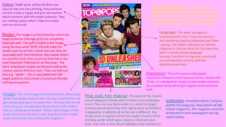
  • 1. Colour: Bright pinks yellows & blue’s are used as they are eye-catching, they standout and the create a happy and girly atmosphere which connects with the target audience. They are inviting colours which make the reader want to see inside. Design: The image is of One Direction which the target audience (teenage girls) are completely obsessed with. The puff is linked to the image using the buzz word ‘WIN’, this will make the reader want to win the t-shirts because they are associated with One Direction. Also capital letters are used for cover lines to convey that that is the most important information on the cover. The word ‘unleashed’ creates excitement making the readers want to find out more. They use informal lexis e.g. “phew” – this is associated with the target audience and creates a humorous friendly inviting atmosphere. Images: The main image is of One Direction, these boys attract the reader because they are seen as attractive and girls desperately want to meet them. This also links to the main story, you are getting to know them so the readers feel on a more personal level. There is also images of the poster which are included inside, therefore if the reader wants that poster they will buy the magazine. The use of words: The ‘1D UNLEASHED’ suggests the interest of the readers because they want to know more about them. This is big enough to read from a distance so it is the first thing you notice therefore being the most important focus. Language: The word ‘outrageous’ associated with Union J has connotations that something bad has happened and there is gossip, the readers will want to read the magazine to find out what the boy band has done. I cannot see any language features, therefore to improve I would add an onomatopoeia word to grab the attention even more. Impression: The cover gives a really good impression of what’s inside because there’s stories with 1D etc. It is designed to appeal to the readers interests by using boy bands which girls appear to be obsessed with. Pose, style, hair, makeup: The poses of the models are all happy and cheeky which creates a fun and happy mood. They are very fashionable, it is what the target audience would want boys their age to wear so therefore is appealing. In addition all of the hair is different, this could create an opinion where the reader chooses which one they prefer which again creates a more personal level. Their skin is clear which highlights their ‘perfection’. Institution: Immediate Media Company publish this magazine, they publish all BBC related magazines. This magazine would be distributed in most newsagents and big supermarkets.
  • 2. I do not think they have made it very clear that it is the contents page because the word ‘contents’ is in plain black and white contrasting to all the other colours going on around. They have added a picture of the front cover to analyse, this is a great skill because then if you only want to find one thing on the front cover then it gives you a direct page number to go to, therefore it makes it quick, simple and easy which is incredibly useful for the target audience. The images appeal to the reader, the magazine has images of what the reader might buy when they are out shopping, this conveys that they are representing the reader. There is an editor’s note which addressed the readers, it is very informal by using the language ‘hey’ and ‘love’ – also we know that the target audience is girls as it has now been said. This is accompanied by an image to create a more personal level. In addition, the language used is very personal with the word ‘your’ – it makes the reader feel special as it is ‘theirs’. A puff has been included in the contents page, about loving boys. This challenges conventions as these are normally only found on the front cover. However I think this is effective because it fits in with the style and design on the magazine. The overall impression of this contents page is very fun and quirky, it would not appeal to boys because stereotypically they do not love all the gossip and boy information. In addition older people would not be interested either because it is all very new and upcoming modern information about teenagers themselves.
  • 3. They have used a landscape picture rather than all portrait here, this is to make the magazine more interesting so not everything is the same. The gutter separating the image is all equal and quite large, I think this is good because it spaces everything out and makes it seem bigger and bolder therefore more eyecatching. They have obviously used a flat plan to work of the dimensions. The spot colour theme for this double page spread is red, this is a bright friendly colours which attracts attention. It is mainly dominated by pictures, this is because the target audience doesn’t want to read loads and load of writing, they would rather have illustrations to look at with quirky captions. Funny captions are used to add humour and create a light hearted atmosphere. This double page spread is mainly about mocking celebrities, this is very humorous and the reader feels on a personal level with them. It isn’t a serious topic which portrays that this isn’t a serious corporate magazine. The overall impression of this double page spread is that it is designed for people who are celebrity mad and like to keep up to date with that world, but not only the good news, the funny news too. This draws in readers because the artists and celebrities are representing them. ‘AWKWARD’ grabs the attention of the reader, they are interested to find out what is so awkward? It makes them read on and become engaged in the magazine.
  • 4. Colour: The red background connotes to blood which is associated with ‘emos’ which is the target audience. The yellow connotes to dangerous which is possibly how they like to be perceived. The cover gives off a dark mysterious mood which reflects the target audience. The masthead is yellow which is harsh on the eyes but grabs your attention and stands out. Design: ‘Bite’ is symbolised by the two Rottweiler's with their mouths open, these have connotations of danger which interests the reader. The capital letters grab the attention of the reader, it highlights the importance and interests the reader. Images: The Of mice and men band member has tattoos, this could represents what the reader would like to aspire to be like. Image: Again the Rottweiler’s symbolise risk and danger which is how emos like to be perceived. The main image is a long shot, this is challenging conventions because it is normally a medium close up, however it works as he is a slim, well groomed man. Pose, style, hair and makeup: The pose of the model is camp and he is protected by dogs which are seen as scary. One image is of a man screaming, this could be foreshadowing that the information inside the magazine is about screamo. Words: ‘PANIC’ makes you want to know what the problem is so the reader will turn the page and read the magazine to find out therefore this is a very effective technique. ‘BITE’ connotes to snap, feisty, dangerous, this could be the image the target audience is trying to portray. The cover lines are very big, they would definitely be able to be read from a distance, you are then drawn into the smaller text. The colour’s of red and yellow makes the magazine stand on a shelf. Language techniques: This magazine contains alliteration: “fights, fury and future” this creates a fun and quirky feel. ‘PANIC’ grabs attention, it seems like there is something cool and catching to read inside. Overall Impression: There is a good indication of what is inside because the cover lines are specific. All apart form ‘panic’ which makes you think there is something exciting but it is just about a band. It is designed for punk rock people, the bands represent the readers interests. Stereotypically young girls and the elderly would not be interested because it is not their genre and nothing interests them. Institution: Bauer media group publishes this in London, they also publish Q.
  • 5. Colour: The main colour theme of yellow and red is carried through to the contents page, the titles are yellow and page numbers red, I think this is a good consistency and creates a theme and house style. The background is white which could be perceived as boring however I think this works well because if it was a bright colour there would be too much going on, however if it was a pastel colour it wouldn’t fit in with the overall impression of the magazine. Images: The theme of danger is continued through the picture of the Rottweiler, however there are glasses added on to add humour to it. All images are landscape or square, this is because it fits with the house style and fits to the flat plans dimensions. Pose, style, hair, make-up: The middle image conveys a singer (Kellin) performing, this is used to attract the readers because that is the sort of concert/gig they would go to. The main image at the top of the page has direct eye contact, this brings it down to a personal level to the reader. It gives the impression that they too want you to read the magazine. Words: I think if you know the magazine and regularly subscribe then you would know where the contents page is, also the use of the white writing on the black background contrasts and stands out. However I think it is on the wrong side of the page, it is not the first thing you look at. Language: On the image of Kellin it has a caption “Kellin’s nipple was a little cold” – this is mocking him but not in a nasty way because he is a favourite artist. However it would appeal to the humour of the readers. This is colloquial language which represents the target audience. Overall impression: The overall impression gives a good indication to what is inside because it includes the bands which have stories, articles, interviews and pictures inside. It appeals to the same target audience as the front cover. I would make the gradients a little smaller so it is not so spaced out to make it look a little more brought together. On the other hand I think the consistency of the colours, images and house style add to the overall feel.
  • 6. Design: The words ‘hearts’ and ‘souls’ really stand out, they have connotations of desire, love and happiness. This could be the feeling which the band are trying to spread to the reader. These words fit with the images because they look passionate. The fact that the words heart and soul stand out so much shows that that is what it is all really about. Images & pose, style, hair, make-up: the band members are all pulling weird faces, this is to symbolise their individuality. In addition the image represents the ideal that the target reader would like to aspire too, especially young males who want tattoos, they could be inspired by this photo. The men are seen as attractive to the female audience so dressing them in tight clothing (far left) appeals to them. Colour: Again the colour is consistent, the reds and yellows and been transferred through to create this feel of a house style. Also the colours are effective on the page because the picture is all dull colours so you are instantly drawn to the bright colours which makes you read the headline. Language: Again the headline is the only thing which grabs the attention of the reader due to the colours and the boldness. In addition there is a puff which I think is situated in the correct place because it is related to the image and text. Overall impression: The font is the biggest attention seeking item on this page, the font type compliments the type of band that they are as well.
  • 7. This magazine has been published since marsh 1952, it was Britain's best selling music magazine during the seventies and it is still very popular. It mainly features on indie/rock bangs, for example Arctic Monkeys, the target audience is young adults and teens. The main image is relevant to the main cover line, he is dressed quite smartly which could represent that he is trying to look cool and trendy as it is his comeback and he wants to make a good impression. The colours are mainly simple and corporate except the origami birds, they are yellow and blue which draws attention to him, they could symbolise his success. The colours of the birds also link to the colour of the text which creates a good house style. The design is bold and clear so it can be easily understood, the important information is underlined. I think to improve the front cover they should have used bigger font for the cover stories to attract more attention.
  • 8. The Contents page is not very good, it is very cluttered because you don’t know what is going on or where to look. It does not appeal to young people because there is too much writing. I think the image on the double page spread is good because it appeal to the younger audience with humour (a person dressed as Elvis Presley), however I do not think this fits in with the addressed house style.