
Recommended
More Related Content
What's hot
What's hot (20)
Viewers also liked
Viewers also liked (12)
Similar to Contents page analysis
Similar to Contents page analysis (20)
Recently uploaded
Recently uploaded (13)
Contents page analysis
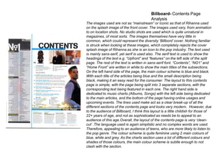
- 1. Billboard- Contents Page Analysis The images used are not as “mainstream” or iconic as that of Rihanna used on the splash image of the front cover. The images used vary, from animation to on location shots. No studio shots are used which is quite unnatural in magazines, of most sorts. The images themselves have very little in common, which could represent the diversity „Billbord‟ cover. Nothing familiar is struck when looking at these images, which completely rejects the cover splash image of Rihanna as she is an icon to the pop industry. The text used is mainly sans-serif, yet serif is used also. The serif text is used to show the headings of the text e.g. “Upfront” and “features” on the left side of the split page. The rest of the text is written in sans-serif font. “Contents”, “NO1” and “Home Front” are written in white to show the main titles of the subsections. On the left hand side of the page, the main colour scheme is blue and black. With each title of the articles being blue and the small description being black, making it an easy read for the consumer. The layout to this contents page is simple, with the page being split into 3 separate sections, with the corresponding text being featured in each one. The right hand side is dedicated to music charts (Albums, Songs) with the left side being dedicated to the main articles, and the bottom of the page having online usages and upcoming events. The lines used make act as a clear break-up of all the different sections of the contents page and looks very modern. However, due to the audience of Billboard, I think this layout is a little childish for those of 22+ years of age, and not as sophisticated as needs be to appeal to an audience of this age.Overall, the layout of the contents page is very „cleancut‟ .The language used is again simplistic and no complex words are used. Therefore, appealing to an audience of teens, who are more likely to listen to the pop genre. The colour scheme is quite feminine using 2 main colours of blue, white and grey. As the charts section uses a lot of different colours and shades of those colours, the main colour scheme is subtle enough to not clash with the section.
- 2. Q- Contents Page Analysis Q‟s contents page is primarily based around the images it uses. The are all on location shots and show a lot of action within them all, they are the opposite to the posed studio photographs featured within other magazines. The images overlap, creating a textured/cluttered look, which could (metaphorically speaking) represent the music Q covers- mainly bands who produce layered instrumental and vocal sounds. The only image different to the other featured on the page is the picture of David Bowie. The image used is iconic, rather than recent and alongside the tag line “They‟re making a total exhibition of him.” shows the iconography of the artists within the genre of music Q are all about. The taglines supporting each of the images of the left-hand side gives nothing away. So the consumer will be intrigued to know the story about some of their favourite musicians. The text one the side of the page is extremely minimal, yet necessary to hint at the storylines. On the right hand side of the contents, every title of the feature and regular articles are written in serif font, with the cover story font being sans-serif, this creates an immediate visual difference between the two sections of text. As said, the left hand side of the page is based around the one location “real” pictures of the artists/bands featured. Whilst the right handside holds all the information. The columns separating each bit of text are split in “Cover Story”, “Features” and “Regulars”. This clearly separates what is new in this issue of the magazine, to the regular/visual articles that feature in this magazine. Therefore the consumer can make the decision as to whether they would like to buy this issue easier. The language used, like most magazines is simplistic and there is very little of „a play on words‟ within the title of the article, therefore the consumer knows exactly what the article is about, with no confusion. Personally, I think the layout of this contents page is professional and will definitely appeal to an audience of their target age (15-24 years). The cluttered look with keep their attention locked on this page, and won‟t be something they will just flick over when reading the magazine.
- 3. Q- Contents Page Analysis Unlike „Q‟, mixmag opts to use one main image as opposed to several smaller images. Although the image used by mixmag catches dance music in action and therefore is a wise choice to use. The clothing the model wears looks as if it may be from a different era, possibly referencing from the breakout of dance music in the 70‟s. It is metallic and glittery/sparkly, therefore grabbing the full attention of those around her. The girl herself is in focus, whilst those in the background are blurred, showing the model in action and presenting the high spirit of the music genre. The image isn‟t very well lit, however against the pure black background, the image almost looks like it is in fact in spotlight. The dark look of the model used, with short brunette hair, smoky eyes and a crowd of men around her: Shows her as a potential femme fatal character that mesmerises those around her with the way she dances. “Contents” is written in quite a quirky font, with the majority of the other writing being in a far more subtly sans-serif font. The headlines/titles of each article are straight forward and to the point, therefore the consumer doesn‟t need to „flick‟ through the magazine in order to scan the article to decide whether it is to their taste. All of the text is white, which stands out against the black, which also leaves the image being the only colour on the page. At the bottom of the page, it reads “Your Free CD: Boys Noize”- this lists all the tracks of the artist‟s new album, alongside a description of the artist, giving the consumer a recommendation of music, picked by experts of the genre. The layout of mixmag, is quite simplistic, with each section of text being clearly separated by a line underneath the previous section. The whole layout looks very clean cut and sophisticated. The image used takes up a high proportion of the page, meaning the woman can appeal most to the „male gaze‟, a concept of Laura Mulvey‟s. It also becomes the main focus of the page, which will attract to this type of reader who have a high disposable income to spend on nights out such as those pictured. The language used is simplistic and all the sentences are short, yet tell the consumer everything they need to know, in context of the article.