
Recommended
More Related Content
What's hot
What's hot (19)
Viewers also liked
Viewers also liked (10)
Similar to Double page rolling stones
Similar to Double page rolling stones (20)
More from Yves Robinson
More from Yves Robinson (20)
Recently uploaded
Recently uploaded (8)
Double page rolling stones
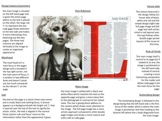
- 1. Design balance/symmetry Main image Masthead text House style Rule of thirds Guttenberg design the main image is situated on the left hand page and is given the entire page where as the text is placed on the other, the large red ‘L’ to represent the star Lady gaga draws attention to the text side and makes it more interesting, thus balancing out the two pages. The three text columns are aligned vertically to the image to create an organised appearance. The mast head isn't a main focus in the pages design and is situated in the top right corner, not the main point of focus, it is written in two different fonts and doesn’t stand out too much compared to the vibrant ‘L’ on the page. the text on the page is a classic times new roman and is small, black and nothing fancy. It almost appears as a background with the bright red ‘L’ that is layered over the top of the text to signify the artists initial , the text is aligned in the normal three column rule and focus’ more on the information rather than the appearance it gives. the main image is edited with a black and white effect which matches the text on the opposite page and gives a more classy feel to the photograph in contrast to her naked state. The star is giving direct address to the camera which draws more attention to the image . The full page image has a more artistic approach compared to other double page images and shows a more mature and sultry side to Lady gaga. The colours featured in the design follow Q’s house style of black, white and red and the simple design (right side full page image and left page text with artists initial in red layered over the top) follows other double page spread layouts of the issues at this time. The main image itself is central to its page but if looked at as one, the image is positioned on the left hand side, instead of central, creating a more interesting composition for the reader and allows Lady gaga to be the main focus for this page. The Guttenberg design is followed In this design being that the left hand side is the first focus of the reader which is where the main image is positioned. And then leading to the bottom left where the L leads diagonally from the main image. Yves Robinson
- 2. Design balance/symmetry Main image Masthead text House style Rule of thirds Guttenberg design The main image is placed on the right hand side of the double page in an informal way taking up part of the right in a diagonal. The text and mast head is shaped around the image of the artists and there is little negative space left. The black, white and grey colours give the layout a sense of completion and balance the heavy use of image with the bold text on the left. The mast head is in a black sans serif font fitting with the colour scheme used. And is shaped in a way that is bold and easy to read around the main image, yet stands out against the paler grey background. They have used slight exaggeration to draw attention to the artists and the page. The main bodies of text are again in black fitting with the colour scheme yet are much smaller and fainter compared to the mast head which it is aligned under and main image that it is shaped around. They have use of a kicker and a drop cap to follow the classic article style. The text isn't a main focus in the first appearance of the page and fills negative space The main image is edited in black and white and follows the colour scheme of the page. The colours give a much more mature and classy feel to the page. Even though the artists isn't giving a direct address, her eyes are still a main focus in the image. The edges of her hair are out of focus and give a softer finish to the image as it blends in to the text on the left hand side. Although non of the rolling stones double pages have the exact same layout, there are similar designs with a black and white theme. The style of layout and design seem to vary to suit each artists and in this case, it gives a classy, elegant and old fashioned approach to design, like the artists music and image The main image is placed to the left of the double page and goes over the middle of the page, following the rule of thirds and giving a more interesting composition for the reader. It also makes the main image the first focus of the reader and gives importance to the artists. The mast head is placed in the top left hand corner which follows this design rule in that that section of the page is the first place the reader looks. It then leads to the artists face to the left and slightly below the mast head, and then to the text in the bottom right. Making the design more appealing and easy to the eye Yves Robinson