SlideShare a Scribd company logo
1 of 6
FRONT COVER- MAGAZINE 1
There are many colours presented on this front cover. There is: white,
black, yellow, red and blue. As there is a variety it makes it looks busy
and a lot going on. Using these colours makes certain text stand out
(key information) to attract your attention. Most of the text uses the
same font; sans serif font. This is effective because it’s bold and eye
catching in a way alerting. It seems to be a well-known magazine and
they are confident having the image overlapping the title. Used
rhetorical questions to make it feel direct and that you want to know
‘getting back together?’ The main image is famous 50 cent and diddy.
They cover most of the page of the magazine. This aspires to the target
audience because it’s a hip hop magazine, therefore including these
people link to the genre and stories. The image also uses direct
address. There are three other images included on the front cover
which link with the stories in the magazine, they are key images that
would attracted their target audience: Chris Brown, Rhianna and Dr.
Dre. The title is white so does not stand out as much as everything else
on the page. However it is bold with a black shadow that emphasises it.
This is fine for this magazine as it is popular and well-known. The
strapline ‘covering the entire hip hop culture’ is completely covered by
the main image with just being able to see ‘culture’ this would not be
good for a new magazine yet it being around for years people will
recognise this. ‘Shocking’ is used to link with one of the stories. This
CONTENTS PAGE-MAGAZINE 1The contents page has a white background with red boarders and sub-titles, and
black text. It makes it look important and alert. There are different colours of red
(gradient) or dark and light red which breaks it up. Again sans serif font is used.
This is good because it works with the front cover being consistent throughout the
magazine. Having certain words bolder than others suggests key things the
audience would want to find quickly. There are two main images on the contents
page. Yet they have included an image of another one of their magazines. This
allows the audience to see what’s next and get them to subscribe. The images used
on the contents page would appeal to the reader because it links with the stories
they are interested in. The first image is relaxed ‘Jamie Foxx’ (24) looks in his
environment, and happy as he is smiling. He is surrounded by musical instruments
which works well with the music ‘magazine. The second image ‘Quent’ (49) looks
more like an organised shot. He is looking away from the camera as if he is
focusing on something. The lens is focused on him so he stands out, with the
blurred background. Yet you can see he is outside somewhere busy. You can
identify the contents page from glance because the layout is clear. It’s separated
with boxes and subheadings. It also includes folio, making it clear it is a contents
page. It’s appealing to the reader by the images they have used (which I have
already talked about). The text is quite small, however having important
information bold or larger. Certain parts are sectioned off to break it up so it don’t
look ‘flooded’. Overall this is good because of this and large text it’s easy to read
from a distance.
It uses language which addresses the reader and grabs their attention. This is done
by using words such as ‘style’, ‘entertainment’, ‘music’ and ‘webwatch’. This is
everything the reader wants to see in the magazine and what they are interested in
so by using these words grabs their attention. I wouldn’t say it’s the best contents
DOUBLE PAGE SPREAD-MAGAZINE
1 The colours used on the double page spread has been done quite clever.
Where it is a ‘light’ story the colours green and gold have been used.
When it’s a hard story the colours ‘red’ and ‘burgundy’ have been used.
This makes you think it’s important, danger or something serious. There
has been a mixture of fonts used, moreover serif and sans serif font. The
sub titles are larger than the text information, this allows the reader to
spot what they want to find on the page. The text all links with the images
by being about the stories written about. It’s engaging with the target
audience by always including celebrity’s names, which would be of
interest to them. All the images on the double page spread represent the
target audience. This is proven as established the stories are aimed for
the target audience to aspire to them. Therefore so will the images as
they all link with the text. All the images are photos of celebrity’s which
instantly gives the reader the information they made need to find what
they are looking for and make them keen in this double page spread.
They words like ‘word on the street’. This could interest the reader as it’s
what they want to find out in the magazine. This is well aimed at the
target audience because its language the target audience uses and would
relate to. I like the layout of the double page spread as it’s not too busy,
it does this by breaking it up with boxes, colours and larger text. They
have also used symbols/pictures which link in with the double page. This
is because it’s a star = famous singers. With a microphone= music. This
makes it look more interesting and fills the gap nicely. As I said before
FRONT COVER- MAGAZINE 2The front cover easily stands out. This is because it has bright background;
which is luminous orange then goes gradient to a red colour. It gives the
impression that it is quite arty. All the colours link together using the same
background colour on some of the text, and white and black text too. The main
image is black and white, however because of such the bright background it
makes it stand out more. The design of the front cover is very neat, most of the
text goes around the image quite neatly. There are different fonts/styles of text.
All different sizes and colours. This is all depending on what the text says. It
tends to start of white then follows up with black or orange. This carries on
throughout the page so it works well. The target audience is concentrating on
music like classic rock, and older people for mature music lovers. The image
displays this very. The image is engaging because it has direct address, and
makes it feel personal. I like how the main image is in black white which
replicates smart and sophisticating; which is perfect for the target audience. It
also distracts you from such a bright background and makes it all work well
together. There is a puff in the left hand corner; ‘FREE CD!’ …’plus 5 bonus
tracks’. This is good because it’s going to attract, by doing this is sharing the
love of music with the target audience, and this suggest there will be lots of
interest in common inside as well. The title ‘MOJO’ is not clear, furthermore the
main image covers it. However this is done because it’s a well-recognised
magazine. This magazine would easily stand out on the shelf because of the
bold fonts, image and mainly colour. It address the reader and grabs their
attention by the language they use. ‘The only interview’ this makes the
magazine important as it holds what other magazines don’t. It shows they are
up to date and a professional magazine. They use written codes ‘…’ by doing
this makes you want to find out more and turn the page.
Overall I believe the front cover is effective. It has a good indication of what’s
CONTENTS PAGE-MAGAZINE 2
The contents page goes over two pages, which both look
quite different. The first page is has a black background. With
a clear title ‘Mojo’ which is in white, this is good because it
stands out really well against the black background. The folio
and title ‘features’ are red with all the other text white. By
making the name of the page stand out its larger text and
bold. Red, white and black all work well together and look
smart. On the first page of the contents it has a large image
of a boy holding a guitar. This works well as its not crowded,
it makes the page simple and neat. The font is clear and sans
serif, which is easy to read and works well with the front
cover. However at the bottom of the page there is a quote
which is in serif font. This shows the magazine varies and
make it easy for the eye. The second page is white with
‘Mojo’ in black, which is a good contrast of the first page. It
has a small collage of images all to do with music and art. It
also links with the stories. As this is aimed at an older age
group it is presented smartly and use good vocabulary. They
have used words like ‘luxury’, ‘intelligence and
‘empowerment’. These all work with the demographic as it’s
sophisticated. You can identify the contents from a glance
because of the layout. The contents page is effective because
it relates well to the target audience. It represents the
DOUBLE PAGE SPREAD-MAGAZINE
2 The double page spread I chose linked with the target audience
well and the front cover. The images are in black and white, as
the background. The text has some gold but apart from that all
black and white. I like this because it gives a feel of the history
and looks smart which is the impression the magazine wants to
give. In this double page spread there is quite a lot of text.
However this good because it’s what the target audience would
want to see; lots of information. It only has 3 images which are
clear and not busy as the main focus in the information. The
text is small and the same the whole way through which shows
it’s a detailed article. The images on over the two pages are in
black and white. The first images blends in with the black
background, and is large which breaks it up nicely before a lot
of text. The second image is the only thing in colour. It is
broken away from the rest of the information as if it’s a
completely different story. The words used are all very formal.
The text starts off with a drop cap. This is good because there
is a lot of text it really breaks it up. They have broken it up by
using gaps and larger text. I think the double page spread is
effective because it links with the front cover and target
audience very well. It does this by using a black and white
theme and using formal language. This wouldn’t appeal to a
teenager because there is lots of small text and lots of

More Related Content

What's hot

Contents Page and Double Page Spread
Contents Page and Double Page SpreadContents Page and Double Page Spread
Contents Page and Double Page SpreadMystifyingproductions
 
Analysis of ‘kerrang’ music magazine
Analysis of ‘kerrang’ music magazineAnalysis of ‘kerrang’ music magazine
Analysis of ‘kerrang’ music magazineAS Media Column E
 
SIMILAR PRODUCT RESEARCH (SPR) OF 3 FEATURE ARTICLES
SIMILAR PRODUCT RESEARCH (SPR) OF 3 FEATURE ARTICLESSIMILAR PRODUCT RESEARCH (SPR) OF 3 FEATURE ARTICLES
SIMILAR PRODUCT RESEARCH (SPR) OF 3 FEATURE ARTICLESsammieharris
 
Contents page analysis
Contents page analysisContents page analysis
Contents page analysisEllen Davies
 
Similarities And Differences Between Different Magazines
Similarities And Differences Between Different MagazinesSimilarities And Differences Between Different Magazines
Similarities And Differences Between Different MagazinesMaaZe
 
Becky double page spread magazine analysis
Becky double page spread  magazine analysisBecky double page spread  magazine analysis
Becky double page spread magazine analysisCharis Creber
 
Mojo magazine analysis
Mojo magazine analysis Mojo magazine analysis
Mojo magazine analysis Najat Hachem
 
Music magazine Ahmad Wahab
Music magazine Ahmad WahabMusic magazine Ahmad Wahab
Music magazine Ahmad Wahabasmediab13
 
Question 1 Evaluation
Question 1 EvaluationQuestion 1 Evaluation
Question 1 EvaluationEveSalmon
 
Double Page Spread
Double Page SpreadDouble Page Spread
Double Page SpreadNicoleMedia
 
Homework double page spread 2
Homework double page spread 2Homework double page spread 2
Homework double page spread 2JadeOckerby
 
AS media studies magazine research and planning
AS media studies magazine research and planning AS media studies magazine research and planning
AS media studies magazine research and planning Caitlin Meredith
 
Front cover analysis
Front cover analysisFront cover analysis
Front cover analysisML1421
 

What's hot (20)

Contents Page and Double Page Spread
Contents Page and Double Page SpreadContents Page and Double Page Spread
Contents Page and Double Page Spread
 
1. research
1. research1. research
1. research
 
Analysis of ‘kerrang’ music magazine
Analysis of ‘kerrang’ music magazineAnalysis of ‘kerrang’ music magazine
Analysis of ‘kerrang’ music magazine
 
Analysing 3 magazines
Analysing 3 magazinesAnalysing 3 magazines
Analysing 3 magazines
 
SIMILAR PRODUCT RESEARCH (SPR) OF 3 FEATURE ARTICLES
SIMILAR PRODUCT RESEARCH (SPR) OF 3 FEATURE ARTICLESSIMILAR PRODUCT RESEARCH (SPR) OF 3 FEATURE ARTICLES
SIMILAR PRODUCT RESEARCH (SPR) OF 3 FEATURE ARTICLES
 
Unit 14
Unit 14Unit 14
Unit 14
 
Contents page analysis
Contents page analysisContents page analysis
Contents page analysis
 
Similarities And Differences Between Different Magazines
Similarities And Differences Between Different MagazinesSimilarities And Differences Between Different Magazines
Similarities And Differences Between Different Magazines
 
Becky double page spread magazine analysis
Becky double page spread  magazine analysisBecky double page spread  magazine analysis
Becky double page spread magazine analysis
 
Magazine cover analysis
Magazine cover analysisMagazine cover analysis
Magazine cover analysis
 
Mojo magazine analysis
Mojo magazine analysis Mojo magazine analysis
Mojo magazine analysis
 
Music magazine Ahmad Wahab
Music magazine Ahmad WahabMusic magazine Ahmad Wahab
Music magazine Ahmad Wahab
 
Question 1 Evaluation
Question 1 EvaluationQuestion 1 Evaluation
Question 1 Evaluation
 
Double Page Spread
Double Page SpreadDouble Page Spread
Double Page Spread
 
Magazine analysis
Magazine analysisMagazine analysis
Magazine analysis
 
Homework double page spread 2
Homework double page spread 2Homework double page spread 2
Homework double page spread 2
 
Classic Rock
Classic Rock Classic Rock
Classic Rock
 
AS media studies magazine research and planning
AS media studies magazine research and planning AS media studies magazine research and planning
AS media studies magazine research and planning
 
Magazine Analysis
Magazine AnalysisMagazine Analysis
Magazine Analysis
 
Front cover analysis
Front cover analysisFront cover analysis
Front cover analysis
 

Viewers also liked

Evaluation Question 1
Evaluation Question 1Evaluation Question 1
Evaluation Question 1Kamil Burczyk
 
Evaluation of the preliminary task
Evaluation of the preliminary taskEvaluation of the preliminary task
Evaluation of the preliminary tasksianna given
 
Evaluation of college magazine
Evaluation of college magazineEvaluation of college magazine
Evaluation of college magazineBycia
 
Inserting a pull quote
Inserting a pull quoteInserting a pull quote
Inserting a pull quotesianna given
 
Moving the tshirt print
Moving the tshirt printMoving the tshirt print
Moving the tshirt printsianna given
 
วิธีสอนแบบอุปมาน
วิธีสอนแบบอุปมานวิธีสอนแบบอุปมาน
วิธีสอนแบบอุปมานJames12324
 
Moving the tshirt print
Moving the tshirt printMoving the tshirt print
Moving the tshirt printsianna given
 
evaluation question
evaluation questionevaluation question
evaluation questionsianna given
 
Hip-Hop Weekly Analysis
Hip-Hop Weekly AnalysisHip-Hop Weekly Analysis
Hip-Hop Weekly AnalysisJosh Brett
 

Viewers also liked (18)

Evaluation Question 1
Evaluation Question 1Evaluation Question 1
Evaluation Question 1
 
Evaluation Question
Evaluation QuestionEvaluation Question
Evaluation Question
 
Evaluation of the preliminary task
Evaluation of the preliminary taskEvaluation of the preliminary task
Evaluation of the preliminary task
 
Logo title thing
Logo title thingLogo title thing
Logo title thing
 
Evaluation of college magazine
Evaluation of college magazineEvaluation of college magazine
Evaluation of college magazine
 
Logiesforum 7 10
Logiesforum 7 10Logiesforum 7 10
Logiesforum 7 10
 
Inserting a pull quote
Inserting a pull quoteInserting a pull quote
Inserting a pull quote
 
Logiesforum - 10 tips
Logiesforum - 10 tipsLogiesforum - 10 tips
Logiesforum - 10 tips
 
Moving the tshirt print
Moving the tshirt printMoving the tshirt print
Moving the tshirt print
 
Logo title thing
Logo title thingLogo title thing
Logo title thing
 
Articolo hestetika marc_kalinka
Articolo hestetika marc_kalinkaArticolo hestetika marc_kalinka
Articolo hestetika marc_kalinka
 
วิธีสอนแบบอุปมาน
วิธีสอนแบบอุปมานวิธีสอนแบบอุปมาน
วิธีสอนแบบอุปมาน
 
Moving the tshirt print
Moving the tshirt printMoving the tshirt print
Moving the tshirt print
 
NME Analysis
NME AnalysisNME Analysis
NME Analysis
 
evaluation question
evaluation questionevaluation question
evaluation question
 
Hip-Hop Weekly Analysis
Hip-Hop Weekly AnalysisHip-Hop Weekly Analysis
Hip-Hop Weekly Analysis
 
Focus group
Focus groupFocus group
Focus group
 
Design Patterns
Design PatternsDesign Patterns
Design Patterns
 

Similar to Magazine analysis

Analysis of magazine covers
Analysis of magazine coversAnalysis of magazine covers
Analysis of magazine coversAmy Lea
 
Contents analysis
Contents analysis Contents analysis
Contents analysis tafigaza
 
Tasks 1 4 and hwk 1
Tasks 1 4 and hwk 1Tasks 1 4 and hwk 1
Tasks 1 4 and hwk 1charlie__1
 
Market research on the pop and rock music genre
Market research on the pop and rock music genreMarket research on the pop and rock music genre
Market research on the pop and rock music genreivelinaemilova
 
Magazine Textual Analysis
Magazine Textual AnalysisMagazine Textual Analysis
Magazine Textual AnalysisJwbread
 
Textual analysis
Textual analysisTextual analysis
Textual analysisJwbread
 
Tasks 1 4 and hwk 2
Tasks 1 4 and hwk 2Tasks 1 4 and hwk 2
Tasks 1 4 and hwk 2charlie__97
 
Analysing 3 magazine covers
Analysing 3 magazine coversAnalysing 3 magazine covers
Analysing 3 magazine coversblack-bird
 
Annotations of contents pages
Annotations of contents pagesAnnotations of contents pages
Annotations of contents pageslucyvh
 
Media coursework 9 analysis'
Media coursework 9 analysis'Media coursework 9 analysis'
Media coursework 9 analysis'Mcyuzuzo
 
Media coursework 9 analysis'
Media coursework 9 analysis'Media coursework 9 analysis'
Media coursework 9 analysis'Mcyuzuzo
 
Magazine analysis research
Magazine analysis researchMagazine analysis research
Magazine analysis researchhsmedia16
 
Research- Double page spread
Research- Double page spreadResearch- Double page spread
Research- Double page spreadalicegrimshaw
 
Double Page Spread Research
Double Page Spread ResearchDouble Page Spread Research
Double Page Spread Researchbeckyjay26
 

Similar to Magazine analysis (20)

Analysis of magazine covers
Analysis of magazine coversAnalysis of magazine covers
Analysis of magazine covers
 
Textual Analyasis
Textual AnalyasisTextual Analyasis
Textual Analyasis
 
Contents analysis
Contents analysis Contents analysis
Contents analysis
 
Tasks 1 4 and hwk 1
Tasks 1 4 and hwk 1Tasks 1 4 and hwk 1
Tasks 1 4 and hwk 1
 
Market research
Market researchMarket research
Market research
 
Market research on the pop and rock music genre
Market research on the pop and rock music genreMarket research on the pop and rock music genre
Market research on the pop and rock music genre
 
Magazine Textual Analysis
Magazine Textual AnalysisMagazine Textual Analysis
Magazine Textual Analysis
 
Textual analysis
Textual analysisTextual analysis
Textual analysis
 
Tasks 1 4 and hwk 2
Tasks 1 4 and hwk 2Tasks 1 4 and hwk 2
Tasks 1 4 and hwk 2
 
Analysing 3 magazine covers
Analysing 3 magazine coversAnalysing 3 magazine covers
Analysing 3 magazine covers
 
Magazine Analysis
Magazine AnalysisMagazine Analysis
Magazine Analysis
 
Annotations of contents pages
Annotations of contents pagesAnnotations of contents pages
Annotations of contents pages
 
All 3 deconstructions
All 3 deconstructionsAll 3 deconstructions
All 3 deconstructions
 
Contents pages
Contents pagesContents pages
Contents pages
 
Media coursework 9 analysis'
Media coursework 9 analysis'Media coursework 9 analysis'
Media coursework 9 analysis'
 
Media coursework 9 analysis'
Media coursework 9 analysis'Media coursework 9 analysis'
Media coursework 9 analysis'
 
Mojo
MojoMojo
Mojo
 
Magazine analysis research
Magazine analysis researchMagazine analysis research
Magazine analysis research
 
Research- Double page spread
Research- Double page spreadResearch- Double page spread
Research- Double page spread
 
Double Page Spread Research
Double Page Spread ResearchDouble Page Spread Research
Double Page Spread Research
 

Recently uploaded

Top Astrologer, Kala ilam specialist in USA and Bangali Amil baba in Saudi Ar...
Top Astrologer, Kala ilam specialist in USA and Bangali Amil baba in Saudi Ar...Top Astrologer, Kala ilam specialist in USA and Bangali Amil baba in Saudi Ar...
Top Astrologer, Kala ilam specialist in USA and Bangali Amil baba in Saudi Ar...baharayali
 
O9654467111 Call Girls In Shahdara Women Seeking Men
O9654467111 Call Girls In Shahdara Women Seeking MenO9654467111 Call Girls In Shahdara Women Seeking Men
O9654467111 Call Girls In Shahdara Women Seeking MenSapana Sha
 
Angela Killian | Operations Director | Dallas
Angela Killian | Operations Director | DallasAngela Killian | Operations Director | Dallas
Angela Killian | Operations Director | DallasAngela Killian
 
IMPACT OF FISCAL POLICY AND MONETARY POLICY ON THE ECONOMIC GROWTH OF NIGERIA...
IMPACT OF FISCAL POLICY AND MONETARY POLICY ON THE ECONOMIC GROWTH OF NIGERIA...IMPACT OF FISCAL POLICY AND MONETARY POLICY ON THE ECONOMIC GROWTH OF NIGERIA...
IMPACT OF FISCAL POLICY AND MONETARY POLICY ON THE ECONOMIC GROWTH OF NIGERIA...AJHSSR Journal
 
定制(ENU毕业证书)英国爱丁堡龙比亚大学毕业证成绩单原版一比一
定制(ENU毕业证书)英国爱丁堡龙比亚大学毕业证成绩单原版一比一定制(ENU毕业证书)英国爱丁堡龙比亚大学毕业证成绩单原版一比一
定制(ENU毕业证书)英国爱丁堡龙比亚大学毕业证成绩单原版一比一ra6e69ou
 
Spotify AI DJ Deck - The Agency at University of Florida
Spotify AI DJ Deck - The Agency at University of FloridaSpotify AI DJ Deck - The Agency at University of Florida
Spotify AI DJ Deck - The Agency at University of Floridajorirz24
 
Independent Escorts Lucknow 8923113531 WhatsApp luxurious locale in your city...
Independent Escorts Lucknow 8923113531 WhatsApp luxurious locale in your city...Independent Escorts Lucknow 8923113531 WhatsApp luxurious locale in your city...
Independent Escorts Lucknow 8923113531 WhatsApp luxurious locale in your city...makika9823
 
Dubai Call Girls O528786472 Diabolic Call Girls In Dubai
Dubai Call Girls O528786472 Diabolic Call Girls In DubaiDubai Call Girls O528786472 Diabolic Call Girls In Dubai
Dubai Call Girls O528786472 Diabolic Call Girls In Dubaihf8803863
 
Mastering Wealth with YouTube Content Marketing.pdf
Mastering Wealth with YouTube Content Marketing.pdfMastering Wealth with YouTube Content Marketing.pdf
Mastering Wealth with YouTube Content Marketing.pdfTirupati Social Media
 
Add more information to your upload Tip: Better titles and descriptions lead ...
Add more information to your upload Tip: Better titles and descriptions lead ...Add more information to your upload Tip: Better titles and descriptions lead ...
Add more information to your upload Tip: Better titles and descriptions lead ...SejarahLokal
 
9990611130 Find & Book Russian Call Girls In Crossings Republik
9990611130 Find & Book Russian Call Girls In Crossings Republik9990611130 Find & Book Russian Call Girls In Crossings Republik
9990611130 Find & Book Russian Call Girls In Crossings RepublikGenuineGirls
 
Cosmic Conversations with Sociocosmos...
Cosmic Conversations with Sociocosmos...Cosmic Conversations with Sociocosmos...
Cosmic Conversations with Sociocosmos...SocioCosmos
 
Call Girls In Andheri East Call 9167673311 Book Hot And Sexy Girls
Call Girls In Andheri East Call 9167673311 Book Hot And Sexy GirlsCall Girls In Andheri East Call 9167673311 Book Hot And Sexy Girls
Call Girls In Andheri East Call 9167673311 Book Hot And Sexy GirlsPooja Nehwal
 
Online Social Shopping Motivation: A Preliminary Study
Online Social Shopping Motivation: A Preliminary StudyOnline Social Shopping Motivation: A Preliminary Study
Online Social Shopping Motivation: A Preliminary StudyAJHSSR Journal
 

Recently uploaded (20)

Top Astrologer, Kala ilam specialist in USA and Bangali Amil baba in Saudi Ar...
Top Astrologer, Kala ilam specialist in USA and Bangali Amil baba in Saudi Ar...Top Astrologer, Kala ilam specialist in USA and Bangali Amil baba in Saudi Ar...
Top Astrologer, Kala ilam specialist in USA and Bangali Amil baba in Saudi Ar...
 
O9654467111 Call Girls In Shahdara Women Seeking Men
O9654467111 Call Girls In Shahdara Women Seeking MenO9654467111 Call Girls In Shahdara Women Seeking Men
O9654467111 Call Girls In Shahdara Women Seeking Men
 
Angela Killian | Operations Director | Dallas
Angela Killian | Operations Director | DallasAngela Killian | Operations Director | Dallas
Angela Killian | Operations Director | Dallas
 
IMPACT OF FISCAL POLICY AND MONETARY POLICY ON THE ECONOMIC GROWTH OF NIGERIA...
IMPACT OF FISCAL POLICY AND MONETARY POLICY ON THE ECONOMIC GROWTH OF NIGERIA...IMPACT OF FISCAL POLICY AND MONETARY POLICY ON THE ECONOMIC GROWTH OF NIGERIA...
IMPACT OF FISCAL POLICY AND MONETARY POLICY ON THE ECONOMIC GROWTH OF NIGERIA...
 
Enjoy ➥8448380779▻ Call Girls In Noida Sector 93 Escorts Delhi NCR
Enjoy ➥8448380779▻ Call Girls In Noida Sector 93 Escorts Delhi NCREnjoy ➥8448380779▻ Call Girls In Noida Sector 93 Escorts Delhi NCR
Enjoy ➥8448380779▻ Call Girls In Noida Sector 93 Escorts Delhi NCR
 
定制(ENU毕业证书)英国爱丁堡龙比亚大学毕业证成绩单原版一比一
定制(ENU毕业证书)英国爱丁堡龙比亚大学毕业证成绩单原版一比一定制(ENU毕业证书)英国爱丁堡龙比亚大学毕业证成绩单原版一比一
定制(ENU毕业证书)英国爱丁堡龙比亚大学毕业证成绩单原版一比一
 
Spotify AI DJ Deck - The Agency at University of Florida
Spotify AI DJ Deck - The Agency at University of FloridaSpotify AI DJ Deck - The Agency at University of Florida
Spotify AI DJ Deck - The Agency at University of Florida
 
Delhi 99530 vip 56974 Genuine Escort Service Call Girls in Masudpur
Delhi  99530 vip 56974  Genuine Escort Service Call Girls in MasudpurDelhi  99530 vip 56974  Genuine Escort Service Call Girls in Masudpur
Delhi 99530 vip 56974 Genuine Escort Service Call Girls in Masudpur
 
9953056974 Young Call Girls In Kirti Nagar Indian Quality Escort service
9953056974 Young Call Girls In  Kirti Nagar Indian Quality Escort service9953056974 Young Call Girls In  Kirti Nagar Indian Quality Escort service
9953056974 Young Call Girls In Kirti Nagar Indian Quality Escort service
 
Independent Escorts Lucknow 8923113531 WhatsApp luxurious locale in your city...
Independent Escorts Lucknow 8923113531 WhatsApp luxurious locale in your city...Independent Escorts Lucknow 8923113531 WhatsApp luxurious locale in your city...
Independent Escorts Lucknow 8923113531 WhatsApp luxurious locale in your city...
 
Hot Sexy call girls in Ramesh Nagar🔝 9953056974 🔝 Delhi escort Service
Hot Sexy call girls in Ramesh Nagar🔝 9953056974 🔝 Delhi escort ServiceHot Sexy call girls in Ramesh Nagar🔝 9953056974 🔝 Delhi escort Service
Hot Sexy call girls in Ramesh Nagar🔝 9953056974 🔝 Delhi escort Service
 
Dubai Call Girls O528786472 Diabolic Call Girls In Dubai
Dubai Call Girls O528786472 Diabolic Call Girls In DubaiDubai Call Girls O528786472 Diabolic Call Girls In Dubai
Dubai Call Girls O528786472 Diabolic Call Girls In Dubai
 
Mastering Wealth with YouTube Content Marketing.pdf
Mastering Wealth with YouTube Content Marketing.pdfMastering Wealth with YouTube Content Marketing.pdf
Mastering Wealth with YouTube Content Marketing.pdf
 
Add more information to your upload Tip: Better titles and descriptions lead ...
Add more information to your upload Tip: Better titles and descriptions lead ...Add more information to your upload Tip: Better titles and descriptions lead ...
Add more information to your upload Tip: Better titles and descriptions lead ...
 
9990611130 Find & Book Russian Call Girls In Crossings Republik
9990611130 Find & Book Russian Call Girls In Crossings Republik9990611130 Find & Book Russian Call Girls In Crossings Republik
9990611130 Find & Book Russian Call Girls In Crossings Republik
 
young call girls in Greater Noida 🔝 9953056974 🔝 Delhi escort Service
young call girls in  Greater Noida 🔝 9953056974 🔝 Delhi escort Serviceyoung call girls in  Greater Noida 🔝 9953056974 🔝 Delhi escort Service
young call girls in Greater Noida 🔝 9953056974 🔝 Delhi escort Service
 
Bicycle Safety in Focus: Preventing Fatalities and Seeking Justice
Bicycle Safety in Focus: Preventing Fatalities and Seeking JusticeBicycle Safety in Focus: Preventing Fatalities and Seeking Justice
Bicycle Safety in Focus: Preventing Fatalities and Seeking Justice
 
Cosmic Conversations with Sociocosmos...
Cosmic Conversations with Sociocosmos...Cosmic Conversations with Sociocosmos...
Cosmic Conversations with Sociocosmos...
 
Call Girls In Andheri East Call 9167673311 Book Hot And Sexy Girls
Call Girls In Andheri East Call 9167673311 Book Hot And Sexy GirlsCall Girls In Andheri East Call 9167673311 Book Hot And Sexy Girls
Call Girls In Andheri East Call 9167673311 Book Hot And Sexy Girls
 
Online Social Shopping Motivation: A Preliminary Study
Online Social Shopping Motivation: A Preliminary StudyOnline Social Shopping Motivation: A Preliminary Study
Online Social Shopping Motivation: A Preliminary Study
 

Magazine analysis

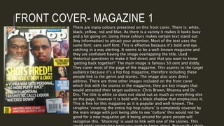
  • 1. FRONT COVER- MAGAZINE 1 There are many colours presented on this front cover. There is: white, black, yellow, red and blue. As there is a variety it makes it looks busy and a lot going on. Using these colours makes certain text stand out (key information) to attract your attention. Most of the text uses the same font; sans serif font. This is effective because it’s bold and eye catching in a way alerting. It seems to be a well-known magazine and they are confident having the image overlapping the title. Used rhetorical questions to make it feel direct and that you want to know ‘getting back together?’ The main image is famous 50 cent and diddy. They cover most of the page of the magazine. This aspires to the target audience because it’s a hip hop magazine, therefore including these people link to the genre and stories. The image also uses direct address. There are three other images included on the front cover which link with the stories in the magazine, they are key images that would attracted their target audience: Chris Brown, Rhianna and Dr. Dre. The title is white so does not stand out as much as everything else on the page. However it is bold with a black shadow that emphasises it. This is fine for this magazine as it is popular and well-known. The strapline ‘covering the entire hip hop culture’ is completely covered by the main image with just being able to see ‘culture’ this would not be good for a new magazine yet it being around for years people will recognise this. ‘Shocking’ is used to link with one of the stories. This
  • 2. CONTENTS PAGE-MAGAZINE 1The contents page has a white background with red boarders and sub-titles, and black text. It makes it look important and alert. There are different colours of red (gradient) or dark and light red which breaks it up. Again sans serif font is used. This is good because it works with the front cover being consistent throughout the magazine. Having certain words bolder than others suggests key things the audience would want to find quickly. There are two main images on the contents page. Yet they have included an image of another one of their magazines. This allows the audience to see what’s next and get them to subscribe. The images used on the contents page would appeal to the reader because it links with the stories they are interested in. The first image is relaxed ‘Jamie Foxx’ (24) looks in his environment, and happy as he is smiling. He is surrounded by musical instruments which works well with the music ‘magazine. The second image ‘Quent’ (49) looks more like an organised shot. He is looking away from the camera as if he is focusing on something. The lens is focused on him so he stands out, with the blurred background. Yet you can see he is outside somewhere busy. You can identify the contents page from glance because the layout is clear. It’s separated with boxes and subheadings. It also includes folio, making it clear it is a contents page. It’s appealing to the reader by the images they have used (which I have already talked about). The text is quite small, however having important information bold or larger. Certain parts are sectioned off to break it up so it don’t look ‘flooded’. Overall this is good because of this and large text it’s easy to read from a distance. It uses language which addresses the reader and grabs their attention. This is done by using words such as ‘style’, ‘entertainment’, ‘music’ and ‘webwatch’. This is everything the reader wants to see in the magazine and what they are interested in so by using these words grabs their attention. I wouldn’t say it’s the best contents
  • 3. DOUBLE PAGE SPREAD-MAGAZINE 1 The colours used on the double page spread has been done quite clever. Where it is a ‘light’ story the colours green and gold have been used. When it’s a hard story the colours ‘red’ and ‘burgundy’ have been used. This makes you think it’s important, danger or something serious. There has been a mixture of fonts used, moreover serif and sans serif font. The sub titles are larger than the text information, this allows the reader to spot what they want to find on the page. The text all links with the images by being about the stories written about. It’s engaging with the target audience by always including celebrity’s names, which would be of interest to them. All the images on the double page spread represent the target audience. This is proven as established the stories are aimed for the target audience to aspire to them. Therefore so will the images as they all link with the text. All the images are photos of celebrity’s which instantly gives the reader the information they made need to find what they are looking for and make them keen in this double page spread. They words like ‘word on the street’. This could interest the reader as it’s what they want to find out in the magazine. This is well aimed at the target audience because its language the target audience uses and would relate to. I like the layout of the double page spread as it’s not too busy, it does this by breaking it up with boxes, colours and larger text. They have also used symbols/pictures which link in with the double page. This is because it’s a star = famous singers. With a microphone= music. This makes it look more interesting and fills the gap nicely. As I said before
  • 4. FRONT COVER- MAGAZINE 2The front cover easily stands out. This is because it has bright background; which is luminous orange then goes gradient to a red colour. It gives the impression that it is quite arty. All the colours link together using the same background colour on some of the text, and white and black text too. The main image is black and white, however because of such the bright background it makes it stand out more. The design of the front cover is very neat, most of the text goes around the image quite neatly. There are different fonts/styles of text. All different sizes and colours. This is all depending on what the text says. It tends to start of white then follows up with black or orange. This carries on throughout the page so it works well. The target audience is concentrating on music like classic rock, and older people for mature music lovers. The image displays this very. The image is engaging because it has direct address, and makes it feel personal. I like how the main image is in black white which replicates smart and sophisticating; which is perfect for the target audience. It also distracts you from such a bright background and makes it all work well together. There is a puff in the left hand corner; ‘FREE CD!’ …’plus 5 bonus tracks’. This is good because it’s going to attract, by doing this is sharing the love of music with the target audience, and this suggest there will be lots of interest in common inside as well. The title ‘MOJO’ is not clear, furthermore the main image covers it. However this is done because it’s a well-recognised magazine. This magazine would easily stand out on the shelf because of the bold fonts, image and mainly colour. It address the reader and grabs their attention by the language they use. ‘The only interview’ this makes the magazine important as it holds what other magazines don’t. It shows they are up to date and a professional magazine. They use written codes ‘…’ by doing this makes you want to find out more and turn the page. Overall I believe the front cover is effective. It has a good indication of what’s
  • 5. CONTENTS PAGE-MAGAZINE 2 The contents page goes over two pages, which both look quite different. The first page is has a black background. With a clear title ‘Mojo’ which is in white, this is good because it stands out really well against the black background. The folio and title ‘features’ are red with all the other text white. By making the name of the page stand out its larger text and bold. Red, white and black all work well together and look smart. On the first page of the contents it has a large image of a boy holding a guitar. This works well as its not crowded, it makes the page simple and neat. The font is clear and sans serif, which is easy to read and works well with the front cover. However at the bottom of the page there is a quote which is in serif font. This shows the magazine varies and make it easy for the eye. The second page is white with ‘Mojo’ in black, which is a good contrast of the first page. It has a small collage of images all to do with music and art. It also links with the stories. As this is aimed at an older age group it is presented smartly and use good vocabulary. They have used words like ‘luxury’, ‘intelligence and ‘empowerment’. These all work with the demographic as it’s sophisticated. You can identify the contents from a glance because of the layout. The contents page is effective because it relates well to the target audience. It represents the
  • 6. DOUBLE PAGE SPREAD-MAGAZINE 2 The double page spread I chose linked with the target audience well and the front cover. The images are in black and white, as the background. The text has some gold but apart from that all black and white. I like this because it gives a feel of the history and looks smart which is the impression the magazine wants to give. In this double page spread there is quite a lot of text. However this good because it’s what the target audience would want to see; lots of information. It only has 3 images which are clear and not busy as the main focus in the information. The text is small and the same the whole way through which shows it’s a detailed article. The images on over the two pages are in black and white. The first images blends in with the black background, and is large which breaks it up nicely before a lot of text. The second image is the only thing in colour. It is broken away from the rest of the information as if it’s a completely different story. The words used are all very formal. The text starts off with a drop cap. This is good because there is a lot of text it really breaks it up. They have broken it up by using gaps and larger text. I think the double page spread is effective because it links with the front cover and target audience very well. It does this by using a black and white theme and using formal language. This wouldn’t appeal to a teenager because there is lots of small text and lots of