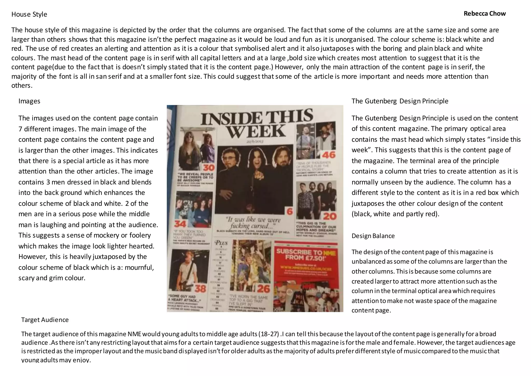
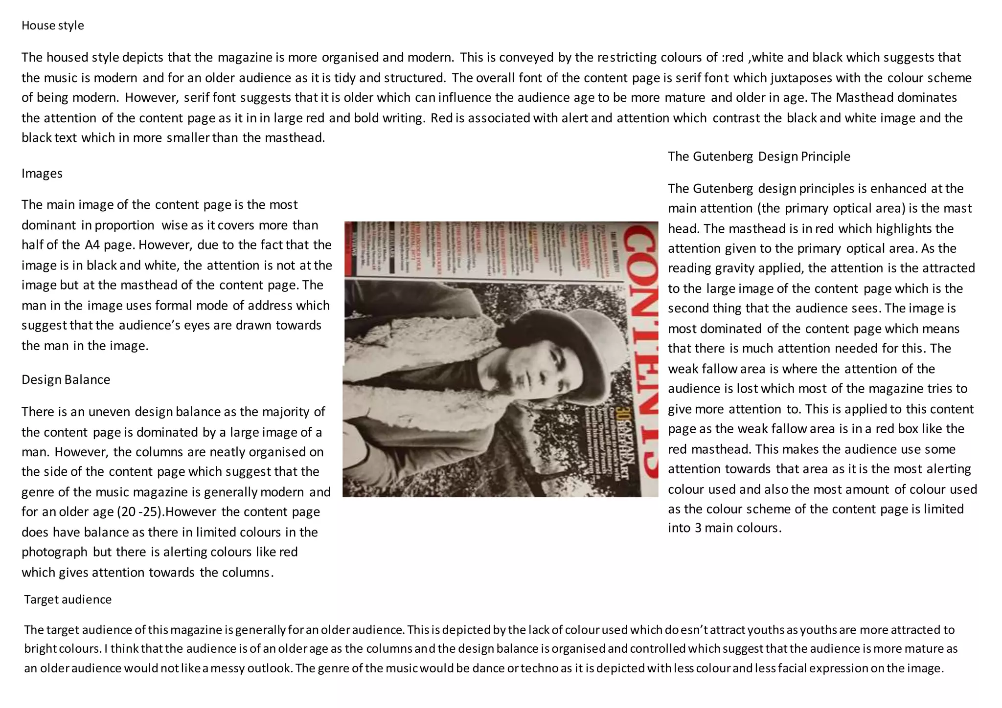
The house style of the magazine depicts an organized and modern style. This is conveyed through a restricted color scheme of red, white, and black, suggesting a modern music genre for an older audience. The masthead dominates attention in large red bold text, contrasting the smaller black text. The main image covers more than half the page but does not draw attention due to its black and white style. The Gutenberg design principles highlight the masthead as the primary optical area of focus, with the large image as the second area. Red boxes draw attention to weaker areas. The content page has an uneven design balance but neatly organized columns, suggesting a modern genre for an audience of 20-25 years old.