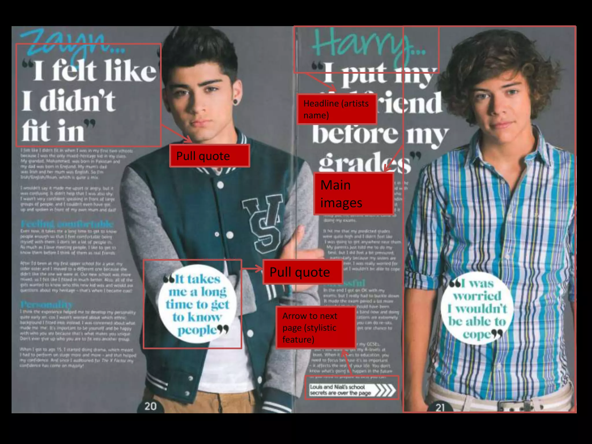
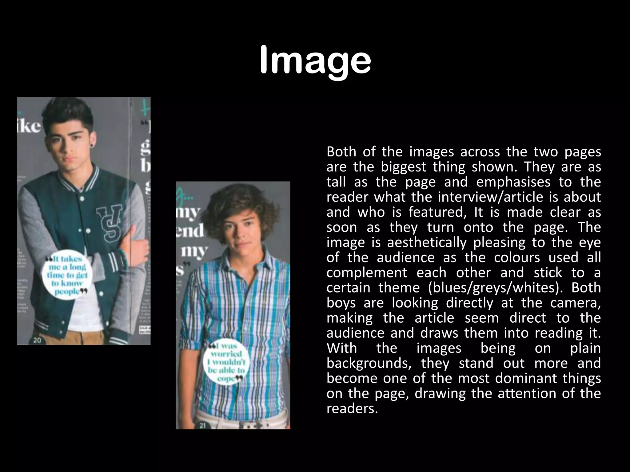
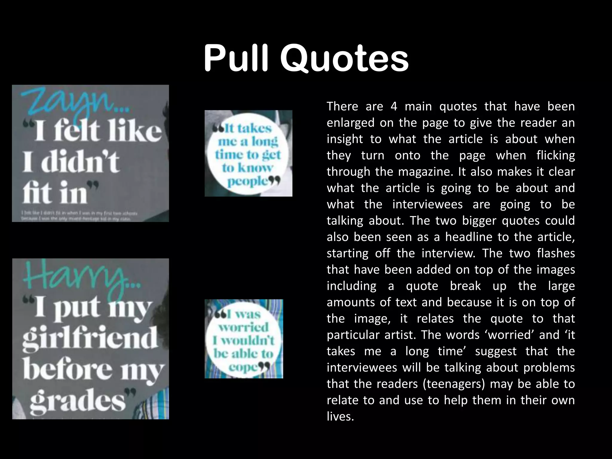
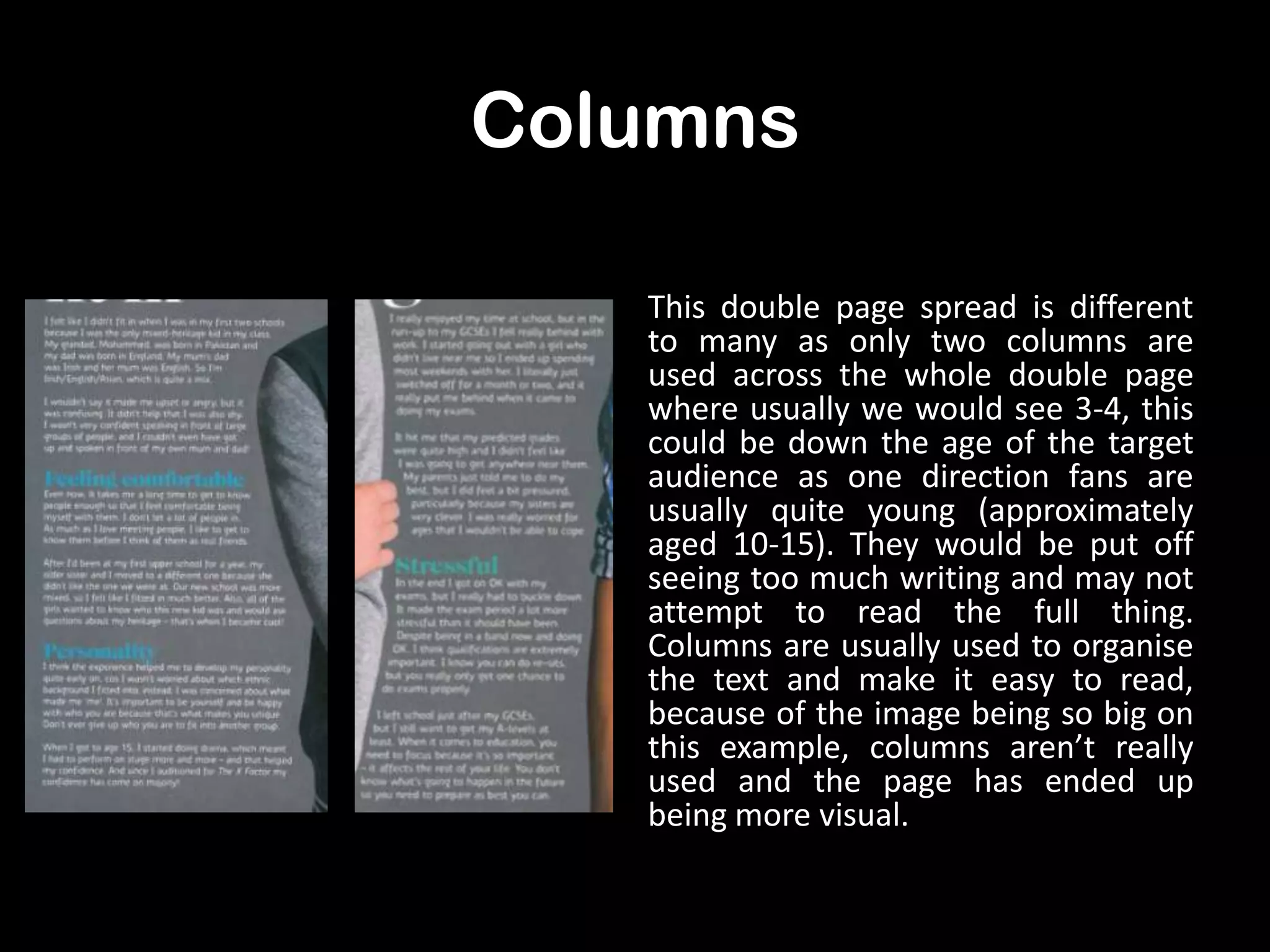
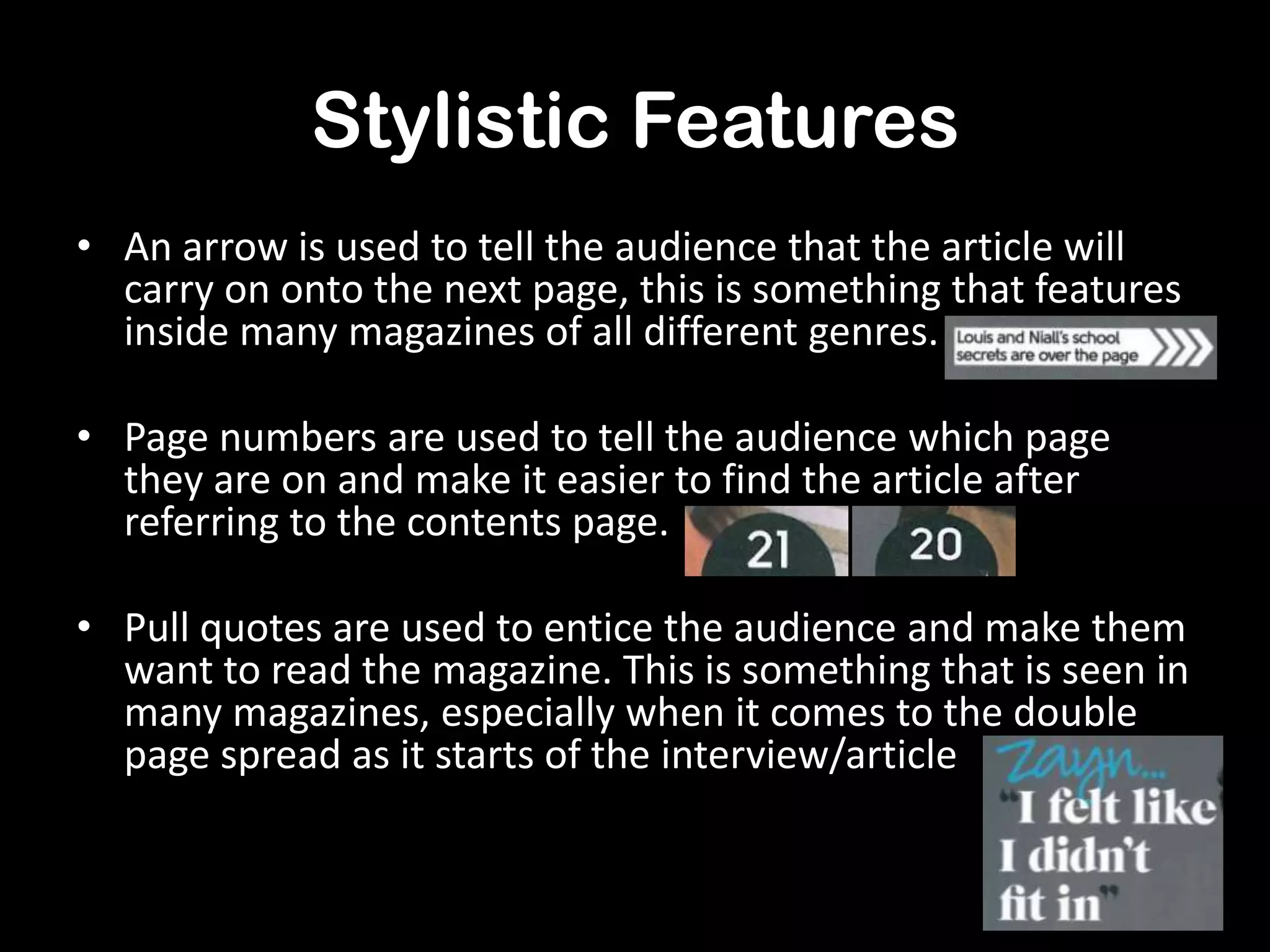
Double
Page
Spread
Analysis.
Headline (artists
name)

Pull quote

Main
images

Pull quote
Arrow to next
page (stylistic
feature)
Image
Both of the images across the two pages
are the biggest thing shown. They are as
tall as the page and emphasises to the
reader what the interview/article is about
and who is featured, It is made clear as
soon as they turn onto the page. The
image is aesthetically pleasing to the eye
of the audience as the colours used all
complement each other and stick to a
certain theme (blues/greys/whites). Both
boys are looking directly at the camera,
making the article seem direct to the
audience and draws them into reading it.
With the images being on plain
backgrounds, they stand out more and
become one of the most dominant things
on the page, drawing the attention of the
readers.
Pull Quotes
There are 4 main quotes that have been
enlarged on the page to give the reader an
insight to what the article is about when
they turn onto the page when flicking
through the magazine. It also makes it clear
what the article is going to be about and
what the interviewees are going to be
talking about. The two bigger quotes could
also been seen as a headline to the article,
starting off the interview. The two flashes
that have been added on top of the images
including a quote break up the large
amounts of text and because it is on top of
the image, it relates the quote to that
particular artist. The words ‘worried’ and ‘it
takes me a long time’ suggest that the
interviewees will be talking about problems
that the readers (teenagers) may be able to
relate to and use to help them in their own
lives.
Columns
This double page spread is different
to many as only two columns are
used across the whole double page
where usually we would see 3-4, this
could be down the age of the target
audience as one direction fans are
usually quite young (approximately
aged 10-15). They would be put off
seeing too much writing and may not
attempt to read the full thing.
Columns are usually used to organise
the text and make it easy to read,
because of the image being so big on
this example, columns aren’t really
used and the page has ended up
being more visual.
Colour Scheme
The colours consist of mainly greys, whites, blues and some
black, even the clothes that the boys are wearing fit this scheme.
The images are also considerably brighter than the text and the
background making them more obvious and dominant on the
pages. This allows the readers to automatically be drawn to them
and quickly understand what the pages are going to include.
Even though the colours are quite plain and maybe even dull, the
names of the singers are written in a brighter blue, starting off
the article and making the people featuring in the article stand
out even more.
Stylistic Features
• An arrow is used to tell the audience that the article will
carry on onto the next page, this is something that features
inside many magazines of all different genres.
• Page numbers are used to tell the audience which page
they are on and make it easier to find the article after
referring to the contents page.
• Pull quotes are used to entice the audience and make them
want to read the magazine. This is something that is seen in
many magazines, especially when it comes to the double
page spread as it starts of the interview/article

Double page spread analysis

  • 1.
  • 2.
    Headline (artists name) Pull quote Main images Pullquote Arrow to next page (stylistic feature)
  • 3.
    Image Both of theimages across the two pages are the biggest thing shown. They are as tall as the page and emphasises to the reader what the interview/article is about and who is featured, It is made clear as soon as they turn onto the page. The image is aesthetically pleasing to the eye of the audience as the colours used all complement each other and stick to a certain theme (blues/greys/whites). Both boys are looking directly at the camera, making the article seem direct to the audience and draws them into reading it. With the images being on plain backgrounds, they stand out more and become one of the most dominant things on the page, drawing the attention of the readers.
  • 4.
    Pull Quotes There are4 main quotes that have been enlarged on the page to give the reader an insight to what the article is about when they turn onto the page when flicking through the magazine. It also makes it clear what the article is going to be about and what the interviewees are going to be talking about. The two bigger quotes could also been seen as a headline to the article, starting off the interview. The two flashes that have been added on top of the images including a quote break up the large amounts of text and because it is on top of the image, it relates the quote to that particular artist. The words ‘worried’ and ‘it takes me a long time’ suggest that the interviewees will be talking about problems that the readers (teenagers) may be able to relate to and use to help them in their own lives.
  • 5.
    Columns This double pagespread is different to many as only two columns are used across the whole double page where usually we would see 3-4, this could be down the age of the target audience as one direction fans are usually quite young (approximately aged 10-15). They would be put off seeing too much writing and may not attempt to read the full thing. Columns are usually used to organise the text and make it easy to read, because of the image being so big on this example, columns aren’t really used and the page has ended up being more visual.
  • 6.
    Colour Scheme The coloursconsist of mainly greys, whites, blues and some black, even the clothes that the boys are wearing fit this scheme. The images are also considerably brighter than the text and the background making them more obvious and dominant on the pages. This allows the readers to automatically be drawn to them and quickly understand what the pages are going to include. Even though the colours are quite plain and maybe even dull, the names of the singers are written in a brighter blue, starting off the article and making the people featuring in the article stand out even more.
  • 7.
    Stylistic Features • Anarrow is used to tell the audience that the article will carry on onto the next page, this is something that features inside many magazines of all different genres. • Page numbers are used to tell the audience which page they are on and make it easier to find the article after referring to the contents page. • Pull quotes are used to entice the audience and make them want to read the magazine. This is something that is seen in many magazines, especially when it comes to the double page spread as it starts of the interview/article