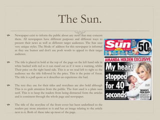
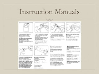
3. The Sun.
Newspaper exist to inform the public about any news that may concern
them. All newspapers have different purposes and different ways to
present their news as well as different target audiences. The Sun uses
very unique styles. The Mode of address for this newspaper is informal
as they use humor and don’t use posh words to appeal to their target
audience.
The title is placed in bold at the top of the page on the left hand side in
white backed with red so it can stand out as if it were a warning, whilst
Their price on the right hand side. This is as we read left to right so the
audience see the title followed by the price. This is the point of focus.
The title is a pull quote as it describes an experience she had.
The text they use for their titles and storylines are also bold although
This is to grab attention from the public. The font used is a plain sans
serif. This is to keep the readers from being distracted form the articles
and is consistent through the whole page and newspaper.
The title of the storyline of the front cover has been underlined so the
readers pay more attention to it and has an image relating to the article
next to it. Both of these take up most of the page.
4. The page is laid out well and neatly so the audience are able to read it clearly. The pages are
portrait and the articles are placed next to each other to fit the gaps. Each article has either
one or two columns and they all have a picture near them showing the audience relating
images. Some of the images have been enlarged so they readers can see it better. The page
numbers are located in the top outer corners of the pages in red.
Most of the images of people on this two page spread are taken at mid shot so we can see
the their face and their build. This is so we can see more and have other aspects to focus on
such as the background and clothing style.
The design of the page is different articles backed onto a black background. This may be to
promote professionalism.
7. Instructions exist to give people directions on how to carry out a specific task the right
way. The mode of address of instruction manuals are informal so they don’t
complicate people who may be new at completing certain tasks.
The font style in an instruction manual is usually a plain simple font such as Arial. This
is so the readers can read the instruction with ease. This is a modern font as traditional
fonts are usually fancier. The font isn’t written in bold or italic to maintain the simple
theme.
The page layout can be portrait or landscape depending on the type of instructions that
are being written although these instructions are landscape as there are images step by
step to show the reader what they should be dealing with at a certain stage.
The instructions have paragraphs of text underneath each picture describing what is
going on. They are laid out neatly so that the reader is able to read them easily.
9. Journalism Vs Game.
Journalism and game are both informal content to suit their target
audiences and make things easier for them although a big
difference is that they both have different purposes.