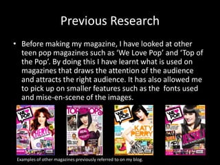
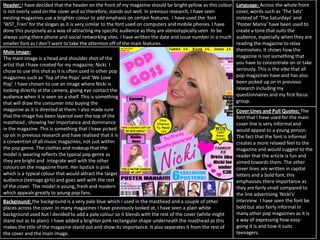
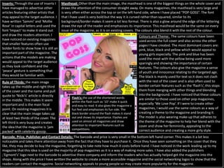
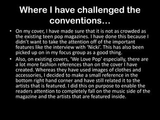
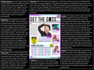
SlideShare a Scribd company logo
1 of 13
In what ways does
your media product
use, develop, or
challenge forms and
conventions of real
media products?
Evaluation Question 1~
Introduction
• During the production of my magazine, I have
made sure that I have referred to existing
magazines to guide me through the process. The
research that I have done previously, before I
began making my magazine, has really helped me
to understand the typical conventions of a teen
pop magazine and see what I needed to be
included on my magazine to attract the right
audience. In this first section of the evaluation, I
will highlight the areas where I have used or
challenged certain conventions of a music
magazine.
Previous Research
• Before making my magazine, I have looked at other
teen pop magazines such as ‘We Love Pop’ and ‘Top of
the Pop’. By doing this I have learnt what is used on
magazines that draws the attention of the audience
and attracts the right audience. It has also allowed me
to pick up on smaller features such as the fonts used
and mise-en-scene of the images.
Examples of other magazines previously referred to on my blog.
Front
Cover.
Header: I have decided that the header on the front of my magazine should be bright yellow as this colour
is not overly used on the cover and so therefore, stands out well. In previous research, I have seen
existing magazines use a brighter colour to add emphasis on certain features. I have used the font
‘WST_Fren’ for the slogan as it is very similar to the font used on computers and mobile phones. I have
done this purposely as a way of attracting my specific audience as they are stereotypically seen to be
always using there phone and social networking sites. I have written the date and issue number in a much
smaller font as I don’t want to take the attention off of the main features.
Main image:
The main image is a head and shoulder shot of the
artist that I have created for my magazine; Nicki. I
chose to use this shot as it is often used in other pop
magazines such as ‘Top of the Pops’ and ‘We Love
Pop’. I have chosen to use an image where Nicki is
looking directly at the camera, giving eye contact the
audience when it is seen on a shelf. This is something
that will draw the consumer into buying the
magazine as it is directed at them. I also made sure
that the image has been layered over the top of the
masthead , showing her importance and dominance
in the magazine. This is something that I have picked
up on in previous research and have realised that it is
a convention of all music magazines, not just within
the pop genre. The clothes and makeup that the
model is wearing reflects the typical pop genre as
they are bright and integrate well with the other
colours on the magazine front. Her lipstick is pink
which is a typical colour that would attract the target
audience (teenage girls) and goes well with the rest
of the cover. The model is young, fresh and modern
which appeals greatly to young pop fans.
Cover Lines and Pull Quotes: The
font that I have used for the main
cover line is very informal and
would appeal to a young person.
The fact that the font is informal
creates a more relaxed feel to the
magazine and would suggest to the
reader that the article is fun and
aimed towards them. The other
cover lines are written in capital
letters and a bold font, this
emphasises there importance as
they are fairly small compared to
the line advertising ‘Nicki’s’
interview. I have seen the font be
bold but also fairly informal in
many other pop magazines as it is
a way of expressing how easy-
going it is and how it suits
teenagers.
Language: Across the whole front
cover, words such as ‘The Sats’
instead of ‘The Saturdays’ and
‘Poster Mania’ have been used to
create a tone that suits the
audience, especially when they are
reading the magazine to relax
themselves. It shows how the
magazine is not something that
you have to concentrate on or take
seriously. This is the vibe that all
pop magazines have and has also
been picked up on in previous
research including my
questionnaires and my first focus
group.
Background: the background is a very pale blue which I used in the masthead and a couple of other
places across the cover. In many magazines I have previously looked at, I have seen a plain white
background used but I decided to add a pale colour so it blends with the rest of the cover (white might
stand out as to plain). I have added a brighter pink rectangular shape underneath the masthead as this
makes the title of the magazine stand out and show its importance. It also separates it from the rest of
the cover and the main image.
Colours and Theme: The same colours have been
used across the full cover and also across the other
pages I have created. The most dominant covers are:
pink, blue, black and yellow which would appeal to
young girls especially. The pink and blue has been
used the most with the yellow being used more
sparingly and showing the importance of certain
features. The colours also give the magazine a sense
of youth and innocence relating to the targeted age.
The black is mainly used for text so it does not clash
with the rest of the cover and is also often used to
border certain features such as the ‘flash’s’, this stops
them from merging with other things and blending
into the background. I have noticed that these colours
are similar to those used on other pop magazines,
especially ‘We Love Pop’. If I were to create other
magazines, I would use the same colours as a way of
creating a theme to the magazine and branding it.
The model is also wearing make-up that adheres to
the theme of the magazine to help her blend with the
cover and show her femininity, appealing to the
correct audience and creating a more girly style.
Inserts: Through the use of inserts I
have managed to advertise other
articles featuring other artists that
may appeal to the target audience. I
have written ‘Sammi’ and ‘Mollie
Rose’ in capital letters and used the
font ‘Impact’ to make it stand out
and draw the readers attention. I
have noticed on existing magazines
that smaller features often use
bolder fonts to show how it is still an
important part of the magazine. The
actions that the models are making
would appeal to the target audience
as they look confident and the
‘peace’ gesture is something that
they would be familiar with.
Rule of Thirds: the main image
takes up the middle and right third
of the cover and the name and pull
quote to ‘Nicki’s’ article is directly
in the middle. This makes it seem
important and is the main focal
point. On existing magazines it is
clear that the main image takes up
at least two thirds of the cover. The
left third is very busy and creates
the idea that the magazine is ‘jam
packed’ with celebrity gossip.
Barcode, Price, Publisher and Contact Details: The barcode and price is very small in the bottom left hand corner. This makes it a lot less
noticeable and takes there attention away from the fact that they have to purchase it. Once they have seen something on the cover that they
like, they may decide to buy the magazine, forgetting to take note how much it costs before hand. I have noticed in the work leading up to my
magazine that this idea is used on the majority of pop magazines as it is a way of making more sales. I have also added the publishers
;‘Egmont’s’ logo next to the barcode to advertise there company and inform the readers who has actually helped get the magazine into the
shops. Along with the price I have written the website to create a more accessible magazine and the social networking logos to show that the
readers can contact the magazine. Social networking appeals to young people so may create more popularity for the magazine.
Masthead: Other than the main image, the masthead is one of the biggest things on the whole cover and
draws the attention of the consumer straight away. On many magazines, the masthead is very large and
is very often either across the top or on the left hand side, where I have placed “POP GOSS”. The font
that I have used is very bold but the way it is curved rather than squared, similar to its
background/border makes it seem a lot less formal. There is also a glow around the edge of the lettering
draws the eye of the reader and emphasises its importance. This masthead would be the same on every
issue of the magazine, as it is on existing covers. The colours also blend it with the rest of the colour.
Flash’s: the use of the shortened words
within the flash such as ‘1D’ make it quick
and easy to read. It also gives the magazine a
fun feel and emphasises its fun side. The
black border around the flash makes it stand
out and shows its importance. Flashes are
used on almost all magazines and draw
attention to important features such as
competitions.
Where I have challenged the
conventions…
• On my cover, I have made sure that it is not as crowded as
the existing teen pop magazines. I have done this because I
didn’t want to take the attention off of the important
features like the interview with ‘Nicki’. This has also been
picked up on in my focus group as a good thing.
• Also, on existing covers, ‘We Love Pop’ especially, there are
a lot more fashion references than on the cover I have
created. Whereas they have used images of clothes and
accessories, I decided to make a small reference in the
bottom right hand corner and have still related it to the
artists that is featured. I did this on purpose to enable the
readers attention to completely fall on the music side of the
magazine and the artists that are featured inside.
Contents
Page.
Masthead: The masthead on the page is
clearly ‘GET THE GOSS’. The lexis ‘Goss’ can
automatically be related to the title of the
full magazine and could even be seen as a
pun. It also suggests that by reading the
contents page, the reader will know exactly
what pages they need to visit to find the
latest celebrity gossip. The font that I have
used for the masthead is ‘Agency FB’ and is
bold, drawing the eye of the reader. It is
also written in capitals which gives it a
sense of dominance on the page and the
underline separates it from the features
underneath. Many contents pages that I
have looked at have a title and is often used
as a way of welcoming the reader into
reading the page.
Stylistic Features: From this page onwards, I
certain things such as the website and page
number will be used on every page. This
will be the theme of the magazine and the
same font will be used in every issue for
theses features. The logo of the magazine
will also be seen in the corner of every
contents page to give the magazine a
branded look.
Editorial: Within the majority of magazines, an editorial is written as a way of introducing that
issue and in many pop magazines, it is signed by the editors in a handwritten type of font, in this
case I have used ‘Bradley Hand ICT’. Within the editorial I have touched upon the main features in
this issue and used language that would appeal to the reader and may even be used by the
reader. It is informal and suggests an fun, less serious tone. I have started it off with a drop-cap
that has been backed by a small pink square to draw attention to it and make the reader begin
reading it.
Images: The images help the reader to identify
what the magazine will contain and avoid
confusion after seeing the front cover. The
article advertised on the front involving ‘Nicki’ is
again shown here and the photo of her is the
biggest on the page. This continues the idea that
she is the main feature in the magazine and
creates the impression that it is something that
the reader definitely needs to read. The other
three images are a lot smaller but are supported
by sub-quotes from the articles attracting the
audience into reading. The page numbers are on
top of the images to guide the reader to the
right page. This is something I have seen used in
‘We Love Pop’ and I agree that it is the best way
to guide the reader in the right direction, baring
in mind that the images will be one of the things
they look at first.
Cover Lines: There are several cover lines
across the contents page, the biggest being
a quotation taken from ‘Nicki’s’ interview.
This will draw the reader into wanting to
read more and they will then turn to the
double page spread. As done in many pop
magazines, I have given a cover line for
every image to help the reader identify
what the artist will be talking about.
Colours: The colours I have used are the
same as what is seen on the contents page.
As in other magazines, this creates a theme
and helps the reader automatically see what
magazine they are reading.
Layout: The layout of the page is very similar to
what I have seen in other pop magazines. I have
chosen to do this as in my previous research and
questionnaires, I have found that people find it
easy to follow and quick to read through, with
the images helping them understand who is
featured. I have used a background to give it
more colour and the squares used around
certain section including the images give it more
organisation.
Where I have challenged the
conventions…
• I have only used 4 pictures on my contents page but on the pages I
have researched, I have seen 5 or 6. Again, I have done this to stop
the page looking too full and over-crowded. I wanted to give more
space to the box with the actual guide to the pages so it was even
easier to follow.
• There are also three columns in the contents box but in ‘We Love
Pop’ there are only 2. I did this to make it clearer where all the
pages were as in my original focus group, one of the interviewee’s
found the layout harder to follow.
• The main image is also not as big, along with the editorial and cover
lines. I did this to give me room to add in other things like the flash
and another column in the contents guide ‘box’. I did not want my
contents page to be too similar to that of existing magazines and
wanted to do a couple of things that had not previously been done.
Double
Page
Spread.
House Style: The house style of my double page spread is clearly very simple and easy to follow. Everything on the page follows the
conventions of a typical pop magazine, with the artists name being at the top along with a small introduction to the interview. The
columns are in a suitable order, allow the interview to follow on and be easily read by the reader. The footer is in a different colour to
separate the website address and the page numbers from the rest of the interview. I have began the article with a drop cap to show the
reader where it clearly begins . It also makes the interview seem important and as though it should be read.
By-line: I have added a by-line
down the centre of the article
to show who has written it
and who has provided the
photographs. This follows the
typical conventions of a music
magazine and even though it
is small, it can be seen.
Pull Quote: I have used a pull quote in the centre of the first page as a way of drawing the reader into
the interview without them having to actually read it before hand. If they see ‘1D’ mentioned they may
have even more interest as they are a typical pop boy band. I have used text that is bigger than the rest
of the article and have backed it with a pink box to make it stand out from the article. The quotation
marks show that it is something that Nicki has said. This is often used in all magazines, not just pop.
Artists Name: other than the
main image, the artists name
is the biggest thing on the
page. This emphasises who is
featured on the page and tells
the reader that this is the
main page that is advertised
on the contents page. I have
used the same font and text
colour for this name as I have
on the front cover to almost
give her a logo. I did this a way
of linking the page with the
front cover.
Images: Both images have been
brightened so they appear the
same. Her actions would appeal
to the target audience as in the
smaller image she is revealing
gossip and in the larger image she
is playing the guitar, relating to
the music side of the magazine.
Mise-En-Scene: The model is wearing the colours that blend with
the rest of the page and the brightness of the image means it
does not clash with the rest of the page. Her actions show her
confidence which is something noticed in many pop magazines.
The guitar keeps the theme about music running across the page
and emphasises the main topic of the article. The plain
background is something seen in most pop magazines as a setting
might make it look too busy.
Language: The language in the
article suggests a conversation
rather than a formal interview
which would appeal to the
targeted audience. Shortened
words like ‘1D’ would attract the
audience as it suggests a less
serious article. Most pop
magazines are informal and
casual.
Font: most music magazines
vary the font used to suit what
they have written. The font in
the article is easy to read and
wouldn’t put the reader off
wanting to read it. The font used
to write her name could be
described as hand written which
makes it more personal and as if
it has been written by ‘Nicki’
herself. It is obvious that most
magazines change the fonts to
add more interest for the reader
and make the page look more
interesting.
Where I have challenged the
conventions…
• In the teen pop magazines that I have previously
looked at, I have noticed that they don’t usually
contain double page spreads featuring an
interview. The double page spreads in existing
pop magazines are often used to show pictures
with small amounts of text and single pages are
usually used for interviews.
• I have also used 6 columns whereas many
magazines I have looked at have had 3-4 columns
on interview pages.

More Related Content

What's hot

How i challenged the norms and conventions of
How i challenged the norms and conventions ofHow i challenged the norms and conventions of
How i challenged the norms and conventions ofetaylorchs
 
How i challenged the norms and conventions of
How i challenged the norms and conventions ofHow i challenged the norms and conventions of
How i challenged the norms and conventions ofetaylorchs
 
Music magazine
Music magazine Music magazine
Music magazine melcrny1
 
New media evaluation
New media evaluationNew media evaluation
New media evaluationJAAN12345
 
Evaluation of my music magazine hannah's work
Evaluation of my music magazine hannah's workEvaluation of my music magazine hannah's work
Evaluation of my music magazine hannah's workS0935
 
Evaluation of my music magazine hannah's work
Evaluation of my music magazine hannah's workEvaluation of my music magazine hannah's work
Evaluation of my music magazine hannah's workS0935
 
Media Evaluation
Media EvaluationMedia Evaluation
Media Evaluationfitton92
 
In what ways does your media product use
In what ways does your media product useIn what ways does your media product use
In what ways does your media product useKalise
 
In what ways does your media product use, develop or challenge forms and conv...
In what ways does your media product use, develop or challenge forms and conv...In what ways does your media product use, develop or challenge forms and conv...
In what ways does your media product use, develop or challenge forms and conv...charlotte_abbott
 
Question one
Question oneQuestion one
Question oneEllieLott
 
Megan Howarth media AS evaluation
Megan Howarth  media AS evaluationMegan Howarth  media AS evaluation
Megan Howarth media AS evaluationablizz
 
Media evaluation
Media evaluationMedia evaluation
Media evaluationIvanacx
 
Media evaluation presentation
Media evaluation presentationMedia evaluation presentation
Media evaluation presentationmuminab
 

What's hot (17)

How i challenged the norms and conventions of
How i challenged the norms and conventions ofHow i challenged the norms and conventions of
How i challenged the norms and conventions of
 
How i challenged the norms and conventions of
How i challenged the norms and conventions ofHow i challenged the norms and conventions of
How i challenged the norms and conventions of
 
Music magazine
Music magazine Music magazine
Music magazine
 
New media evaluation
New media evaluationNew media evaluation
New media evaluation
 
Evaluation of my music magazine hannah's work
Evaluation of my music magazine hannah's workEvaluation of my music magazine hannah's work
Evaluation of my music magazine hannah's work
 
Evaluation of my music magazine hannah's work
Evaluation of my music magazine hannah's workEvaluation of my music magazine hannah's work
Evaluation of my music magazine hannah's work
 
Media Evaluation
Media EvaluationMedia Evaluation
Media Evaluation
 
In what ways does your media product use
In what ways does your media product useIn what ways does your media product use
In what ways does your media product use
 
In what ways does your media product use, develop or challenge forms and conv...
In what ways does your media product use, develop or challenge forms and conv...In what ways does your media product use, develop or challenge forms and conv...
In what ways does your media product use, develop or challenge forms and conv...
 
Evaluation
EvaluationEvaluation
Evaluation
 
Research and Planning
Research and Planning Research and Planning
Research and Planning
 
Media evaluation
Media evaluationMedia evaluation
Media evaluation
 
Question one
Question oneQuestion one
Question one
 
Megan Howarth media AS evaluation
Megan Howarth  media AS evaluationMegan Howarth  media AS evaluation
Megan Howarth media AS evaluation
 
Media evaluation
Media evaluationMedia evaluation
Media evaluation
 
Media evaluation presentation
Media evaluation presentationMedia evaluation presentation
Media evaluation presentation
 
Maganalysis
MaganalysisMaganalysis
Maganalysis
 

Similar to 1

Media Evaluation Lewis Cooke
Media Evaluation Lewis CookeMedia Evaluation Lewis Cooke
Media Evaluation Lewis Cookeguest8e34681
 
As Media Evaluation 1.25
 As Media Evaluation 1.25 As Media Evaluation 1.25
As Media Evaluation 1.25BaneTMB
 
Uptown evaluation
Uptown   evaluationUptown   evaluation
Uptown evaluationfitton92
 
Evaluation
EvaluationEvaluation
EvaluationHazieee
 
Evaluation
EvaluationEvaluation
EvaluationHazieee
 
Evaluation
EvaluationEvaluation
EvaluationHazieee
 
Evaluation 1.2
Evaluation 1.2Evaluation 1.2
Evaluation 1.2BaneTMB
 
AS Media Final Evaluation
AS Media  Final EvaluationAS Media  Final Evaluation
AS Media Final EvaluationNav Man
 
Question 1
Question 1Question 1
Question 1MasumaU
 
Question 1 - Media Evaluation
Question 1 - Media EvaluationQuestion 1 - Media Evaluation
Question 1 - Media Evaluationbeckiemcconnell
 
Q1 - In what ways does your media product use, develop or challenge forms and...
Q1 - In what ways does your media product use, develop or challenge forms and...Q1 - In what ways does your media product use, develop or challenge forms and...
Q1 - In what ways does your media product use, develop or challenge forms and...MasumaU
 
New media evaluation
New media evaluationNew media evaluation
New media evaluationJas1231
 
New media evaluation
New media evaluationNew media evaluation
New media evaluationasmaa786
 
New media evaluation
New media evaluationNew media evaluation
New media evaluationasmaa786
 
New media evaluation
New media evaluationNew media evaluation
New media evaluationasmaa786
 
Evaulation For Coursework
Evaulation For CourseworkEvaulation For Coursework
Evaulation For Courseworkrachaelyoung
 
Evaulation To My Coursework
Evaulation To My CourseworkEvaulation To My Coursework
Evaulation To My Courseworkrachaelyoung
 

Similar to 1 (20)

Media Evaluation Lewis Cooke
Media Evaluation Lewis CookeMedia Evaluation Lewis Cooke
Media Evaluation Lewis Cooke
 
As Media Evaluation 1.25
 As Media Evaluation 1.25 As Media Evaluation 1.25
As Media Evaluation 1.25
 
Uptown evaluation
Uptown   evaluationUptown   evaluation
Uptown evaluation
 
Evaluation
EvaluationEvaluation
Evaluation
 
Evaluation
EvaluationEvaluation
Evaluation
 
Evaluation
EvaluationEvaluation
Evaluation
 
Evaluation 1.2
Evaluation 1.2Evaluation 1.2
Evaluation 1.2
 
AS Media Final Evaluation
AS Media  Final EvaluationAS Media  Final Evaluation
AS Media Final Evaluation
 
Question 1
Question 1Question 1
Question 1
 
Question 1 - Media Evaluation
Question 1 - Media EvaluationQuestion 1 - Media Evaluation
Question 1 - Media Evaluation
 
Q1 - In what ways does your media product use, develop or challenge forms and...
Q1 - In what ways does your media product use, develop or challenge forms and...Q1 - In what ways does your media product use, develop or challenge forms and...
Q1 - In what ways does your media product use, develop or challenge forms and...
 
AS Media - Evaluation (Magazine)
AS Media - Evaluation (Magazine)AS Media - Evaluation (Magazine)
AS Media - Evaluation (Magazine)
 
Evaluation 1
Evaluation 1Evaluation 1
Evaluation 1
 
AS Media Evaluation
AS Media EvaluationAS Media Evaluation
AS Media Evaluation
 
New media evaluation
New media evaluationNew media evaluation
New media evaluation
 
New media evaluation
New media evaluationNew media evaluation
New media evaluation
 
New media evaluation
New media evaluationNew media evaluation
New media evaluation
 
New media evaluation
New media evaluationNew media evaluation
New media evaluation
 
Evaulation For Coursework
Evaulation For CourseworkEvaulation For Coursework
Evaulation For Coursework
 
Evaulation To My Coursework
Evaulation To My CourseworkEvaulation To My Coursework
Evaulation To My Coursework
 

Recently uploaded

EPANDING THE CONTENT OF AN OUTLINE using notes.pptx
EPANDING THE CONTENT OF AN OUTLINE using notes.pptxEPANDING THE CONTENT OF AN OUTLINE using notes.pptx
EPANDING THE CONTENT OF AN OUTLINE using notes.pptxRaymartEstabillo3
 
History Class XII Ch. 3 Kinship, Caste and Class (1).pptx
History Class XII Ch. 3 Kinship, Caste and Class (1).pptxHistory Class XII Ch. 3 Kinship, Caste and Class (1).pptx
History Class XII Ch. 3 Kinship, Caste and Class (1).pptxsocialsciencegdgrohi
 
Presiding Officer Training module 2024 lok sabha elections
Presiding Officer Training module 2024 lok sabha electionsPresiding Officer Training module 2024 lok sabha elections
Presiding Officer Training module 2024 lok sabha electionsanshu789521
 
Capitol Tech U Doctoral Presentation - April 2024.pptx
Capitol Tech U Doctoral Presentation - April 2024.pptxCapitol Tech U Doctoral Presentation - April 2024.pptx
Capitol Tech U Doctoral Presentation - April 2024.pptxCapitolTechU
 
How to Configure Email Server in Odoo 17
How to Configure Email Server in Odoo 17How to Configure Email Server in Odoo 17
How to Configure Email Server in Odoo 17Celine George
 
Meghan Sutherland In Media Res Media Component
Meghan Sutherland In Media Res Media ComponentMeghan Sutherland In Media Res Media Component
Meghan Sutherland In Media Res Media ComponentInMediaRes1
 
Computed Fields and api Depends in the Odoo 17
Computed Fields and api Depends in the Odoo 17Computed Fields and api Depends in the Odoo 17
Computed Fields and api Depends in the Odoo 17Celine George
 
“Oh GOSH! Reflecting on Hackteria's Collaborative Practices in a Global Do-It...
“Oh GOSH! Reflecting on Hackteria's Collaborative Practices in a Global Do-It...“Oh GOSH! Reflecting on Hackteria's Collaborative Practices in a Global Do-It...
“Oh GOSH! Reflecting on Hackteria's Collaborative Practices in a Global Do-It...Marc Dusseiller Dusjagr
 
भारत-रोम व्यापार.pptx, Indo-Roman Trade,
भारत-रोम व्यापार.pptx, Indo-Roman Trade,भारत-रोम व्यापार.pptx, Indo-Roman Trade,
भारत-रोम व्यापार.pptx, Indo-Roman Trade,Virag Sontakke
 
Enzyme, Pharmaceutical Aids, Miscellaneous Last Part of Chapter no 5th.pdf
Enzyme, Pharmaceutical Aids, Miscellaneous Last Part of Chapter no 5th.pdfEnzyme, Pharmaceutical Aids, Miscellaneous Last Part of Chapter no 5th.pdf
Enzyme, Pharmaceutical Aids, Miscellaneous Last Part of Chapter no 5th.pdfSumit Tiwari
 
Organic Name Reactions for the students and aspirants of Chemistry12th.pptx
Organic Name Reactions  for the students and aspirants of Chemistry12th.pptxOrganic Name Reactions  for the students and aspirants of Chemistry12th.pptx
Organic Name Reactions for the students and aspirants of Chemistry12th.pptxVS Mahajan Coaching Centre
 
18-04-UA_REPORT_MEDIALITERAСY_INDEX-DM_23-1-final-eng.pdf
18-04-UA_REPORT_MEDIALITERAСY_INDEX-DM_23-1-final-eng.pdf18-04-UA_REPORT_MEDIALITERAСY_INDEX-DM_23-1-final-eng.pdf
18-04-UA_REPORT_MEDIALITERAСY_INDEX-DM_23-1-final-eng.pdfssuser54595a
 
Proudly South Africa powerpoint Thorisha.pptx
Proudly South Africa powerpoint Thorisha.pptxProudly South Africa powerpoint Thorisha.pptx
Proudly South Africa powerpoint Thorisha.pptxthorishapillay1
 
Alper Gobel In Media Res Media Component
Alper Gobel In Media Res Media ComponentAlper Gobel In Media Res Media Component
Alper Gobel In Media Res Media ComponentInMediaRes1
 
Introduction to ArtificiaI Intelligence in Higher Education
Introduction to ArtificiaI Intelligence in Higher EducationIntroduction to ArtificiaI Intelligence in Higher Education
Introduction to ArtificiaI Intelligence in Higher Educationpboyjonauth
 
ECONOMIC CONTEXT - PAPER 1 Q3: NEWSPAPERS.pptx
ECONOMIC CONTEXT - PAPER 1 Q3: NEWSPAPERS.pptxECONOMIC CONTEXT - PAPER 1 Q3: NEWSPAPERS.pptx
ECONOMIC CONTEXT - PAPER 1 Q3: NEWSPAPERS.pptxiammrhaywood
 
Earth Day Presentation wow hello nice great
Earth Day Presentation wow hello nice greatEarth Day Presentation wow hello nice great
Earth Day Presentation wow hello nice greatYousafMalik24
 
call girls in Kamla Market (DELHI) 🔝 >༒9953330565🔝 genuine Escort Service 🔝✔️✔️
call girls in Kamla Market (DELHI) 🔝 >༒9953330565🔝 genuine Escort Service 🔝✔️✔️call girls in Kamla Market (DELHI) 🔝 >༒9953330565🔝 genuine Escort Service 🔝✔️✔️
call girls in Kamla Market (DELHI) 🔝 >༒9953330565🔝 genuine Escort Service 🔝✔️✔️9953056974 Low Rate Call Girls In Saket, Delhi NCR
 
Full Stack Web Development Course for Beginners
Full Stack Web Development Course  for BeginnersFull Stack Web Development Course  for Beginners
Full Stack Web Development Course for BeginnersSabitha Banu
 

Recently uploaded (20)

EPANDING THE CONTENT OF AN OUTLINE using notes.pptx
EPANDING THE CONTENT OF AN OUTLINE using notes.pptxEPANDING THE CONTENT OF AN OUTLINE using notes.pptx
EPANDING THE CONTENT OF AN OUTLINE using notes.pptx
 
History Class XII Ch. 3 Kinship, Caste and Class (1).pptx
History Class XII Ch. 3 Kinship, Caste and Class (1).pptxHistory Class XII Ch. 3 Kinship, Caste and Class (1).pptx
History Class XII Ch. 3 Kinship, Caste and Class (1).pptx
 
Presiding Officer Training module 2024 lok sabha elections
Presiding Officer Training module 2024 lok sabha electionsPresiding Officer Training module 2024 lok sabha elections
Presiding Officer Training module 2024 lok sabha elections
 
Capitol Tech U Doctoral Presentation - April 2024.pptx
Capitol Tech U Doctoral Presentation - April 2024.pptxCapitol Tech U Doctoral Presentation - April 2024.pptx
Capitol Tech U Doctoral Presentation - April 2024.pptx
 
How to Configure Email Server in Odoo 17
How to Configure Email Server in Odoo 17How to Configure Email Server in Odoo 17
How to Configure Email Server in Odoo 17
 
Meghan Sutherland In Media Res Media Component
Meghan Sutherland In Media Res Media ComponentMeghan Sutherland In Media Res Media Component
Meghan Sutherland In Media Res Media Component
 
Computed Fields and api Depends in the Odoo 17
Computed Fields and api Depends in the Odoo 17Computed Fields and api Depends in the Odoo 17
Computed Fields and api Depends in the Odoo 17
 
TataKelola dan KamSiber Kecerdasan Buatan v022.pdf
TataKelola dan KamSiber Kecerdasan Buatan v022.pdfTataKelola dan KamSiber Kecerdasan Buatan v022.pdf
TataKelola dan KamSiber Kecerdasan Buatan v022.pdf
 
“Oh GOSH! Reflecting on Hackteria's Collaborative Practices in a Global Do-It...
“Oh GOSH! Reflecting on Hackteria's Collaborative Practices in a Global Do-It...“Oh GOSH! Reflecting on Hackteria's Collaborative Practices in a Global Do-It...
“Oh GOSH! Reflecting on Hackteria's Collaborative Practices in a Global Do-It...
 
भारत-रोम व्यापार.pptx, Indo-Roman Trade,
भारत-रोम व्यापार.pptx, Indo-Roman Trade,भारत-रोम व्यापार.pptx, Indo-Roman Trade,
भारत-रोम व्यापार.pptx, Indo-Roman Trade,
 
Enzyme, Pharmaceutical Aids, Miscellaneous Last Part of Chapter no 5th.pdf
Enzyme, Pharmaceutical Aids, Miscellaneous Last Part of Chapter no 5th.pdfEnzyme, Pharmaceutical Aids, Miscellaneous Last Part of Chapter no 5th.pdf
Enzyme, Pharmaceutical Aids, Miscellaneous Last Part of Chapter no 5th.pdf
 
Organic Name Reactions for the students and aspirants of Chemistry12th.pptx
Organic Name Reactions  for the students and aspirants of Chemistry12th.pptxOrganic Name Reactions  for the students and aspirants of Chemistry12th.pptx
Organic Name Reactions for the students and aspirants of Chemistry12th.pptx
 
18-04-UA_REPORT_MEDIALITERAСY_INDEX-DM_23-1-final-eng.pdf
18-04-UA_REPORT_MEDIALITERAСY_INDEX-DM_23-1-final-eng.pdf18-04-UA_REPORT_MEDIALITERAСY_INDEX-DM_23-1-final-eng.pdf
18-04-UA_REPORT_MEDIALITERAСY_INDEX-DM_23-1-final-eng.pdf
 
Proudly South Africa powerpoint Thorisha.pptx
Proudly South Africa powerpoint Thorisha.pptxProudly South Africa powerpoint Thorisha.pptx
Proudly South Africa powerpoint Thorisha.pptx
 
Alper Gobel In Media Res Media Component
Alper Gobel In Media Res Media ComponentAlper Gobel In Media Res Media Component
Alper Gobel In Media Res Media Component
 
Introduction to ArtificiaI Intelligence in Higher Education
Introduction to ArtificiaI Intelligence in Higher EducationIntroduction to ArtificiaI Intelligence in Higher Education
Introduction to ArtificiaI Intelligence in Higher Education
 
ECONOMIC CONTEXT - PAPER 1 Q3: NEWSPAPERS.pptx
ECONOMIC CONTEXT - PAPER 1 Q3: NEWSPAPERS.pptxECONOMIC CONTEXT - PAPER 1 Q3: NEWSPAPERS.pptx
ECONOMIC CONTEXT - PAPER 1 Q3: NEWSPAPERS.pptx
 
Earth Day Presentation wow hello nice great
Earth Day Presentation wow hello nice greatEarth Day Presentation wow hello nice great
Earth Day Presentation wow hello nice great
 
call girls in Kamla Market (DELHI) 🔝 >༒9953330565🔝 genuine Escort Service 🔝✔️✔️
call girls in Kamla Market (DELHI) 🔝 >༒9953330565🔝 genuine Escort Service 🔝✔️✔️call girls in Kamla Market (DELHI) 🔝 >༒9953330565🔝 genuine Escort Service 🔝✔️✔️
call girls in Kamla Market (DELHI) 🔝 >༒9953330565🔝 genuine Escort Service 🔝✔️✔️
 
Full Stack Web Development Course for Beginners
Full Stack Web Development Course  for BeginnersFull Stack Web Development Course  for Beginners
Full Stack Web Development Course for Beginners
 

1

  • 1. In what ways does your media product use, develop, or challenge forms and conventions of real media products? Evaluation Question 1~
  • 2. Introduction • During the production of my magazine, I have made sure that I have referred to existing magazines to guide me through the process. The research that I have done previously, before I began making my magazine, has really helped me to understand the typical conventions of a teen pop magazine and see what I needed to be included on my magazine to attract the right audience. In this first section of the evaluation, I will highlight the areas where I have used or challenged certain conventions of a music magazine.
  • 3. Previous Research • Before making my magazine, I have looked at other teen pop magazines such as ‘We Love Pop’ and ‘Top of the Pop’. By doing this I have learnt what is used on magazines that draws the attention of the audience and attracts the right audience. It has also allowed me to pick up on smaller features such as the fonts used and mise-en-scene of the images. Examples of other magazines previously referred to on my blog.
  • 5. Header: I have decided that the header on the front of my magazine should be bright yellow as this colour is not overly used on the cover and so therefore, stands out well. In previous research, I have seen existing magazines use a brighter colour to add emphasis on certain features. I have used the font ‘WST_Fren’ for the slogan as it is very similar to the font used on computers and mobile phones. I have done this purposely as a way of attracting my specific audience as they are stereotypically seen to be always using there phone and social networking sites. I have written the date and issue number in a much smaller font as I don’t want to take the attention off of the main features. Main image: The main image is a head and shoulder shot of the artist that I have created for my magazine; Nicki. I chose to use this shot as it is often used in other pop magazines such as ‘Top of the Pops’ and ‘We Love Pop’. I have chosen to use an image where Nicki is looking directly at the camera, giving eye contact the audience when it is seen on a shelf. This is something that will draw the consumer into buying the magazine as it is directed at them. I also made sure that the image has been layered over the top of the masthead , showing her importance and dominance in the magazine. This is something that I have picked up on in previous research and have realised that it is a convention of all music magazines, not just within the pop genre. The clothes and makeup that the model is wearing reflects the typical pop genre as they are bright and integrate well with the other colours on the magazine front. Her lipstick is pink which is a typical colour that would attract the target audience (teenage girls) and goes well with the rest of the cover. The model is young, fresh and modern which appeals greatly to young pop fans. Cover Lines and Pull Quotes: The font that I have used for the main cover line is very informal and would appeal to a young person. The fact that the font is informal creates a more relaxed feel to the magazine and would suggest to the reader that the article is fun and aimed towards them. The other cover lines are written in capital letters and a bold font, this emphasises there importance as they are fairly small compared to the line advertising ‘Nicki’s’ interview. I have seen the font be bold but also fairly informal in many other pop magazines as it is a way of expressing how easy- going it is and how it suits teenagers. Language: Across the whole front cover, words such as ‘The Sats’ instead of ‘The Saturdays’ and ‘Poster Mania’ have been used to create a tone that suits the audience, especially when they are reading the magazine to relax themselves. It shows how the magazine is not something that you have to concentrate on or take seriously. This is the vibe that all pop magazines have and has also been picked up on in previous research including my questionnaires and my first focus group. Background: the background is a very pale blue which I used in the masthead and a couple of other places across the cover. In many magazines I have previously looked at, I have seen a plain white background used but I decided to add a pale colour so it blends with the rest of the cover (white might stand out as to plain). I have added a brighter pink rectangular shape underneath the masthead as this makes the title of the magazine stand out and show its importance. It also separates it from the rest of the cover and the main image.
  • 6. Colours and Theme: The same colours have been used across the full cover and also across the other pages I have created. The most dominant covers are: pink, blue, black and yellow which would appeal to young girls especially. The pink and blue has been used the most with the yellow being used more sparingly and showing the importance of certain features. The colours also give the magazine a sense of youth and innocence relating to the targeted age. The black is mainly used for text so it does not clash with the rest of the cover and is also often used to border certain features such as the ‘flash’s’, this stops them from merging with other things and blending into the background. I have noticed that these colours are similar to those used on other pop magazines, especially ‘We Love Pop’. If I were to create other magazines, I would use the same colours as a way of creating a theme to the magazine and branding it. The model is also wearing make-up that adheres to the theme of the magazine to help her blend with the cover and show her femininity, appealing to the correct audience and creating a more girly style. Inserts: Through the use of inserts I have managed to advertise other articles featuring other artists that may appeal to the target audience. I have written ‘Sammi’ and ‘Mollie Rose’ in capital letters and used the font ‘Impact’ to make it stand out and draw the readers attention. I have noticed on existing magazines that smaller features often use bolder fonts to show how it is still an important part of the magazine. The actions that the models are making would appeal to the target audience as they look confident and the ‘peace’ gesture is something that they would be familiar with. Rule of Thirds: the main image takes up the middle and right third of the cover and the name and pull quote to ‘Nicki’s’ article is directly in the middle. This makes it seem important and is the main focal point. On existing magazines it is clear that the main image takes up at least two thirds of the cover. The left third is very busy and creates the idea that the magazine is ‘jam packed’ with celebrity gossip. Barcode, Price, Publisher and Contact Details: The barcode and price is very small in the bottom left hand corner. This makes it a lot less noticeable and takes there attention away from the fact that they have to purchase it. Once they have seen something on the cover that they like, they may decide to buy the magazine, forgetting to take note how much it costs before hand. I have noticed in the work leading up to my magazine that this idea is used on the majority of pop magazines as it is a way of making more sales. I have also added the publishers ;‘Egmont’s’ logo next to the barcode to advertise there company and inform the readers who has actually helped get the magazine into the shops. Along with the price I have written the website to create a more accessible magazine and the social networking logos to show that the readers can contact the magazine. Social networking appeals to young people so may create more popularity for the magazine. Masthead: Other than the main image, the masthead is one of the biggest things on the whole cover and draws the attention of the consumer straight away. On many magazines, the masthead is very large and is very often either across the top or on the left hand side, where I have placed “POP GOSS”. The font that I have used is very bold but the way it is curved rather than squared, similar to its background/border makes it seem a lot less formal. There is also a glow around the edge of the lettering draws the eye of the reader and emphasises its importance. This masthead would be the same on every issue of the magazine, as it is on existing covers. The colours also blend it with the rest of the colour. Flash’s: the use of the shortened words within the flash such as ‘1D’ make it quick and easy to read. It also gives the magazine a fun feel and emphasises its fun side. The black border around the flash makes it stand out and shows its importance. Flashes are used on almost all magazines and draw attention to important features such as competitions.
  • 7. Where I have challenged the conventions… • On my cover, I have made sure that it is not as crowded as the existing teen pop magazines. I have done this because I didn’t want to take the attention off of the important features like the interview with ‘Nicki’. This has also been picked up on in my focus group as a good thing. • Also, on existing covers, ‘We Love Pop’ especially, there are a lot more fashion references than on the cover I have created. Whereas they have used images of clothes and accessories, I decided to make a small reference in the bottom right hand corner and have still related it to the artists that is featured. I did this on purpose to enable the readers attention to completely fall on the music side of the magazine and the artists that are featured inside.
  • 9. Masthead: The masthead on the page is clearly ‘GET THE GOSS’. The lexis ‘Goss’ can automatically be related to the title of the full magazine and could even be seen as a pun. It also suggests that by reading the contents page, the reader will know exactly what pages they need to visit to find the latest celebrity gossip. The font that I have used for the masthead is ‘Agency FB’ and is bold, drawing the eye of the reader. It is also written in capitals which gives it a sense of dominance on the page and the underline separates it from the features underneath. Many contents pages that I have looked at have a title and is often used as a way of welcoming the reader into reading the page. Stylistic Features: From this page onwards, I certain things such as the website and page number will be used on every page. This will be the theme of the magazine and the same font will be used in every issue for theses features. The logo of the magazine will also be seen in the corner of every contents page to give the magazine a branded look. Editorial: Within the majority of magazines, an editorial is written as a way of introducing that issue and in many pop magazines, it is signed by the editors in a handwritten type of font, in this case I have used ‘Bradley Hand ICT’. Within the editorial I have touched upon the main features in this issue and used language that would appeal to the reader and may even be used by the reader. It is informal and suggests an fun, less serious tone. I have started it off with a drop-cap that has been backed by a small pink square to draw attention to it and make the reader begin reading it. Images: The images help the reader to identify what the magazine will contain and avoid confusion after seeing the front cover. The article advertised on the front involving ‘Nicki’ is again shown here and the photo of her is the biggest on the page. This continues the idea that she is the main feature in the magazine and creates the impression that it is something that the reader definitely needs to read. The other three images are a lot smaller but are supported by sub-quotes from the articles attracting the audience into reading. The page numbers are on top of the images to guide the reader to the right page. This is something I have seen used in ‘We Love Pop’ and I agree that it is the best way to guide the reader in the right direction, baring in mind that the images will be one of the things they look at first. Cover Lines: There are several cover lines across the contents page, the biggest being a quotation taken from ‘Nicki’s’ interview. This will draw the reader into wanting to read more and they will then turn to the double page spread. As done in many pop magazines, I have given a cover line for every image to help the reader identify what the artist will be talking about. Colours: The colours I have used are the same as what is seen on the contents page. As in other magazines, this creates a theme and helps the reader automatically see what magazine they are reading. Layout: The layout of the page is very similar to what I have seen in other pop magazines. I have chosen to do this as in my previous research and questionnaires, I have found that people find it easy to follow and quick to read through, with the images helping them understand who is featured. I have used a background to give it more colour and the squares used around certain section including the images give it more organisation.
  • 10. Where I have challenged the conventions… • I have only used 4 pictures on my contents page but on the pages I have researched, I have seen 5 or 6. Again, I have done this to stop the page looking too full and over-crowded. I wanted to give more space to the box with the actual guide to the pages so it was even easier to follow. • There are also three columns in the contents box but in ‘We Love Pop’ there are only 2. I did this to make it clearer where all the pages were as in my original focus group, one of the interviewee’s found the layout harder to follow. • The main image is also not as big, along with the editorial and cover lines. I did this to give me room to add in other things like the flash and another column in the contents guide ‘box’. I did not want my contents page to be too similar to that of existing magazines and wanted to do a couple of things that had not previously been done.
  • 12. House Style: The house style of my double page spread is clearly very simple and easy to follow. Everything on the page follows the conventions of a typical pop magazine, with the artists name being at the top along with a small introduction to the interview. The columns are in a suitable order, allow the interview to follow on and be easily read by the reader. The footer is in a different colour to separate the website address and the page numbers from the rest of the interview. I have began the article with a drop cap to show the reader where it clearly begins . It also makes the interview seem important and as though it should be read. By-line: I have added a by-line down the centre of the article to show who has written it and who has provided the photographs. This follows the typical conventions of a music magazine and even though it is small, it can be seen. Pull Quote: I have used a pull quote in the centre of the first page as a way of drawing the reader into the interview without them having to actually read it before hand. If they see ‘1D’ mentioned they may have even more interest as they are a typical pop boy band. I have used text that is bigger than the rest of the article and have backed it with a pink box to make it stand out from the article. The quotation marks show that it is something that Nicki has said. This is often used in all magazines, not just pop. Artists Name: other than the main image, the artists name is the biggest thing on the page. This emphasises who is featured on the page and tells the reader that this is the main page that is advertised on the contents page. I have used the same font and text colour for this name as I have on the front cover to almost give her a logo. I did this a way of linking the page with the front cover. Images: Both images have been brightened so they appear the same. Her actions would appeal to the target audience as in the smaller image she is revealing gossip and in the larger image she is playing the guitar, relating to the music side of the magazine. Mise-En-Scene: The model is wearing the colours that blend with the rest of the page and the brightness of the image means it does not clash with the rest of the page. Her actions show her confidence which is something noticed in many pop magazines. The guitar keeps the theme about music running across the page and emphasises the main topic of the article. The plain background is something seen in most pop magazines as a setting might make it look too busy. Language: The language in the article suggests a conversation rather than a formal interview which would appeal to the targeted audience. Shortened words like ‘1D’ would attract the audience as it suggests a less serious article. Most pop magazines are informal and casual. Font: most music magazines vary the font used to suit what they have written. The font in the article is easy to read and wouldn’t put the reader off wanting to read it. The font used to write her name could be described as hand written which makes it more personal and as if it has been written by ‘Nicki’ herself. It is obvious that most magazines change the fonts to add more interest for the reader and make the page look more interesting.
  • 13. Where I have challenged the conventions… • In the teen pop magazines that I have previously looked at, I have noticed that they don’t usually contain double page spreads featuring an interview. The double page spreads in existing pop magazines are often used to show pictures with small amounts of text and single pages are usually used for interviews. • I have also used 6 columns whereas many magazines I have looked at have had 3-4 columns on interview pages.