Questionnaire
Responses.
Question 1
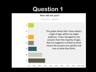
This graph shows that I have asked a
range of ages within my target
audience. I have managed to see
answers from the majority of ages
that my magazine is aimed at which
means the answers are specific and
true to what they think.
Question 2
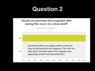
Everybody within my target audience said that
they would purchase the magazine. This tells me
that what I included within the magazine was
appealing to them and attracted them.
Question 3
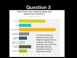
This tells me that the
photos were the main
thing that appealed to my
audience. The colours
used were also one of the
top things selected,
showing me that my
choice was correct.
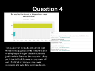
Question 4
The majority of my audience agreed that
the contents page is easy to follow but one
or two people thought that I should have
just listed the features. Because most of my
participants liked the way my page was laid
out, I feel that my contents page was
successful and suited my target audience.
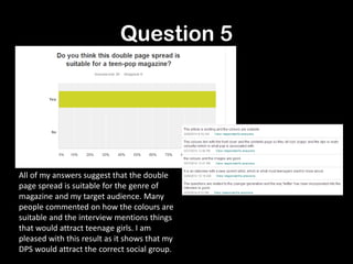
Question 5
All of my answers suggest that the double
page spread is suitable for the genre of
magazine and my target audience. Many
people commented on how the colours are
suitable and the interview mentions things
that would attract teenage girls. I am
pleased with this result as it shows that my
DPS would attract the correct social group.
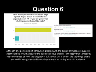
Question 6
Although one person didn’t agree, I am pleased with the overall answers as it suggests
that the article would appeal to the audience I have chosen. I am happy that somebody
has commented on how the language is suitable as this is one of the key things that is
noticed in a magazine and is very important in attracting a certain audience.
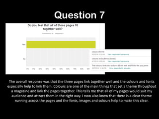
Question 7
The overall response was that the three pages link together well and the colours and fonts
especially help to link them. Colours are one of the main things that set a theme throughout
a magazine and link the pages together. This tells me that all of my pages would suit my
audience and attract them in the right way. I now also know that there is a clear theme
running across the pages and the fonts, images and colours help to make this clear.
Question 8
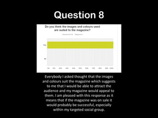
Everybody I asked thought that the images
and colours suit the magazine which suggests
to me that I would be able to attract the
audience and my magazine would appeal to
them. I am pleased with this response as it
means that if the magazine was on sale it
would probably be successful, especially
within my targeted social group.
Question 9
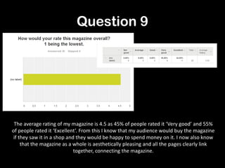
The average rating of my magazine is 4.5 as 45% of people rated it ‘Very good’ and 55%
of people rated it ‘Excellent’. From this I know that my audience would buy the magazine
if they saw it in a shop and they would be happy to spend money on it. I now also know
that the magazine as a whole is aesthetically pleasing and all the pages clearly link
together, connecting the magazine.
Question 10
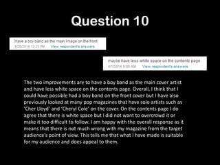
The two improvements are to have a boy band as the main cover artist
and have less white space on the contents page. Overall, I think that I
could have possible had a boy band on the front cover but I have also
previously looked at many pop magazines that have solo artists such as
‘Cher Lloyd’ and ‘Cheryl Cole’ on the cover. On the contents page I do
agree that there is white space but I did not want to overcrowd it or
make it too difficult to follow. I am happy with the overall response as it
means that there is not much wrong with my magazine from the target
audience’s point of view. This tells me that what I have made is suitable
for my audience and does appeal to them.

Questionnaire responses

  • 1.
  • 2.
    Question 1 This graphshows that I have asked a range of ages within my target audience. I have managed to see answers from the majority of ages that my magazine is aimed at which means the answers are specific and true to what they think.
  • 3.
    Question 2 Everybody withinmy target audience said that they would purchase the magazine. This tells me that what I included within the magazine was appealing to them and attracted them.
  • 4.
    Question 3 This tellsme that the photos were the main thing that appealed to my audience. The colours used were also one of the top things selected, showing me that my choice was correct.
  • 5.
    Question 4 The majorityof my audience agreed that the contents page is easy to follow but one or two people thought that I should have just listed the features. Because most of my participants liked the way my page was laid out, I feel that my contents page was successful and suited my target audience.
  • 6.
    Question 5 All ofmy answers suggest that the double page spread is suitable for the genre of magazine and my target audience. Many people commented on how the colours are suitable and the interview mentions things that would attract teenage girls. I am pleased with this result as it shows that my DPS would attract the correct social group.
  • 7.
    Question 6 Although oneperson didn’t agree, I am pleased with the overall answers as it suggests that the article would appeal to the audience I have chosen. I am happy that somebody has commented on how the language is suitable as this is one of the key things that is noticed in a magazine and is very important in attracting a certain audience.
  • 8.
    Question 7 The overallresponse was that the three pages link together well and the colours and fonts especially help to link them. Colours are one of the main things that set a theme throughout a magazine and link the pages together. This tells me that all of my pages would suit my audience and attract them in the right way. I now also know that there is a clear theme running across the pages and the fonts, images and colours help to make this clear.
  • 9.
    Question 8 Everybody Iasked thought that the images and colours suit the magazine which suggests to me that I would be able to attract the audience and my magazine would appeal to them. I am pleased with this response as it means that if the magazine was on sale it would probably be successful, especially within my targeted social group.
  • 10.
    Question 9 The averagerating of my magazine is 4.5 as 45% of people rated it ‘Very good’ and 55% of people rated it ‘Excellent’. From this I know that my audience would buy the magazine if they saw it in a shop and they would be happy to spend money on it. I now also know that the magazine as a whole is aesthetically pleasing and all the pages clearly link together, connecting the magazine.
  • 11.
    Question 10 The twoimprovements are to have a boy band as the main cover artist and have less white space on the contents page. Overall, I think that I could have possible had a boy band on the front cover but I have also previously looked at many pop magazines that have solo artists such as ‘Cher Lloyd’ and ‘Cheryl Cole’ on the cover. On the contents page I do agree that there is white space but I did not want to overcrowd it or make it too difficult to follow. I am happy with the overall response as it means that there is not much wrong with my magazine from the target audience’s point of view. This tells me that what I have made is suitable for my audience and does appeal to them.