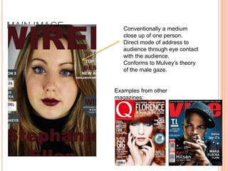
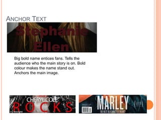
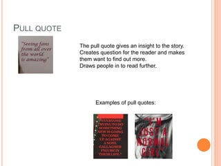
In what ways does
your media product
use, develop or
challenge forms and
conventions of real
media products?
1.
FRONT
COVER
Masthead
Features
Tagline
Anchor
Text
Main Cover
Line
Cover Lines
Main Image
MASTHEAD
Big and bold as a common convention of a music
magazine.
Placed at the top of the magazine. The masthead is
usually
Placed behind the image but I decided to put it in front
as I
feel that it stands out more to the audience.Masthead examples from other
magazines:
MAIN IMAGE Conventionally a medium
close up of one person.
Direct mode of address to
audience through eye contact
with the audience.
Conforms to Mulvey’s theory
of the male gaze.
Examples from other
magazines:
FEATURES
Gives the audience an
insight to what they
can expect from the
magazine.
Conventionally
positioned on the right
hand side of the
magazine.
ANCHOR TEXT
Big bold name entices fans. Tells the
audience who the main story is on. Bold
colour makes the name stand out.
Anchors the main image.
MAIN COVER LINE
Conventionally contrasts the main cover image and
anchor text. Made to stand out and draw the
audience in.
Fits in with the magazine style.
Links to the main article
Examples of cover lines:
CONTENTS
PAGE
Masthead
Features
Feature
Image
Images
Numbers
NUMBERS
Bold page numbers mean
that it is easy for the
audience to navigate their
way around the magazine.
It is convenient and the
colours link to the overall
colour scheme of the
magazine.
IMAGES
I used a variety of different sized
images.
Used the convention of the main
image linking to the main article.
Little text draws the audiences
attention to the images.
DOUBLE PAGE
Text
columns
Page number
Main image
quote
MAIN IMAGE
Forms a personal relationship
through direct address with the
audience.
Direct address draws in the
target audience.
Examples from other
magazines:
PULL QUOTE
The pull quote gives an insight to the story.
Creates question for the reader and makes
them want to find out more.
Draws people in to read further.
Examples of pull quotes:
COLUMNS AND PAGE NUMBERS
Article is neatly arranges into
three columns. Makes it easy
to read and follow.
Conventionally positioned at
the bottom of the page in the
right hand corner
Easy to navigate the
magazine.
Separate from the main text.

Question 1

  • 1.
    In what waysdoes your media product use, develop or challenge forms and conventions of real media products? 1.
  • 2.
  • 3.
  • 4.
    MASTHEAD Big and boldas a common convention of a music magazine. Placed at the top of the magazine. The masthead is usually Placed behind the image but I decided to put it in front as I feel that it stands out more to the audience.Masthead examples from other magazines:
  • 5.
    MAIN IMAGE Conventionallya medium close up of one person. Direct mode of address to audience through eye contact with the audience. Conforms to Mulvey’s theory of the male gaze. Examples from other magazines:
  • 6.
    FEATURES Gives the audiencean insight to what they can expect from the magazine. Conventionally positioned on the right hand side of the magazine.
  • 7.
    ANCHOR TEXT Big boldname entices fans. Tells the audience who the main story is on. Bold colour makes the name stand out. Anchors the main image.
  • 8.
    MAIN COVER LINE Conventionallycontrasts the main cover image and anchor text. Made to stand out and draw the audience in. Fits in with the magazine style. Links to the main article Examples of cover lines:
  • 9.
  • 10.
  • 11.
    NUMBERS Bold page numbersmean that it is easy for the audience to navigate their way around the magazine. It is convenient and the colours link to the overall colour scheme of the magazine.
  • 12.
    IMAGES I used avariety of different sized images. Used the convention of the main image linking to the main article. Little text draws the audiences attention to the images.
  • 13.
  • 14.
  • 15.
    MAIN IMAGE Forms apersonal relationship through direct address with the audience. Direct address draws in the target audience. Examples from other magazines:
  • 16.
    PULL QUOTE The pullquote gives an insight to the story. Creates question for the reader and makes them want to find out more. Draws people in to read further. Examples of pull quotes:
  • 17.
    COLUMNS AND PAGENUMBERS Article is neatly arranges into three columns. Makes it easy to read and follow. Conventionally positioned at the bottom of the page in the right hand corner Easy to navigate the magazine. Separate from the main text.