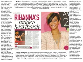
Colour Scheme: The             Masthead: The masthead is quite plain as well as having a bit of style to it. The celebrity’s name is        Main Image: The main
main colours used in          designed to be the plainest thing on the page, which is within the masthead, however the ‘sexy’ pink          image of this double
this double page            colour used almost reflects the personality of ‘Rihanna’. The rest of the masthead looks fairly calligraphic    page spread takes up
spread are ‘sexy’           and stylish which shadows the boring look in the name of the celebrity. There is a clever use of alliteration   the whole of the
pink, white, black and       in the masthead which makes it even more effective. The masthead is placed in the top half of the first        second page and is a
nude. The pink is                                               page in this double page spread.                                            medium close-up the
used to reflect the                                                                                                                         model. This shows how
personality of the                                                                                                                          important it is
celebrity whereas the                                                                                                                       compared to every
black and white                                                                                                                             other thing on the
contrasting colours                                                                                                                         page. The reason for it
are used for text and                                                                                                                       being the most
background. The nude                                                                                                                        important thing is
colour is used                                                                                                                              because it is the most
because it matches                                                                                                                          attention seeking
the top of the model in                                                                                                                     feature, the reader
the main image as                                                                                                                           automatically gets
well as her lip colour.                                                                                                                     drawn to this photo.
The speech marks at                                                                                                                         The pink background in
the bottom of the first                                                                                                                     the photo matches the
page is in ‘sexy’ pink                                                                                                                      lip colour of the model
which contrasts with                                                                                                                        as well as the colour
all the other colours                                                                                                                       scheme of the
and stands out more.                                                                                                                        magazine.

Pug: The only other                                                                                                                         Cover line: There is
feature on the second                                                                                                                       only one cover line on
page of the double is                                                                                                                       this page which is
the pug as we can see                                                                                                                       automatically classed as
which matches the                                                                                                                           the main cover line. It is
colour scheme and the                                                                                                                       a quote from someone
masthead. Again the                                                                                                                         else, about the model in
‘sexy’ pink colour is                                                                                                                       the main image, which is
used which reflects the                                                                                                                     the person who these
personality of the model                                                                                                                    two pages are about.
in the main image, as                                                                                                                       This insists on how
she is looking very                                                                                                                         important she is. The
‘sexy’. The pug is a             Overall Impression: The overall impression given by this double page spread is quite simple and            font is in capital
simple circle shape with      straight forward. The reader is easily able to identify who and what it is about with the help of the main    letters, with a plain
a white arrow in              image, masthead and the cover line. The colour scheme reflects the personality of the protagonist of          font, which makes it
it, which helps guide the       these pages very well as the pink is used to convey her feminine personality and ‘sexy’ looks. The          easier to read and
reader. There is no text          layout of the page is very clear as the story is on one page and the main image is on the other.          makes it stand out more.
or anything in this pug.
Main Cover Line: The main cover line of these double pages is         Main Image: The main image on this double page spread is taken at a mid-
the name of the person in the model and the person who is being       long shot, side angle. The model is not looking at the camera, which gives
interviewed at the same time. There is another cover line which is    the idea that she is fierce. Her face expression makes us think she is feisty
on the photo, on the right hand side. It is a quotation from the      and sexy, by the action she s taking by placing her fingers on her hair. The
model who is being interviewed. The cover line on the right hand      face expression she is giving matches the main cover lines on the left hand
side of the page is in with typography as it is on a dark black and   side. The model is wearing cream tones which kind of matches the black
grey background, therefore it is easier to read.                      and white colour scheme.


                                                                                                                            Layout: The layout
Colour Scheme:                                                                                                              of the double page
The main colours                                                                                                            is very simple
used on this double                                                                                                         however clear to
page spread are                                                                                                             read at the same
black, white and                                                                                                            time. There a lot of
some grey. These                                                                                                            information on the
colours are very                                                                                                            page, I am
classy and plain                                                                                                            assuming that this
colours. The layout is                                                                                                      interview takes up
also so plain as the                                                                                                        about two double
background is white                                                                                                         pages. The photo
and the text is                                                                                                             takes up the whole
black, this is a classic                                                                                                    of the page in the
design technique in                                                                                                         right. The writing
many other                                                                                                                  section takes up the
magazines like this                                                                                                         whole of the other
one and many                                                                                                                page on the left
double page                                                                                                                 hand side.
spreads.


Font Type: The font face of the main cover line is fancy    Overall Impression: These two pages have an overall classy effect. The pages
and simple at the same time, it gives the mood of sexy      are very clear and simple as well as the colour scheme. This makes the magazine
time and romance. On the other hand, the font of the        look wealthy. If the pages were very busy, this would give the magazine a very un-
interview is a simple legible font.                         classy and cheap looking effect. However these pages are not like this and not
                                                            busy; which is why I am, classing them as classy. The placing of the photo is very
                                                            professional as well as the photo itself.
The main feature of this               For the main story typography white has been used, this was a good choice as white                 Underneath the main text but on                     There are many
double page spread is again        contrasts very well with red, as it is very clear and easy to read. But I think that to make the         top of the headline is a kicker           conventions of a double
the convention main image.        Double page spread more attracting and worth reading there could have been more columns                 which gives a slight description of         page which differentiate
Unlike the double page            of text. The first half of ‘Alicia’s’ name is very clearly seen as the font colour contrast well with    the artists on a positive note in           from other pages in the
spread taken from Vibe            the background. The second half of the artists name ‘…cia’ is slightly difficult to read as they        order to make the reader fond of           magazine. Also a double
magazine the main image            have picked the same pinkish/ peach colour as the material Alicia is holding. It would have               her and want to read what is        page spread can consist of
dominates the right hand           been more successful if the editor chose a colour that contrasted with the outfit colour. The           written about her. This is again     different types of information
side of the page. The main              dark red used in the first half background colour could be connoting deep passion.                written in white in order to create    from interviews, reviews, or
image is of the RnB artists-               Sometimes when red is used it can be used to symbolise love and happiness.                          consistency on the page.                    even promoting an
‘Alicia Keys’. This relates to                                                                                                                                                  upcoming artist. This double
the genre of the music the                                                                                                                                                              page spread has been
magazine promotes. Alicia                                                                                                                                                                   taken from Ebony
Keys is represented as                                                                                                                                                                   magazine. The colour
elegant and beautiful. The                                                                                                                                                              scheme of this page is
mise en scene shows a                                                                                                                                                                orange, maroon/ red and
piece of material on the                                                                                                                                                                                white.
sides of the artists which
she is holding. The medium                                                                                                                                                           Alicia’s eyes are looking
close up shows Alicia Keys                                                                                                                                                       directly at the audience, we
wearing a dress, which is                                                                                                                                                                refer to this as direct
represented as quite                                                                                                                                                                 address. This will attract
feminine and also her make                                                                                                                                                      mainly a wide range of male
up which is simple yet                                                                                                                                                                audience. Its often very
effective and attractive, as                                                                                                                                                    unusual seeing models with
she will immediately attract                                                                                                                                                         their hair blowing as it is
male audience. Her long                                                                                                                                                               very challenging cutting
hair is blowing backwards                                                                                                                                                              around the hair when it
which adds to the graceful                                                                                                                                                                 comes to editing on
look which is being                                                                                                                                                                    Photoshop. But for this
portrayed. This image is a                                                                                                                                                      double page spread it would
cropped image from the                                                                                                                                                                 have been easy as the
main image off the front                                                                                                                                                         background colour the hair
cover, this shows                                                                                                                                                                         is placed in in black.
consistency through the
                                                                                                                                                                                     How the audiences first
magazine and also that
                                                                                                                                                                                attraction will be Alicia, it will
Alicia Keys is the main focal
                                                                                                                                                                                  also be the material she is
point of the magazine.
                                                                                                                                                                                    grabbing as it makes the
Furthermore this can add to
                                                                                                                                                                                 audience wonder what it is.
Alicia Keys being seen as a
                                                                                                                                                                                Maybe part of her outfit or it
role model to the young
                                                                                                                                                                                        may just be parts of a
female target audience.
                                                                                                                                                                                                        curtain.


The background colour of the pages is two different colours. However the headline going across both pages makes the reader acknowledge the two pages link them together. The image is
captioned by some text. The name of the artist – the headline – is shown across the bottom of both the pages, in orange capital serif letters. The serifs typeface gives off a traditional feel. The last
letters of the headline cover the image of the artists. On top of the headline is the text ‘Bares her soul’ which captions the headline and the main image. This text is represents in white which
stands out against the orange headline. Also this follows the colour scheme of the double page spread. At the top of the left hand side page is a by – line which tells us who the article is written by
and the photographer. This is shown in black, and against the dark red background it does not stand out as much, this shows that this information is not as important as other information shown
in a brighter colour. The article is shown in white and unlike the black by line it stands out much more hence showing this is the important piece of information. The first few words – ‘When I sat
down’ are shown in capital letters, this intrigues the audience to read this and hence carrying on reading as they want to know what happens next. Some texts are show in italics which
emphasises on its importance. Unlike Vibe magazine the information is only written as one column. This leaves a lot of negative space on the page. However this could be done in order to not
give off a busy, packed page of texts, as the target audience being teenagers, would get bored as from personal experience. The paragraph ends in mid sentence similarly to vibe magazine which
entices the reader to carry on reading onto the next page.
Colour Scheme-                 Main Cover Line-                                                                         Main Image-

The main colours used on       The main cover line of these double pages is a quotation from the person who is being    The main image
this double page spread        interviewed, and who is in the main image at the same time. The quote itself matches     on this double
are black, white and some      the face impression that the model has given in the main photo; she is looking very      page spread is
grey. These colours are        innocent and naïve.                                                                      taken at a mid-
very classy and plain                                                                                                   close             up
colours. The layout is also                                                                                             shot,       straight
so     plain     as      the                                                                                            angle. The model
background is white and                                                                                                 is not looking at
the text is black, this is a                                                                                            the camera, which
classic design technique                                                                                                gives the idea that
in many other magazines                                                                                                 she is shy. Her
like this one and many                                                                                                  face    expression
double page spreads.                                                                                                    makes us think
                                                                                                                        she is innocent
Layout-                                                                                                                 and naïve, by the
                                                                                                                        action she s taking
The layout of the double                                                                                                by placing her
page is very simple                                                                                                     cheeks     in    her
however clear to read at                                                                                                palm. The face
the same time. There is                                                                                                 expression she is
not many information on                                                                                                 giving matches the
the page, I am assuming                                                                                                 main cover lines
that this interview takes up                                                                                            on the left hand
a few double pages. The                                                                                                 side. The model is
photo takes up more of                                                                                                  wearing       white
the two pages than the                                                                                                  which matches the
writing there is. The                                                                                                   colour scheme of
writing section takes up                                                                                                the pages.
the left quarter section of
the pages.

Overall Impression-
                                                                                              Font Type-
These two pages have an overall classy effect. The pages are very clear and simple as
                                                                                              The font face of the main cover line is very
well as the colour scheme. This makes the magazine look wealthy. If the pages were very
                                                                                              fancy and gives the mood of innocence and
busy, this would give the magazine a very un-classy and cheap looking effect. However
                                                                                              naivety. On the other hand, the font of the
these pages are not like this and not busy; which is why I am, classing them as classy.
                                                                                              interview is a simple legible font.
The placing of the photo is very professional as well as the photo itself.

Double page spread analysis

  • 1.
    Colour Scheme: The Masthead: The masthead is quite plain as well as having a bit of style to it. The celebrity’s name is Main Image: The main main colours used in designed to be the plainest thing on the page, which is within the masthead, however the ‘sexy’ pink image of this double this double page colour used almost reflects the personality of ‘Rihanna’. The rest of the masthead looks fairly calligraphic page spread takes up spread are ‘sexy’ and stylish which shadows the boring look in the name of the celebrity. There is a clever use of alliteration the whole of the pink, white, black and in the masthead which makes it even more effective. The masthead is placed in the top half of the first second page and is a nude. The pink is page in this double page spread. medium close-up the used to reflect the model. This shows how personality of the important it is celebrity whereas the compared to every black and white other thing on the contrasting colours page. The reason for it are used for text and being the most background. The nude important thing is colour is used because it is the most because it matches attention seeking the top of the model in feature, the reader the main image as automatically gets well as her lip colour. drawn to this photo. The speech marks at The pink background in the bottom of the first the photo matches the page is in ‘sexy’ pink lip colour of the model which contrasts with as well as the colour all the other colours scheme of the and stands out more. magazine. Pug: The only other Cover line: There is feature on the second only one cover line on page of the double is this page which is the pug as we can see automatically classed as which matches the the main cover line. It is colour scheme and the a quote from someone masthead. Again the else, about the model in ‘sexy’ pink colour is the main image, which is used which reflects the the person who these personality of the model two pages are about. in the main image, as This insists on how she is looking very important she is. The ‘sexy’. The pug is a Overall Impression: The overall impression given by this double page spread is quite simple and font is in capital simple circle shape with straight forward. The reader is easily able to identify who and what it is about with the help of the main letters, with a plain a white arrow in image, masthead and the cover line. The colour scheme reflects the personality of the protagonist of font, which makes it it, which helps guide the these pages very well as the pink is used to convey her feminine personality and ‘sexy’ looks. The easier to read and reader. There is no text layout of the page is very clear as the story is on one page and the main image is on the other. makes it stand out more. or anything in this pug.
  • 2.
    Main Cover Line:The main cover line of these double pages is Main Image: The main image on this double page spread is taken at a mid- the name of the person in the model and the person who is being long shot, side angle. The model is not looking at the camera, which gives interviewed at the same time. There is another cover line which is the idea that she is fierce. Her face expression makes us think she is feisty on the photo, on the right hand side. It is a quotation from the and sexy, by the action she s taking by placing her fingers on her hair. The model who is being interviewed. The cover line on the right hand face expression she is giving matches the main cover lines on the left hand side of the page is in with typography as it is on a dark black and side. The model is wearing cream tones which kind of matches the black grey background, therefore it is easier to read. and white colour scheme. Layout: The layout Colour Scheme: of the double page The main colours is very simple used on this double however clear to page spread are read at the same black, white and time. There a lot of some grey. These information on the colours are very page, I am classy and plain assuming that this colours. The layout is interview takes up also so plain as the about two double background is white pages. The photo and the text is takes up the whole black, this is a classic of the page in the design technique in right. The writing many other section takes up the magazines like this whole of the other one and many page on the left double page hand side. spreads. Font Type: The font face of the main cover line is fancy Overall Impression: These two pages have an overall classy effect. The pages and simple at the same time, it gives the mood of sexy are very clear and simple as well as the colour scheme. This makes the magazine time and romance. On the other hand, the font of the look wealthy. If the pages were very busy, this would give the magazine a very un- interview is a simple legible font. classy and cheap looking effect. However these pages are not like this and not busy; which is why I am, classing them as classy. The placing of the photo is very professional as well as the photo itself.
  • 3.
    The main featureof this For the main story typography white has been used, this was a good choice as white Underneath the main text but on There are many double page spread is again contrasts very well with red, as it is very clear and easy to read. But I think that to make the top of the headline is a kicker conventions of a double the convention main image. Double page spread more attracting and worth reading there could have been more columns which gives a slight description of page which differentiate Unlike the double page of text. The first half of ‘Alicia’s’ name is very clearly seen as the font colour contrast well with the artists on a positive note in from other pages in the spread taken from Vibe the background. The second half of the artists name ‘…cia’ is slightly difficult to read as they order to make the reader fond of magazine. Also a double magazine the main image have picked the same pinkish/ peach colour as the material Alicia is holding. It would have her and want to read what is page spread can consist of dominates the right hand been more successful if the editor chose a colour that contrasted with the outfit colour. The written about her. This is again different types of information side of the page. The main dark red used in the first half background colour could be connoting deep passion. written in white in order to create from interviews, reviews, or image is of the RnB artists- Sometimes when red is used it can be used to symbolise love and happiness. consistency on the page. even promoting an ‘Alicia Keys’. This relates to upcoming artist. This double the genre of the music the page spread has been magazine promotes. Alicia taken from Ebony Keys is represented as magazine. The colour elegant and beautiful. The scheme of this page is mise en scene shows a orange, maroon/ red and piece of material on the white. sides of the artists which she is holding. The medium Alicia’s eyes are looking close up shows Alicia Keys directly at the audience, we wearing a dress, which is refer to this as direct represented as quite address. This will attract feminine and also her make mainly a wide range of male up which is simple yet audience. Its often very effective and attractive, as unusual seeing models with she will immediately attract their hair blowing as it is male audience. Her long very challenging cutting hair is blowing backwards around the hair when it which adds to the graceful comes to editing on look which is being Photoshop. But for this portrayed. This image is a double page spread it would cropped image from the have been easy as the main image off the front background colour the hair cover, this shows is placed in in black. consistency through the How the audiences first magazine and also that attraction will be Alicia, it will Alicia Keys is the main focal also be the material she is point of the magazine. grabbing as it makes the Furthermore this can add to audience wonder what it is. Alicia Keys being seen as a Maybe part of her outfit or it role model to the young may just be parts of a female target audience. curtain. The background colour of the pages is two different colours. However the headline going across both pages makes the reader acknowledge the two pages link them together. The image is captioned by some text. The name of the artist – the headline – is shown across the bottom of both the pages, in orange capital serif letters. The serifs typeface gives off a traditional feel. The last letters of the headline cover the image of the artists. On top of the headline is the text ‘Bares her soul’ which captions the headline and the main image. This text is represents in white which stands out against the orange headline. Also this follows the colour scheme of the double page spread. At the top of the left hand side page is a by – line which tells us who the article is written by and the photographer. This is shown in black, and against the dark red background it does not stand out as much, this shows that this information is not as important as other information shown in a brighter colour. The article is shown in white and unlike the black by line it stands out much more hence showing this is the important piece of information. The first few words – ‘When I sat down’ are shown in capital letters, this intrigues the audience to read this and hence carrying on reading as they want to know what happens next. Some texts are show in italics which emphasises on its importance. Unlike Vibe magazine the information is only written as one column. This leaves a lot of negative space on the page. However this could be done in order to not give off a busy, packed page of texts, as the target audience being teenagers, would get bored as from personal experience. The paragraph ends in mid sentence similarly to vibe magazine which entices the reader to carry on reading onto the next page.
  • 4.
    Colour Scheme- Main Cover Line- Main Image- The main colours used on The main cover line of these double pages is a quotation from the person who is being The main image this double page spread interviewed, and who is in the main image at the same time. The quote itself matches on this double are black, white and some the face impression that the model has given in the main photo; she is looking very page spread is grey. These colours are innocent and naïve. taken at a mid- very classy and plain close up colours. The layout is also shot, straight so plain as the angle. The model background is white and is not looking at the text is black, this is a the camera, which classic design technique gives the idea that in many other magazines she is shy. Her like this one and many face expression double page spreads. makes us think she is innocent Layout- and naïve, by the action she s taking The layout of the double by placing her page is very simple cheeks in her however clear to read at palm. The face the same time. There is expression she is not many information on giving matches the the page, I am assuming main cover lines that this interview takes up on the left hand a few double pages. The side. The model is photo takes up more of wearing white the two pages than the which matches the writing there is. The colour scheme of writing section takes up the pages. the left quarter section of the pages. Overall Impression- Font Type- These two pages have an overall classy effect. The pages are very clear and simple as The font face of the main cover line is very well as the colour scheme. This makes the magazine look wealthy. If the pages were very fancy and gives the mood of innocence and busy, this would give the magazine a very un-classy and cheap looking effect. However naivety. On the other hand, the font of the these pages are not like this and not busy; which is why I am, classing them as classy. interview is a simple legible font. The placing of the photo is very professional as well as the photo itself.