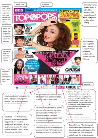
October 19
Analyzing
Magazine
Cover
            2012
The main character name is
                                                                                                                                   mentioned on the front
                                                                                                                                   page to enlarged font size.
                                                                                                                                   The font is pink to be in
                                                                                                                                   contrast with the
                                                                                                                                   background as well as to
                                                                                                                                   question the reader’s mind.
‘’The
Magnificent
Seven’’
shows that
these
actors are
popular
and well
known by
the target
audience
and they
have loads
of fans.


Price - £2.55 this is
shown in small
size because it is
expensive but if it
was cheap it
would of been in
big font.


      Barcode


                                                                                                                       Masthead- It is dark pink colour which
                                                               Main Image – The Main Image Is of a Women posing
 Audience – It is Obvious that the                                                                                     plays the part in creating the colour theme on
                                                               as she is meant to be the role model for this
                                                               magazine. For the readers it shows them how to look     the front cover. It is very popular to have the
 Target Audience for this                                                                                              image on Top of the Masthead on a Particular
                                                               attractive and sexy. The dress looks simple which
 Magazine is female because the                                might suggest people can wear anything and still look   letter. The font is Classy which helps make it
                                                               nice .So anyone Women can buy this Magazine. The        clear to the audience who this Magazine is
 front cover gives it all away the                             main image overlaps the name of the magazine which      targeted at.
 main image is of a girl and the                               shows this magazine is well known and popular. The
                                                               main image is a medium shot.
 font is pink which is a girly
 colour. Age 20-30.

                                                                                                                       Denotation – A Women Posing For the Magazine.
 Article – The Magazine cover is filled with alliteration in
 all the sides for Example ’’ We’ve got Fall covered ’’, ‘’
                                                                                                                       Connotation Designer clothes, Attractive,
                                                                  Anchorage text-The main image is of keira
 Romantic cosy Weekend looks ‘’ ect. This is effective                                                                 Confident, Model, Fashionable.
                                                                  knightley who is a Model/Actor and tells us
 because it sounds catchy when the audience read it
 draws their attention. The colour scheme of pink black           why she is featured on the front cover. This
 and white would draw the attention of Its Target                 is a lure to read the article inside the
 Audience because the Women reading this would                    magazine about her. If you look at the                Direct Address – Most Magazine
 stereotypically be ‘Girly’ things like perfume, make up,
 clothes ECT. And as pink is associated strongly with
                                                                  front cover of the Magazine you can tell              covers have people making direct
 women it is possible they like the colour pink therefore         that there are all actors.                            eye contact with the readers.
 catching their eye.
Selling Line                                   Strapline                                                                           Extra information
On the front
cover it tells us
                                                                                                                                                             is been added to
most of these                                                                                                                                                attract the
artists have
                                                                                                                                                             audience, this
                                                                                                                                                            ta
confession to
make which                                                                                                                                                   also collides well
gets the target                                                                                                                                              with background
audience even
                                                                                                                                                             and the other
more
interested.                                                                                                                                                  writing.


 There are
 giving tips
 to people
 on how to
 spend the
 summer.                                                                                                                                                   Direct Address-
                                                                                                                                                           Most Magazine
                                                                                                                                                           covers feature a
                                                                                                                                                           person making
 Date line – It                                                                                                                                            direct eye
 shows the
                                                                                                                                                           contact with
 year, month
 and date this                                                                                                                                             Readers to reach
 magazine                                                                                                                                                  intimacy.
 came out.


Price – It is £2.99
this is shown in
small size
because it is
expensive but if it
was cheap it
would of been in
big font.


                                                                                                                                                                Barcode


                                                                                                                             Skyline – Pink grabs the audience’s
                                                           Main Image- The main image is of Cher Lloyds who is a             attention as it is aimed at younger
    Audience – The Target Audience for this magazine is
    an audience for both Genders around the age 11 – 18.   singer and tells us why she featured on this Magazine             audiences. It has pink throughout the
    Because it has pictures of younger people In the       cover. The story is mainly based around her. This shows           cover, the writing is black & white, the
    Magazine and has both Genders. Cher Lloyds was         the Magazine is aimed at a younger audience.
                                                                                                                             white background makes it stand out
    famous from X factor she got her target audience
    from X factor as there is a big audience there.
                                                                                                                             against the pink. The rhetorical Question
                                                                                                                             in the skyline makes the audience get
                                                                                                                             more involved so they answer the
                                                           Lead Article – The word Exclusive grabs the audience’s
                                                           attention as they want to know the latest and know                Question in their head.
                                                           what is going on. The word Exclusive grabs audience
                                                           attention with how they’ve changed the font which
                                                           gets them interested even more. The tagline
                                                                                                                            Denotation – A Young Girl Posing.
                                                           underneath the picture says ‘’ I’ve got Major
     Masthead – The Pink colour is                         Confidence Issues’’ It is catchy. At the bottom it says’s
                                                                                                                            Connotation – Attractive, Fashionable, Relaxed.
                                                           ‘Amazeballs Posters’ which the target audience would
     common throughout the whole                           be interested in. If they are big fans
     Magazine that’s how the
     Magazine is recognised. The front                                                                                        Colour Scheme –The photograph
                                                           Anchorage Text –The main image features lots of
     cover works around this colour                        Famous People and text tell us why they are featured on            dominates but the font colour has
                                                           the front cover. All this is a lure to read the article inside
     scheme. The pink colour catches                                                                                          been to compliment the cover. The
                                                           the magazine about them. If you look at the front cover
     the audience attention.                               of the magazine you can tell that there are all singers.           colour here are ones that seem
                                                                                                                              quite female like pink and purple.

Analyzing magazine cover microsoft word

  • 1.
  • 2.
    The main charactername is mentioned on the front page to enlarged font size. The font is pink to be in contrast with the background as well as to question the reader’s mind. ‘’The Magnificent Seven’’ shows that these actors are popular and well known by the target audience and they have loads of fans. Price - £2.55 this is shown in small size because it is expensive but if it was cheap it would of been in big font. Barcode Masthead- It is dark pink colour which Main Image – The Main Image Is of a Women posing Audience – It is Obvious that the plays the part in creating the colour theme on as she is meant to be the role model for this magazine. For the readers it shows them how to look the front cover. It is very popular to have the Target Audience for this image on Top of the Masthead on a Particular attractive and sexy. The dress looks simple which Magazine is female because the might suggest people can wear anything and still look letter. The font is Classy which helps make it nice .So anyone Women can buy this Magazine. The clear to the audience who this Magazine is front cover gives it all away the main image overlaps the name of the magazine which targeted at. main image is of a girl and the shows this magazine is well known and popular. The main image is a medium shot. font is pink which is a girly colour. Age 20-30. Denotation – A Women Posing For the Magazine. Article – The Magazine cover is filled with alliteration in all the sides for Example ’’ We’ve got Fall covered ’’, ‘’ Connotation Designer clothes, Attractive, Anchorage text-The main image is of keira Romantic cosy Weekend looks ‘’ ect. This is effective Confident, Model, Fashionable. knightley who is a Model/Actor and tells us because it sounds catchy when the audience read it draws their attention. The colour scheme of pink black why she is featured on the front cover. This and white would draw the attention of Its Target is a lure to read the article inside the Audience because the Women reading this would magazine about her. If you look at the Direct Address – Most Magazine stereotypically be ‘Girly’ things like perfume, make up, clothes ECT. And as pink is associated strongly with front cover of the Magazine you can tell covers have people making direct women it is possible they like the colour pink therefore that there are all actors. eye contact with the readers. catching their eye.
  • 3.
    Selling Line Strapline Extra information On the front cover it tells us is been added to most of these attract the artists have audience, this ta confession to make which also collides well gets the target with background audience even and the other more interested. writing. There are giving tips to people on how to spend the summer. Direct Address- Most Magazine covers feature a person making Date line – It direct eye shows the contact with year, month and date this Readers to reach magazine intimacy. came out. Price – It is £2.99 this is shown in small size because it is expensive but if it was cheap it would of been in big font. Barcode Skyline – Pink grabs the audience’s Main Image- The main image is of Cher Lloyds who is a attention as it is aimed at younger Audience – The Target Audience for this magazine is an audience for both Genders around the age 11 – 18. singer and tells us why she featured on this Magazine audiences. It has pink throughout the Because it has pictures of younger people In the cover. The story is mainly based around her. This shows cover, the writing is black & white, the Magazine and has both Genders. Cher Lloyds was the Magazine is aimed at a younger audience. white background makes it stand out famous from X factor she got her target audience from X factor as there is a big audience there. against the pink. The rhetorical Question in the skyline makes the audience get more involved so they answer the Lead Article – The word Exclusive grabs the audience’s attention as they want to know the latest and know Question in their head. what is going on. The word Exclusive grabs audience attention with how they’ve changed the font which gets them interested even more. The tagline Denotation – A Young Girl Posing. underneath the picture says ‘’ I’ve got Major Masthead – The Pink colour is Confidence Issues’’ It is catchy. At the bottom it says’s Connotation – Attractive, Fashionable, Relaxed. ‘Amazeballs Posters’ which the target audience would common throughout the whole be interested in. If they are big fans Magazine that’s how the Magazine is recognised. The front Colour Scheme –The photograph Anchorage Text –The main image features lots of cover works around this colour Famous People and text tell us why they are featured on dominates but the font colour has the front cover. All this is a lure to read the article inside scheme. The pink colour catches been to compliment the cover. The the magazine about them. If you look at the front cover the audience attention. of the magazine you can tell that there are all singers. colour here are ones that seem quite female like pink and purple.